You've heard it before: every brand that wants to succeed, needs a logo. It's an undeniable truth. The logo is one of the most important parts of marketing for a simple reason, it is the most recognizable element of your brand. SMEs, large multinationals and even people looking to create their own personal brand - everyone needs a logo.
What is a logo?
In branding we use "logo" to refer to the graphic representation of a brand name. We could say that a good logo is the best opportunity for a brand to give a good first impression. It will be the first thing you see of it on many occasions and your goal is for it to be remembered, so it is tremendously necessary to spend some time on its design.
Logo Types
We can talk about four types of logos on a general level according to their characteristics:
Wordmark It is the one composed only of letters, like that of Zara.
Combination mark. It is the one that is composed of text and an icon, such as the Adidas logo that forms the name of the brand, and the icon of the three lines above.
Letter mark. Like the combination mark it consists of text and icon, but in a different way. This time the text is part of the same image, as for example in the case of the NASA logo.
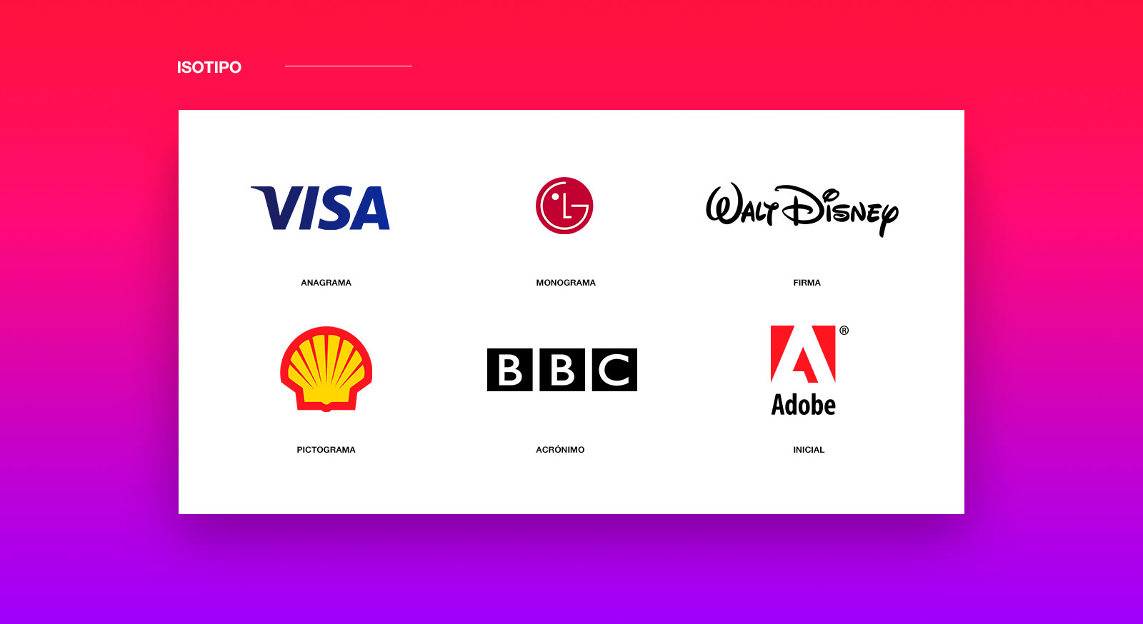
Isotype. It consists only of letters or typography and a symbol or icon.This type of logo has up to six subcategories: anagram, monogram, pictogram, acronym, initial and signature.
If you are a designer and have you have a brand logo assigned you have in your hands one of the most beautiful projects in marketing. Although it is also one of the most demanding ones. But do not burden yourself, to create a good logo you only need time, creativity, and to understand the elements you want to include.
Keys to a good Logo
As in any branding strategy before starting, it is necessary to know who the competitors are and to have a clear identity of the brand. This prior research process is essential before we start to sketch our logo. According to marketing expert Jonah Berger, author of “Contagious: Why Things Catch On”, a logo must meet four premises.
1. Simple
Few things in design tend to look for the opposite. A logo should be simple, which does not mean that it is lacking in depth. We speak of simplicity on an aesthetic level, with a simple design that achieves a great impact at a glance. It is resounding and gets stuck in your memory, like the chorus of a song.
To make it a simple logo, it is best to follow three rules:
Few colors. As much as you like colors, it's easier to remember a simple logo that has no more than three. It will be more visually attractive and it is proven that it is easier to memorize. For example, the Apple logo was the most remembered in this study in which a group of Americans replicated ten iconic logos. Simple lines, a lot of impact and a single color were the key to achieving a greater visual impact.
Clear fonts that are easy to read. Think of the Adidas logo. Three lines and a firm and perfectly easy to read font. The idea is to be remembered by your logo, so don't make it difficult for the customer using a convoluted font that you don't understand.
Not too much of everything. Seeking subtlety above Baroque must always be the key. Remember the Nike logo? You could even draw it right now on paper. The simpler, the easier to remember.
2. Consistent with the brand
A logo should speak of the brand to which it belongs. For example, if we look at the IKEA logo and its huge letters, we get a clear message: “We are sturdy, reliable and robust, like our furniture.”
The logo must convey the essence of the brand even if it is composed only of letters. A font is not just letters, it represents much more and in a logo you have to look to communicate what you want to be remembered for.
3. Memorable
According to Berger, your logo should “help remind your customers that you exist and why you exist”. If you create a logo that is easy to remember, simple and shocking, you will favor that at a glance something is marked by fire on your customers. Like a love at first sight.
The Apple logo, for example, is not only recognizable but anyone who sees it will remember it. That bitten apple needs a single peek to be engraved in your memory.
.

4. Unique
It is essential to have a unique logo. It's not a good idea to “get inspiration” from something already existing, because you run the risk of being mistaken for someone else. You want to stand out, be the center of attention and get everyone to remember you, and for that you need to generate impact and become something unique. Like your brand.
For example, the Amazon logo is unmistakable with others. A smile under the name that in turn is an arrow pointing from “a” to “z” and carrying an implicit message: we have everything

The logo is that perfect reflection you're looking for for a brand. That is why it is so important to use time, resources and talent for its creation. If you are at that point and need a logo that meets your goals, contact us, we will be happy to meet this challenge with you.


