How can we help?Get in touch
What’s a rebranding?
A rebranding is the set of actions that, by changing the name, logo, typography, design, advertising messages or making a combination of the previous ones, seeks to change the mind of customers and investors of an already established brand.
The passage of time is unforgiving for a brand and the need to adapt it to the current situation makes a rebranding of that brand can make a difference when competing in their industry.
Bungee Jumping, Rafting
To build a rebranding to a very strong brand is a very difficult and dangerous decision, the cost it’s supposed to have (changes in facades, uniforms, stationery, vehicles, etc.) and the ability to go wrong make we face a risky activity in which more than one company has ended up losing our shirt along the process.
Large Rebrandings in the history of Spain
RTVE
The new corporate image of RTVE meant a complete break with the past. The president of the corporation, Luis Fernandez, introduced in the late summer of 2008 the winning proposal ideas held year and a half before choosing the new logo.
The winning design by the Catalan agency specializing in branding and communication SUMMA, was a very bold and radical change on the historical logos that came from decades ago representing RTVE.
Telefónica - Movistar
In his branding strategy, it was decided that Telefonica must start getting away as a trademark due to all the prejudices people had and start creating the path for new brands aligned with the new digital world, to refresh their values and build a new imaginary fresh and young.
Movistar arrived here. A brand that made a loud noise at the entrance, but did not it alone. In this case, and very well done, it was introduced as a sub brand of Telefonica. After this, the brand Telefonica was relegated to B2B professional services, between companies, disappearing from the front action with consumers who now buy for Movistar phones do consume Movistar, they speak through and watch television through Movistar.
The Antena 3 Group - Atresmedia
The Antena 3 Group, now renamed Atresmedia, is the largest private media company in Spain. Founded in 1989 this group has evolved over its 20 years of life to become a leader in the sectors it operates (TV, radio, multimedia, advertising, film, events, etc). After its merger with “La Sexta”, the group begins a process of renewal of its entire corporate identity, including a name change and a reorganization of its brand architecture. The project was carried out by the creative team of the group itself.
Correos
The creation of the Group brand was vital to capitalize on the value offered in the different services in a single identity.
The “Correo Group”, is now the new engine in charge of ordering an old portfolio of brands and independent services that dispersed the proposed value and diluted common efforts to create a global image. It aims for a mixed architecture, where the brand of the group 'Grupo Correos' plays its role as an endorser in each of the brands of the service.
A sober, rational identity using the color blue as the corporate, inheritance of its well-known brand Correos, modernize its typography that now works in lower case, giving more weight through its bold treatment and less singular identity.
Very rational identity, which leaves out any glimmer of emotionality that might contain the heritage and history of some of its brands, with over a century of existence.
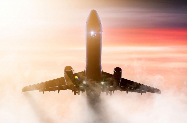
Iberia
Iberia, the most important and ancient Spanish airline merged with British Airways in 2010, and in late 2013 introduced the redesign of its brand by Interbrand.
In order to achieve a stronger, modern and competitive Iberia in airline industry, the company raised this process of reinvention that included extensive research (interviews with about 9,000 people), creating a new brand platform with new values and a new business philosophy, and later the development of a new graphic identity, which affects not only the logo but the entire visual universe.
However, the new concept of identity Iberia went beyond the merely visual. From a time when the airline does have given much importance to the concept of Ambient Branding for this, Iberia added a selection of musical pieces for their customers, who can enjoy during the Customer Journey flight (boarding, flight, landing): ' Como el viento 'by DePedro; 'Rainbows of Colours' by The Sunday Drivers; ' Amor, amor de mis amores, Natalia Lafourcade; "Vespres Els Verds" Mishima; 'Pizzigatos' Love of Lesbian or 'Neon Lights' Lori Meyers are some songs that customers can listen to.
Repsol
Repsol The first logo was created by Wolff Olins in 1988. It was an interpretation of the "horizon", where the sea, the sky and the sun joined in a simple and property sphere. Later in 1996, Cruz Novillo was the teacher in charge of updating the brand, creating the logo version with which we have lived 15 years. Cruz Novillo kept the concept of "horizon" but simplified forms, became more symmetrical set and reset correctly the typography.
With the aim of giving vitality, dynamism, life and optimism, the plane imagotype introduced in 1997 is transformed by a new one with more volume, light and sense of movement.
Typography is maintained, but a new verbal language is set, and given more weight compared to imagotype, but no major changes. White is introduced to replace the blue band, which tries to convey a new era of transparency and closeness, away from the cold blue used today.
Renfe
In 2005, Renfe faced the biggest change in its history. The former large state company was divided into two: on one side, Adif, a manager of train lines and train stations; and on the other Renfe, an operator of trains on that infrastructure. This process, which took place across Europe, allowing separate network operation, to allow competition in the medium term.
The iconic "cookies" of RENFE
Renfe changed from a blue sign, a symbol almost equivalent to the railroad in our country, to a more contemporary one in a new purple color. Thus, Renfe premiered its sixth logo, replacing the previous designed by Cruz Novillo in 2000 (which had updated its own work of 1983). He finally opted for a groundbreaking image, with a little purple used in the branding of our country and a soft typeface. According to the same company, the new image represents four core values: Proximity, Commitment, Excellence and Leadership.