branding

train station estacion de trenes viaje travel marca negocio Claudio Schwarz
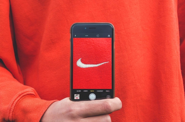
For a business, the brand is much more than a name. We may think that Nike is just Nike, but the famous "Just Do It'' is also part of your brand, as is the red of Coca Cola or as was the unmistakable ringtone of the most popular Nokia.  The brand of your business is the first step to success, just as a good melody is the first step to a good song. There is no better sales tool than building a good brand. When we speak of brand we do so according to the AMA (American Marketing Association) of "a name, term, design, symbol or any other characteristic that identifies a seller's goods or services as distinct from those of other sellers." In other words, it is what makes our business unique and can be reflected in different concepts such as brand value, style standards or visual identity elements such as the logo or corporate colors, to give some examples.  Branding is essential because it is the process of creating a brand, something essential for any business to work. To establish a good brand, it is necessary to do polished and studied branding work by a team of professionals capable of polishing our virtues and with the ability to capture all that we are.  Why having a strong brand is important for your business The main objective of a business is to achieve success and a strong brand is one of the tools with which to achieve it. Creating a good brand can bring us new customers and keep the ones we have already gained. It allows us to connect with consumers and get into their heads and be ever-present, like a teenage crush. A strong brand can be the only one guilty of hooking buyers, an example of which is Apple. This brand has an entourage of groupies behind it that will follow it no matter what it does. If they sold clothes, the brand's followers would buy them. If Apple came out with an energy drink, it would be top of mind for its fans. Apple as a brand is the clearest example of the power it can have on your business. Everything that surrounds Apple is Apple. Its stores, the packaging of its products, its advertising messages, the communication of its new products, its colors, its website. Everything is designed to have the essence of Apple as a brand. And it is such a consolidated and strong brand that it has license to, for example, raise prices without affecting its sales too much, or to launch new phones that barely differ from the previous generation. Having a strong brand is a way of gaining the trust necessary for your customers to become loyal, to leave a mark on them, to be remembered as a brand. It is a tool to stand out from the competition and to achieve assiduity. Some people always buy the same brand of milk, always consume on the same streaming platform or always wear the same brand of clothing.  If the brand is consolidated and gains reliability as well as loyal customers, we will have a reduction in marketing expenses and an increase in sales. We will grow and surpass our competitors and we will be able to face possible crises much better. In addition, a strong brand is a dream brand for workers (look at Google) and loved by customers. How to have a strong brand The name, brand pillar If a friend introduces you to Juan, Victor, Sonia, Luis and Attila, who would you remember the next day by name alone? The first step to remember someone (or something) is the name, that's why this is the base pillar on which your entire brand must rest. Something easy to memorize, powerful, stylish, original. Think of great brands. Names like Zara, Adidas, Tesla or Chanel come to mind. You're unlikely to think of long names or names as complicated to pronounce as Renée Zellweger's last name.  That doesn't mean that more complex names can't be successful, but it does make the job harder, so forget about putting sticks in your wheels and come up with a simple, creative and evocative naming that's easy to memorize. No one said it would be easy, but let's say it's not impossible either. Branding + Visual Identity  The second point after the name is to work on branding and visual identity, and it is the most important point to have a strong brand. Visual identity could be defined as what we see: logo, colors, typography and other visual elements that are applied for example in bags, business cards or email signatures. And the term branding refers to the whole process of defining and building a brand image, including visual identity.  Think of Porsche. It is a brand that exudes elegance and luxury, just like its cars. Its values are reflected in its designs, in the way it communicates, in its social networks. It has worked both branding and visual identity in each and every one of the elements that make up the brand, from the logo to the name through the product itself.   Ver esta publicación en Instagram Una publicación compartida de Porsche Ibérica (@porsche_iberica) A well-worked branding is key to turn our brand into something powerful. The easiest way to understand how important this step is is to see it as a Viking ship that takes us from Norway to England. We need it to be sturdy, solid and effective so that it can ride the waves without exhausting us rowing and so that we don't drown in a storm. Branding is our boat, so let's invest in it.   Work on your brand essence It should be a point within branding, but working on the essence of your brand is so vital to create something that makes an impact that it was essential to bring it out. Every brand can be unique and the key is to find out what makes you unique. Are you special because you only work with natural products made by tattooed ladies and gentlemen, like the cosmetics and personal care brand Lush? Is the key to your products that every design is a redesign of your brand logo like Deus? Think about what's unique about your business so you can create a unique brand. Emotions matter IKEA could have been a brand that sells furniture, but it has preferred to sell homes, and in that difference lies its power. IKEA pursues emotions that it manages to capture, for example, in the spaces of its stores. If you walk through its decorated rooms, it seems that people live there. So much so that you could sit on one of its sofas and imagine that couple on a Friday night, wrapped in a blanket and watching TV resting gently on a piece of BESTÅ furniture. The brand must provide the humanism necessary to connect with our users. It is not only about selling the best product, but that our brand makes them feel something. A cold brand is a forgotten brand. Communication in all its forms My grandmother always said that it is as important to be a good person as it is to look like one. It's not only about knowing who we are as a brand, but also about knowing how to communicate it to our customers. Are you a rogue brand, with original products and that wants to stand out from the rest by manufacturing only in Spain? Say it. Show yourself and show off all those values that define your business.  Use social networks as the valuable tool they are and forget about turning Instagram into a showcase for your products. Go a step further and connect with your users to position yourself and elevate your brand to the next level.  And watch out, because communicating is not just about talking. The images with which we transmit, for example those of our products, must also be part of us. Take care of the aesthetics and think that form and substance must always go hand in hand. We cannot be a sustainable company and then fill the mailboxes of a neighborhood with printed brochures. We could close this article with the axiom that "a business without a strong enough brand is a business doomed to fail". But chances are you already know that, so we'd better tell you that any business can turn its brand into one as strong as concrete. You just need a team of branding experts like ours to make the change happen. Shall we talk?   Main photo: Claudio Schwarz 
Puente de San Francisco
Our glossary of branding made it clear, place branding is the creation of a brand for a place. But what does a good place branding need and what is it used for? Place as a brand must integrate and express its identity, its values and attributes through place branding. That way in which a place communicates with the world is seen exactly how it wants to be seen, is crucial in an era in which we are all connected and competition is growing every day, including between countries, cities or regions.  Paris and its romanticism, Rome and its culture, Tokyo and its technology. These associations that might seem casual are not at all. They are the fruit of a place branding campaign. The aim of place branding actions is to ensure that a region, municipality or country increase its tourism, improve its local market and reputation, attract potential investors and even help its international relations.   The competitive identity within tplace branding   The image of a country plays a crucial role in the competitiveness of companies, as well as in the products and services they offer. For example, Germany is a country that we associate with thoroughness and reliability, so German motor companies are perceived to have the same qualities. But this relationship goes both ways, companies and their brands are also one of the main builders of the image of a country.  Simon Anholt coined this term as a Competitive Identity. The new brand management for nations, cities and regions. He formed that identity with a hexagon with six concepts that interact with each other: tourism, market, politics, investment, culture and public.  Place branding can help build a competitive identity that influences the perceived images and thus achieve the objectives for which it was created. We are not only talking about helping as something beneficial for the place itself, but also for the companies that make up it -their image is also that of all those who are part of it in one way or another- society, companies, tourism... It is important to note that place branding must meet two premises:   Be simple. When we talk about simplicity in design, we talk about less is more. Always. Simplicity must prevail in all actions. Having long-term goals. It is impossible in any branding campaign to achieve short-term objectives, which is also applicable to place branding.    The five principles of place branding     Robert Govers, founding president of the International Place Branding Association (IPBA), developed together with Erik van't Klooster and Gerard Van Keken a set of principles that summarize a good place branding campaign.  Singularity. What makes your brand unique. When we talk about a place as a brand and its identity, it is essential that it clearly defines the unique character that distinguishes this territory from others. Authenticity. It is crucial that to learn what others think of our brand before projecting an image of us. We must also identify clearly and realistically the attributes that will form part of the brand identity in place branding. In this way we can be authentic and faithful to reality. Memorable. If you are authentic and unique, you end up being memorable for the people who visit you. A recurring memory in which the brand of your place will be the first place that comes to mind for example, to invest or visit.  Co-creation. According to Robert Govers, authenticity in place branding is based on co-creation by all those involved in the process. The best way to work on place branding is to forget about pyramids and work together with all those involved, such as the government, companies or society. Place Making. This concept consists of two things: to build, develop products and strategic actions that support the brand's promises; and to cooperate, finding common objectives and points of agreement between all those involved, both stakeholders (term that refers to all those involved in a company) and the public sector, private or society. This comprehensive strategy will feature events, innovations, investments and actions focused on conquering visitors. Place branding success cases   New York, USA If we talk about cities, the most iconic logo in New York City is that of this campaign. It's simple, cosmopolitan and 100% in tune with the city . And it was key to get the city where it is now. It was part of a campaign in the 1970s that promoted tourism through special holiday packages, nationwide advertising campaigns with stars like Frank Sinatra or Liza Minelli and the most famous logo in the city's history, designed by Milton Glazer.    Steve Karmen composed a song to accompany this campaign that still today, is one of the most representative of the city and that at that time brought them out of the financial crisis in which they were plunged.   Paris, France   Developed in 2016 by the French agency Graphéine, the new corporate image of the tourist information offices in Paris is one of the most notable ones in Europe. The work they did including the Eiffel Tower typography is visually significant, authentic and memorable. It still has that French charm, simple and elegant, but modernized. In addition, colorful illustrations by French designer Séverin Millet were added to tourism stationery in a cosmopolitan, avant-garde and chic air. This action is one of those that would be included in the place branding of the French city.    Porto, Portugal In this case, the Portuguese design studio Eduardo Aires wanted to represent Porto as a global, complex and rich city, for which an illustration inspired by the classic tiles of the city was used, it was full of small icons. ​   This change in the visual identity of the city added as one more action in its place branding and made Portuguese citizens feel more identified with Porto.   Asturias, Spain Using gastronomy as a brand value and above all the spectacularity of its landscapes and the sensations it makes you feel, Asturias is another example of effective place branding. In just 48 seconds it manages to convey the peace and harmony that is breathed in the region.    The place branding of Asturias has the longest tradition in Spain. It was shown as a sustainable destination and alternative to beach tourism that has always conquered Spain. “Asturias, Natural Paradise” is a brilliant example of how place branding can be the perfect opportunity to publicize a region and compete using your best weapons.    In this case the key is the Asturian nature, its gastronomic offer and tranquility at its best.    Peru Since 2009 Peru has been working in the place branding of its country, redesigning its own brand identity in 2011, when its new image was presented.  It was built around the flavors, colors and living history of Peru.   The logo changed, giving importance to the letter P that is achieved with a spiral inspired by one of the icons common to all ancient Peruvian cultures. Thus, only with a gesture they manage to represent tradition as well as evolution and change.     Place branding is much more than just a logo or advertising campaign. It's a painstaking job in which even the locals are involved. A way for the rest of the world to easily see who we are and what they could accomplish with us. As a brand, we also belong inexorably to the brand of the place where we are. Being an active part of it is as important as it is beneficial for all parties, as a good place branding not only attracts tourism, but also investors,  and itencourages local businesses to grow.
Chico con sudadera Nike y móvil
In the world of design it is easy for some terms to overlap. This is the case of visual identity and branding, two concepts that may seem similar, but that are not the same at all. Visual identity: What we see. When we talk about visual identity in design, we refer to a combination of elements such as the logo, colors or fonts, applied to certain pieces such as business cards, brochures, websites, email signature,s uniforms...  Corporate stationery for CENIE (International Centre on Ageing) If we simplify it even more, we could say that visual identity is what you can see of a brand. It is governed by the Identity Manual, a vital document for any company, which contains the basic rules for applying the trademark.  The objective of visual identity must always be to convey the essence and values of the brand in a clear and coherent way. An example of a successful visual identity To understand it better let's think of a brand recognized and recognizable by anyone - Apple. Its visual identity is not only its icon of an apple, it is also the design of its packaging, the decoration of its stores, its website, its ads.  Everything that is related to the brand and is perceived by the eye, is part of your visual brand identity. If you look closely, everything that is part of Apple's visual identity is in line.  It's like we're watching a concert in which each instrument plays its note and to create the perfect melody.  The use of color, space, images... even the designs of your products follow the same line.   Apple Store It is not only that the visual identity of a brand manages to connect us with the brand itself, but it allows us to recognize it in an almost organic way. Go to any Apple store in the world and you'll know you're in one. Its brand identity makes it familiar and meaningful. The design team that creates a visual identity around a brand works to ensure that the perception of the customer is as close as possible to the essence, context and emotions of that brand. Using any kind of visual language they manage to make tangible the intangible.   Branding: The construction of the brand    As with any action related to design and marketing, branding has an important emotional part that seeks to make the consumer feel something specific. Although the term branding refers to the process of defining and building the image of a brand as a whole , it also seeks to develop a set of attributes and values that the end consumer perceives as unique and coherent.  A branding strategy ranges from naming and brand architecture to creating the logo and all the visual identity. This process encompasses tangible elements such as brand colors, and other intangibles such as values and attributes that tell our customers what our brand represents.  So we can say that visual identity is a part of branding. The actions that are included in a branding process have the ability to influence the value of our brand and build it with a unique personality. A good branding strategy allows not only to position our brand in the market but also in the head of consumers and helps to create a prestige associated with the value of the products or services we offer.   Details of the Visual Identity created for Bocademia (a new concept of the franchise of Bocademia).   The perception that they have of us in any aspect included in branding is vital for the consumer to end up choosing our brand.  That is why it is important to walk this path with the help of professional branding experts and a team of designers who manage to transfer these emotions to the most physical part of a brand. If you have doubts or think we can help you achieve this, write to us, we will be happy to be part of this process.
You've heard it before: every brand that wants to succeed, needs a logo. It's an undeniable truth. The logo is one of the most important parts of marketing for a simple reason, it is the most recognizable element of your brand. SMEs, large multinationals and even people looking to create their own personal brand - everyone needs a logo. What is a logo?​ In branding we use "logo" to refer to the graphic representation of a brand name. We could say that a good logo is the best opportunity for a brand to give a good first impression. It will be the first thing you see of it on many occasions and your goal is for it to be remembered, so it is tremendously necessary to spend some time on its design.  Logo Types We can talk about four types of logos on a general level according to their characteristics: Wordmark It is the one composed only of letters, like that of Zara.      Combination mark. It is the one that is composed of text and an icon, such as the Adidas logo that forms the name of the brand, and the icon of the three lines above.   Letter mark. Like the combination mark it consists of text and icon, but in a different way. This time the text is part of the same image, as for example in the case of the NASA logo. Isotype. It consists only of letters or typography and a symbol or icon.This type of logo has up to six subcategories: anagram, monogram, pictogram, acronym, initial and signature. If you are a designer and have you have a brand logo assigned you have in your hands one of the most beautiful projects in marketing. Although it is also one of the most demanding ones. But do not burden yourself, to create a good logo you only need time, creativity, and to understand the elements you want to include. Keys to a good Logo As in any branding strategy before starting, it is necessary to know who the competitors are and to have a clear identity of the brand. This prior research process is essential before we start to sketch our logo. According to marketing expert Jonah Berger, author of “Contagious: Why Things Catch On”, a logo must meet four premises.  1. Simple Few things in design tend to look for the opposite. A logo should be simple, which does not mean that it is lacking in depth. We speak of simplicity on an aesthetic level, with a simple design that achieves a great impact at a glance. It is resounding and gets stuck in your memory, like the chorus of a song.  To make it a simple logo, it is best to follow three rules:  Few colors. As much as you like colors, it's easier to remember a simple logo that has no more than three. It will be more visually attractive and it is proven that it is easier to memorize. For example, the Apple logo was the most remembered in this study in which a group of Americans replicated ten iconic logos. Simple lines, a lot of impact and a single color were the key to achieving a greater visual impact. Clear fonts that are easy to read. Think of the Adidas logo. Three lines and a firm and perfectly easy to read font. The idea is to be remembered by your logo, so don't make it difficult for the customer using a convoluted font that you don't understand. Not too much of everything. Seeking subtlety above Baroque must always be the key. Remember the Nike logo? You could even draw it right now on paper. The simpler, the easier to remember. 2. Consistent with the brand  A logo should speak of the brand to which it belongs. For example, if we look at the IKEA logo and its huge letters, we get a clear message: “We are sturdy, reliable and robust, like our furniture.”   The logo must convey the essence of the brand even if it is composed only of letters. A font is not just letters, it represents much more and in a logo you have to look to communicate what you want to be remembered for. 3. Memorable According to Berger, your logo should “help remind your customers that you exist and why you exist”. If you create a logo that is easy to remember, simple and shocking, you will favor that at a glance something is marked by fire on your customers. Like a love at first sight. The Apple logo, for example, is not only recognizable but anyone who sees it will remember it. That bitten apple needs a single peek to be engraved in your memory.   .  4. Unique  It is essential to have a unique logo. It's not a good idea to “get inspiration” from something already existing, because you run the risk of being mistaken for someone else. You want to stand out, be the center of attention and get everyone to remember you, and for that you need to generate impact and become something unique. Like your brand. For example, the Amazon logo is unmistakable with others. A smile under the name that in turn is an arrow pointing from “a” to “z” and carrying an implicit message: we have everything   The logo is that perfect reflection you're looking for for a brand. That is why it is so important to use time, resources and talent for its creation. If you are at that point and need a logo that meets your goals, contact us, we will be happy to meet this challenge with you.
 Diferencias entre claim, eslogan y tagline
Differences between claim, slogan and tagline.  When we talk about branding strategies, we end up mentioning three terms: slogan, claim and tagline. If you are not sure about the difference between these terms, you are not alone. Even marketing experts find it hard to agree when it comes to defining the differences between them. In spite of everything, there are some nuances that can help tell them apart. The key is to know when and why each one of them are used: Taglines are right next to the brand and define it. Wherever they go, they launch the message “This is what we are, and will always be”. Perhaps most characteristic thing about them is that they usually appear along with the logo and are as brief as possible. A slogan also appears along with the brand a brand or a product and tries to grab the attention and describe the brand. If you think it's the same as a tagline, it's because many times that's actually the case! The main difference is that a slogan can focus on the product or the company, while the tagline focuses on the essence and what defines and makes the company. Claims belong to a specific campaign. Note: They are temporary,  but that doesn’t mean that they cannot stick with us for a long time. In Spain, it is enough to say “1880” to a group of people. There will always be several who answer “the most expensive nougat in the world” (although this claim belongs to a campaign that was launched more than ten years ago). Good claims outlive their campaigns and can become taglines. As you see, these concepts overlap,  and it's not uncommon that a claim or slogan becomes a tagline, or acts as these three terms at the very same time. If look up the iconic “Just Do It”, you will see that it is defined as both a slogan and a tagline. Both statements are correct. To create taglines, slogan and claims that stay in the mind of your audience, remember the following: Three keys to getting a successful slogan Before starting the writing process, it is important to think of ideas that can be a perfect complement to boost our advertising. The brand must be easy to be recognized in the slogan. It is also important that it has thee three basic features that are key to making it a powerful slogan: ●     If it's not unique, it's useless. With unique,  we don't only mean that our slogan is creative and gets attention (remember that its main goal is to be remembered), but also that it is truly different. There's no use copying others. ●     It should be brief and concise. A short phrase is easier to remember, so don't make things too complicated. Say what you want to say bluntly. ●      And do not forget about the emotional touch. It is essential that it becomes our trademark, our essence and its values. In addition, sales are linked to moods, so betting on an emotional phrase is playing with better cards. A success story (to understand what a slogan is) If we talk about memorable slogans, the first one that comes to mind is Nike. With “Just do it” Nike achieved not only a powerful message, full of intentions and that absolutely reflected the brand, but it is also an almost "eternal concept" and completely linked to it. Anyone recognizes Nike behind that sentence.     Three keys to getting a successful claim Following Nike's example, “Just do it” would be the tagline or slogan, while “Make Yourself” or “Write the Future” would be claims. Each one of them is the sentence of a campaign, but the brand has its own tagline. To get a good claim, make sure is has the following: ●     Be original. Just like the slogan, claims have to be creative. Each advertising campaign should have its own claim to avoid having them confused with the brand slogan. If we get it catchy, like the chorus of a song, we'll make sure it's remembered. ●     Think about the time. The claim must be suitable for a certain period of time, that of the campaign to which it belongs. ●     Analyze what you want to say and to whom. It's absolutely necessary that, in addition to keeping coherence with the slogan (it would not make sense for them to be contradictory), you think about what you want to convey and to whom. It's essential you perform a good previous market analysis that includes your competitors as well as your own brand. A success story The commercials of the Spanish National Lottery are the perfect example of successful claims. Each year they prepare a different campaign (and a claim). For example, in 2017 and 2018 the claim was “The biggest prize is to share it”. This year, the Christmas campaign has as its claim “Christmas Lottery, the lottery that unites us”. It appears after each ad, in press, radio and television commercials, as a phrase that repeats itself until we remember it.   Taglines: everlasting identity A tagline may have started its life as a slogan, just like it happened to Nokia with “Connecting People”. It was so easy to remember and had so much power and brand identity, that it ended up becoming a tagline. It is easy to confuse the slogan and the tagline, especially if the former is so successful that it ends up being an essential part of the brand as the latter.     “Think Different” es el tagline que lleva años acompañando a Apple. Todas sus campañas de marketing están bajo ese paraguas, pero cada uno tiene un claim diferente, como el del iPhone X, “Say hello to the future”, o el del iPhone 11 Pro, “It’s tough out there”. “Think Different” is the tagline that has stayed with Apple for years. All its marketing campaigns are under that umbrella. However, each one of them has a different claim.  While iPhone X has, “Say hello to the future,” iPhone 11 Pro's claim goes “It's tough out there.” “Think different” is Apple's final closure, a must-have, permanently associated with the brand. It was a slogan that reached such traction that it is already an extension of the name itself. Today,  it's has become much more than that, it's the brand itself. It has become a tagline that always appears next to the brand, and it adds extra value to it. Remember this: a good tagline is one that comes to mind whenever you hear the name of a brand. Slogan, claim and tagline are similar concepts. At times, the limits are simply not clear at all. Think about how you use them. The main thing is that these phrases manage to achieve their goals, whatever these and are attractive and easily remembered. If you have further questions, drop us a line and we will help you reach your own goals.    
imagen desierto
Acronym Word formed by the union of elements of two or more words (motel, emoticon, etc.). Acronyms that are pronounced as a word DAFO, FOMO, etc. Anagram New word formed by transposition of letters from any original word. In graphic design it is a symbol formed by acronym or syllables, the result of an acronym (Inditex, Seat, etc.). Applications Graphic representations of branding elements in different design pieces, such as stationery, promotional materials or digital formats. Archetype Marketing and branding tool that is used to define the personality of a brand based on 12 prototypical personalities. The 12 archetypes of behavior mark universal patterns of behavior and define the values and attitudes of a brand. Architecture The way in which a company organizes its catalog of brands, services and products in the market to improve its positioning. The strategies are differentiated by three brand roles: monolithic, endorsed and individual. Attitude Favorable or unfavorable reaction of the public to a brand, its image and attributes. It is associated with emotions and experiences, and it conditions the buying process. Attributes Tangible features and aspects that define a brand or product and create intangible partnerships. The basis for an emotional strategy. Audiobranding Set of sounds strategically used to build a brand. Part of sensory marketing, it is used to achieve the automatic identification of a brand with a specific sound.   Benchmarketing  Technique of analysis and comparison of a company with other market leaders. It is used to detect opportunities, threats and weaknesses. Benefits Achievement perceived by the user when consuming a product or service. They can be divided into: Functional: designed to meet a universal need, they do not depend on the emotions of customers Emotional: connected with feelings and sensations, satisfy the psychological factors of the user Symbolic: satisfy the need for social self-expression through the consumption of brands. Brand Commercial identification of a product, service or company and all its tangible and intangible values. Differences a company from other competitors in the market. Brand Ambassador A person with credibility and recognition in the sector, contracted by a brand to represent and promote its services or products. Brand awareness Ability that a brand has to remain in the mind y of a consumer. Brand aversion Consumer distrust of the products or services of a brand, caused by prior experience or prejudice. Branding A set of processes whose objective is to build a brand with values and personality that differentiates it in the market and in the mind of the consumer. Brand Descriptor Definition of the activity of the company located under its logo. It allows you to quickly identify the main quality of a product or service. Brand Essence Intangible features of a brand that make it unique, the most important and representative. Brand Identity Values and characteristics that build the brand, define its mission and create a specific memory in the consumer's mind. Brandjacking Phenomenon of appropriation of a brand by a group of consumers who identify with it, to the point of considering it its possession. Brand Loyalty Consumer loyalty to a brand. Preference created by emotional ties and satisfaction that influences brand preferences. Brand personality A set of descriptive traits that are associated with a brand (character, emotions, etc.). Brand Platform A compendium of attributes of different types that configure and define a brand. Brand Portfolio A set of all brands belonging to a company. Brand recognition Ability of a consumer to recognize a brand after prior exposure to it. Brand Value Value and expectations assigned to a product by the consumer   Claim  Simple and direct phrase that synthesizes the attributes of a brand and highlights its differential value. Clean slate brand Little known brand that tries to enter the market, perceived by the user as transparent. CMYK Color code for printing, it consists of four digits indicating the combination of cyan, magenta, yellow and black (Cyan, Magenta, Yellow and Key). Co-branding Alliance of two or more brands in order to create a unique offer without losing your personality. Corporate Identity Handbook Document that puts in order all the rules of graphic application of a brand, from typographies and colors to logos, applications and images. Corporate Social Responsibility Actions of a company aimed at improving society, the environment or the well-being of its employees. Creative briefing Document in which the client provides information about his company and its objectives, integrate the details to determine the direction of the project.   Dilution Weakening of distinctive capabilities of a known brand and loss of its exclusive values. It occurs because of unauthorized or erroneous use by third parties.   E-Branding Generation of prestige and brand values through the use of digital strategies. Employer branding A business strategy that unites HR and marketing actions to achieve reputation and recognition as an employer of value to current and prospective employees. Endorsed brand A model that consists in creating sub-brands with their own identity for certain business units under a parent brand, which brings them together and adds prestige (such as Marriott and its various sub-brands across the price range). Eponym Brand name that thanks to its notoriety becomes a common name describing the products of the category, for example: Kleenex, Rimmel or Jeep.   Golden Ratio Mathematical principle that has been used in art, architecture and design for thousands of years. An indicator of perfection and harmony in compositions. Graphic mark A set of graphic elements that build the visual appearance of a brand. It is divided into: logos, isotypes, isologos and imagotypes.   House of Brands Brand architecture model in which each brand operates independently from the company. HTML Hexadecimal code consisting of a pad and 6 digits and letters, is used to identify colors in web design.   Imagotype Graphic brand that combines the isotype and the logo. The graphic part and the text are not merged into one. Indentation Extra blank space to mark the beginning of a paragraph. Individual Brand A brand architecture strategy in which each sub-brand in a company's brand portfolio has its own unique and individual identity. Ink Sequence The order in which inks are printed. Internal branding Employee-centric communication strategy. It conveys the company's values and ideas to turn workers into brand ambassadors. Isologo Graphic mark in which the icon and text are integrated into each other indivisibly and inseparably. Isotype Iconic or symbolic part of a graphic brand. Design that represents a brand without the need for typography.   Logo Graphical representation of a brand name using only typographical compositions, without other graphic elements. Lorem ipsum  Text commonly used in graphic design to preview typography demonstrations in visual layouts. Lovemark  A concept that aims to establish emotional links between a brand and its customers that goes beyond its products or services.   Misbranding The practice of misleading labeling a product to mimic another or indicate the wrong amount of an ingredient to take advantage of customer confusion. Mission It describes the activity of a company in the market, the reason for its business, who it is directed to and what its objectives are. Monolithic brand A brand architecture model in which products or services do not have individual identities, all contribute to a “masterbrand” and share the generic brand personality (such as Virgin or FedEx). Mockup Photo montages with graphic and web designers can show the customer how their designs will look on different media, such as a business card, a brochure or a website. Monogram A symbol consisting of graphical representations of one or more letters, usually initials.     Naming Creative process whose goal is to choose the name of a brand. Neologism Invented word, without prior meaning, created to name a new concept. Noa Terms that are not perceived negatively in the languages and cultures considered. The naming process must ensure that the brand name is noa.     Offset Printing technique commonly used in advertising. Overbranding Indiscriminate use of proprietary brand names. That is, the excessive use of logos or emblems of the brand. Own brand A line of generic products belonging to a distribution chain, usually a supermarket.   Pantone A system that makes it possible to identify colors using a code. Parent brand Reference mark, the most important in the internal hierarchy of a company. Depending on their importance, in the architecture of brands can be distinguished: monolithic brands, endorsed brands and individual brands. Personal branding Approach to the individual as a brand that should be developed in a similar way to brands. Place branding Creation of a brand identity in one place. You can refer to a municipality, region, or country. Positioning Perception of the brand against competitors on the part of the consumer. Positioning Statement Brief text describing the strategic positioning of a brand. It specifies your value proposition, the position you intend to occupy in the market, main objectives and attributes. Primary and Secondary Color Color range of corporate colors that are divided into main colors that are protagonists of the communication of a brand and in secondary colors that accompany and complete them. Protection area Space delimited around a logo, it allows to protect it from other graphic elements and ensure its readability.   Reason to believe Reason that causes the consumer to believe in the value proposition. Rebranding Redesign of the identity of a brand through various actions such as the change of logo or name. Readability Features of a text that allow easy reading and understanding. A must for a correct representation of a logo in any format or size. Reticle Structure to organize web content widely used in graphic design. RGB Red, Green, Blue. It is a model that makes it possible to create any color by mixing these.   Screen printing Printing system widely used in advertising. Sensory branding Branding practices focused on reinforcing the image of a brand with stimulation of different senses, such as touch, smell or sound. Slogan A short and creative word or phrase, easy to memorize, defines the identity of a brand or conveys an idea or value. It is used in its advertising messages. Sub-brand A way to differentiate a product or explore market niches by endowting an individual brand identity to a product or group of products within a brand.   Tagline Synthetic description that is incorporated to a brand. It is characterized by being witty and catchy. Typography Study of the characters of a text from the visual and design point of view. Typographic Grid A template with horizontal and vertical lines that serves to organize all typographical elements and images. Used to set the sizes, proportions, margins, and contours of a logo. Top of the heart Emotional preference or attachment to a brand by the consumer. Top of mind The first brand a consumer thinks of when referring to a product or service.   Underbranding Grouping of very different products under a brand, causing confusion on the part of consumers.   Value proposition Differential that makes an attractive and unique offer. Voice tone Communicative, visual and register aspects that identify a brand. Vission Goals the company wants to achieve in the future. They must be realistic and achievable. 
Guía rápida para crear un manual de identidad corporativa
A corporate identity manual defines the rules for applying the graphic elements of a brand in order to maintain its visual and communicative coherence. In short, without a manual your brand is lost. The identity of your brand is the personality of your company. This is what makes it stand out in the mind of the consumer and differentiates it from the competition. A corporate identity manual is responsible for aligning all the rules of graphic applications of your brand, from fonts and colors to logos, applications and images. It is a reference tool that explains how a company presents itself to the world through design. Creating a visual guide has two main advantages: it guarantees coherence and saves time.  Consistency is the key to creating a seamless brand image. Every business needs to create communication pieces, such as newsletters, images for social media or online ads. A reference manual allows to gather all the information so that anyone can have access to it at any time and can follow the same criteria when it comes to creating a design. Here are the basic elements that your corporate identity manual should have: 1. Definition and philosophy Before creating a style guide you must be well aware of the brand. The first section should explain the basic concepts, such as mission, vision, personality and fundamental values. It is about capturing the essence of the brand in a few lines of text. 2. Moodboards A collage of inspiring images helps visualize the concepts behind the brand creation. 3. Logos The logo is the most recognizable element of a brand. This part of the manual guarantees the correct use of your logo in any medium. It is necessary to detail here how and when its different versions can be used. In order to prevent erroneous applications that could convey the wrong message, it is important to specify the following basic elements: Anagram or symbol: a graphic element that forms part of the logo and represents one or more concepts. Brand: a distinctive sign whose main function is to differentiate and distinguish the company's services from other competitors. Tagline: a brief phrase specifically designed to express the brand's proposal in an ingenious and intelligent way. Grid and protection zone: a guide that helps to reproduce the logo in any dimension and medium. It establishes a proportional empty space around the logo to ensure its legibility. Application sizes: the minimum recommended size to use a logo without losing its readability in offset, silkscreen and digital printing. Positive and negative space logos: white on black background and black on white background, to indicate which color variant should be used on light and dark backgrounds. Logo placement: a sample of how the brand should be presented on different corporate colours and images. Improper use: details of how the graphic elements of the mark should not be applied, including deformations, colour changes or incorrect sizes. 4. Corporate Colors The choice of primary and secondary corporate colors is one of the most important elements of branding. The manual should specify a sample of colours, using references for both printing and digital media. For printing, two different codes are used:   Pantone: the most widely used color catalog in the world. The use of Pantone references ensures that the printed colour will always be the same as the one chosen in the sample.  CMYK: four digits indicating the combination of four colors: Cyan, Magenta, Yellow and Key. The equivalent of a Pantone colour will not always be exactly the same in CMYK. Two other references are used for digital displays: RGB: a combination of three primary colors (red, green and blue). Pantone and CMYK colour equivalents must be specified in order to display them well on digital formats. HTML: a hexadecimal code formed by a hash and 6 digits and letters. It is used to identify the colors in the web design.. Remember that all these colors can vary a little in each medium. The best strategy is to first choose a print color and look for its digital equivalents.  5. Typographic system Any brand has its own combination of corporate typographies: a main one of the logo and another one, secondary, for the body of the texts. An identity manual specifies the font family (whether regular, bold, or italicized) and sizes (h1, h2, h3). It shows typographies using all of the characters: the letters of the alphabet in upper and lower case and the numbers from 0 to 9. It also includes examples of the application of each one of them in headlines, in secondary texts and the CTA buttons on the web.   6. Photographs and graphic elements This section is essential for any business that often uses elements such as photographs, icons or illustrations as a resource in their communication. It specifies the style of images that can be used and gives examples that match the tone of the brand. It also defines the sizes and the correct and incorrect use of:   Corporate photographs: their style and messages to be conveyed Icons and illustrations: sets that fit the style of the brand Patterns: images used to create backgrounds 7. Applications  A section with the applications of all the previously specified elements in different publications is what completes an identity manual. Depending on the style of each business, designs can be included on stationery, such as business cards, brochures and envelopes, on promotional material, such as t-shirts and pens, or on different packaging formats. Examples of digital formats are also presented here: ad banners, social media creativities and web elements. All this explains the use of the brand, typographies and corporate colours in visual examples of different on- and offline applications. ​ The length of an identity manual depends on the needs of each company. The main objective is to create a guide that details a consistent visual identity and can become a reference point for any future design project.  If you want to improve the image of your business and need experts to create a branding strategy, do not hesitate to contact us. We will be happy to help you with your brand, contact us! Main photo: MontyLov
Libros en una estantería colgada de un árbol en medio del bosque
  In the universe of graphic design it may seem that everything is invented. Our challenge as creators or producers of this new art is to propose different, special, exclusive, own projects. Differentiating your design from the rest with your personal touch is probably our biggest challenge. For this I have compiled the ones that, in my opinion, are the most complete works of the great experts who dominate the different sciences or knowledge applicable to this sector. In them I have found what I consider to be a great part of the knowledge necessary to enlighten us in our complex purpose and to find authentic inspiration. I hope you enjoy them as much as I did. There they go: “The Psychology of colour”, by Eva Heller The German Eva Heller was a sociologist, psychologist and professor of theory ofcommunication and the psychology of colors. Based on her experiments, she wrote the book on the psychology of color, in which she explains how each of them can affect moods. For this, a sample of up to 2,000 people from all over Germany was consulted. One of the conclusions she drew was that each color acts on each person differently, for some people the green color, for example, can be healthy; on the other hand, for others, tranquilizer or even poisonous. That is why this book is ideal to know how we can get to use a color: from a design of a letter from a bar to a logo of a large company.   “A Type Primer”, by John Kane John Kane, professor of typography and design at a major university in Boston, is the author of several well-known books. This one is an introduction for any student and graphic designer on basic principles of typography, from history, through theory and practice. The second edition reviews contents of the first and adds several important details such as the composition of texts, the choice of letters and the use of color in them. It is an ideal book to know how to differentiate and choose different letters based on the use you want to give them. And remember that for a long time there is typographies that never get old.   “Meggs' History of Graphic Design”, by Philip Meggs The graphic designer, professor and historian Philip Meggs is the author of several books on graphic design. This book is essential for all those who want to have a knowledge about graphic design in history. He was one of the first educators to create an overview of the history of graphic design that did not depend exclusively on the structure. In this book you will not only find modern typography design, but also chapters that deal with the origins of printing and typography, as well as the invention of alphabets and writing.   “The laws of simplicity”, by John Maeda Graphic designer John Maeda, visual artist and computer scientist, has written this book to explain why the industry should create more easy-to-use gadgets, since that is what we are looking for today: simplicity, but with sense. More and more of us want, with a simple element, to do more; For example, the mobile phone: we want a device that communicates with others, but also have internet to search for information or even get to see a movie. All in one. Maeda tells us here what the 10 laws of simplicity are and the most important for him is 10, THE ONLY ONE: "Simplicity consists in subtracting what is obvious and adding the specific”.   “ The Art Of Looking Sideways”, by Alan Fletcher Alan Fletcher, one of the most influential graphic designers of his time, is one of the founding partners of the legendary independent design consultancy Pentagram. As expected, this book virtually touches perfection talking about fonts, spaces and other elements. What most attracts the attention of this work is that, to do so, it does not repeat a single page typographically. Fletcher describes this book as a "collection of fragments"; There are more than 1,000 quotes from other designers, writers and artists who have served as inspiration, in addition to many anecdotes. The book has neither beginning nor end, it is written especially to be able to be read from any page, no matter where it is opened, and to give a different vision to everyone who reads it, not only to professionals in the field of design, but also in a personal level.   “Psychology for creatives”, by Frank Berzbach Frank Berzbach is a professor of psychology and pedagogy. In this book he explains how to survive work, from workers at home to the office, as well as how to keep the ingenuity and expectations for customers. Also, analyze with humor the factors that condition the performance and how to manage time productively.   “How to be a graphic designer without losing your soul”, by Adrian Shaughnessy Adrian Shaughnessy, designer and writer, gives us advice from his experience of how to do jobs that fill us psychologically and also make money with them. A self-help book, it could be said, but arguing with precision the advantages and virtues of being a graphic designer; It also develops how to set up your studio from 0 adding the problems that there are when looking for work, customers and workers.    “Designing Brand Identity: An essential guide for the whole branding team”, by Alina Wheeler Alina Wheeler is a brand designer who has written this bestseller that is already on its way to the 5th edition. The book is also in Spanish under the name of "Diseños de marca." It is a book divided into 5 parts that describe step by step easily and with simplicity. It describes both how to create a brand from scratch, as well as give impulse to those that already exist. Alina, in this book, also gives us effective methods to achieve inspiration, as well as a series of tools to achieve success in brand design. It is a highly recommended book that should be on any shelf of any designer.   “Know your onions: How to Think Like a Creative, Act Like a Businessman and Design Like a God”, by Drew de Soto Drew de Soto is the owner of Nancy Victor Gallery and director of Navig8 Ltd. This book is written, as its name suggests, to show the way to anyone who wants to be a great businessman, at the same time a great graphic designer, and to think as a creative. It is a practical and quick book to read, without pleasing others nor very technical.   “Grid Systems in Graphic Design”, by Josef Müller Brockmann Josef Müller was a graphic designer and university professor. This book is also in Spanish under the name of "Sistemas de Retículas". Address the composition of the typography either in magazine, book, catalog, etc. This book seeks harmony between the graphic design of the typography and the images and illustrations that can be in any of its forms.   Main photo: Hitoshi Suzuki
Lake and forest
There comes a time when brands are faced with the need to renew their corporate image to try to adapt to new times or by a natural evolution of the company. This may be one of the most difficult decisions a company must make. A rebranding involves many risks that must be willing to assume, especially when the brand is recognized especially for its logo or colors and we want to make a change in these aspects. Here you have the top 10 of the best rebranding of this year: Movistar The most important Spanish telecommunications multinational was born in 1995 under the name of Telefónica de España SA. In 2010 it started to use the name Movistar for its advertising image, trying to reach a younger audience. A very necessary facelift for the oldest telephone company in our country. Throughout this time Movistar has carried out 6 rebrandings of its logo, tending towards simplicity, until the last one was carried out in 2017. This rebranding has been carried out by the company Lambie-Nairn. What was their objective? To show a brand closer to new technologies, giving it an expression of modernity and symbolising the company's new business challenges. For Movistar's new design, it has been decided to eliminate the glosses and reliefs (goodbye M in 3D), as well as the blue background in gradient. Now the M is flat, simpler and sometimes detached from the green to appear in some cases also in blue and white. This flatter form is also designed to be used in social networks and to be able to create from its curves a more simplified language, easily applicable. Converse The famous brand of canvas slippers was created in Massachusetts in 1908. It has made several rebrandings throughout its more than 100 years of history, but maintaining since the 70s the star and arrow. The British studio Sawdust was in charge of the rebranding. From the beginning they have been clear that they would maintain the essence of Converse. As Adam Cohn, director of global design, said in an interview for the Cool Hunting website: "the star and arrow symbol has been in use since the 1970s and we wanted it to be an important part of our identity; that part of the research was clear: let's take advantage of an icon that is part of our legacy and that also represents progress. The challenge was to put our name on the composition, so we had to develop a new typographic arrangement. In this design the word "Converse" is now in the background, making it smaller than the image of the arrow along with the star. The typography has been changed, going on to use, according to the agency, "a mixture of 4 or 5 versions that were used in the past for the logo of the brand". Cirque du Soleil In 1984, one of the world's largest circus companies was created in Baie-Saint-Paul. Currently, taking into account only the shows that take place in the city of Las Vegas receive more than 9 million spectators a year. Since its inception have made 5 rebrandings, most have always kept the traditional lines except the latter has definitely broken with them. The Brand Union Consultant in collaboration with Commissaire Officiel Studio, has been in charge of this change. The aim of the company is to become a multi-brand company, creating a parallel brand away from the show, hence the design shows a completely different image to what we are used to. The design has the same medallion but much more simplified, allowing it to be used in smaller formats. It can also be used more comfortably on social networks. The logo has gone from incorporating many details to simple and clear lines, as has the typography that has been refined for better legibility in social networks. The intense yellow color they used, is now a more dull and sophisticated yellow. The colors used for the background are blue, white and black. Formula 1 It has been 67 years since the first Formula 1 race was held in 1950 in England, plus the previous branding was for 23 years. The design has been made by the London agency Wieden + Kennedy. The change of ownership to Liberty Media has been one of the triggers of this change of image. In addition, the need to adapt to new times and its use in social networks. The logo now consists of two straight figures with a curve simulating an F and a vertical line simulating a 1. Representing two cars that run a circuit, wanting to reach the finish line. The new branding shows a much simpler image and with fewer details, thus achieving lines more in line with current events, more modern. Ebay The pioneer of online product auctions was founded in 1995 in California. Throughout its history its logo has undergone only two modifications. In the beginning, the logo included multicolored letters superimposed on top of each other, giving a childish image. In the first rebranding they kept the multicolored letters but separated them to get a better legibility. The second and last rebranding carried out for the brand by Form& together with the ebay team, the brand has decided to get rid of the multicoloured letters. The colors are still kept in the background, betting on a more elegant design and not so childish but without losing its essence. The typography used is Market Sans, created by Swiss Typefaces especially for this project. Schweppes This company was born in 1783 in the city of Geneva, but did not reach Spain until the 1950s. The brand is owned by different companies in each of the countries, so it is not difficult to see that both branding and packaging are in turn different. For example, in the United Kingdom it is owned by Coca Cola, while in Spain it is owned by Orangina-Schweppes. The new UK branding has been designed between Coca-Cola and Kenyon Weston. The new shape of the bottle is inspired by Jacob Schweppe's original model from 1783. The pity is that this redesign will not reach countries like Spain since Schweppes is not part of the Coca-Cola group. On this occasion they have opted for a change in typography, now it is dry stick eliminating the serifs for better use and printing on the new bottles. Häagen Dazs Since the unpronounceable New York ice cream company was born in 1961, there had been no corporate image redesign until today. The Manchester LOVE agency has been in charge of washing the face of the brand. The aim of Häagen Dazs with this change is to renew and modernize itself to adapt to the new times and technological advances. The black and gold colours that gave an old-fashioned image have been eliminated. Burgundy was the only one that remained intact, the brand's flagship colour. They have also redesigned their packaging, making it more visual. The ice cream brand has more than 50 patterns to decorate all the packs. Artists, designers and art directors from all over the world have lent themselves to carry out this rebranding. YouTube The world's most visited video platform, with more than 1.5 billion users, was born in California in 2005. The number of members is only surpassed by Facebook, which has more than 2,000 million users. It should be noted that this year YouTube counted 1,000 million hours in views a day, doubling what was achieved in 2015 when 500 million hours were counted. The rebranding has been done by the company itself, with Christopher Bettig in the art part and Robert Thompson in navigation and video viewing. In addition, they have had the collaboration of Saffron for the creation of the design. This has been their first rebranding since it was created, with the aim of making existing elements work better. Youtube Sans, a more rounded and less condensed typeface, has been specially created for the occasion, in order to improve its legibility without losing its essence. The word "Tube" has been taken out of the red box, joining it to "You". In addition, they have placed in front of "Youtube" the play icon of their videos, a new element added to the logo of the brand. Calvin Klein One of the most important fashion houses in the world, founded in 1968 in the United States, has made the second rebranding of its history in 2017. The brand operates in more than 110 countries, obtaining annual revenues of more than 8,000 million dollars. On this occasion, the design was created by Raf Simons, under the direction of graphic designer Peter Saville. This change has been a tribute to the founder and the foundations of the house. The most notable changes have been the change from lower case names to capital letters and the use of a new typeface, discarding the traditionally used Futura. Audi The German automobile company was founded in 1909 and became part of the Volkswagen Group in 1965. It now operates worldwide with annual revenues of 45,096 million euros. It is not the first time that the brand decides to redesign its logo, have a long history of changes always trying to adapt to new times. The redesign has been carried out by Audi in collaboration with the German agencies Strichpunkt and KMS TEAM. The objective sought on this occasion was to adapt to new technologies and break with the current image giving free rein to creativity. In the new branding we can see that the word Audi has been removed in its entirety and disposed of the reliefs and brightness of the rings (goodbye to the 3D design of these). The logo has become completely flat and with simple lines, allowing better use in social networks.   Main photo: Andreas Gucklhorn
Ikea building
Any person that has survived a Saturday in Ikea with their partner can tell that the experience of going has nothing to do with the joy that overwhelms the faces of the clients in their TV ads. Well, something similar happens with the logo. Few know that the name of the brand comes from the initials of its founder, Ingvar Kampara. The following letters are from his family’s farm, Elmtaryd and his hometown, Agunnaryd. Ingvar Kampara   The Ikea logotype, despite not being particularly beautiful, has contributed to the brand’s success by elevating the company’s values and hiding its weaknesses. The colors Yellow and blue, both primaries evidently represent the colors of the Sweedish national flag, but they also communicate very interesting values from a design standpoint. Yellow symbolizes joy, happiness, intelligence and energy. People perceive it as a lighthearted color; hence it is never used in luxury brands, instead it is present in companies that want to get to a massive audience. Blue symbolizes freshness, transparency. It has a soothing effect in the mind and companies that use dark blue in their logotype want to communicate matureness, wisdom and confidence. It’s the color of the sky and the sea, so it’s associated to stability, peace and depth. It is used in companies from the health, insurance or technology sectors. In short, what Ikea is telling you is that if you buy one of their furniture you’re someone smart, happy and lighthearted who likes their home to look peaceful and stable. Yes, all that.   Typography The Swedish brand uses in its logotype a modification of Futura with a slight —almost imperceptible— serif. The name of the brand appears in all caps and a very heavy weight, these two features are very relevant because on the serviceableness, trustworthiness and endurance they communicate.   Mom and Dad are actually Santa You arrive home and start opening the box of the new furniture over which the entire discography of Earth, Wind and Fire will rest, accompanied by your 32’’ tv and a bunch of useless trinkets you’ve been collecting from your trips and that only you care about. You spread all the pieces in the floor; classify the screws by size and nuts and washers by diameter. Is at that moment you realize that maybe you’re not that smart, that peacefulness and joy are looking through the window and that serviceableness and durability of the piece of junk you have before you are tasteless joke. It’s the same feeling you had when you found out mom and dad were actually Santa Claus or when you saw the Adam’s apple on that husky-voiced girl you kissed in the dark.   Great work Even if it didn’t seem like it, Ikea’s logotype is a great work. It amplifies their strengths and, as we saw, it flatters their weak points. We can confidently state that  Robin Nicholas,the creator, is partly to blame for the success the brand’s had worldwide. Do you still want your nephew to do your logo because his drawings are nice?   Main photo: Oleg Laptev
Grandes rebrandings en la historia de España
What’s a rebranding?  A rebranding is the set of actions that, by changing the name, logo, typography, design, advertising messages or making a combination of the previous ones, seeks to change the mind of customers and investors of an already established brand.  The passage of time is unforgiving for a brand and the need to adapt it to the current situation makes a rebranding of that brand can make a difference when competing in their industry.   Bungee Jumping, Rafting To build a rebranding to a very strong brand is a very difficult and dangerous decision, the cost it’s supposed to have (changes in facades, uniforms, stationery, vehicles, etc.) and the ability to go wrong make we face a risky activity in which more than one company has ended up losing our shirt along the process.   Large Rebrandings in the history of Spain   RTVE The new corporate image of RTVE meant a complete break with the past. The president of the corporation, Luis Fernandez, introduced in the late summer of 2008 the winning proposal ideas held year and a half before choosing the new logo.  The winning design by the Catalan agency specializing in branding and communication SUMMA, was a very bold and radical change on the historical logos that came from decades ago representing RTVE.   Telefónica - Movistar In his branding strategy, it was decided that Telefonica must start getting away as a trademark due to all the prejudices people had and start creating the path for new brands aligned with the new digital world, to refresh their values and build a new imaginary fresh and young.  Movistar arrived here. A brand that made a loud noise at the entrance, but did not it alone. In this case, and very well done, it was introduced as a sub brand of Telefonica. After this, the brand Telefonica was relegated to B2B professional services, between companies, disappearing from the front action with consumers who now buy for Movistar phones do consume Movistar, they speak through and watch television through Movistar.   The Antena 3 Group - Atresmedia The Antena 3 Group, now renamed Atresmedia, is the largest private media company in Spain. Founded in 1989 this group has evolved over its 20 years of life to become a leader in the sectors it operates (TV, radio, multimedia, advertising, film, events, etc). After its merger with “La Sexta”, the group begins a process of renewal of its entire corporate identity, including a name change and a reorganization of its brand architecture. The project was carried out by the creative team of the group itself.   Correos The creation of the Group brand was vital to capitalize on the value offered in the different services in a single identity. The “Correo Group”, is now the new engine in charge of ordering an old portfolio of brands and independent services that dispersed the proposed value and diluted common efforts to create a global image. It aims for a mixed architecture, where the brand of the group 'Grupo Correos' plays its role as an endorser in each of the brands of the service. A sober, rational identity using the color blue as the corporate, inheritance of its well-known brand Correos, modernize its typography that now works in lower case, giving more weight through its bold treatment and less singular identity. Very rational identity, which leaves out any glimmer of emotionality that might contain the heritage and history of some of its brands, with over a century of existence.   Iberia Iberia, the most important and ancient Spanish airline merged with British Airways in 2010, and in late 2013 introduced the redesign of its brand by Interbrand. In order to achieve a stronger, modern and competitive Iberia in airline industry, the company raised this process of reinvention that included extensive research (interviews with about 9,000 people), creating a new brand platform with new values and a new business philosophy, and later the development of a new graphic identity, which affects not only the logo but the entire visual universe.  However, the new concept of identity Iberia went beyond the merely visual. From a time when the airline does have given much importance to the concept of Ambient Branding for this, Iberia added a selection of musical pieces for their customers, who can enjoy during the Customer Journey flight (boarding, flight, landing): ' Como el viento 'by DePedro; 'Rainbows of Colours' by The Sunday Drivers; ' Amor, amor de mis amores, Natalia Lafourcade; "Vespres Els Verds" Mishima; 'Pizzigatos' Love of Lesbian or 'Neon Lights' Lori Meyers are some songs that customers can listen to.   Repsol Repsol The first logo was created by Wolff Olins in 1988. It was an interpretation of the "horizon", where the sea, the sky and the sun joined in a simple and property sphere. Later in 1996, Cruz Novillo was the teacher in charge of updating the brand, creating the logo version with which we have lived 15 years. Cruz Novillo kept the concept of "horizon" but simplified forms, became more symmetrical set and reset correctly the typography.  With the aim of giving vitality, dynamism, life and optimism, the plane imagotype introduced in 1997 is transformed by a new one with more volume, light and sense of movement. Typography is maintained, but a new verbal language is set, and given more weight compared to imagotype, but no major changes. White is introduced to replace the blue band, which tries to convey a new era of transparency and closeness, away from the cold blue used today.   Renfe In 2005, Renfe faced the biggest change in its history. The former large state company was divided into two: on one side, Adif, a manager of train lines and train stations; and on the other Renfe, an operator of trains on that infrastructure. This process, which took place across Europe, allowing separate network operation, to allow competition in the medium term. The iconic "cookies" of RENFE Renfe changed from a blue sign, a symbol almost equivalent to the railroad in our country, to a more contemporary one in a new purple color. Thus, Renfe premiered its sixth logo, replacing the previous designed by Cruz Novillo in 2000 (which had updated its own work of 1983). He finally opted for a groundbreaking image, with a little purple used in the branding of our country and a soft typeface. According to the same company, the new image represents four core values: Proximity, Commitment, Excellence and Leadership.
Rebranding de la Denominación de Origen Rivera del Duero
Rebranding is basically like a facelift that businesses do to adapt to new times. In the business world, it’s a very common practice and since no one likes wine and design like we do, we came up with this series of rebranding proposals for some of the best known wine designations in Spain, a field which is increasingly taking steps towards modernizing its brands in order to connect with an increasingly visual public.   At wildwildweb we are working on various design projects within the wine world, including Helvetica Wine, Vinorama, Volandín, Palante and Despacio.   Main photo: Yousef Espanioly
How can we help?Get in touch