


How can we help?Get in touch
A corporate identity manual defines the rules for applying the graphic elements of a brand in order to maintain its visual and communicative coherence. In short, without a manual your brand is lost.
The identity of your brand is the personality of your company. This is what makes it stand out in the mind of the consumer and differentiates it from the competition. A corporate identity manual is responsible for aligning all the rules of graphic applications of your brand, from fonts and colors to logos, applications and images. It is a reference tool that explains how a company presents itself to the world through design. Creating a visual guide has two main advantages: it guarantees coherence and saves time.
Consistency is the key to creating a seamless brand image. Every business needs to create communication pieces, such as newsletters, images for social media or online ads. A reference manual allows to gather all the information so that anyone can have access to it at any time and can follow the same criteria when it comes to creating a design.
Here are the basic elements that your corporate identity manual should have:
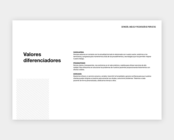
1. Definition and philosophy
Before creating a style guide you must be well aware of the brand. The first section should explain the basic concepts, such as mission, vision, personality and fundamental values. It is about capturing the essence of the brand in a few lines of text.
2. Moodboards
A collage of inspiring images helps visualize the concepts behind the brand creation.

3. Logos
The logo is the most recognizable element of a brand. This part of the manual guarantees the correct use of your logo in any medium. It is necessary to detail here how and when its different versions can be used. In order to prevent erroneous applications that could convey the wrong message, it is important to specify the following basic elements:
- Anagram or symbol: a graphic element that forms part of the logo and represents one or more concepts.
- Brand: a distinctive sign whose main function is to differentiate and distinguish the company's services from other competitors.
- Tagline: a brief phrase specifically designed to express the brand's proposal in an ingenious and intelligent way.
- Grid and protection zone: a guide that helps to reproduce the logo in any dimension and medium. It establishes a proportional empty space around the logo to ensure its legibility.
- Application sizes: the minimum recommended size to use a logo without losing its readability in offset, silkscreen and digital printing.
- Positive and negative space logos: white on black background and black on white background, to indicate which color variant should be used on light and dark backgrounds.
- Logo placement: a sample of how the brand should be presented on different corporate colours and images.
- Improper use: details of how the graphic elements of the mark should not be applied, including deformations, colour changes or incorrect sizes.
![]()
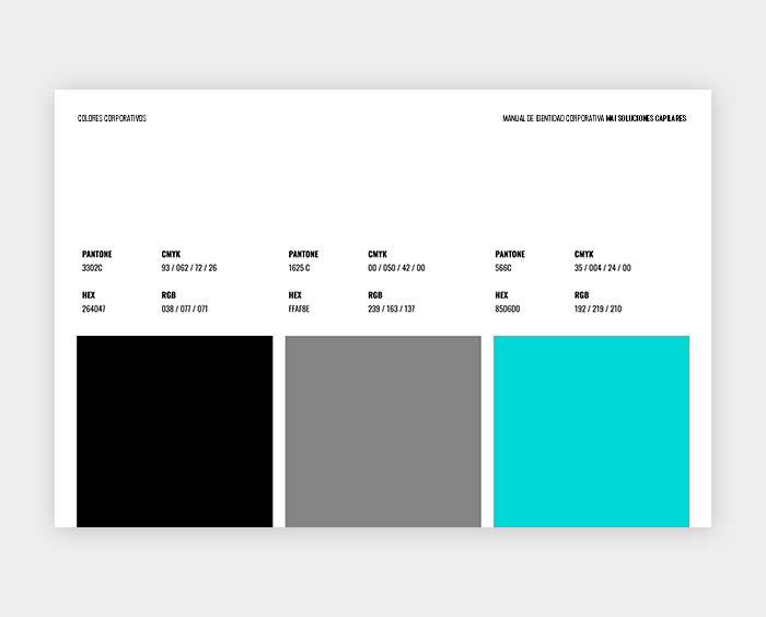
4. Corporate Colors
The choice of primary and secondary corporate colors is one of the most important elements of branding. The manual should specify a sample of colours, using references for both printing and digital media.
For printing, two different codes are used:
- Pantone: the most widely used color catalog in the world. The use of Pantone references ensures that the printed colour will always be the same as the one chosen in the sample.
- CMYK: four digits indicating the combination of four colors: Cyan, Magenta, Yellow and Key. The equivalent of a Pantone colour will not always be exactly the same in CMYK.
Two other references are used for digital displays:
- RGB: a combination of three primary colors (red, green and blue). Pantone and CMYK colour equivalents must be specified in order to display them well on digital formats.
- HTML: a hexadecimal code formed by a hash and 6 digits and letters. It is used to identify the colors in the web design..
Remember that all these colors can vary a little in each medium. The best strategy is to first choose a print color and look for its digital equivalents.
5. Typographic system
Any brand has its own combination of corporate typographies: a main one of the logo and another one, secondary, for the body of the texts. An identity manual specifies the font family (whether regular, bold, or italicized) and sizes (h1, h2, h3). It shows typographies using all of the characters: the letters of the alphabet in upper and lower case and the numbers from 0 to 9. It also includes examples of the application of each one of them in headlines, in secondary texts and the CTA buttons on the web.
.jpg)
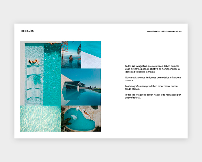
6. Photographs and graphic elements
This section is essential for any business that often uses elements such as photographs, icons or illustrations as a resource in their communication. It specifies the style of images that can be used and gives examples that match the tone of the brand. It also defines the sizes and the correct and incorrect use of:
- Corporate photographs: their style and messages to be conveyed
- Icons and illustrations: sets that fit the style of the brand
- Patterns: images used to create backgrounds
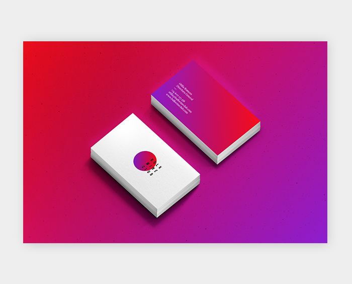
7. Applications
A section with the applications of all the previously specified elements in different publications is what completes an identity manual. Depending on the style of each business, designs can be included on stationery, such as business cards, brochures and envelopes, on promotional material, such as t-shirts and pens, or on different packaging formats. Examples of digital formats are also presented here: ad banners, social media creativities and web elements. All this explains the use of the brand, typographies and corporate colours in visual examples of different on- and offline applications.
The length of an identity manual depends on the needs of each company. The main objective is to create a guide that details a consistent visual identity and can become a reference point for any future design project.
If you want to improve the image of your business and need experts to create a branding strategy, do not hesitate to contact us. We will be happy to help you with your brand, contact us!
Main photo: MontyLov