


How can we help?Get in touch
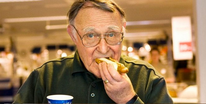
Any person that has survived a Saturday in Ikea with their partner can tell that the experience of going has nothing to do with the joy that overwhelms the faces of the clients in their TV ads. Well, something similar happens with the logo.
Few know that the name of the brand comes from the initials of its founder, Ingvar Kampara. The following letters are from his family’s farm, Elmtaryd and his hometown, Agunnaryd.
Ingvar Kampara
The Ikea logotype, despite not being particularly beautiful, has contributed to the brand’s success by elevating the company’s values and hiding its weaknesses.
The colors
Yellow and blue, both primaries evidently represent the colors of the Sweedish national flag, but they also communicate very interesting values from a design standpoint.
Yellow symbolizes joy, happiness, intelligence and energy. People perceive it as a lighthearted color; hence it is never used in luxury brands, instead it is present in companies that want to get to a massive audience.
Blue symbolizes freshness, transparency. It has a soothing effect in the mind and companies that use dark blue in their logotype want to communicate matureness, wisdom and confidence. It’s the color of the sky and the sea, so it’s associated to stability, peace and depth. It is used in companies from the health, insurance or technology sectors.
In short, what Ikea is telling you is that if you buy one of their furniture you’re someone smart, happy and lighthearted who likes their home to look peaceful and stable. Yes, all that.
Typography
The Swedish brand uses in its logotype a modification of Futura with a slight —almost imperceptible— serif. The name of the brand appears in all caps and a very heavy weight, these two features are very relevant because on the serviceableness, trustworthiness and endurance they communicate.
![]()
Mom and Dad are actually Santa
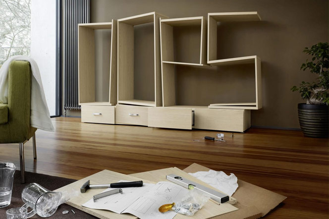
You arrive home and start opening the box of the new furniture over which the entire discography of Earth, Wind and Fire will rest, accompanied by your 32’’ tv and a bunch of useless trinkets you’ve been collecting from your trips and that only you care about.
You spread all the pieces in the floor; classify the screws by size and nuts and washers by diameter. Is at that moment you realize that maybe you’re not that smart, that peacefulness and joy are looking through the window and that serviceableness and durability of the piece of junk you have before you are tasteless joke.
It’s the same feeling you had when you found out mom and dad were actually Santa Claus or when you saw the Adam’s apple on that husky-voiced girl you kissed in the dark.
Great work
Even if it didn’t seem like it, Ikea’s logotype is a great work. It amplifies their strengths and, as we saw, it flatters their weak points. We can confidently state that Robin Nicholas,the creator, is partly to blame for the success the brand’s had worldwide.
Do you still want your nephew to do your logo because his drawings are nice?
Main photo: Oleg Laptev
Author
Related works

Rebranding of the international leader in claims processing in Spain, Portugal, France and Brazil.

Our tribute to the queen of typography