Multiasistencia is a multinational group founded in the early 1980s. The leader in claims processing in Spain, Portugal, France and Brazil, providing outsourcing solutions for large corporate clients, mainly in the finance and insurance sectors.
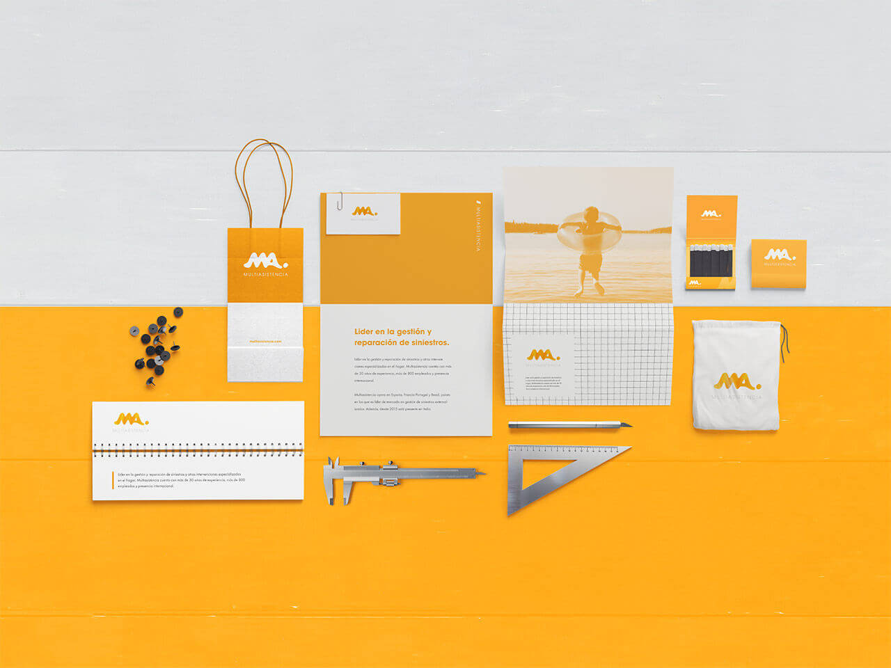
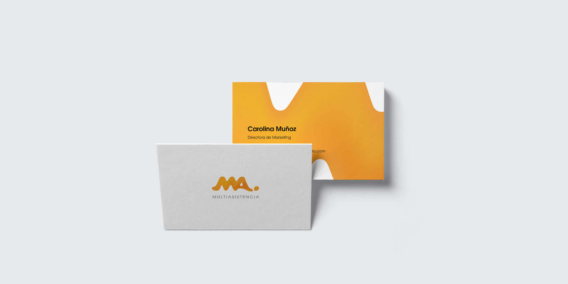
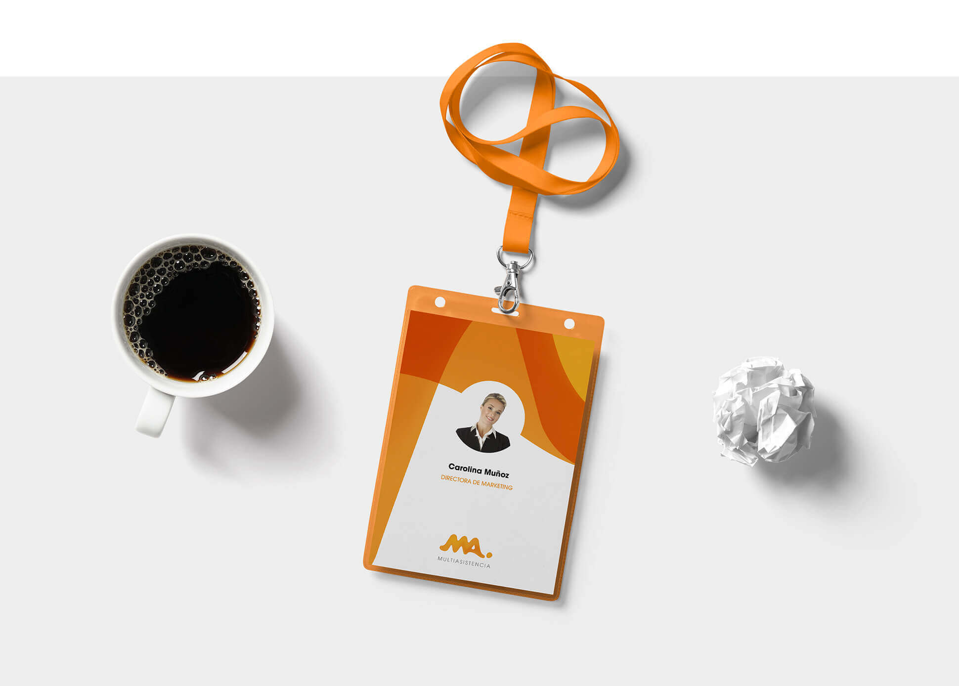
We were responsible for redesigning the corporate identity in order to adapt it to the new dimension of the company.
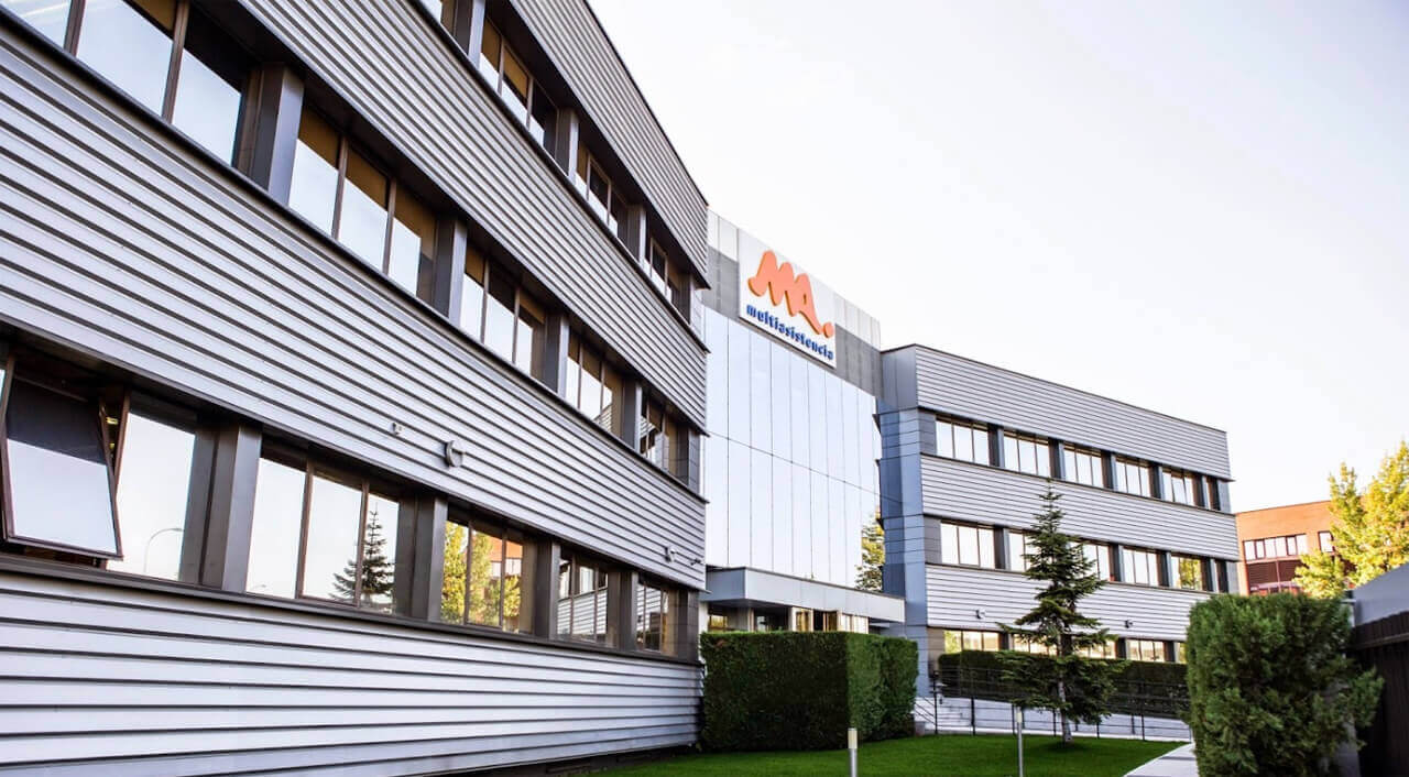
The old image of Multiasistencia needed a revolution. It did not transmit the image of being a leading company in the sector and this was the main challenge. To provide the company with a visual identity that reflected its importance. To do this, we studied the competitors' brands, created a business canvas and developed different proposals based on the company's values. The final brand is an evolution of the M and the A, which appeared in the old logo, but in this case embodying the values of the company. One thing most important within these values is adaptability, as it is a company that offers personalised services to other brands. Their capacity for adaptivity and flexibility is what makes them indisputable leaders within the outsourcing sector.
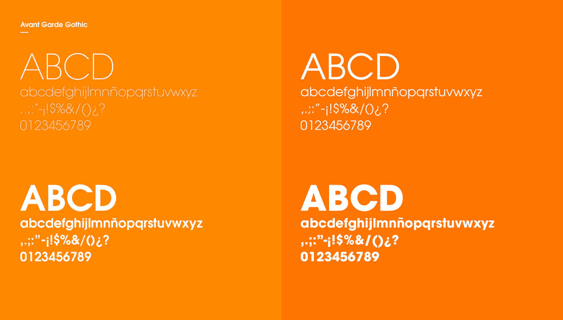
The Imagotype is complemented by the Avant Garde typography, a sans serif in its lighter weight, which brings the modern and innovative message.
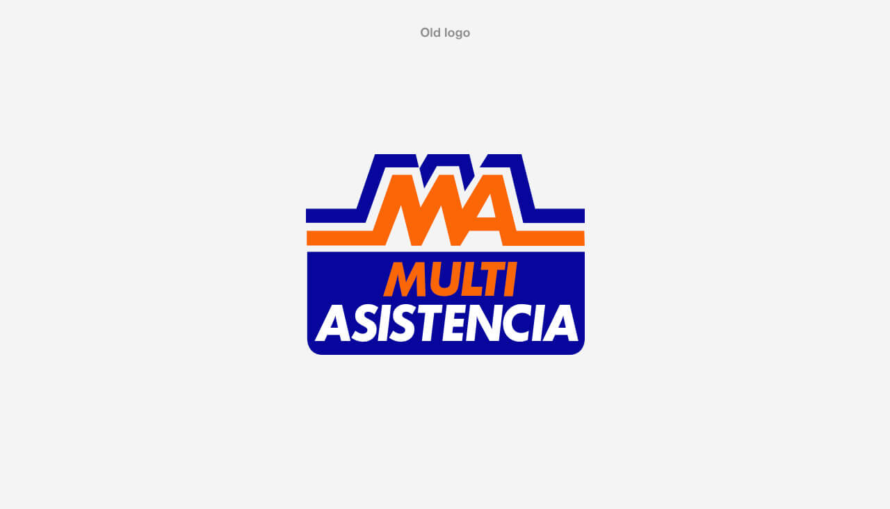
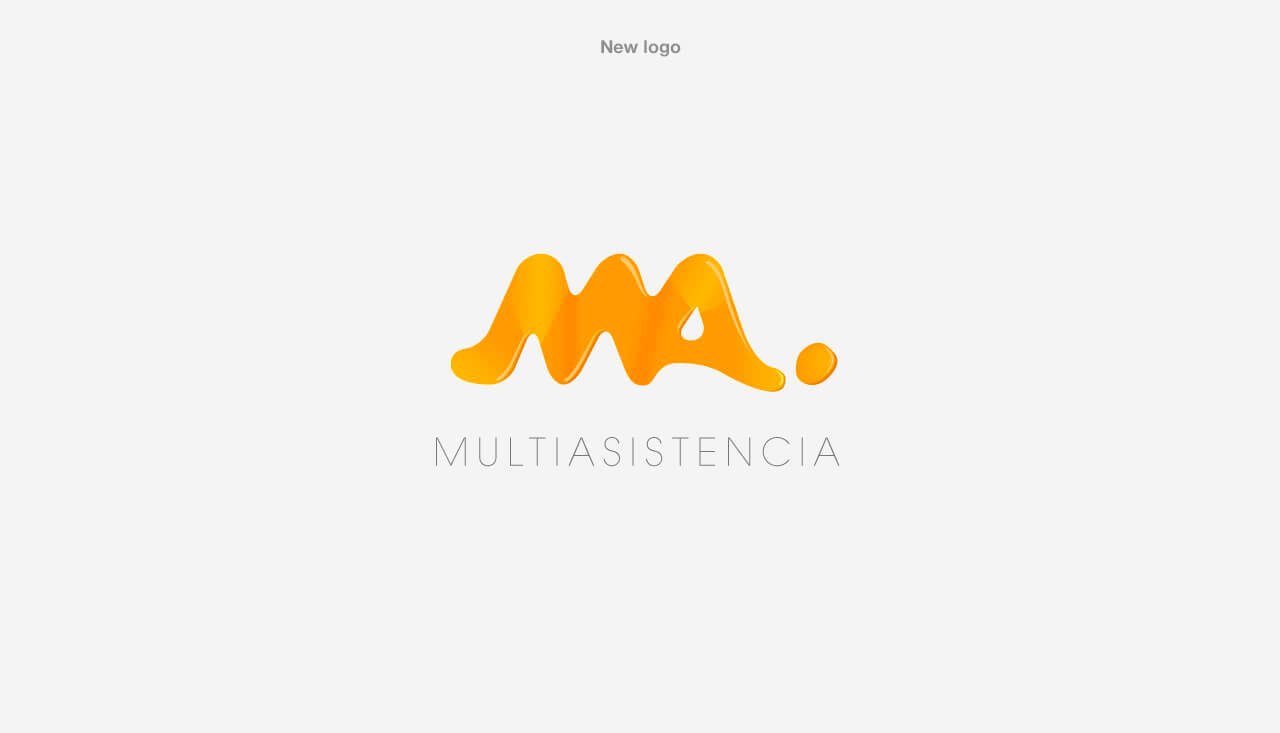
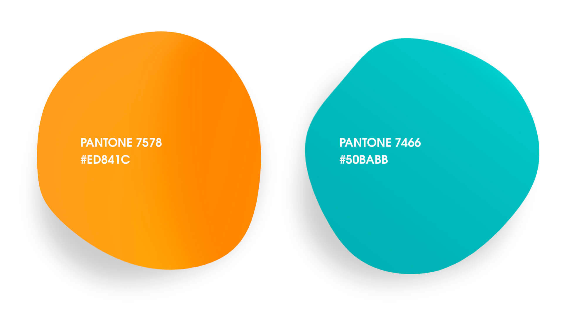
The colors mark the personality of a brand. In this case we stayed with the orange, which had been the main color of the company since its foundation, in order not to move too far from its roots. We eliminated the dark blue and replaced it with a turquoise that combines perfectly with the shades of orange which acts as the primary color in the brand. The corporate typeface is Avant Garde, a geometric sans serif typeface designed by Herb Lubalin that combines extraordinarily with the brand's smooth anagram.
A brand needs to have a direction and be applicable in different media types, always in a logical way. In order to standardise all its uses we drew up a corporate identity manual that would assure a homogeneous, attractive and easily identifiable image for the organisation, and at the same time let us optimise the effectiveness of its message.
