

How can we help?Get in touch
In commemoration of last year's International Women's Day #iwd2018, many brands wanted to honor it by doing an eye-catching online and in some cases offline campaign.
Scalpel and Illustrator in hand, transformed their brands to their most feminine version.
Here are 10 examples of the best known brands.
MCDONALD'S
![]()
With this simple gesture, to turn its logo around, Mcdonalds launched last year a marketing campaign in the U.S., changing both posters, packaging ... not spared in expenses.
It was one of the most popular examples, both for the importance of the company and the scale of the campaign. Step by step, Mcdonnals, step by step.
MTV
MTV also signed up to the trend and modified its logo just like Mcdonald's, turning it upside down in W mode. They launched this proposal in their different social networks profiles. MTV is a company aimed at a mostly young audience and it is interesting that they get involved in this type of initiative of inclusiveness and diversity.
![]()
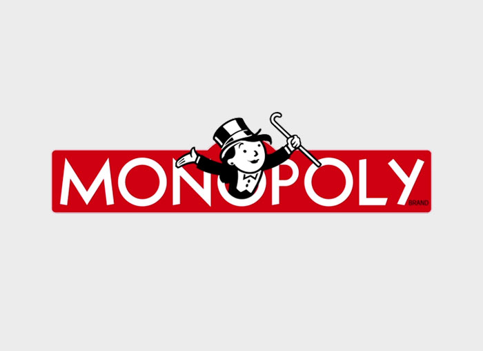
MONOPOLY
Creative Equals, which aims to support women and promote diversity in the creative industry, also launched a campaign with the slogan "Here's to more women" in which they replace iconic logos of different brands in their feminine version to focus on the gender inequality that is evident in brands and branding. Logos such as Monopoly, Pringles, Dreamworks...were candidates.
Here we can see the change, not only in gender but also...of age? it seems that this monopoly lady still follows something more stereotyped than it seemed.
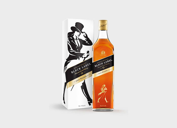
JOHNNY WALKER
Johnny or rather Jane Walker appeared in commemoration of this day to present this new product, a simple adaptation of its logo so characteristic, the known as "walker", a very elegant and refined gentleman in the best style of the twentieth century. The brand also presented the exhibition Signs of Progress at the New York Historical Society, an exhibition to exhibit poster designs for pro-feminist demonstrations throughout the United States.
GIGANTE VERDE
“Gigante Verde” has opted for a small transformation of its logo feminizing the features of the strong giant that represents its brand, refining them but without losing its strong essence.
It is subtle but somehow representative of the different typologies of the female body, at least we haven´t found a green barbie.

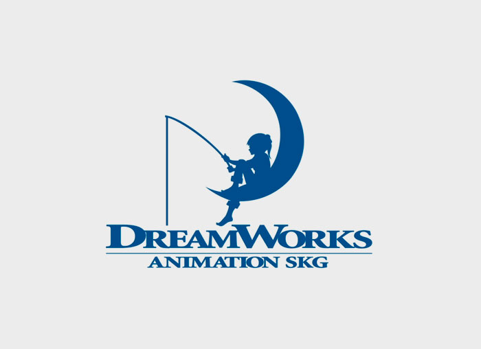
DREAMWORKS
This is also a work of the organization Creative Equals, it is the logo of DreamWorks Animation SKG, Inc. an American animation studio, which produces mainly animated films, among which are Shrek, Madagascar...
It is interesting that we bear in mind these signs of inequality in the design of products and brands aimed at children since it can be difficult even at an early age to filter these details that can also be maintained unconsciously in adult life.
If they sell that you are a princess that need to be rescued this thought may accompany you forever. Fortunately, new canons in character and script design are currently being observed in this industry.
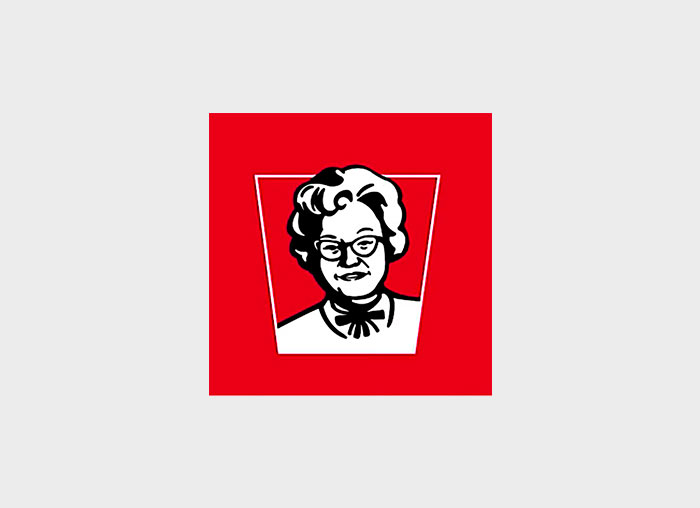
KFC
Claudia Sanders became the star (at least for a day) of the famous KFC restaurant chain. This campaign took place in the networks of the Malaysian headquarters, where 57% of the employees are women. That's why management said it was fair to recognize the work they do.
According to the tweet published by KFC Malaysia, Claudia Sanders was the wife of Colonel Sanders, who gives image to the brand, he was the one who gave the world his secret recipe for fried chicken but she was the one who mixed the spices...
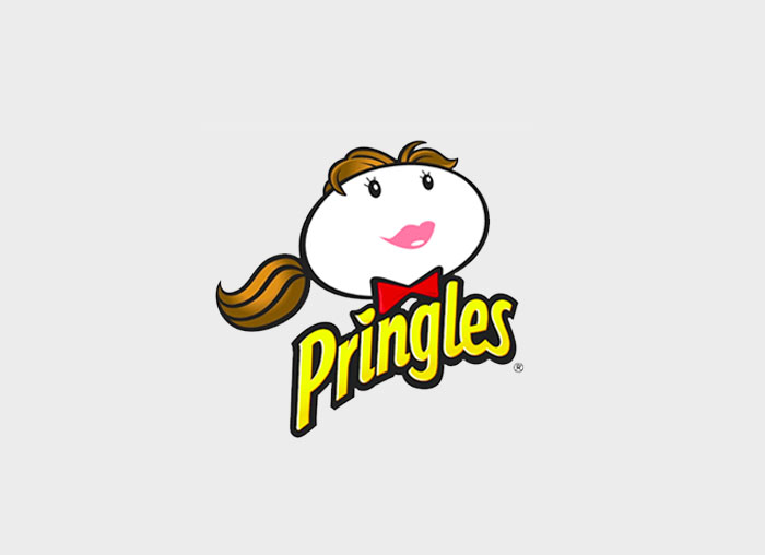
PRINGLES
The logo of the dehydrated potato brand was also a candidate for processing. For its commercial launch was created the well-known mascot with a characteristic moustache, "Julius Pringles", designed by Louis R. Dixon.
In this case it is a somewhat stereotypical transformation with long hair, lipstick and eyelashes but it is true that in such a cartoon and schematic logo it is consistent to maintain this style.
WINERIES TIO PEPE
We also wanted to represent one of the most typical Spanish products and one of the icons that has also had more representation outside Spain, "Tio Pepe" wineries. It was the work of Luis Pérez Solero, cartoonist, musician and poet, and in 1929 he founded Impera SL, possibly one of the oldest advertising agencies in Spain. With the same grace his Andalusian and flamenco female version is imortalized.
.jpg)
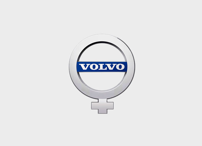
VOLVO
The logo of this prestigious Swedish car brand, from its origin through its evolution over the years was regularly criticized by feminist associations for the use of the male symbol, which did not cease to amaze Swedish businessmen who explained that it was a very different origin, the god Mars holding a shield and an arrow. May it be, and since it is not good to get into discussions, we have found an inclusive alternative for Volvo, you are welcome.
CONCLUSIONS
What is it that makes us think about these brand actions?
There was a lot of talk last year about these design changes, which a lot of brands signed up for.
Many thought it was a powerful initiative that helped to give visibility to the feminist movement in the media, others that it was nothing more than attracting attention in networks and that there was no real commitment on the part of these brands and associations.
Well, although we can see that there is a bit of everything, more committed and less, it is hopeful to know that we are beginning to be aware of how, in a subtle way, this inequality continues to weigh on our society and that we must begin to tear down these walls in what surrounds us day by day, like this tin of peas that you surely have in the pantry.
We will be watching this year for branding news and marketing actions what they have prepared for us.
Main photo: Max Ostrozhinskiy
Related works

The digital transformation of one of the most prestigious and influential brands.

Our tribute to the queen of typography