


How can we help?Get in touch
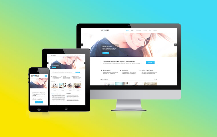
Responsive web design has gone from being an extra service for customers to almost an obligation. The possibility of making a website without following this paradigm is no longer contemplated. And not only in Drupal, but in any CMS.
Much of this new guideline when designing has had Google, which in 2015 decided to give a new boost to this design philosophy including as an important factor of measurement for technical SEO positioning. To this day, websites that are perfectly adapted to any device have better ranking in Google, while the others suffer penalties.
But Google has not been the only one that has driven this trend. The users themselves have been more demanding and have very positively valued the webs with this design, failing to use the ones they found uncomfortable navigating from their small devices.
Drupal has not been left behind in this trend while every time is more and more established within the community and this does not stop to generate modules specifically developed for the creation of responsive webs.
Currently there is no barrier between responsive design and web development in Drupal. Any design proposal can be perfectly executed thanks to all the modules that exist. Even design paradigms such as "Mobile First", which consists of designing the mobile versions of the web first and scaling the design to the desktop version, are perfectly compatible with the creation of a site based on Drupal.
Here is a list of the best modules for responsive design in Drupal:
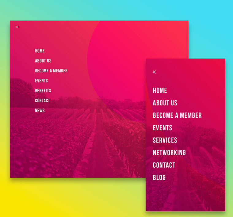
The famous "hamburger menu" is an indispensable element for any responsive design of quality. Ideally you should do a little development by combining Jquery with Css, but this module will save you that time. Once installed you will be able to configure many options, for example to what measure of pixels you want the menu to be activated or what style you want it to have.
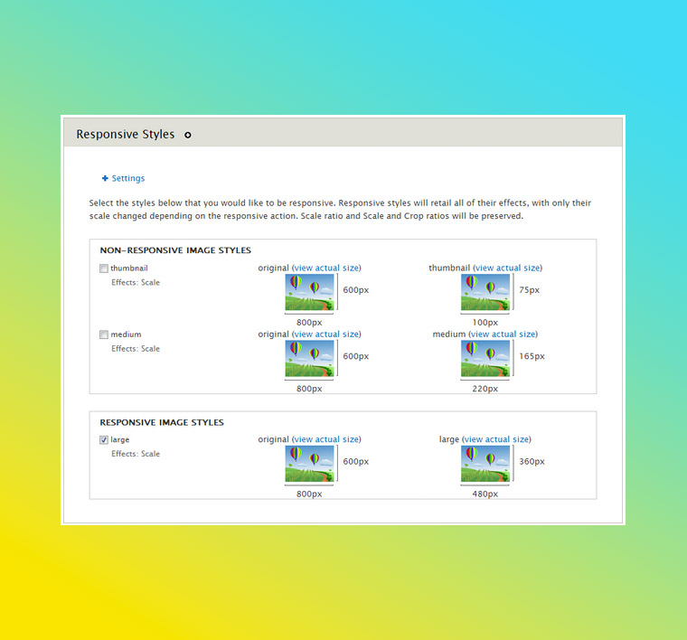
One of the biggest problems of responsive design is the loading of images. A very heavy load of photos causes the web to load very slowly on mobile devices. This module allows us to create different image styles so that the web automatically serves the photos adapted to the size of the screen. It also supports the Media module, which will make uploaded images with the text editor also have this capability.
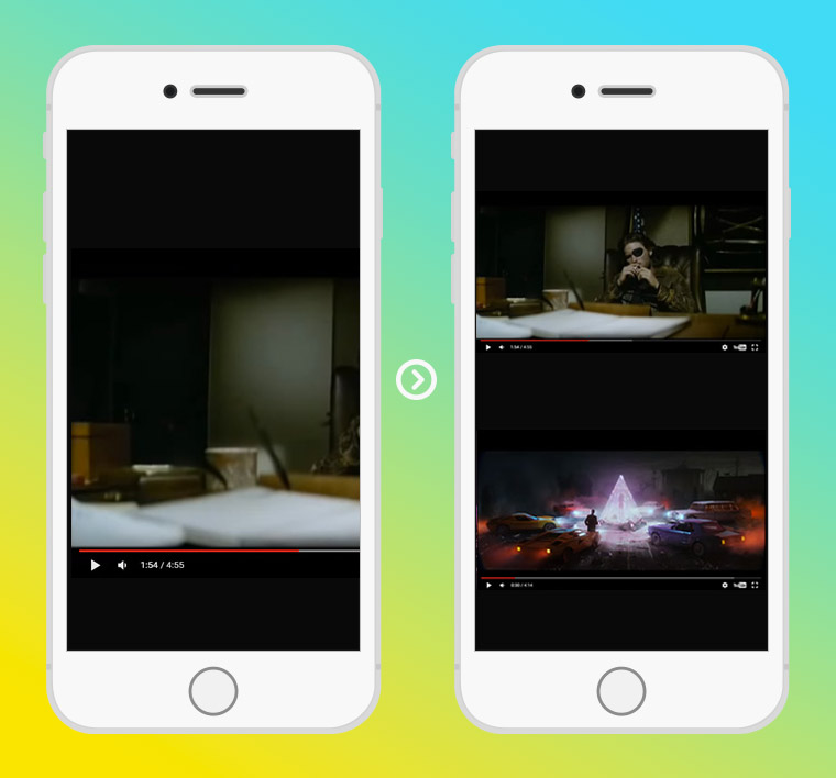
I do not know about you, but I find it quite annoying to enter a website that integrates videos and not being able to play because they appear maximized. With this module this problem is solved since, once configured, any video that you upload to the web will appear adapted to the correct size of the screen.
Another of the headaches between designers and developers are the much feared (and hated) TABLES. This module finally attacks the problem "tables vs. mobiles" and solves it with an integration that converts the table into a very intuitive and with great usability box of drop-down options.
.jpg)
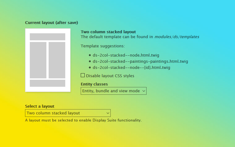
Created in source only for fluidly designed webs, it is currently used in virtually every development, and is a strong candidate to enter the next version of Drupal Core. The most useful thing is that you can choose the design of the templates of the nodes without theming. But it also allows you to create custom fields, such as fields with PHP code or fields that show existing blocks, and integrate them into the structure of the node.
With this module we can keep the images of a slider fluid so they do not deform. Its load speed is very good and allows to configure its style and time of reproduction. It is not a complete solution since, depending on the format of the images, they can become very small in mobiles and give usability problems.
Fields Groups + Easy Responsive Tabs to Accordion
The greatest virtue of this module is that it allows us to create groups of fields without theming. Among the styles you can choose to display them is the tabs mode. This is where responsive restrictions come into play as tabs usually do not work properly on oversized mobiles. With the Easy Responsive Tabs to Accordion sub module you can convert the tabs into a simple, fluid vertical menu. It is one of the best responsive Drupal solutions we have used so far.
.jpg)
Background images or backgrounds that are used on covers or banners, are often another of the responsive headaches. Being a fluid design, the image is usually deformed as the container reduces its width. But with this module we will ensure that the image is maintained with the same high and ALWAYS centered, without deforming.
As you can see there are a lot of modules that can make life easier for us when implementing a responsive design in our Drupal website. It is important to keep in mind that there will always be some adjustments in CSS and Jquery so that everything stays the way we want, but thanks to these modules we will get a 100% responsive website made with Drupal.
Fotografía principal: Victor Xok
Related works

The club for the professionals of the bulk wine industry.
Kidswear