There´re lists, lists and more lists. And they´re all subjective and imperfect and this one too, and much more.
There´s nothing I like more in this life than Design and Music, so writing this article has been a mixture of enjoyment and responsibility coupled with constant doubts.
All the lists of this type that I've seen in magazines or on the internet have always seemed incomplete, repeating over and over again the same 10 covers, as if there was no life beyond Andy Warhol's banana or Thorgerson's beam of prism light for Pink Floyd. Obviously this one could neither miss those, or others which belong to that "indispensable" group of songs, but I want to go further and propose in this article a more complete list, the list I would have liked to see then, yes, me, because for you probably this list will also still be imperfect.
Ryuchi Sakamoto
B2 Unit
.jpg)
Takeo Aizawa and Tsuguya Inoue made the design of this totally pioneering album which includes the classic music of the electro Riot in Lagos
Joe Jackson
Look sharp!

Michael Ross made a design, whose merit lies, above all, in the incredible photo of the great Brian Griffin, and no, I'm not talking about the dog of Family Guy.
Sweet
Off the record

This illustration of Terry Pastor always fascinated me as a child, so when I thought about writing this article I said "this is in for sure".
Led Zeppelin
IV

I don´t want to look like nostalgic at a bar, but the vinyl gave a design support that is impossible to imitate on a CD.
Here is an example of cover and back cover that must be seen as a whole. Jimmy Page and Robert Plant designed the design. Robert had bought the picture on the front page of a junkyard in Reading, and they came up with the idea that the image of the man with the wood represented the old thing in a derelict building, with the contrast of the new one behind.
Dead Kennedys
Frankechrist
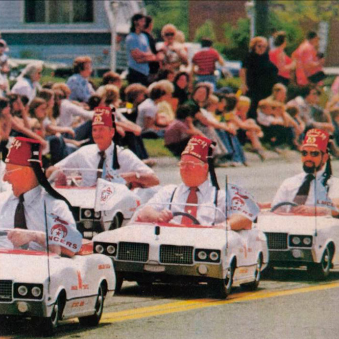
The story behind this cover is so wonderful that it certainly deserves to appear here.
The story behind this cover is so wonderful that it certainly deserves to appear here. The surrealist image is the detail of a photograph of a Shriners’ parade, showing four members of the Ancient Arabic Order of the Mystic Reliquary (in English A.A.N.M.S.) driving toy cars. The four members of the order that appear on the cover subsequently sued the band for the use of their image, in 1986. However what really made the people mad was in its interior: The LP had a poster called "Penis Landscape" by HR Giger the Swiss artist, consisting of an image of penies penetrating vulvas. The group was denounced for amorality by a conservative American association (PMRC) which led to a trial in 1986 in which band members were convicted, but were finally acquitted a year later. Like straight out of a movie!.
Manfred Mann's Earth Band
The roaring silence
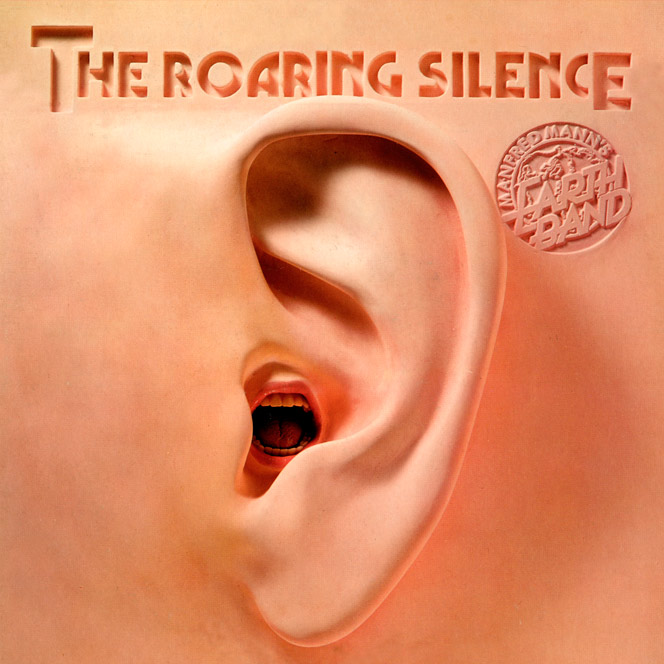
Spectacular art by Shirtsleeve Studio for one of the bands that, at that time, contributed more to Hofmann's sugar.
Freddie Hubbard
Hub-tones
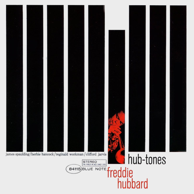
This cover is the essence of the Blue Note design, a style that marked a time and still continues to be old school. The record, nothing from out of this world, was just Freddie Hubbard accompanied by people like a certain Herbie Hancock or a certain Clifford Jarvis. Spectacular.
Kiss
Peter Criss, Ace Frehley, Genne Simmons, Paul Stanley

This is neither a cover nor a disc; these are four covers and four albums that belong to one of the most original projects in the history of music. This is the simultaneous release of four solo albums by Kiss members. Although none of the albums contains the work of more than one member of the group, they were marketed as Kiss albums. It was the first time that all the members of a rock band, published solo albums, and besides, on the same day.
Bob Dylan
Planet waves

For the price of a vinyl, you take a picture and a painting of the very Bob Dylan. It was not the first time he did, he had already given the brush in Self Portrait and Music from Big Pink. En On the right-hand side of the picture you can read the words "unbreakable songs and torch ballads". Well, that.
The Clash
London calling
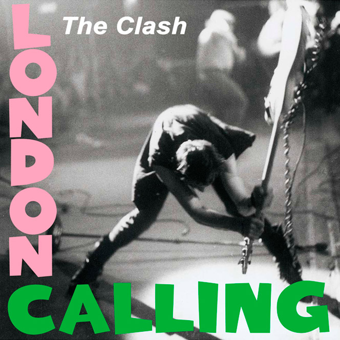
The picture of Pennie Smith with Paul Simonon pounding his bass Fender Precision is one of the most iconic images of music. However, what not everyone knows is that the typography is a tribute to the first record of Elvis Presley.
Elvis Presley
Elvis Presley

Here is the first album of the rock king released in March 1956.
Hot chip
Why Make Sense?
.jpg)
Designers Nick Relph and Matthew Cooper made a unique printing technique specifically created for this occasion, based on an algorithm that randomly modifies the color and image of the cover for each of the vinyl prints, giving Result hundreds of thousands of different combinations.
Bill Evans
Undercurrent
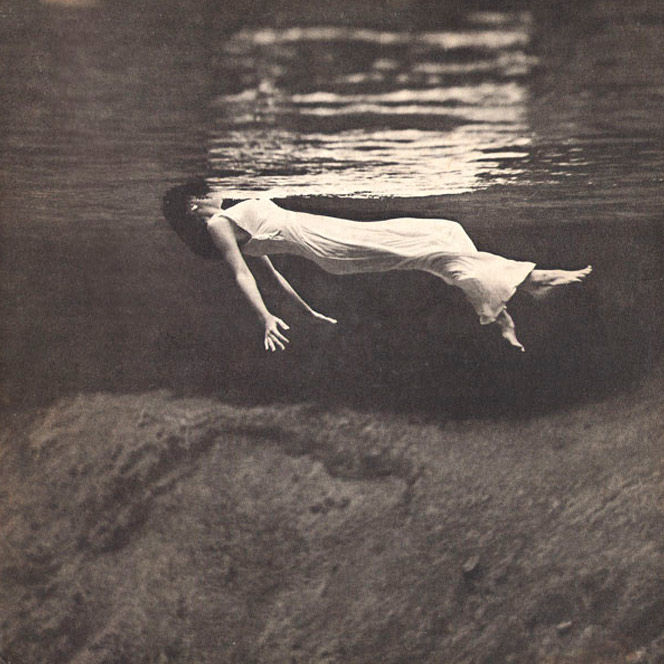
The photograph of Toni Frissell, entitled "Weeki Wachee, Florida" of 1947 is so shocking that later both the band This ascension and The Beauvilles used it to illustrate each album. But nothing, the original is this.
Kraftwerk
The man machine

Another "indispensable" for any list. The cover is based on the constructivist work of El Lissitzky, illustrator of avant-garde propaganda during the consolidation of the Soviet revolution. As usual, during the cold war, the image gave much to talk about.
Pj Harvey
Rid of me

This cover I love because it perfectly defines the music of Pj Harvey: impulsivity, imperfection and delicacy. The photo was captured by Maria Mochnacz, and was taken in the photographer's bathroom. Due to the small size of the room, he had to place his camera against the wall in front of Harvey and could not look through the camera viewfinder.
Guns and roses
Appetite for Destruction

I do not know if more disks or patches were sold to suck it with this illustration.
Behind this cover there is another story of those that deserve to be told. The original cover was a design by the Californian artist Robert Williams in which appears a robot that supposedly just raped a girl. The problem came when Geffen's managers saw that this design could be a setback for sales of the album, so it was decided to change the cover before releasing the LP, which generated two months of delay in launching it.
Honeymoon Suite
Honeymoon Suite
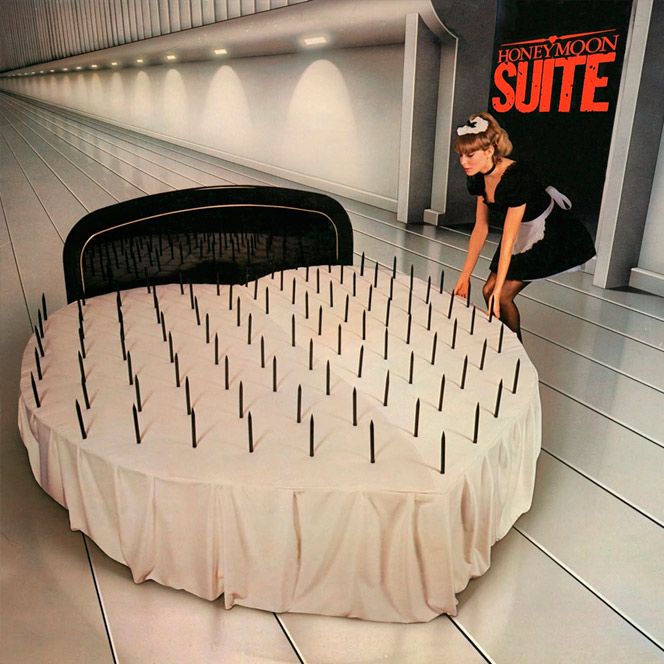
Steve Gerdes and Dean Motter were in charge of the cover design of the Canadian band's first album. Motter was combining his career as a designer with that of cartoonist, being the creator of Mister X, one of the most influential New Wave in the 80's.
Yellow Magic Orquestra
X∞Multiplies
.jpg)
The band of genius Ryuchi Sakamoto released this album in 1980. Takayuki Innami was in charge of creating this fantastic album cover that had two versions, which they released in Japan, much more experimental, and published for other countries. In which they cleaned intros and endings like the New Age theme ending with a succession of abrupt and complex sounds. Perhaps they thought that the rest of humanity was not prepared certain musical concepts. Maybe they got it right.
Supertramp
Breakfast in America

Grammy winner for best cover design in 1979. This work by the brilliant Mike Doud symbolizes an aerial view of New York from the seat of an airplane. In it appears the actress Kate Murtagh dressed as waitress doing Statue of Liberty, with a bottom of vessels representing the skyline of the city.
Todd Terje
It's album time
.jpg)
A cover with an illustration by Bendik Kaltenborn is a sure hit. In addition the disc of the dj and Norwegian producer is one of those that you can not stop listening to time and time again.
Elton John
21 at 33

Norman Moore has designed hundreds of covers that surely you remember perfectly, some with much more success than others. This one, which we are dealing with, from 1980, seems to me very worthy of appearing on this list, as much for the image as for the fine typographic composition, very unusual for the time..
The Who
The Who sell out

This cover is divided into panels that include photographs taken by David Montgomery to each member of the group, two on the cover and two on the back cover.
Pete Townshend appears on the cover, applying a deodorant of the fictitious brand Odorono (title of one of the themes), and Roger Daltrey, sitting in a bathtub full of Heinz brand beans. On the back cover are Keith Moon, throwing in the face an ointment called Medac, and John Entwistle, dressed in leopard skin and embracing a woman. Like its music, the cover is pure psychedelia.
Beasty Boys
Licensed to ill

Rolling Stone says this is the best debut album in the history of music and I think I quite agree. They broke all the molds in a United States where, with vague exceptions, whites made rock and rap blacks, and much less anyone would think to mix those two worlds. So, fans of metal tracksuit, you know who opened the way. The cover is an illustration of David Gamble, known in the world as World B.Omes.
By the way, there is an album not very well-known of Beasty Boys that to me changed my life and that I know by heart: The In Sound from Way Out! A piece of instrumental album with 13 funk hits that are a joy. I leave it there.
Martin Briley
One night with a stranger
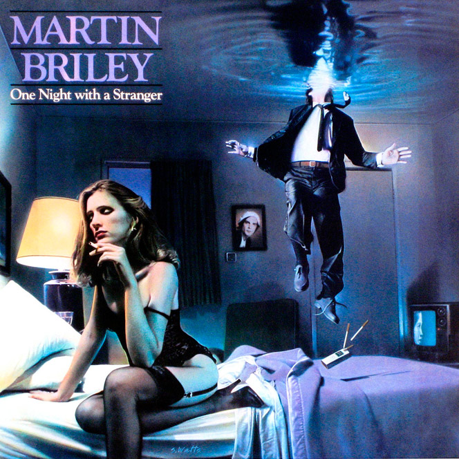
The cover of this album, by illustrator Stan Watts and the design studio Lumen Whiteman, reproduces the first frame of the video "The salt in my tears", theme that opened the album of the English artist.
Radiohead
OK Computer

The cover of this almost perfect album (this is not opinion, it is information) is a collage of images and texts indesciifrables in the Esperanto language. Work by Stanley Donwood, author of several cover designs by Radiohead, with the invaluable collaboration of Thom Yorke.
The Rolling Stones
Their Satanic Majesties Request
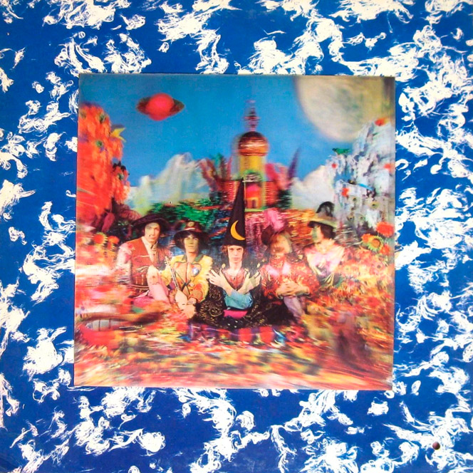
The initial versions of this album presented a three-dimensional image of the band realized by the photographer Michael Cooper. The lenticular image shows how the heads of the group members turn except for Jagger's, whose hands appear crossed in front of him.
The best thing about this cover is that when you look at it very closely, you can see the faces of the four Beatles, apparently in response to the inclusion of a doll wearing a sweater the message 'We invite the Rolling Stones' on the cover of Sgt. Pepper, of which I shall speak later.
Quatermass
Quatermass

This trio of musicians ahead of their time (they were active from 1969 to 1971) left us a short but intense collection of prog rock themes and this cover, which I could watch for hours in my youth.
The Cribs
Men's needs, women's needs, whatever
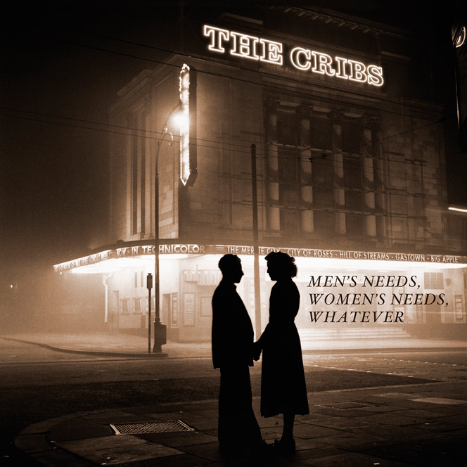
Janette Beckman a to photography and Rob Crane to design were the creators of this cover so cinematic that it is pure poetry.
Pink Floyd
Dark side of the moon

Well, we have arrived at The Cover, it is true that it is more visible than the black thread but it had to be on this list.
The Hipgnosis design collective was once again responsible for creating the cover of the band's eighth album; Had already designed other covers for Pink Floyd previously. However this time the order was clear: "we want something more classy, elegant"
Everybody attributes this cover to Storm Thorgerson, but the "currier" who designed the prism with his hands was George Hardie, employee of Hipgnosis. To Caesar what is of Caesar, that Thorgerson has already received many applause, deserved, yes.
Funky Porcini
Fast asleep

The Openmind studio was in charge of designing this magnificent cover for this Ninja Tune artist who mixed jazz, drum and bass and hip hop as a few since the late nineties.
The Jeff Beck Group
Beck-Ola

Warning: if you put a painting of René Magritte on the cover of your album, you will ALWAYS come out on all the lists you make of this type.
Led Zeppelin
Houses of the holy
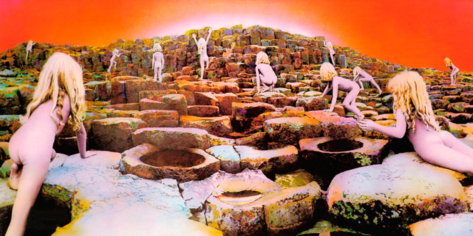
The fifth disc, but first with a pronounceable title of the Zeppelin was work (again) of Thorgerson, although the thing did not start anything well.
According to Page: We had commissioned the design of Houses of the Holy and this guy, Storm, came with a photo of an electric green tennis court and a racket. I said "What the hell does this have to do with?" And he said, "Racquet, do not you get it?" (Racket, in English, means both "racquet" and "fraud", and also "noise" or "noise"). I replied: "Are you telling me that our music is a racket? Go out!".
They finally accepted the following idea that Thorgerson proposed to them, which was born of Arthur C. Clarke's science fiction book "The End of Childhood" (also known as "The Children of Icarus"), published in 1953.
Nirvana
Nevermind

According to Cobain, the idea for this cover was taken while watching a TV show about underwater births with Grohl. Cobain mentioned it to Geffen's artistic director, Robert Fisher, who found several shocking images of these underwater births, but they were too explicit for the record company, so they decided to take the photo themselves.
By the way, the child has grown older.
Manfred Mann's Earth Band
Chance
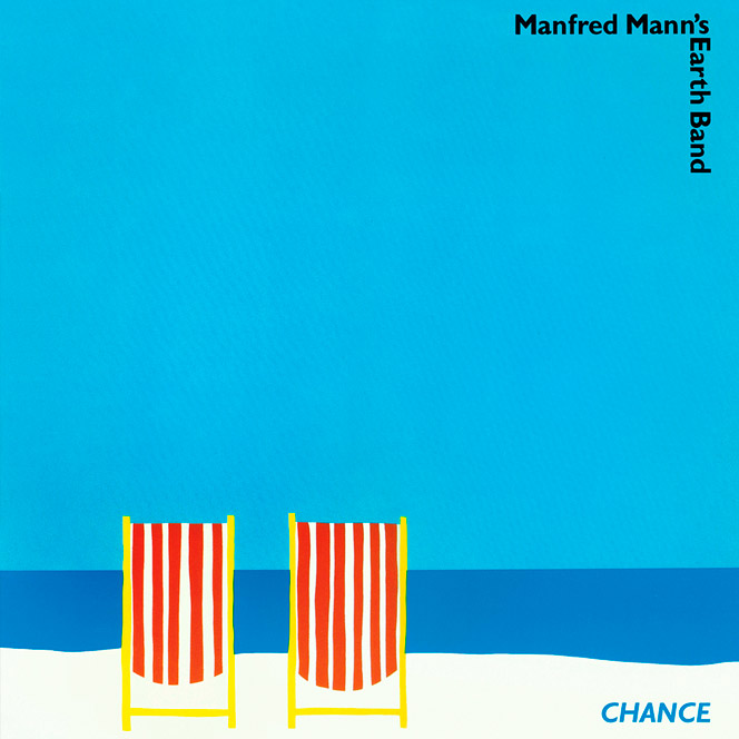
The covers of Manfred Mann's were almost all good, but this, perhaps for its simplicity far from the style of the band, I always liked. The design is by Martin Poole and the illustration by Ole Kortzau.
Battles
La Di Da Di

LThe wizards of the infinite loop and post-rock or whatever you want to call it. It is a difficult group for most, but I'm flipped (for many reasons that are not the case to tell now). The ménage à trois formed by Ian Williams, John Stanier and Dave Konopka is pure adrelanina, and the latter, besides doing what he wants with his guitar is a brilliant designer, author of this and the previous (all excellent) covers of the Band from New York.
New Order
Power corruption & lies

Peter Saville's design for the album had a color code to represent the band's name and album title. The cover is a reproduction of the painting "A Basket of Roses" by French artist Henri Fantin-Latour, which is part of the National Gallery permanent collection in London..
Squarepusher
Damogen furies
.jpg)
The studio Build together with photographer Timothy Saccenti were in charge of the art of this album, transmitting to perfection the finesse and chaos of this English musician.
Michael Jackson
Dangerous
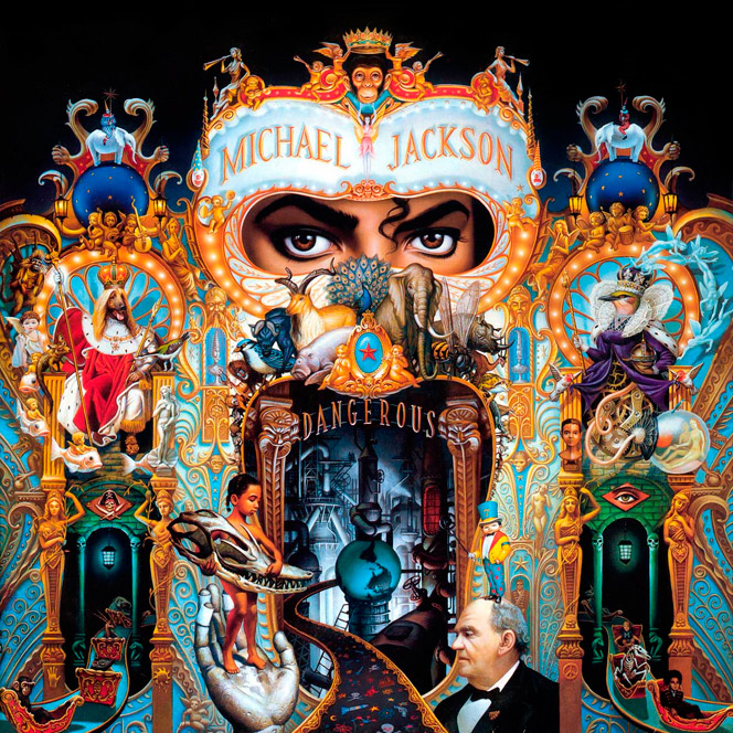
I remember that I bought the cassette in Discoplay being a monkey and I was throwing the dead hours seeing the illustration of Mark Ryden.
We are faced with a cover full of details and symbols with which some friend of conspiranoico would rub his hands. The fact is that Ryden, who took 6 months to complete the work, wanted to reflect much of the life of Michael Jackson in this illustration, For example, just above the eyes appears a monkey on the verge of being crowned, it is Bubbles, the chimpanzee of MJ that died in 1989.
Le Roux
So fired up
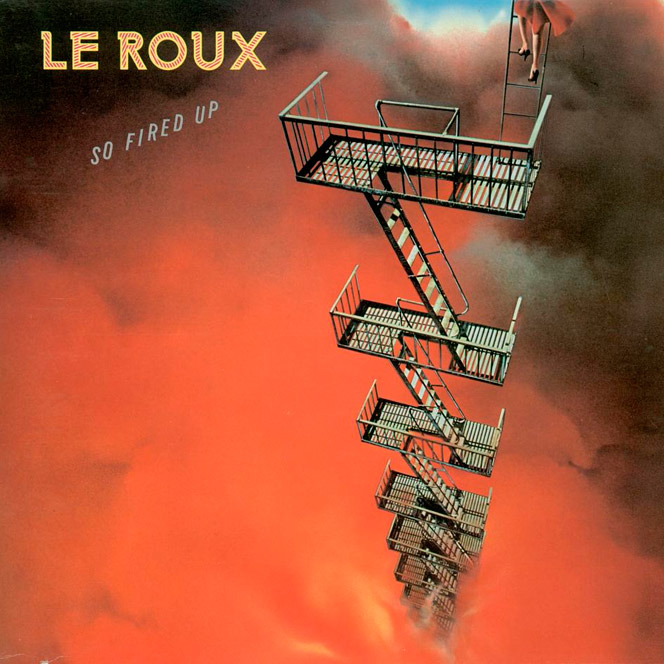
Paul Maxon was the creator of the cover of this album of the Lousiana band. I've never known if the girl goes down or up.
Lee Bannon
Pattern of excel

A tune from Ninja Tune with a wonderful cover that I still do not know the author, so if anyone knows, please let him hand.
Miles Davis
Bitches Brew
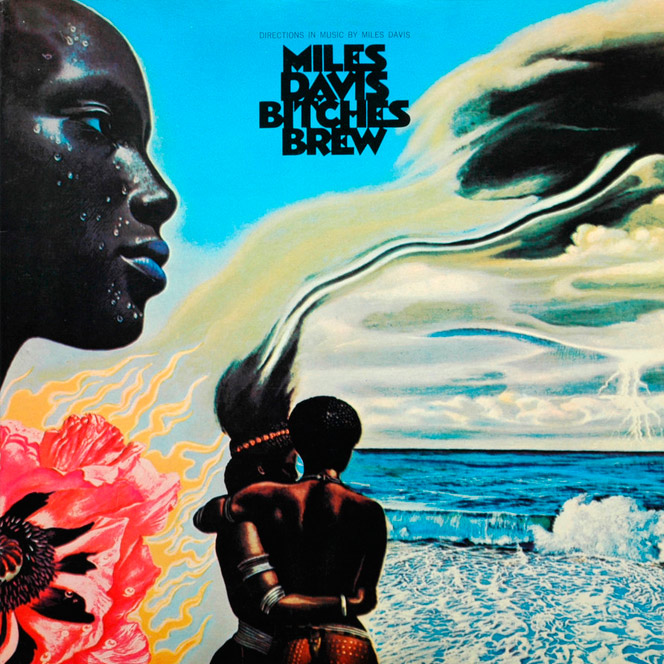
Although as the Kind of Blue there is nothing like it, I think this mythical cover of Mati Klarwein deserves more recognition.
The Beatles
Abbey road
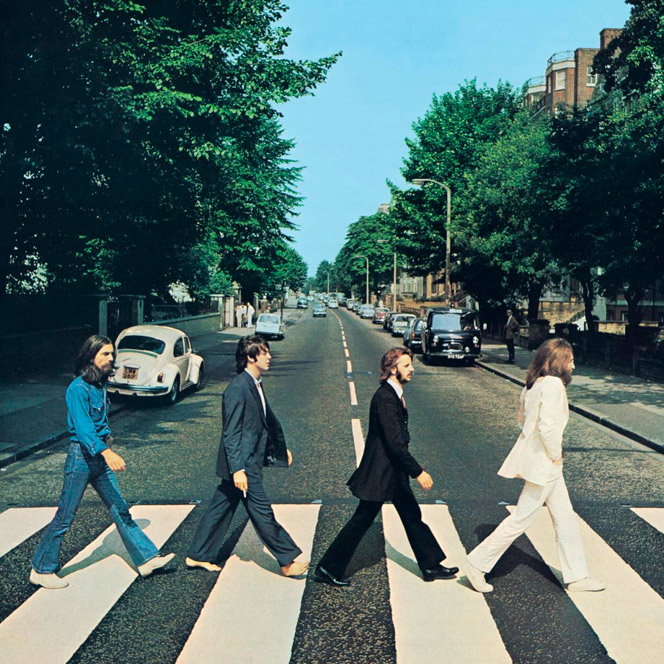
On August 8, 1969 at 11:30 AM, in front of EMI studios on Abbey Road, photographer Iain McMillan took one of the most iconic photographs in the history of music. McMillan had to be content with 10 minutes to work, which is the maximum the police agreed to stop the traffic on the street.
The Velvet Underground & Nico
s/t

And from one classic we move on to another.
The first copies of the album invited "Peel slowly and see". When the banana took off, another one appeared under flesh color, very Warhol everything.
UFO
Phenomenon

Again Hipgnosis is behind this cover of the British hard rock band of the seventies. It is one of the key records for British bands born in the late seventies and early eighties as Iron Maiden, who used to make a version of the theme "Doctor Doctor" in many of their live shows.
Average White Band
The best of
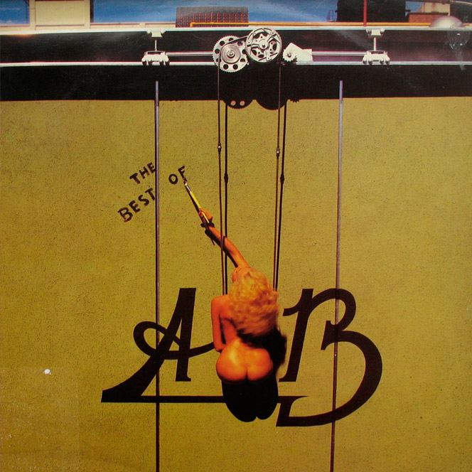
Laurence Hoadley was in charge of the art of this compilation of the Scottish band that so much influenced to giants like The Brand New Heavies or Incognito.
Supertramp
...Famous last words...

Mike Dowd and Norman Moore made this cover that, at the time of its launch, many people interpreted for both the title and the image as a possible dissolution of the group.
The Beatles
Sgt. Pepper's Lonely Hearts Club Band
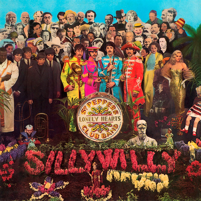
The Beatles' eighth studio album, as everyone knows, contains lots of trivia.
We can see several celebrities who accompany the British band, such as Edgar Allan Poe, Bob Dylan, Marilyn Monroe, Marlon Brando and even Albert Einstein.
Many fans see in her allusions to the supposed death of Paul: the car that appears in the bottom right, symbolizing the accident that caused the death of Paul, the bass formed by yellow flowers and that only has three strings, the same members Of the band that would remain alive; Or the hand that appears on Paul's head, which is a Hindu symbol related to death.
Come on, this cover gives a spectacular game for everyone with conspiracy thinking.
Chicago
Chicago 13
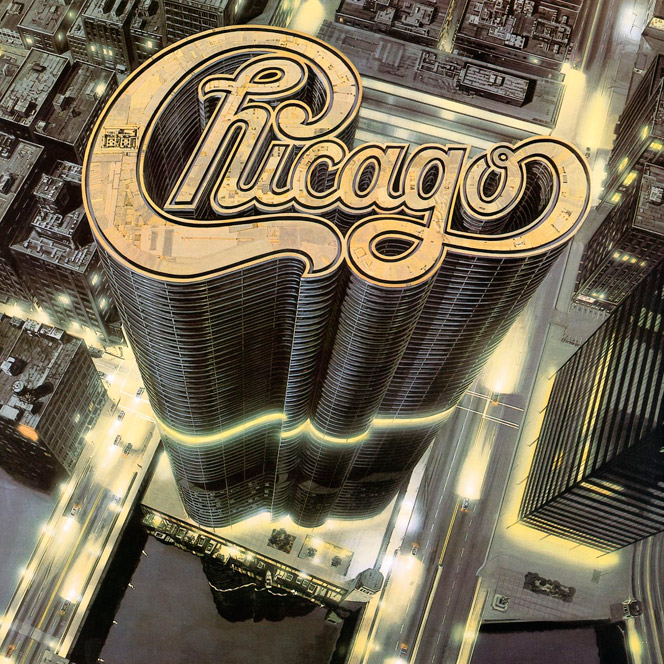
The fabulous Gary Meyer was in charge of making the spectacular illustration of the cover of this album of the 79. The rest of the design was in charge of Tony Lane. I have to say that all the covers in this band are great.
David Bowie
Aladdin Sane

Getting the cover of a disc to end up being a pop icon is something that has happened 3 or 4 times in history, and this is one of them. Brian Duffy was the photographer who immortalized Bowie's makeup by Algerian Pierre La Roche.
A curiosity about the title of this album: it is a play on words that hides A lad insane (a crazy man) in honor of his schizophrenic brother.
Grace Jones
Island life

The duo formed by Grace Jones and designer Jean-Paul Goude is one of the most successful and recognized in the history of music. Everything that each one is, owes it to the other. They created together an imaginary difficult to overcome and that continues to influence artists and designers today.
Joy Division
Unknown Pleasures
.jpg)
That on your first record do not put either the title of the same, nor the name of the band, is to have them square. If in addition, in the contra you do not put the typical list of songs is that, one of two, or you are a fucking genius, or you are like a goat. Time has shown that it came first.
Peter Saville, the designer, explained that the image is the reproduction of 100 pulses of the first pulsar discovered (the pulsar is a type of star emitting pulses of electromagnetic radiation periodically). No one knew for sure where this image first appeared, which already illustrated a book by the University of Cambridge in 77. Until a specialist in doctoral theses of the University of Cornell drafted between the period 1968 and 1970 discovered that the image Was part of a paper by Harold D. Craft titled Radio Observations of pulse profiles and twelve-pulse dispersion measurements..
So far my "small" list of the best covers in the history of music, aware that I could have included many more, and doubting if I miss any that I wanted to appear, but that with such saturation has remained in the inkwell. At some point you have to put the end point and this moment seems fine.


