
How can we help?Get in touch
It looks like little by little we realize that wines not only mixes up with script typographies and heraldry shields; including your heraldry or your surnames to the product you are selling seems a bit of a yokel. However there are great wines with a terrible design: the one doesn’t rule out the other.
Good wines, bad design
The true fact is that in Spain we have always produced exceptional wines but with a poor design. This has been the trend until wine cellars realized that young people were loosing interest in the product and purchases dropped drastically.
There are many factors involved: from changes in the people’s taste and habits, demanding fresher wines with a snack instead of drinking them while having a steak, to the final design of the brand and the bottle itself. Design does matter significantly when trying to engage consumers to your product.
Eyesight
In a wine tasting – and I have attended quite a few of them – the first sense used is the eyesight: picking up your glass of wine and using a white background in order to notice all shades, shines and cleanliness. But we tend to forget that in terms of eyesight, the first and most important thing when choosing a wine is the design and the bottle itself: wider, longer, squarer looking, opacity, translucent…
All these factors must be taken into account depending on the wine and the target audience.
Let’s do a brief but inspiring revision of new bottle designs that do take all these factors into account:
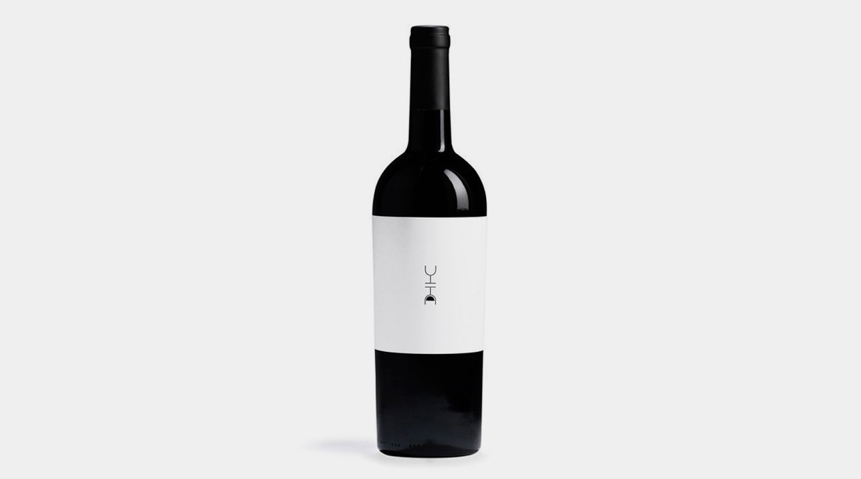
Minimal
Minimalistic design is the most basic one and rules out all heavy elements of the view. The purpose of a minimal design is to highlight the content while saving in visual elements. ‘Less is more’ as Mies Van Der Rohe used to say.
.jpg)
Dilab 211
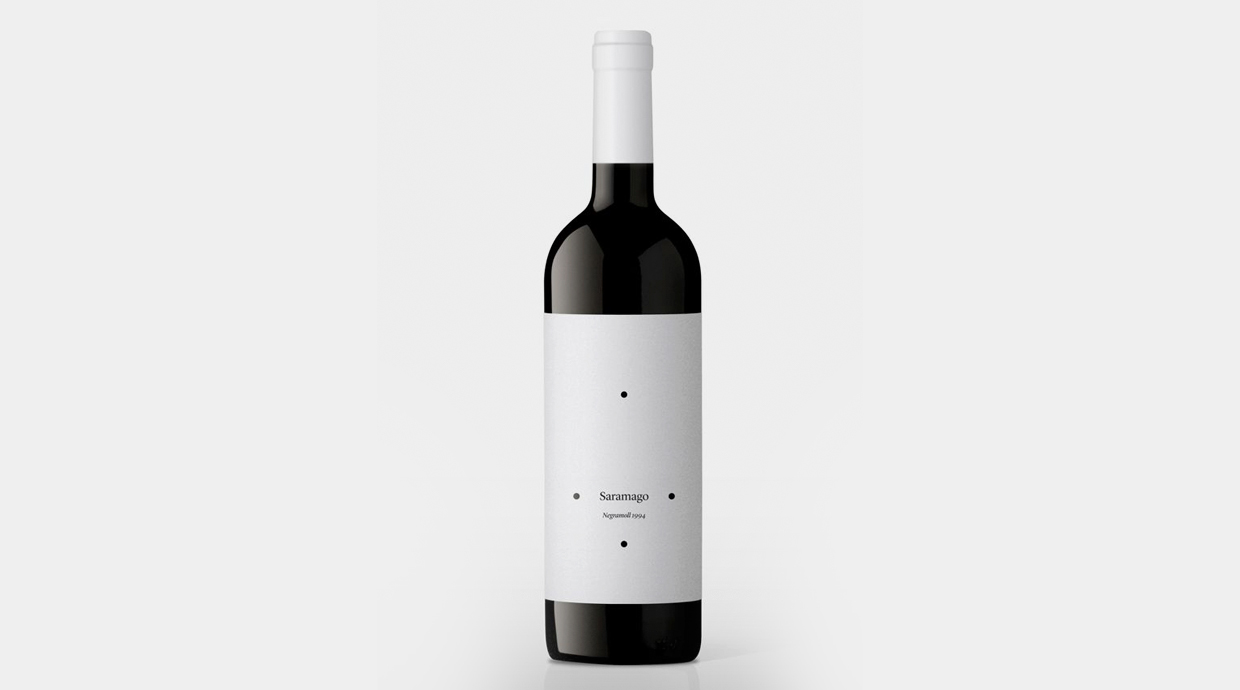
Saramago
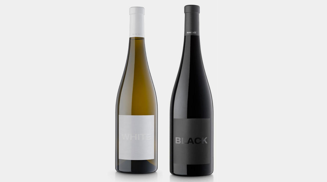
Black Montrubi
Optimist
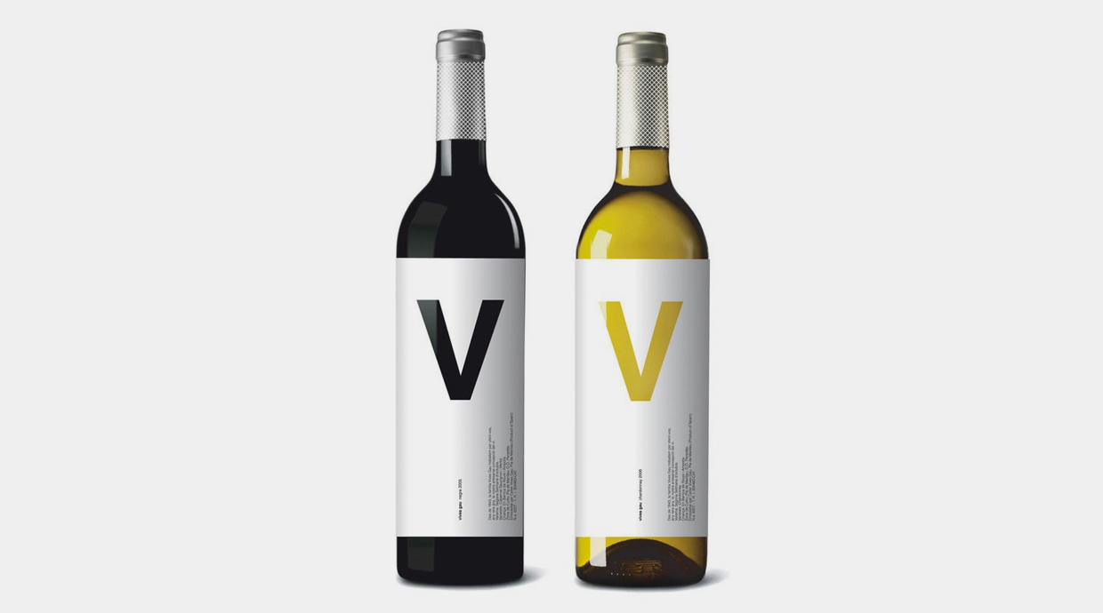
Vives Gau
Illustration
There are many different styles having the illustration as a common nexus: from retro to pop, comic… a good illustration is always a good advertisement.
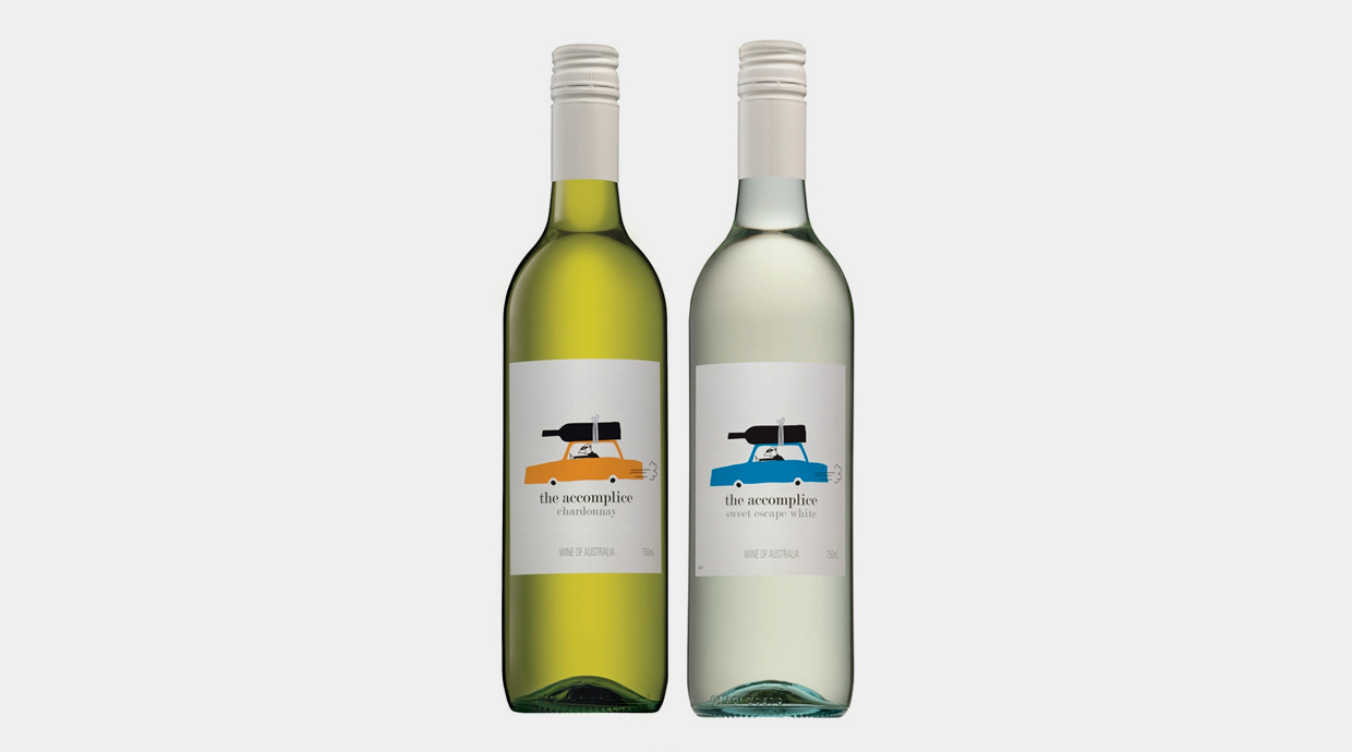
The Accomplice
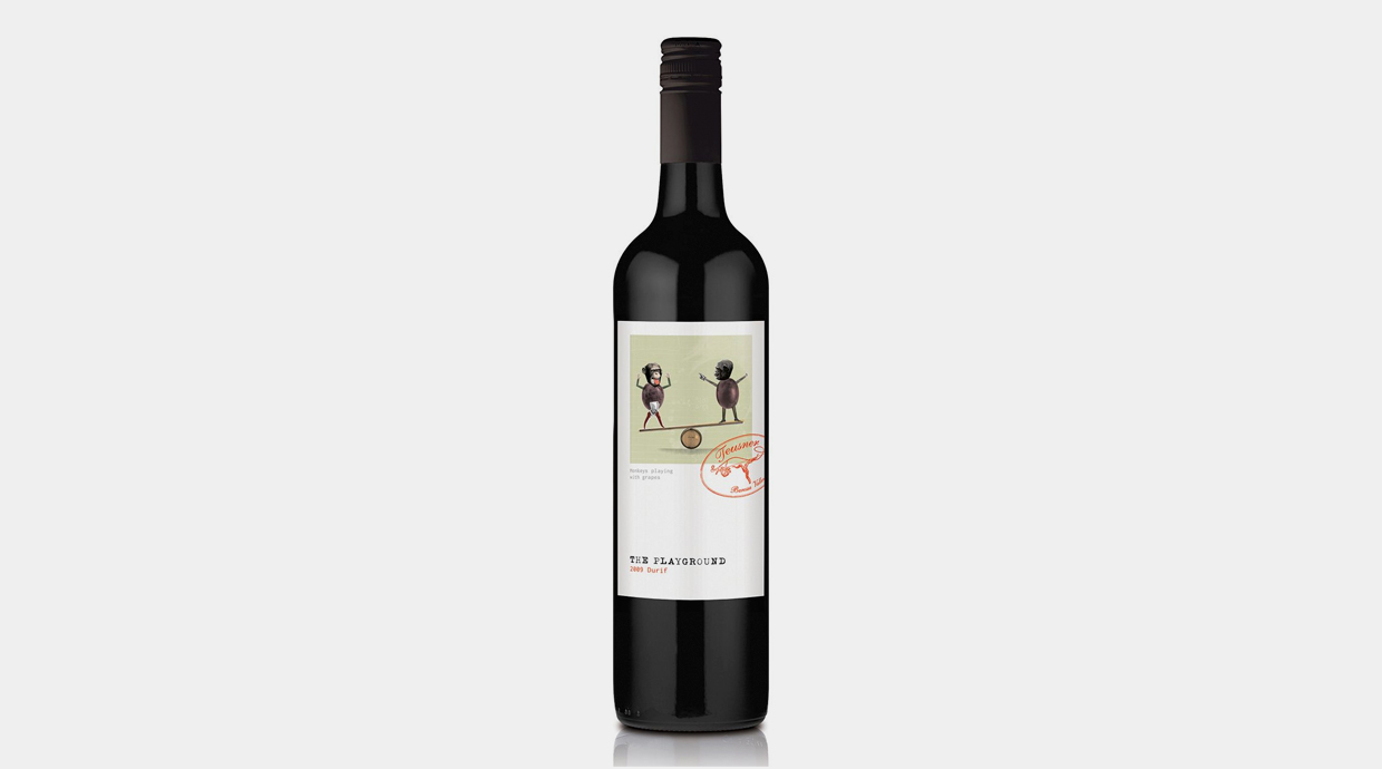
The Playground
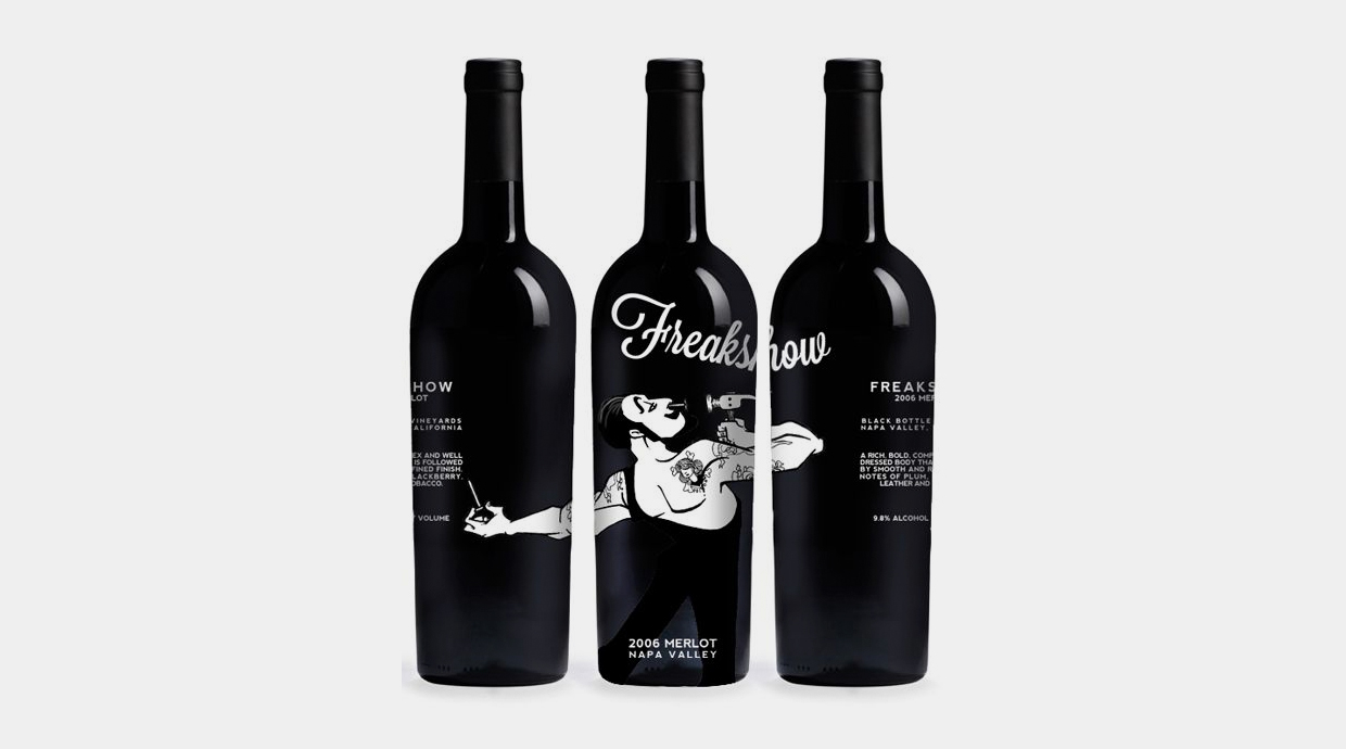
Freakshow
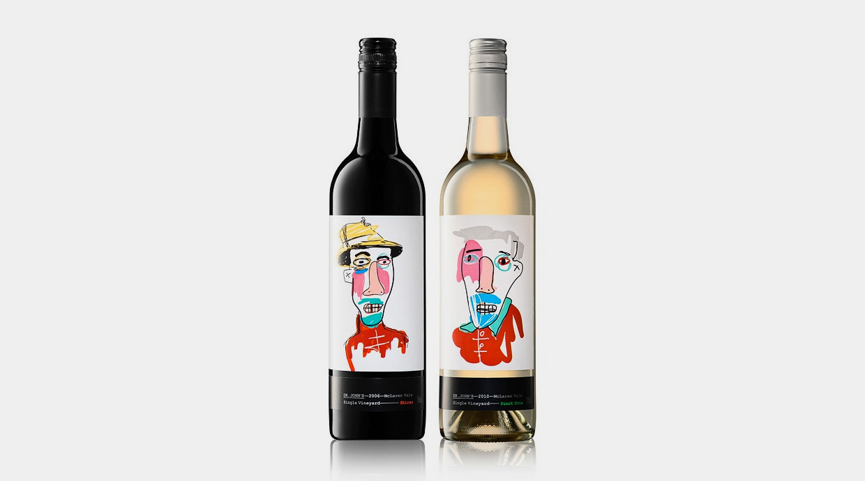
Dr Johns
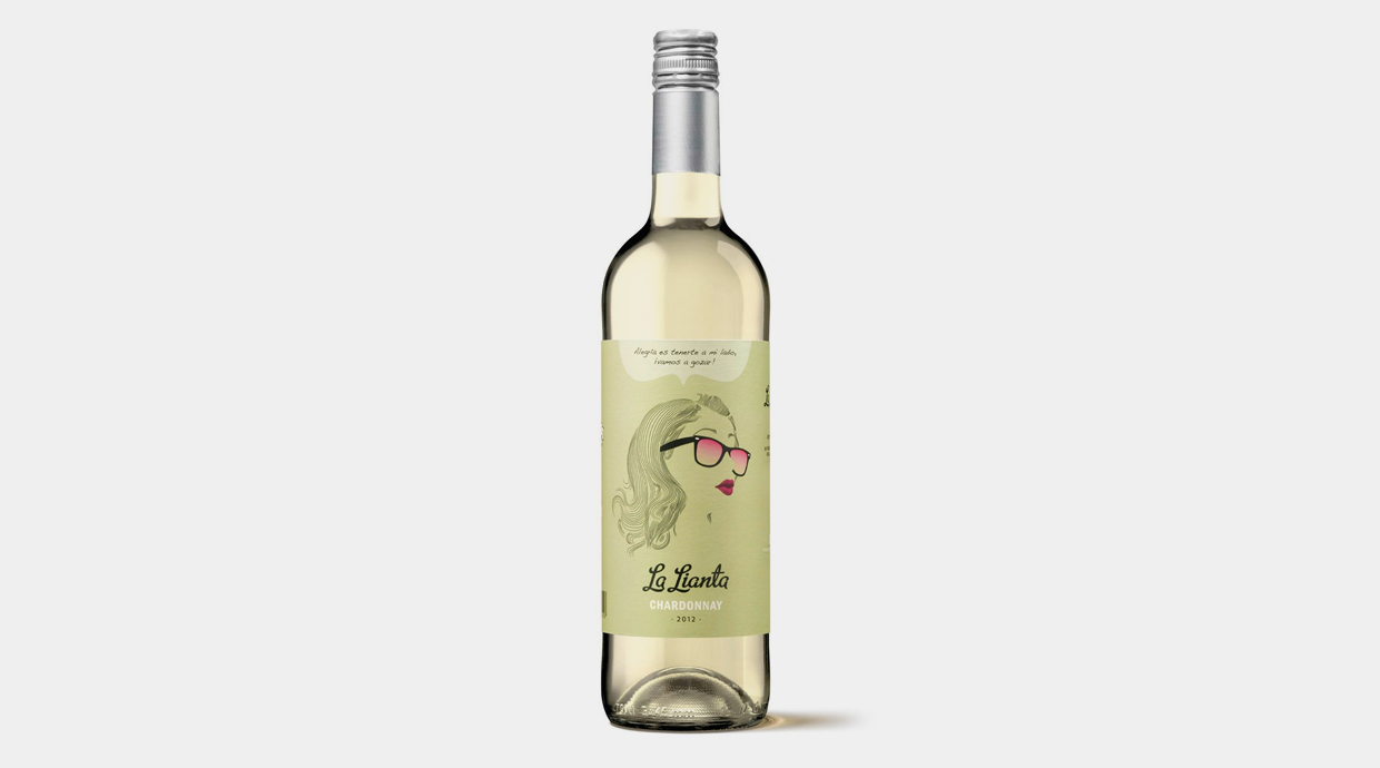
La lianta
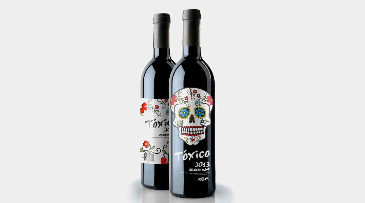
Tóxico
Geometric patterns
A pattern is an image that can be applied as many times as desired, resulting in an infinite view without breaks. Something similar to wallpaper.
Using geometric patterns is indeed a great asset to keep the customer’s attention in a supermarket’s aisle or an off-licence, since patterns are attractive in a visual way due to their balance and almost hypnotic features.
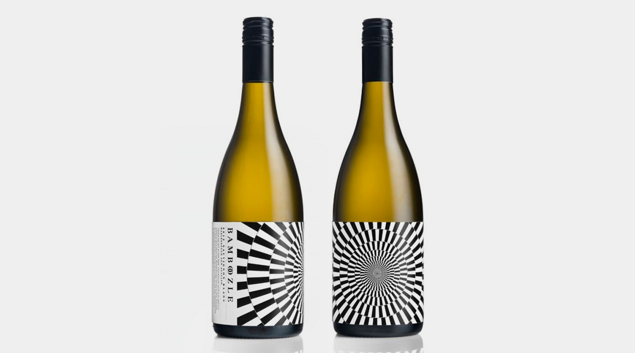
Bamboozle
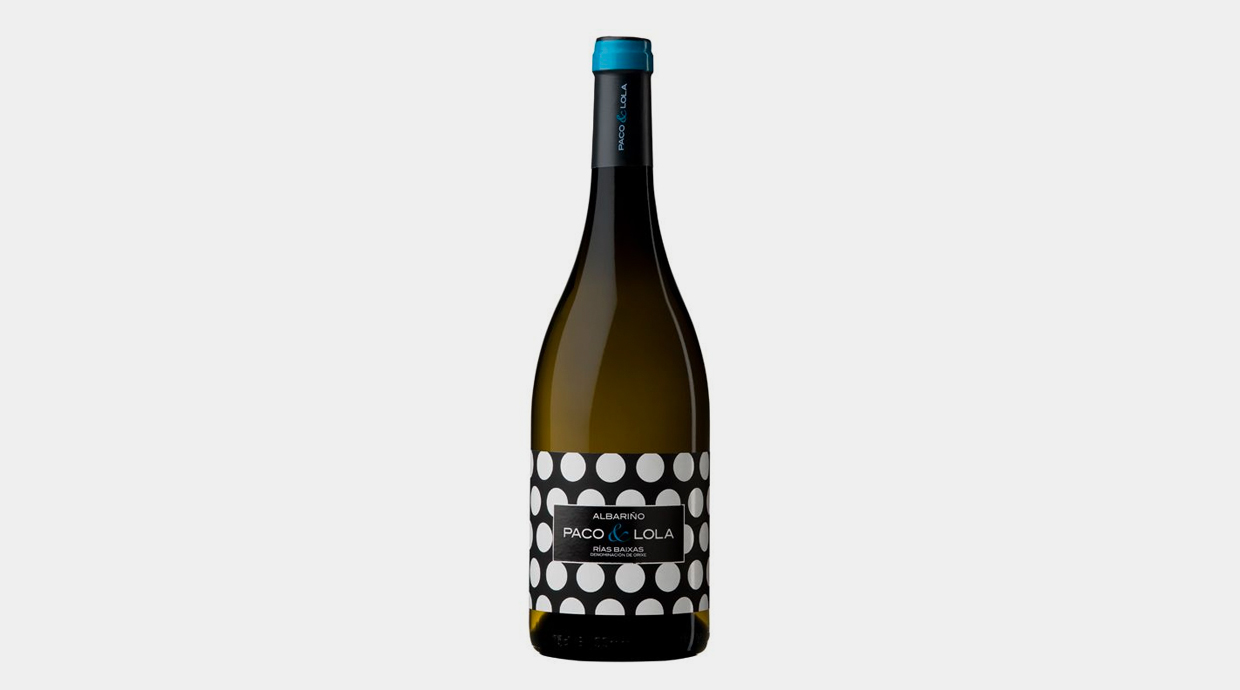
Paco & Lola
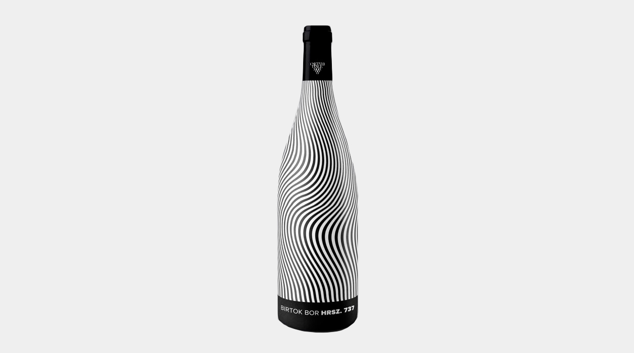
Hrsz. 737
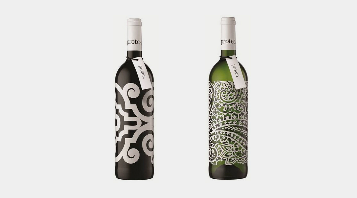
Protea
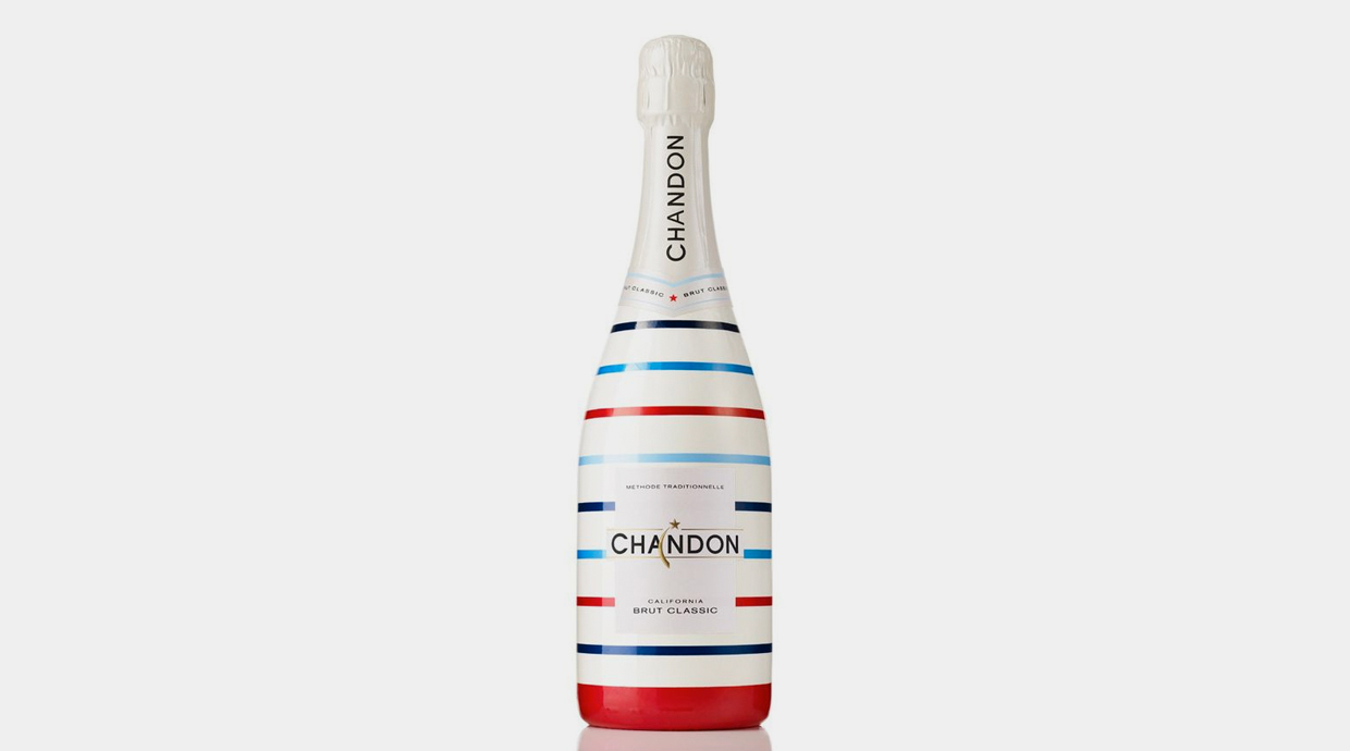
Chandon
Photography
Playing around with conceptual pictures in a wine bottle would have sounded a bit crazy years ago, but the truth is that the end result can be truly remarkable.
Atipus
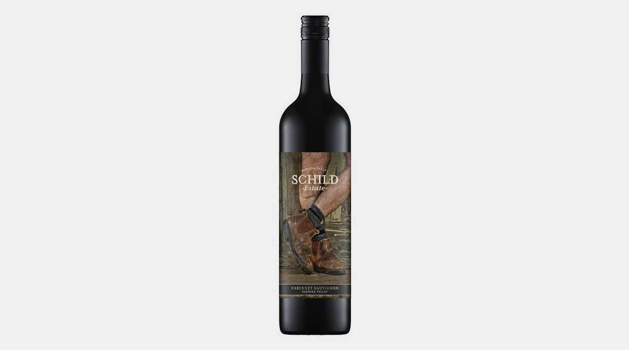
Schild
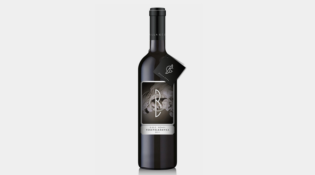
Balla Géza
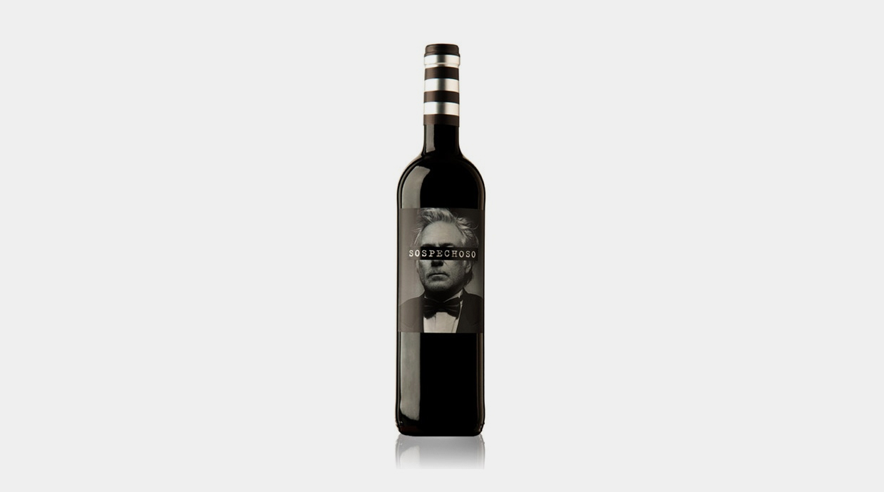
Portraits
A portrait, whether being a photograph or an illustration, works really well. There is nothing as powerful as a face or a penetrating gaze.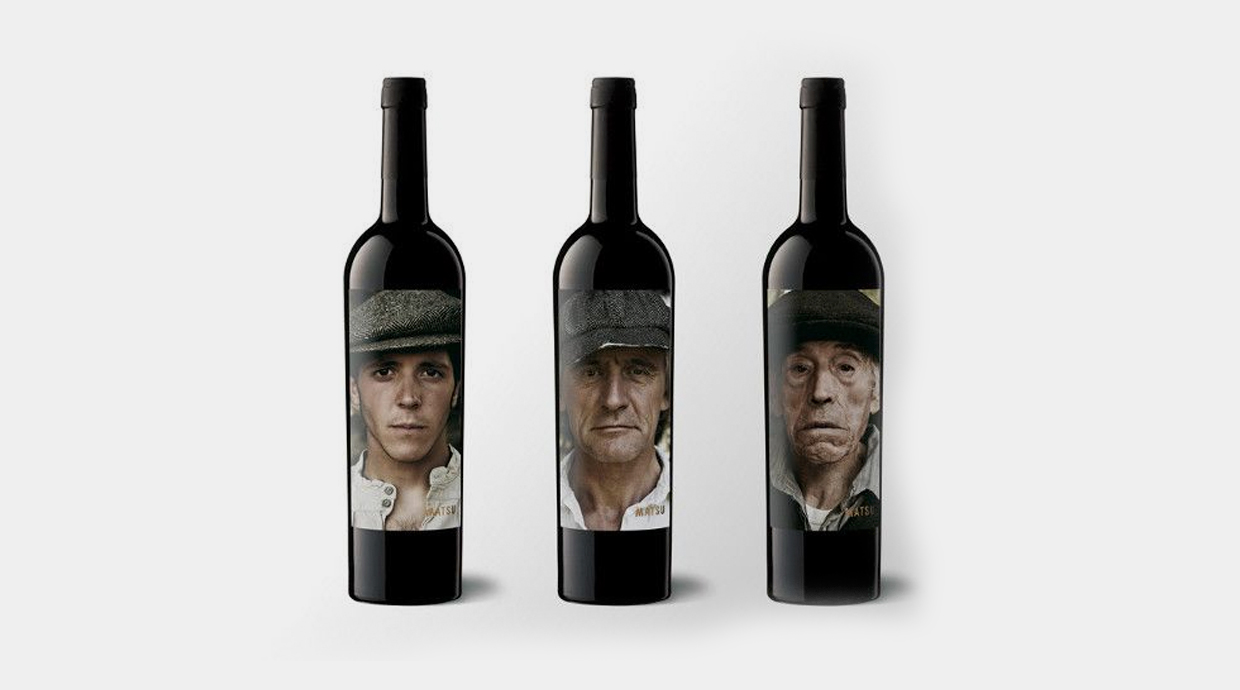
Pícaro
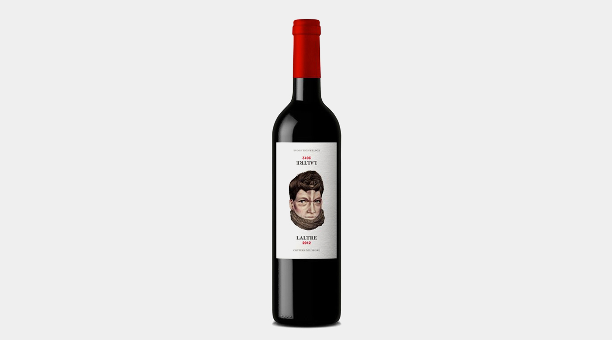
Laltre
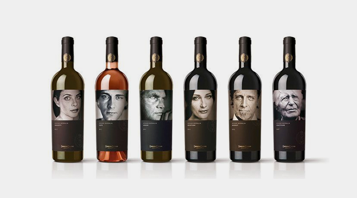
Minima Moralia
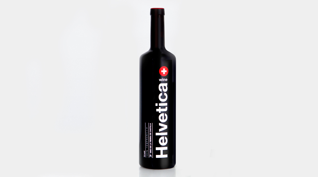
Typography
A good typography design is a real slap in the face. Lets take apart 5 different fonts: Sans Serif, Serif, Script, Handwriting and Monospace.
Sans Serif
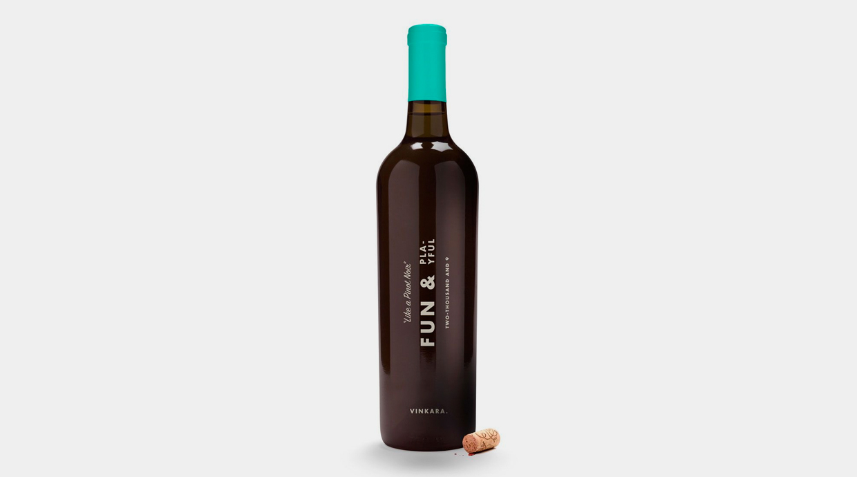
Botella de vino Fun & Playful
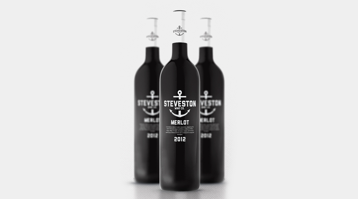
Steveston
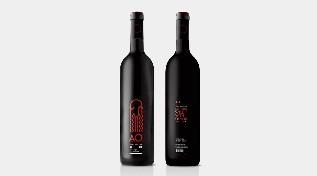
AO
Serif
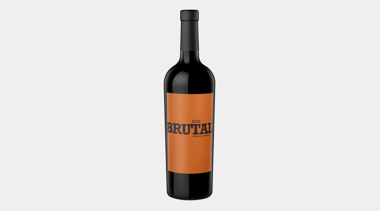
Brutal
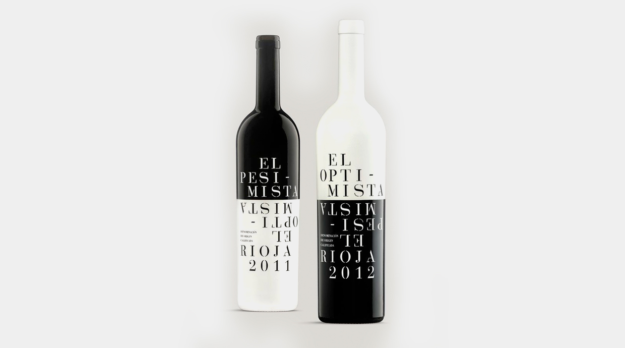
Optimista-Pesimista
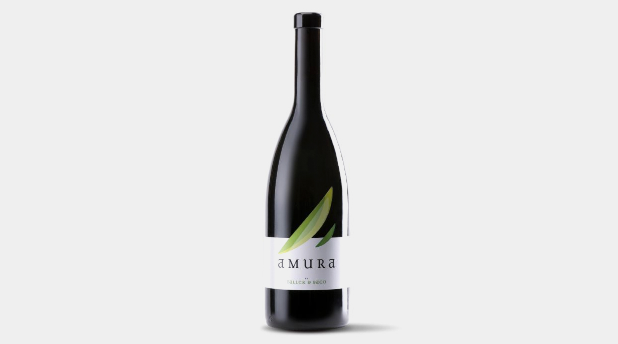
Amura
Script
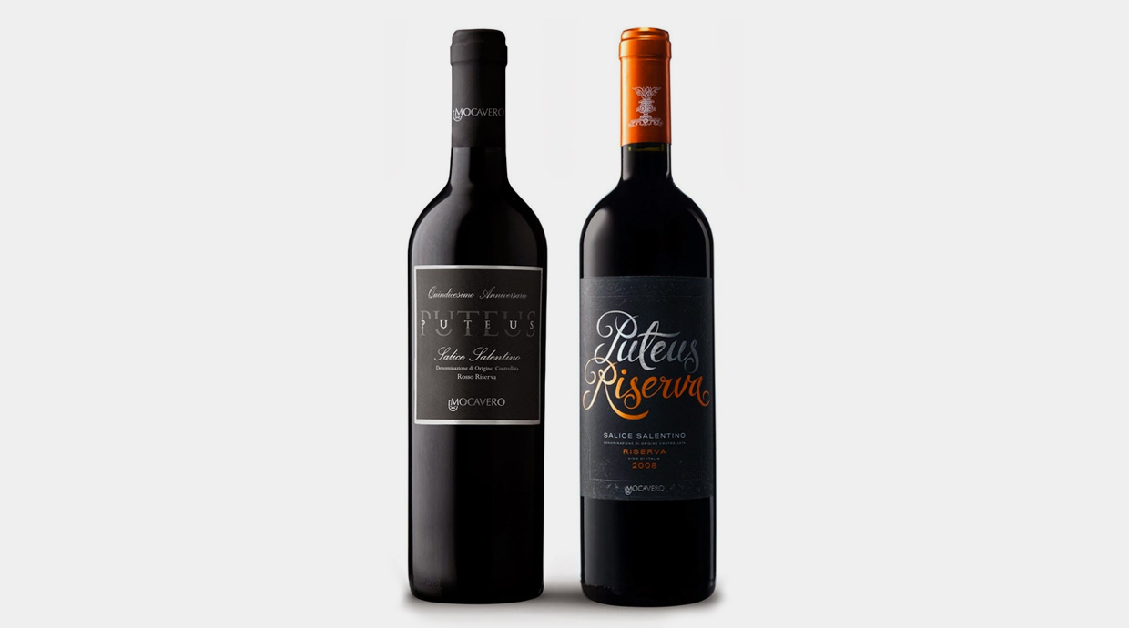
Puteus Riserva
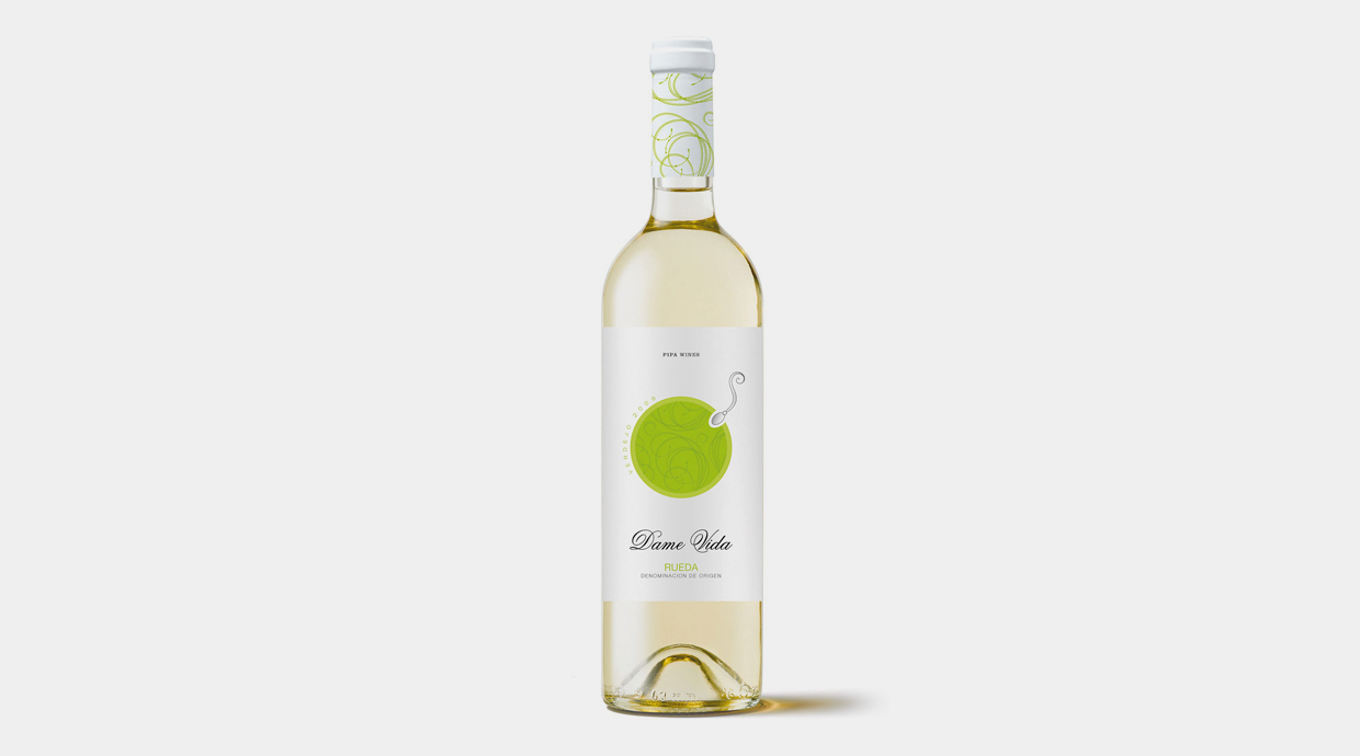
Dame Vida
Handwriting
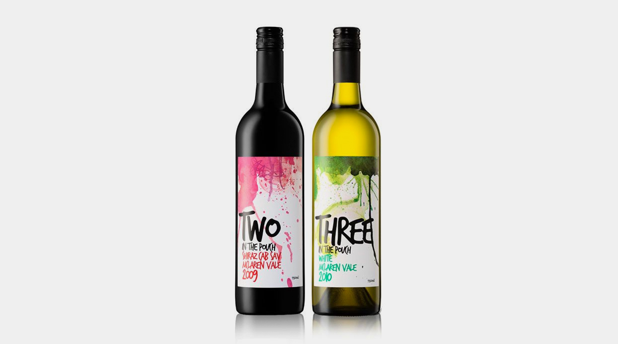
Two & Three
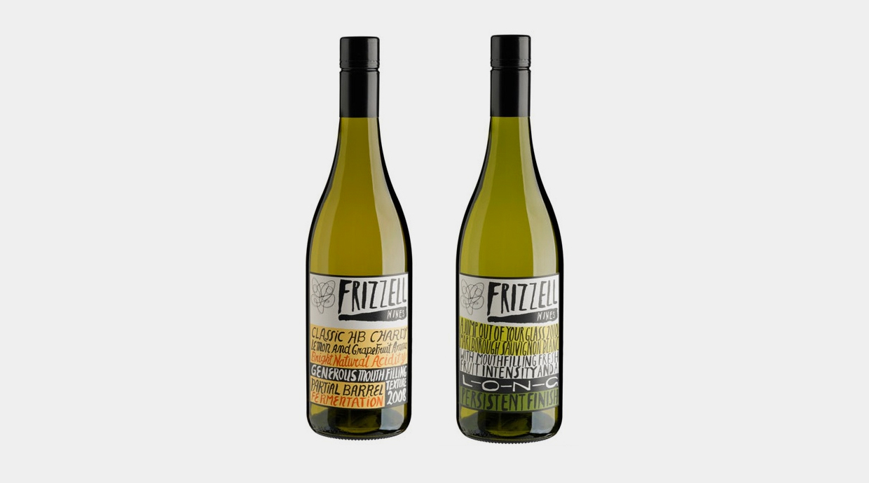
Frizell
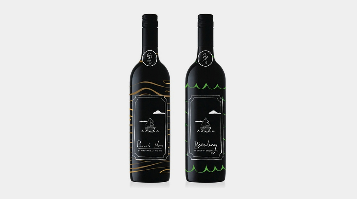
Smooth Sailling
Monospace
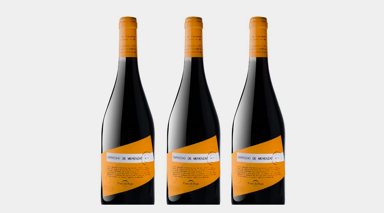
Capricho de Merenzao
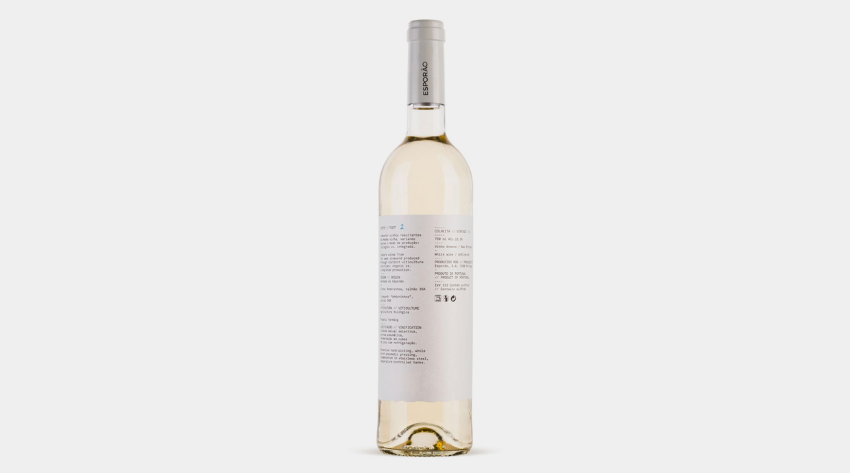
Esporâo wine
In Spain we are starting to take seriously the design in an area that requires renewing, and it has been proven that wines can be dressed up pretty well and with a wide variety of clothings.