
How can we help?Get in touch
What is a good movie without a good presentation?
That would be precisely what we think producers, directors and other people related to the world of cinema. Thanks for that, we have been able to enjoy designers and artists who put their imprint in these productions, as well as we did in our article that reviewed the best covers of the history of music.
Nowadays we can find very good examples of how it`s work different styles and trends in the world of design today.
We present a list of some of the last years that have pleasantly surprised us.
The wolf of Wall Street
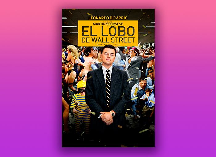
The f ***** best p*** in history, f ****!
Let's not neglect the forms, but it's a very appropriate way to describe the poster of this Scorsese film.
This poster was a work of the agency BLT Communications, in charge of other works like Alita or Stranger Things, among others.
One of the mythical scenes of the film is located in a brokers office who listen absorbed a motivator talk of his boss (Leonardo Dicaprio) and then an image of this same scenario where the characters are losing control completely.
What we can see in the poster is a frame of that lack of control while the protagonist looks at us defiantly, summarizing very well the mood of the film.
The Reborn
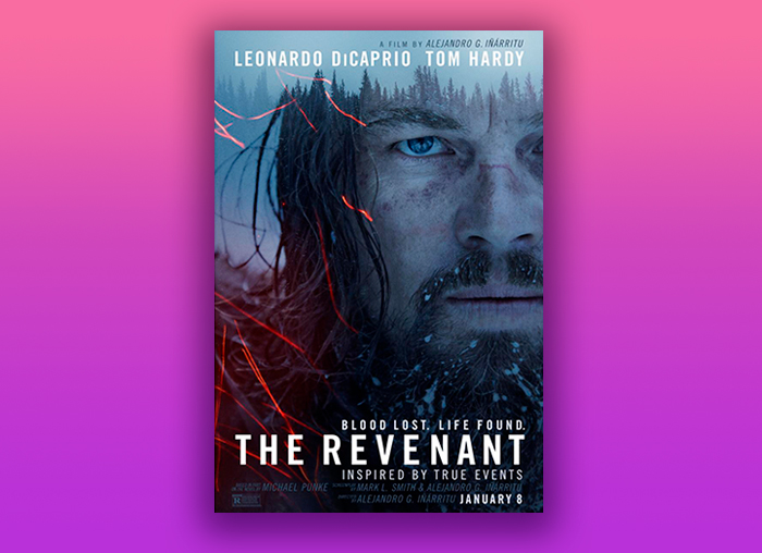
If we analyze a little the use of color and composition, we can appreciate the general air of the film and especially the cold. Very cold. Although in the poster they opted for the portrait of the protagonist instead of the magnificent landscapes, I like the contrast chosen by those red lines against the cold blue of the face and the background. In general, it transmits to me the harshness of the situation and the mishaps that Leonardo Dicaprio had to face again.
After all, with this movie, he took the Oscar, and we see that he had to suffer to get it.
Moonlight
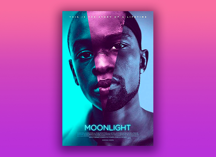
This poster (and many others) was designed by the art director Steve Reeves of the agency InSync Plus, which is responsible for other works such as Red Sparrow and Star Wars: The Last Jedi.
It is the fusion of three faces forming one, the protagonist, in the three phases of his life that tells the story: childhood, adolescence and maturity.
According to the own Reeves, the poster came out at the first try, almost without any modification in the art, only adjustments of color, which is surprising for the one that is dedicated to this industry.
The Grand Hotel Budapest
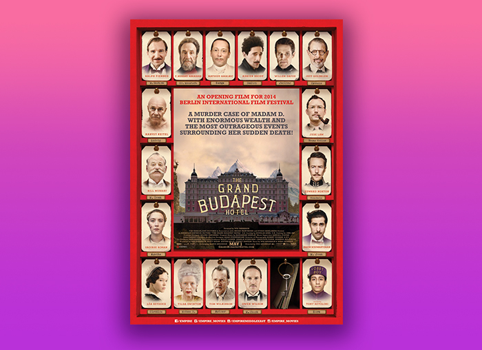
For this design they played with the shape of an old hotel reception as a presentation of the actors participating in the film. The use of color in general in this film is very interesting, oscillating between warm, pink and red, and blue. It reminds me a little of the splendor of ancient Russia with its great families of the aristocracy.
The typography also accompanies the poster with a classic touch, thanks to the serif, but giving it a slightly more contemporary twist with the shape and with the narrowest font.
The design of Gran Hotel Budapest was based on real hotels in the Eastern European area. One of them, the Palace Bristol Hotel, was the inspiration for the pastel pink color of the fictional hotel.
Mother!
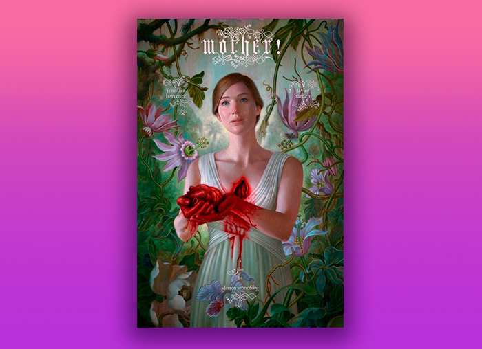
There are several posters for this film but the most interesting one is that of the protagonist, Jennifer Lawrence, who is illustrated by evoking a bucolic image full of symbolism that wants to remind me of Frida Kalho or Dalí. In fact, she is surrounded by flowers but holding a bloody heart in her hands.
These posters caused great sensation when they came out and came from the hand of James Jean, illustrator of Taiwanese origin.
The typography, freehand and above with the exclamation, awakens a sense of strength, drama and passion.
Isle of Dogs
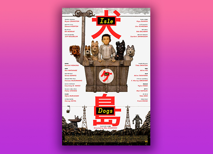
Designed also by BLT communications, which in addition to the posters, developed the campaign for networks, videos and other advertising material.
The Isle of Dogs is an animated film directed by Wes Anderson that is set in a dystopian future located in Japan, in which due to a disease like canine flu all dogs have been banished to an island. I am struck by the influence of Japanese aesthetics on the poster, both in the colors, as of course and most striking, in the Japanese characters that translate both the title and the name of all the actors. Yes, even the Americans.
Likewise, the use of the vertical composition used in the poster is associated with Japanese culture and writing.
Birdman
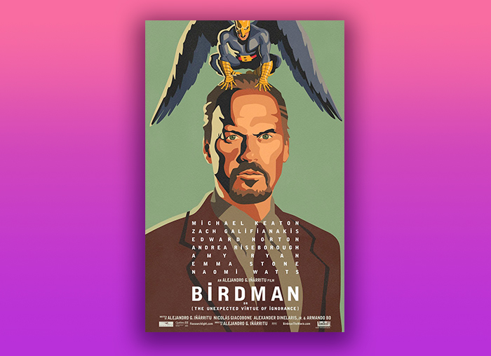
As if it were a classic superhero illustration, with a style that is more similar to silk screen printing for flat color spaces, the protagonist of our poster is presented.
Birdman tells the story of Riggan Thomson, an actor in decline who can not get rid of the obsession with his old role that gave him fame. The incarnation of the superhero that still hovers in his head, here we literally see it reflected in the design.
Flatliners
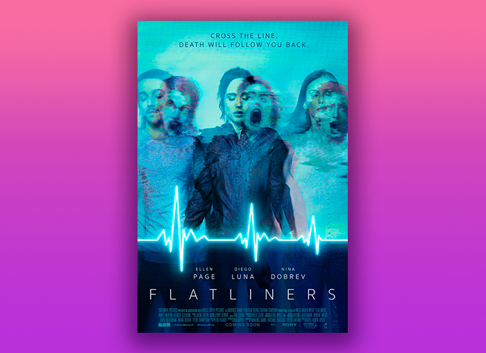
This poster is also quite interesting. Play with the effect of double exposure, that is, mix two photographs in the same frame. It also subtly shifts the channels of which the color is composed, hence one can see more blue and in the other more red.
Thanks to this effect, the protagonists show themselves on the one hand in a state of unconsciousness and at the same time suffering situations close to death, all due experiment to which they are going to submit.
Drive
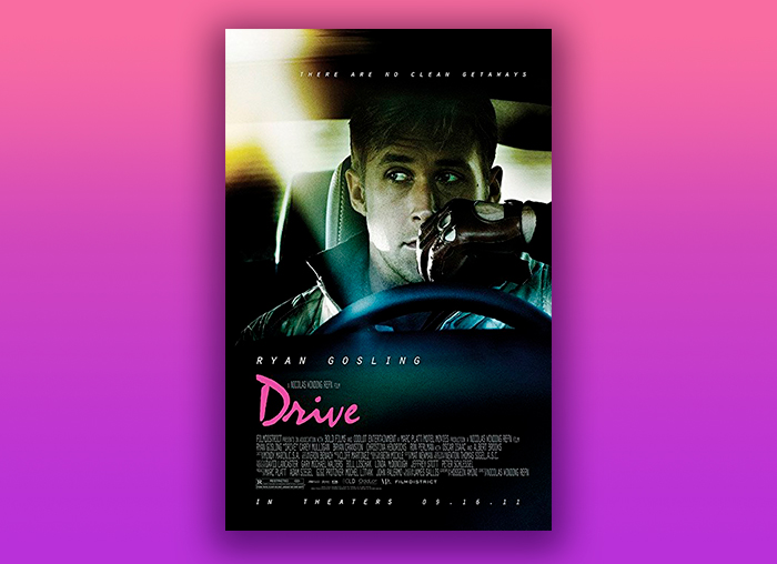
This poster attracts my attention because of two issues that are somewhat opposed to my understanding. The style of the film is neo-noir, being able to see in a pose of hard type the mysterious "The Driver", the protagonist of the film. But then we find a pink eighties font that puts us in another context. Although the film is set in a more modern era, it retains certain features of the old cinema films.
La la land
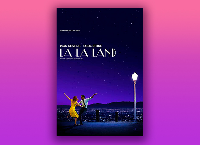
This poster was designed by the London agency All City and was published for the Venice Film Festival in August 2018. It represents a mythical scene of the film in which the protagonists intimate after a party.
The scene called "a lovely night" is a dance number at dusk very Hollywood style. Is not it the same street lamp as in "Singing in the rain"? Anyway...
The team focused on reducing the scene to a single image for the poster and capture that sky so characteristic of the magic hour.
Her
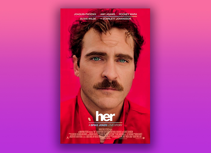
The first thing that strikes me about this poster is the great combination of colors. The red that almost hits us saying 'romanticism' contrasts with the eyes of the protagonist, who seems to look at us with a melancholy and sad face saying "some of this is not going to turn out very well". This apparent simple combination of graphic elements effectively communicate the overall tone of the film that the critic liked so much.
Enemy
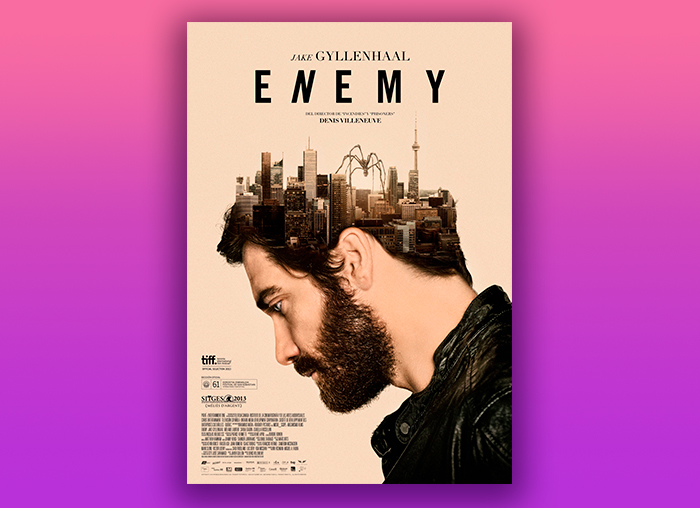
In this poster we find some subtle clues that reveal part of the plot. First the "N" in the typography is slightly inclined in italic mode that leads us to think of something parallel. Then is complement it with photomanipulation in which the mysterious city comes out of the head of the protagonist. And finally a spider, or something like that, that will appear as a symbol later in the narrative. Well, at that point in the movie you start to suspect.
Meeting your double in real life, usually against you, is never a good sign. This is the premise of the story told by this psychological thriller directed by Denis Villeneuve.
After having made a brief review of some of the posters that I consider most relevant, we can recognize the importance that is currently given to their design. Not only for being the cover letter and our first value judgment when choosing movies, but also the posters teach us great graphic solutions to communicate the complex ideas of some arguments. Although this list may seem short, if we go deep we will discover a lot of good designs (and some bad ones of course) throughout the history of cinema.
Main photo: Max Ostrozhinskiy
Related articles
Related works

Renewing the image of a unique historical place.

Our tribute to the queen of typography