How can we help?Get in touch
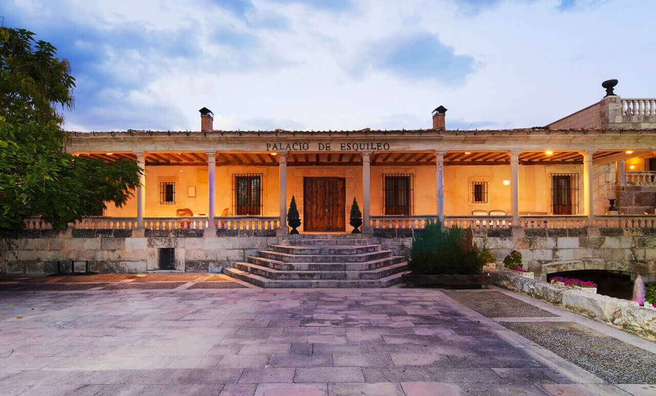
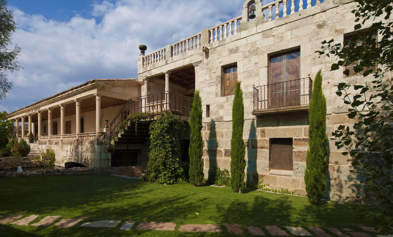
Renewing the image of a unique historical place.
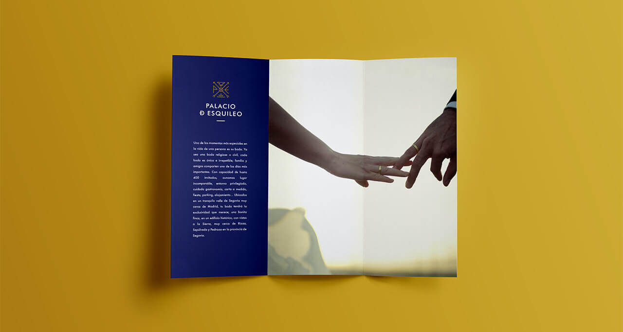
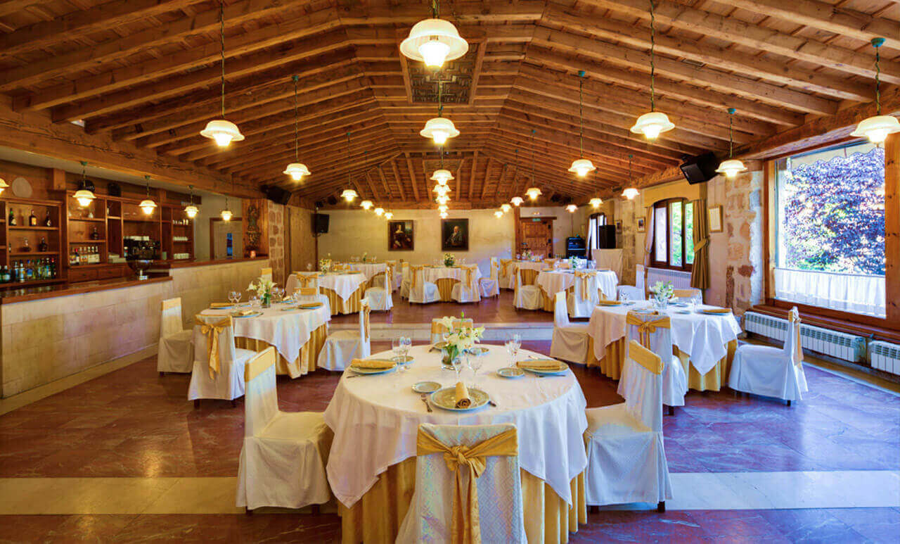
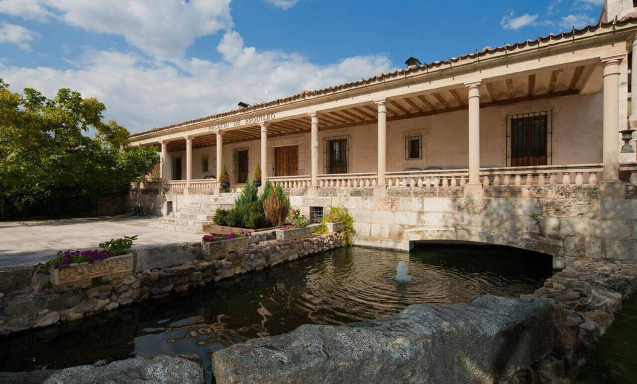
Palacio de Esquileo is a charming hotel that specializes in wedding receptions and business meetings.
After a change of management, from parents to children, we were in charge of the rebranding of Palacio de Esquileo.
With a future ahead of them, the hotel needed a new image that would transmit both modernity and history and would enhance its development and differentiate it from its competitors.
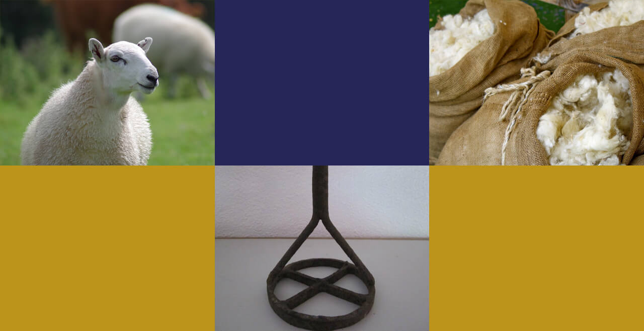
A hotel with history
The hotel is close to medieval towns of Segovia such as Riaza, Sepúlveda, Pedraza, Ayllón or Maderuelo.
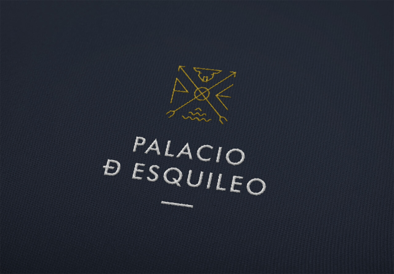
Esquileo comes from shearing, "esquilar" in Spanish, which means cutting wool to cattle gives the name to the brand. This is what was done in these centres, 37 of which were documented in 1700 on the northern slope of the Central System, the economic base of the Crown of Castile and which for centuries was its most important industry. Once sheared, the sheep were branded with the irons of each house.
The challenge of the project was to represent the concepts that accompany the story of the brand, cattle and shearing, in a modern and elegant way. Our goal was to convey the exclusivity of the place and generate a strong link with its target audience.
Solution
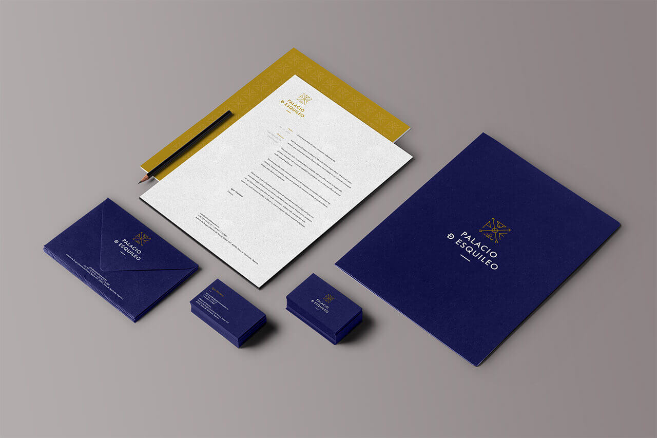
For typography we used Futura, an elegant sans serif font which is very different from the majority tendency in the sector in which we see how Script or serif are the ones that are the most commonly used. This way we distinguish ourselves from the competition and we manage to transmit the concept of modernity that was intended. We also introduced the link between the letters D and E as a nod to this medieval history of the place

Applications
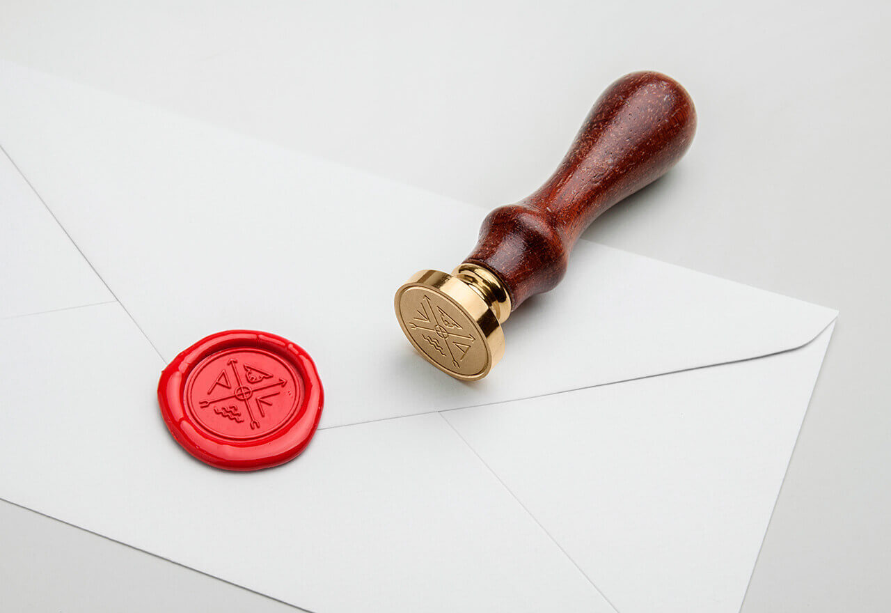
The previous identity did not adapt well to all types of media and sizes, so one of our challenges was to make it work perfectly in all contact points and all its applications. To do this, we created a symbol inspired by the cattle branding irons that referred to the concepts of wool and sheep, along with the initials of the name of the farm.
For the colours we chose two complementary shades, gold and dark blue, which give the sensation of exclusivity and elegance that the brand intends to transmit within the sector.