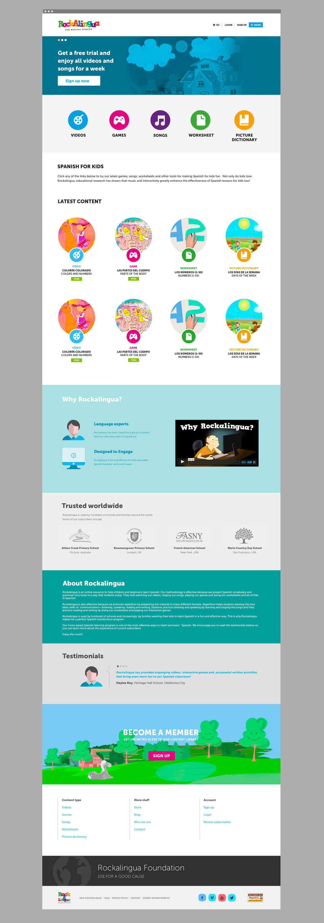
Rockalingua is a project born in San Francisco and it aims to teach Spanish in a fun and original way through animated videos and songs. We take care of naming, corporate identity and website development.
Corporate Identity
When building the brand, we set out to create a name and a logo to convey fun and entertainment which is the best way for a child to get close to an educational tool; we sought a name that worked in different languages but preferably in English, which is the initial target of the startup. We use a very wide color range to attract attention and to be associated with cartoons trying to establish a recognizable visual link with the children. In addition, with the typographic game in which the letters are superimposed we generate a sense of interactivity with the language, which is the main feature of the tool.
Ubercart Drupal 7 + + Autorize.net: Peace of mind
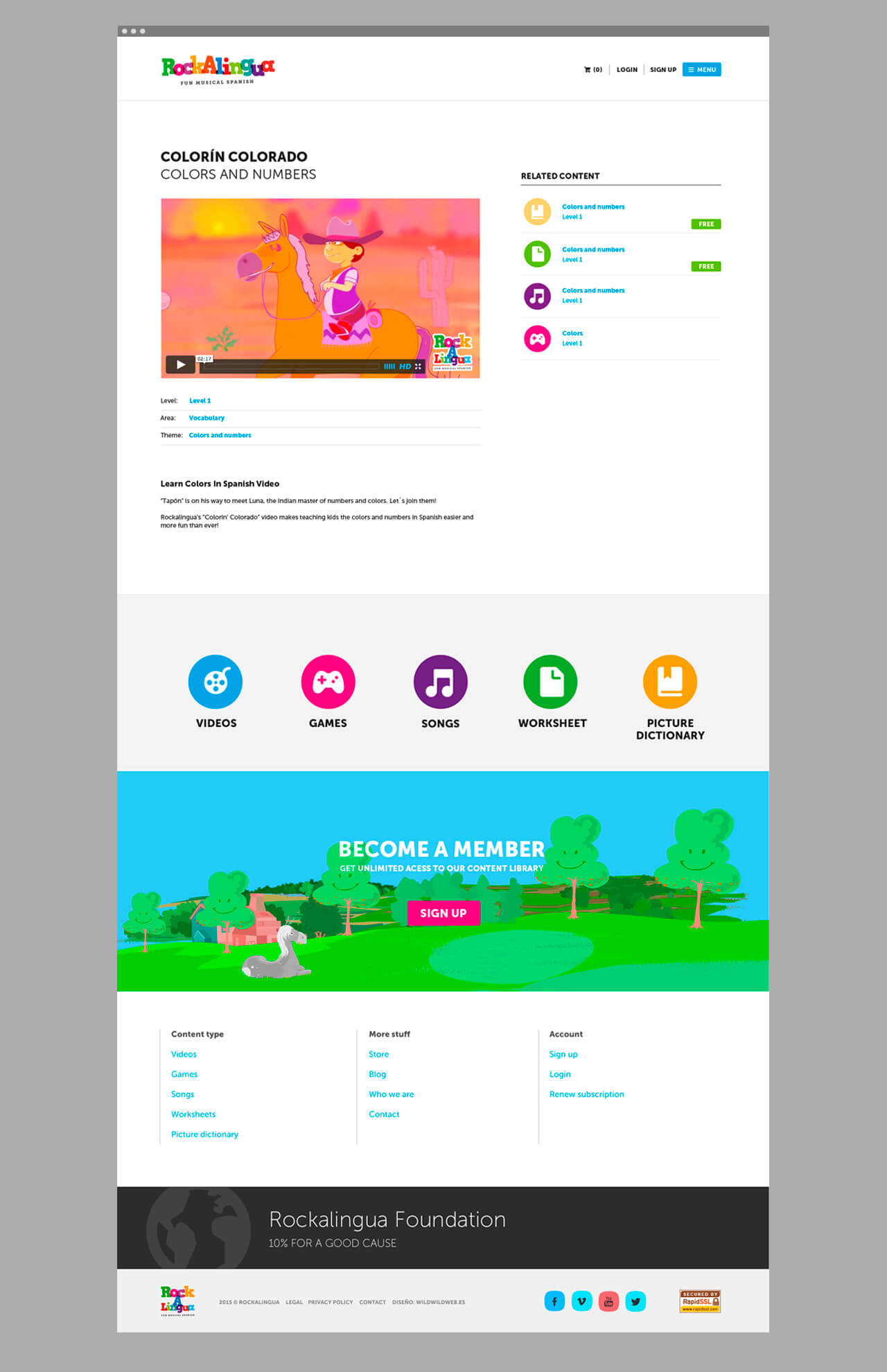
For the architecture, we propose a solution based on Drupal 7 with a very simple operation based on views that generate lists of content type games, videos, worksheets and more. The site's goal is to attract subscribers so each content has a free teaser and then prompts the user to purchase a premium subscription. There are also several fully free content with the goal of becoming viral and attract traffic. Through a simple check of the permissions, the content is shown according to each user role’s role.
To implement online sales we use Ubercart and link it with paypal and also with the subscriptions platform autorize.net which is one of the most robust and complete ones. To ensure the availability of the platform, we host the site Blackmesh, a hosting provider specialized in Drupal, and we configure the cache Varnish system.
Designing for children and adults: a challenge
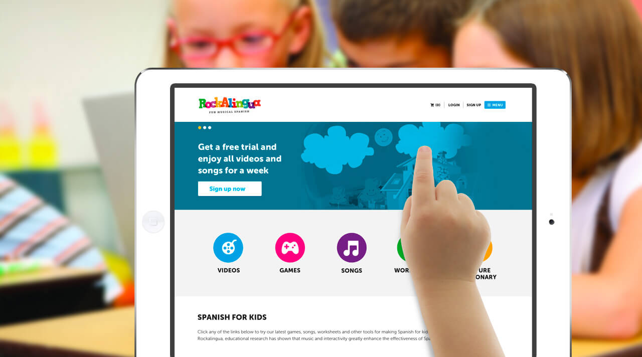
The responsive design was created, as usual, by the paradigm "mobile first" first modeling appearance and web architecture in mobile devices and adapting after to other larger screen sizes. We worked to improve the visualizations of the site on tables because rockalingua.com users are children in schools, who are led by teachers, and they both access the site mainly from these devices. The navigation menu "offcanvas" is always visible in both mobile and desktop and brings that feeling of fresh and cutting edge interactive design. Colors and icons to the menu items were incorporated to facilitate the use of it to children under 7 years.


