How can we help?Get in touch
Reason Why is the most read online marketing & advertising magazines in Spain and in Latin America. We were tasked with redesigning their brand and website.
We faced the challenge of creating a new digital identity that would convey the leadership position of the company without losing the essence of its origins
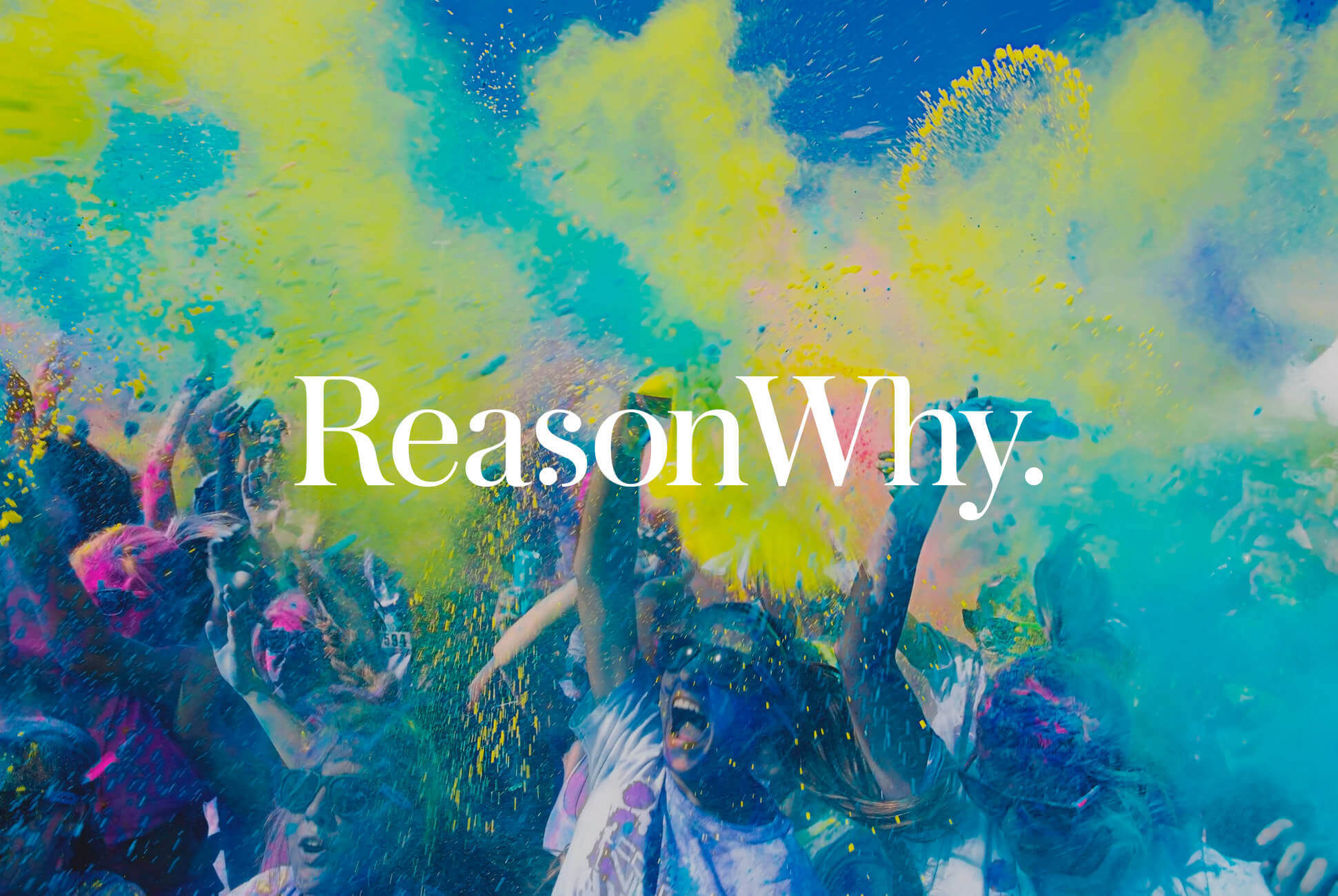
Rebranding to reinforce leadership
For the visual identity, we decided to go for exclusively typographic ideas and to avoid adding new graphic elements that would distort the image, also conveying something too radical compared to the initial logo. However, we wanted to clearly represent the evolution of the company, now absolutely consolidated.
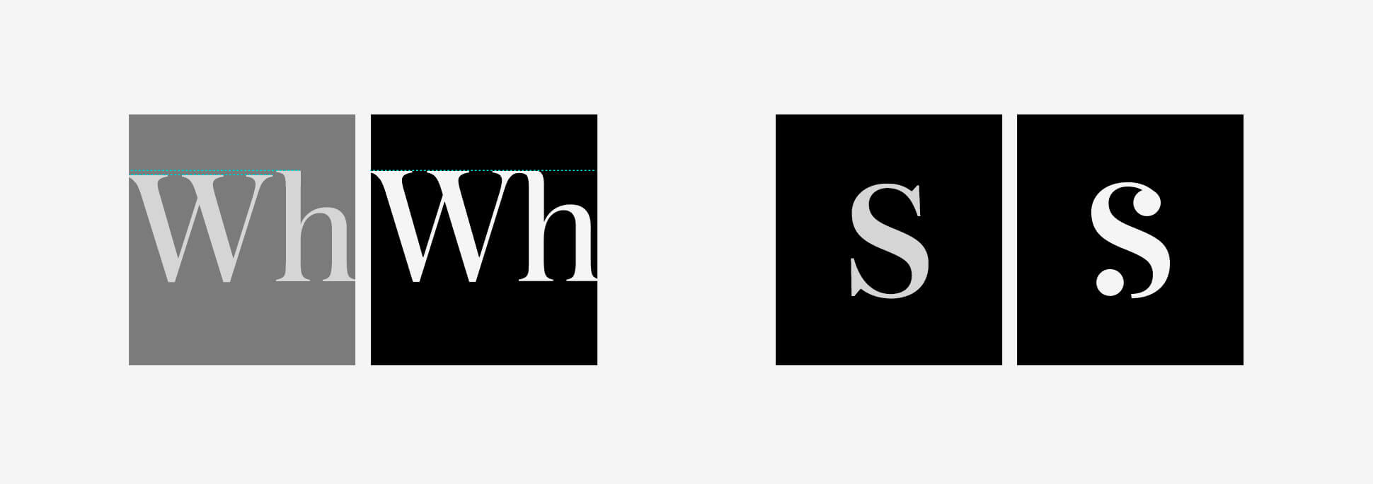
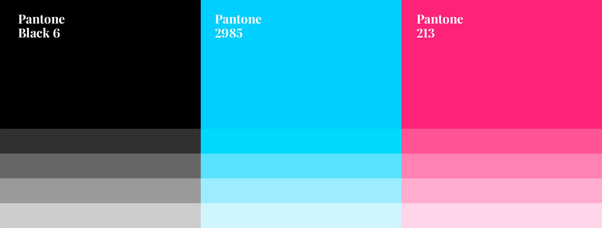
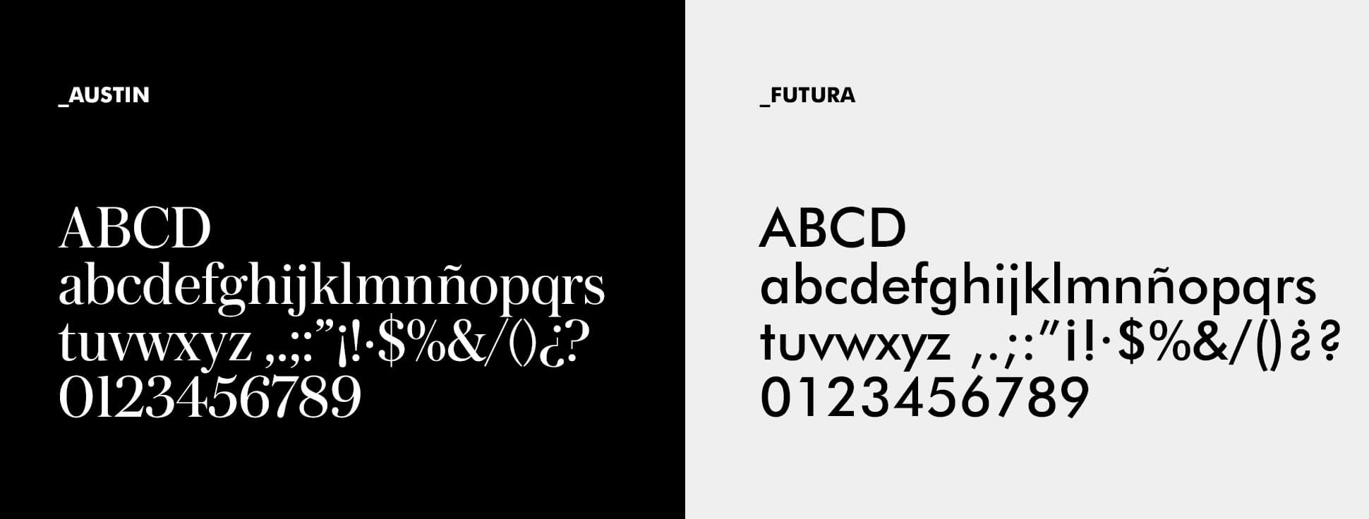
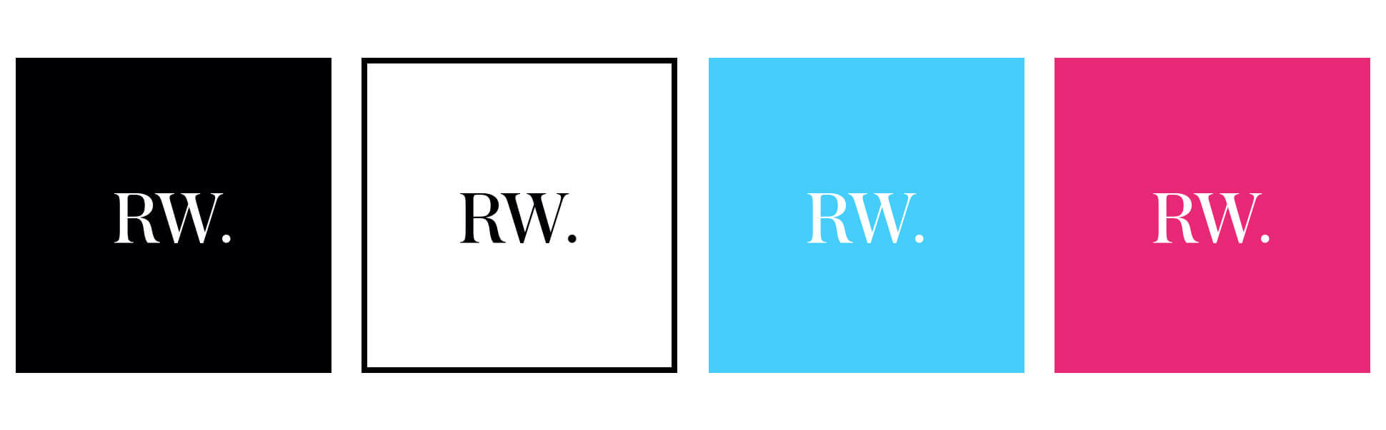
We chose a brand that conveyed sobriety, reliability and lots of personality based on the Austin typeface, with a series of font modifications to add ligatures and unique elements.
A living brand
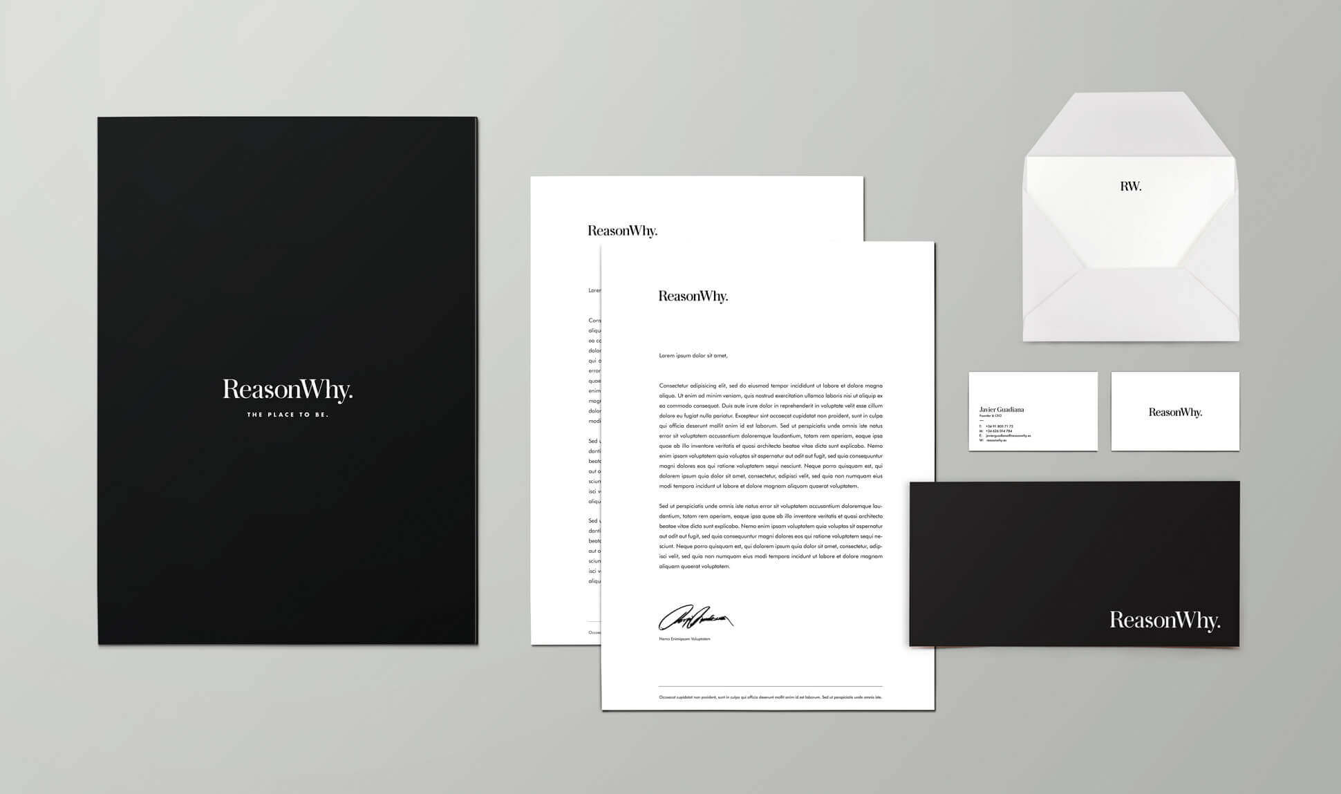
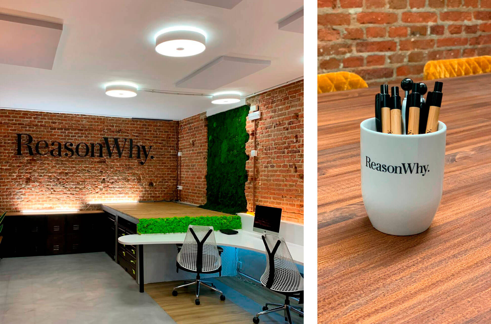
Reason Why is a living brand that has to work both online and offline perfectly. In order to achieve this, we created a corporate identity manual that specifies typographies, colours and all the applications of the brand within different media. By using a protective mesh for the brand, we ensured that the logo may be reproduced in different places, always respecting its legibility. In addition, in the manual we determined minimum sizes for offset, serigraphy and screen, as well as a reduced version of the logo to supports of very reduced dimensions, such as profiles on social networks platforms, small watermarks for videos, etc.
Web redesign
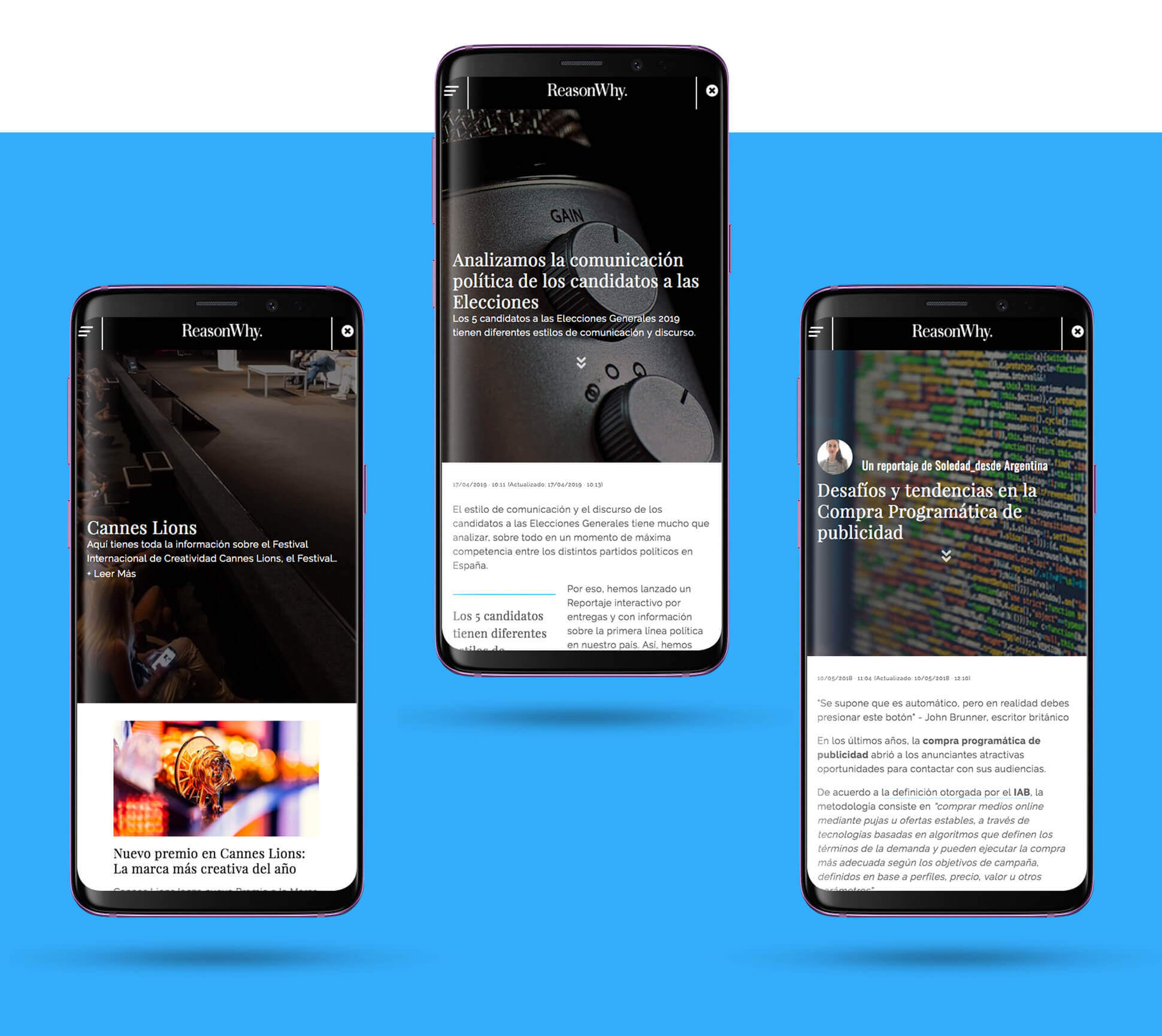
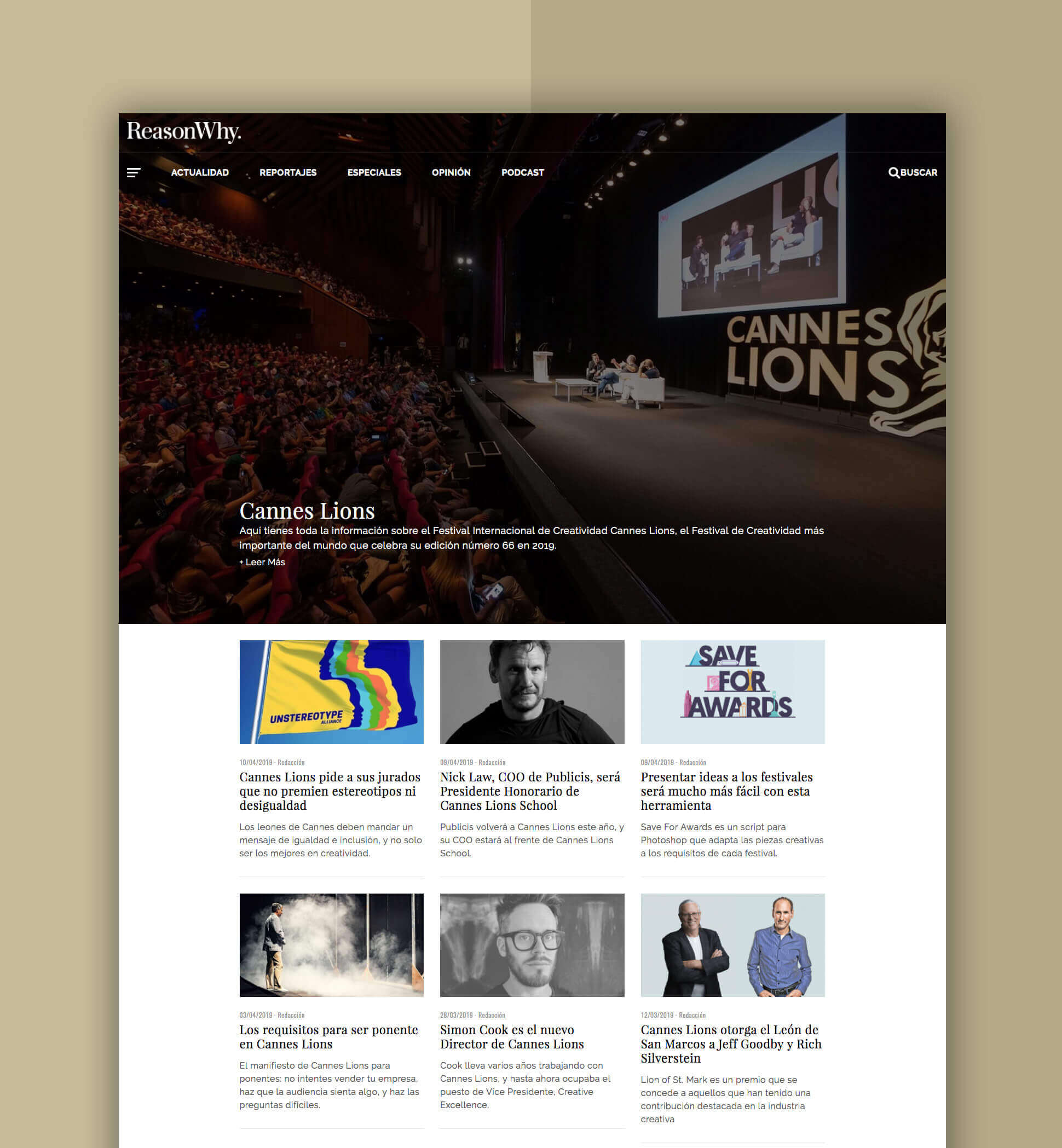
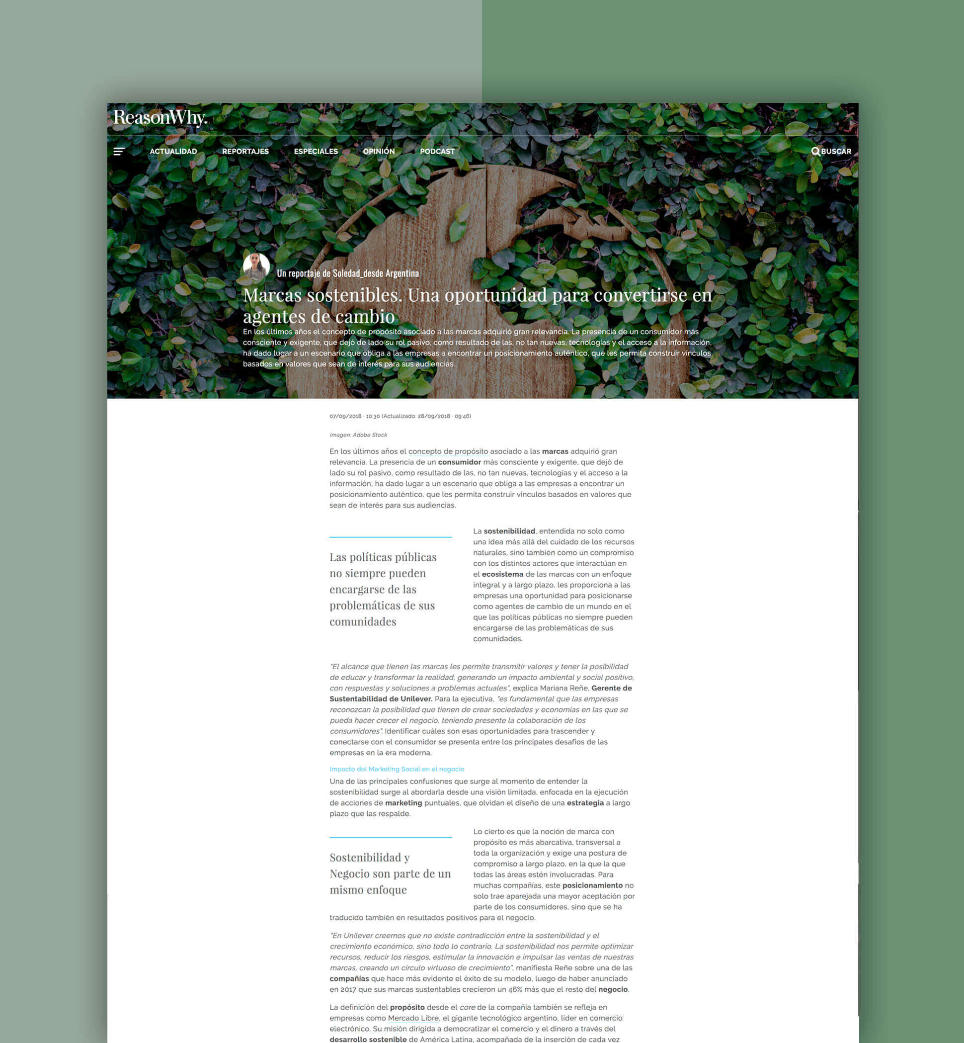
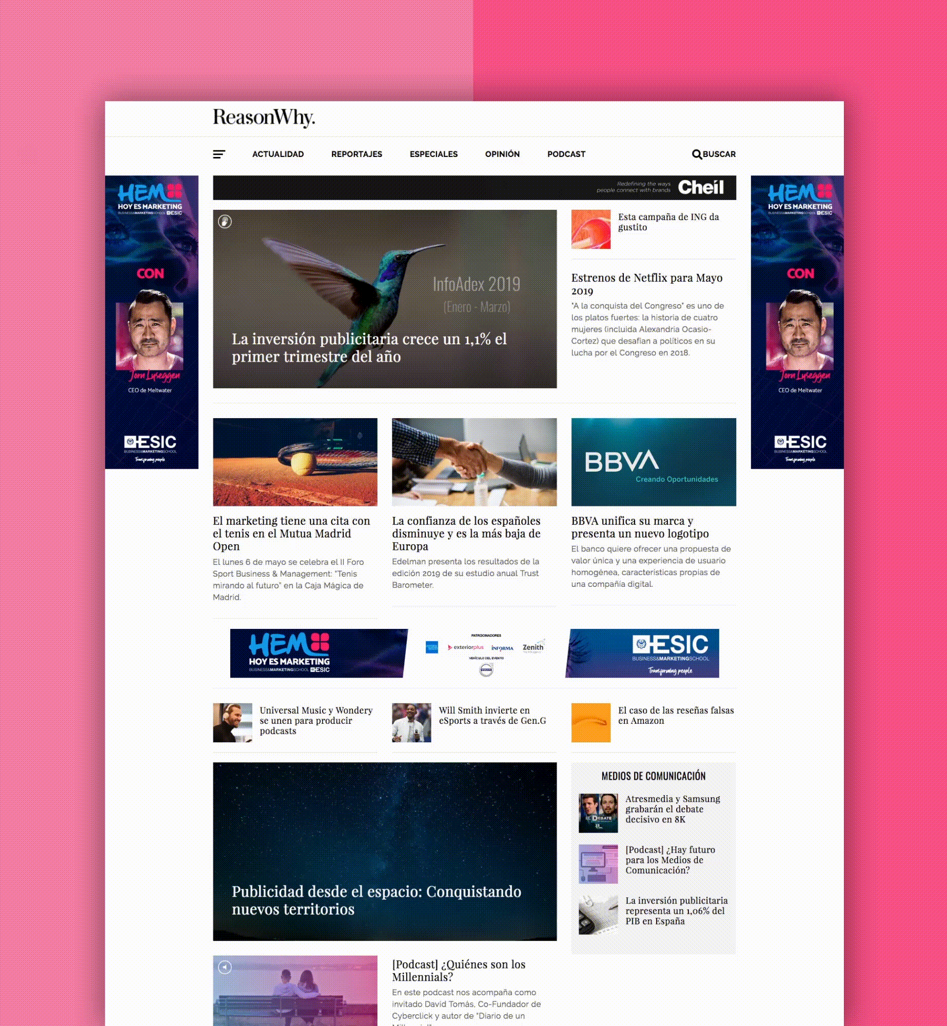
In order to create a unique and satisfying user experience for the readers of the new ReasonWhy we carried out a complete UX design process.
The development was divided into 5 phases: definition, research, analysis, design and testing.
Throughout the process we used an infinite number of practices and UX artefacts such as: business canvas model, interviews with the client's team and with the users, a competition study, inspiration study, content inventories, user personas, experience map, user flows, wireframes, mockups and prototypes.
The final outcome is a clean, elegant, honest website with a modular design alongside a clear and easy-to-manage content hierarchy.