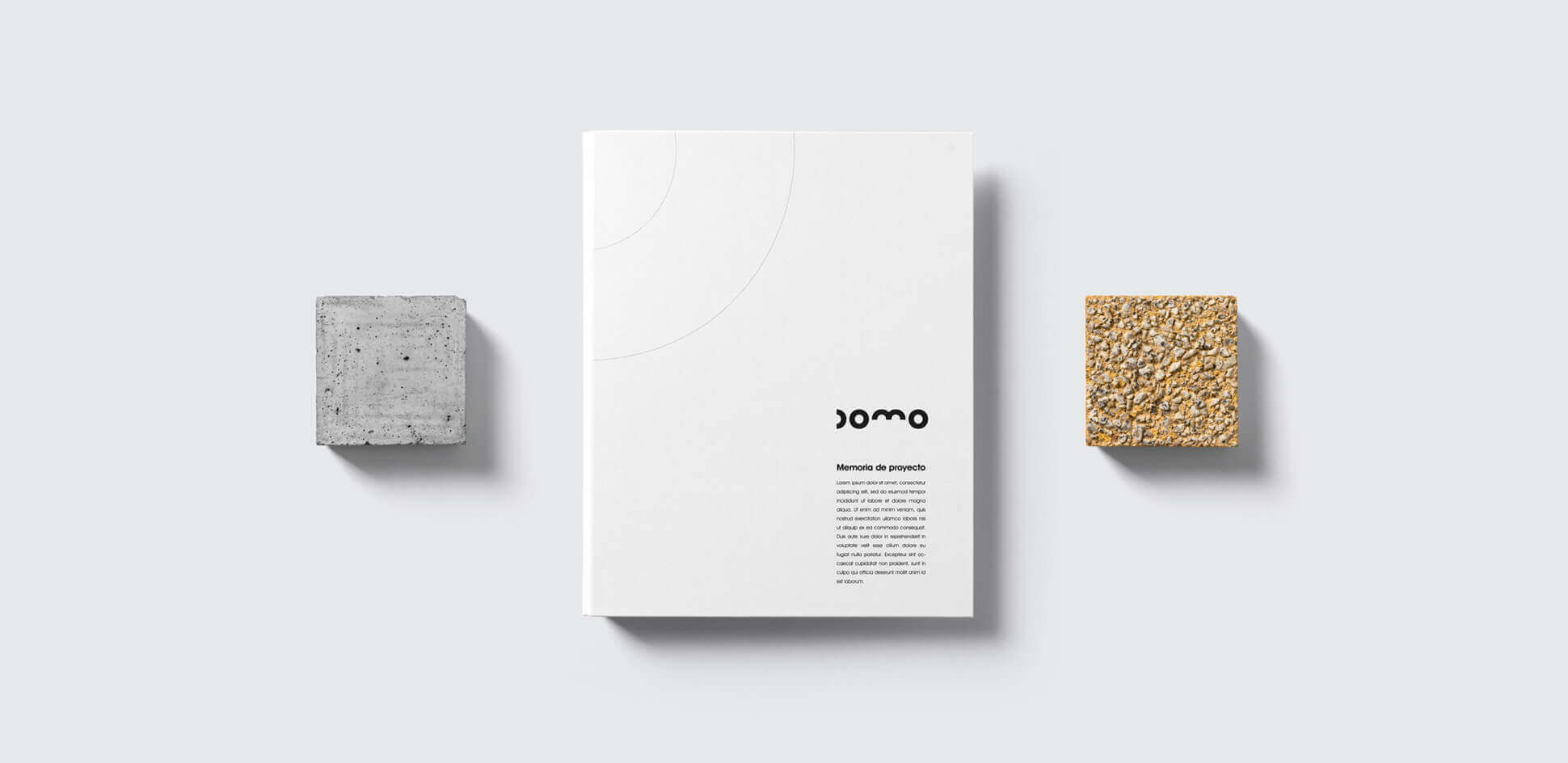
Domo is an architecture studio located in the heart of Barcelona that specialises in the renovation of existing buildings, both residential and for other public or private uses.
After years of operating under the name of its founder, we were hired to create a new brand that would convey the current status of the company.
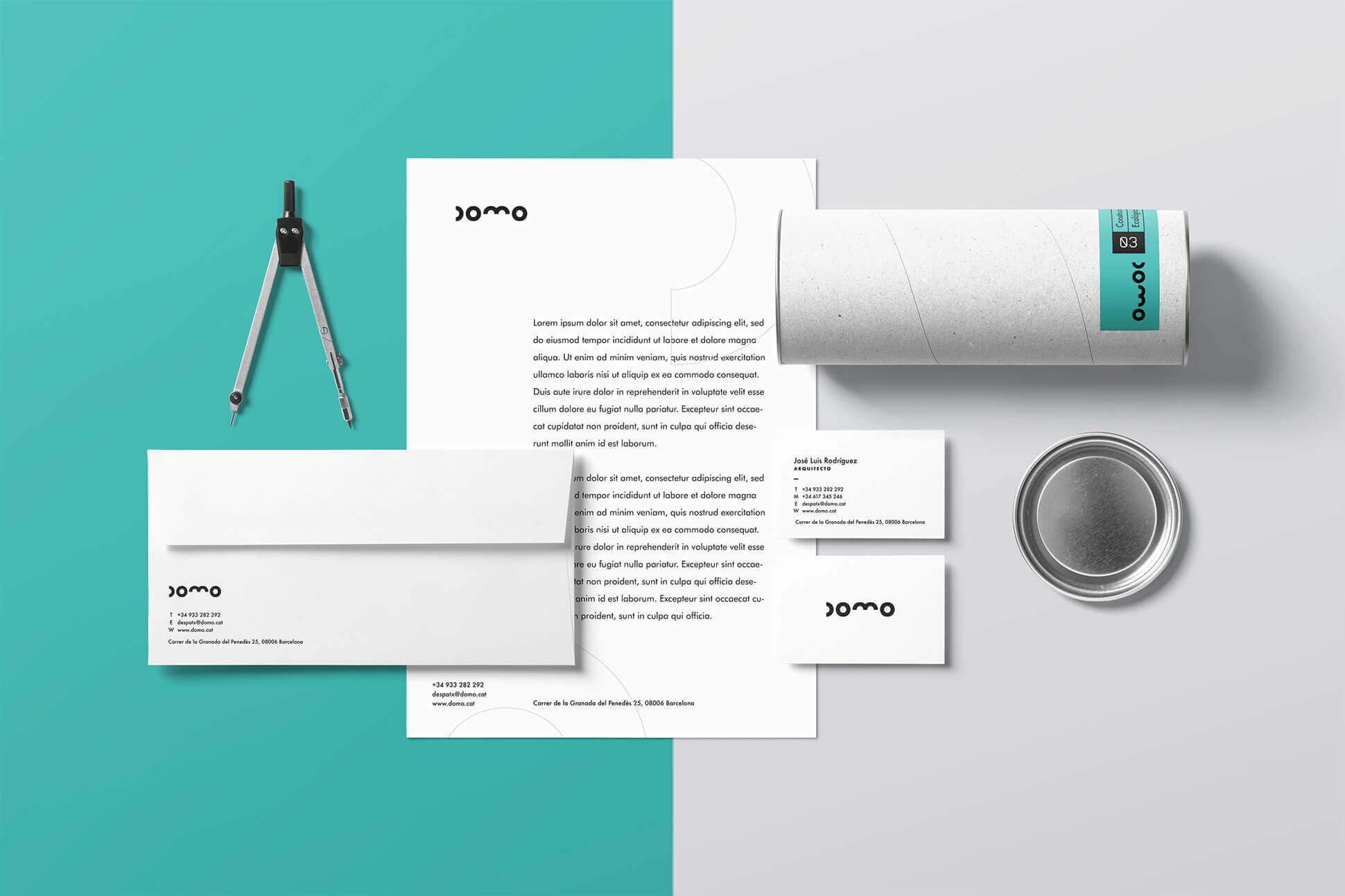
Through a consultancy process we carried out the strategic analysis and diagnosis of the situation to later define the identity and experience of the new brand.
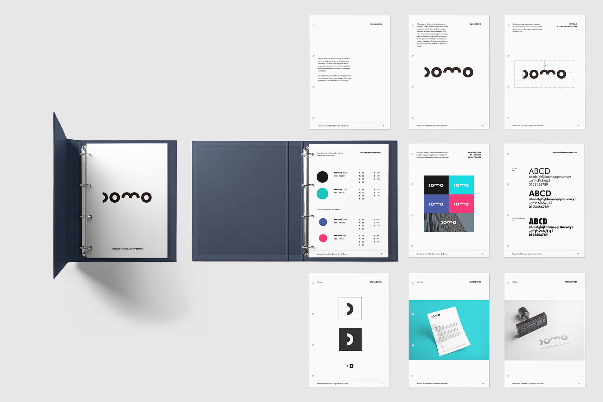
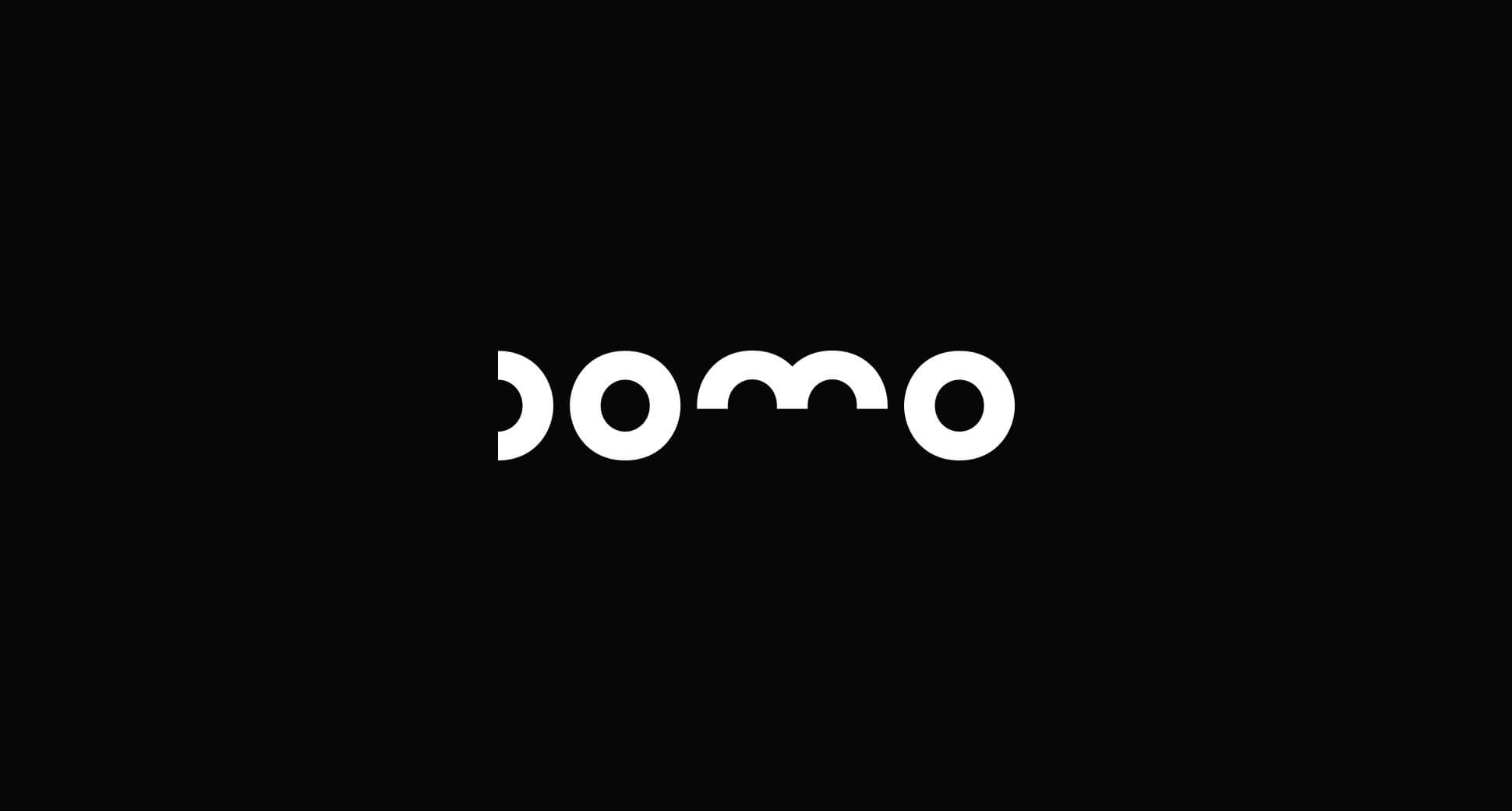
We were looking for an identity that conveyed two concepts: design and construction. We proposed a design based on the graphic sample of the dome, represented by a semicircle.

If the brand is a repository of meanings that build value and preference among our audiences, the name is what represents us.
Among the architecture studios there is an over-saturation of names that refer to their directors and the client wanted to avoid that. We were looking for a name that was very easy to remember, with a clear sonority and above all that was closely associated with the world of architecture. From these premises arose Domo.
In order to know the meaning of the term dome, first of all it is necessary to discover its etymological origin. In this case we can explain that it derives from the French word "dôme", which means "dome" or "round roof". However, it should not be forgotten that this Gallic term, in turn, comes from the Greek 'doma', which can be translated as roof. The idea of dome is used in the field of architecture with reference to a cupola. It is a vault in the shape of a half sphere or similar that can cover part or all of a building.
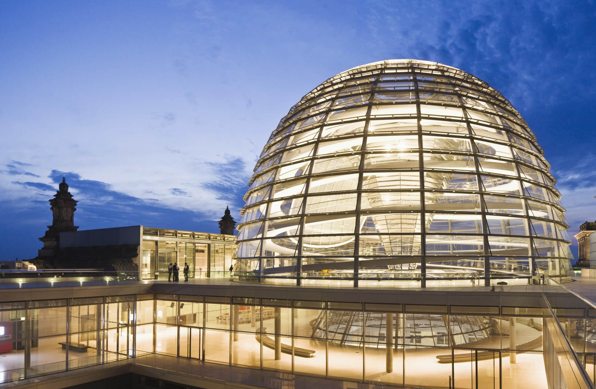

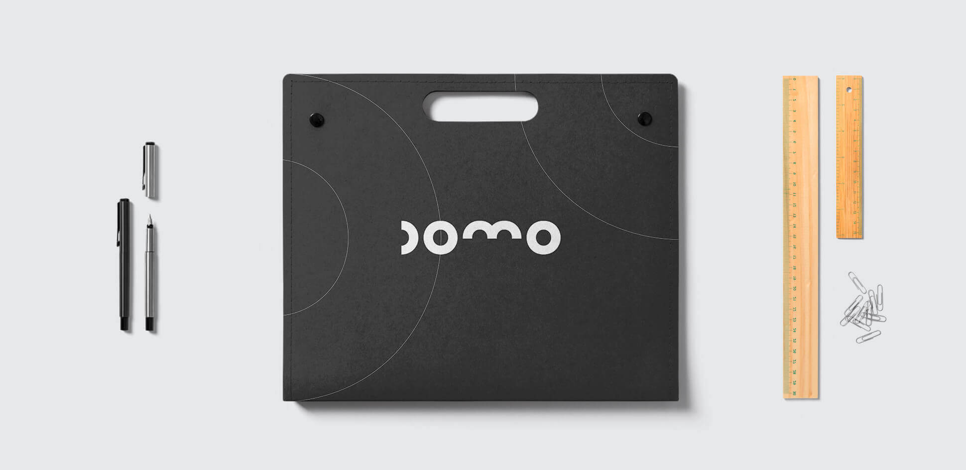
Through the concept of the dome we build the idea on which the visual identity is based. Using only semicircles, as the minimum graphic representation of the dome, we composed the typography that gives life to the brand.
