How can we help?Get in touch
Designing the brand and the digital ecosystem of the leading website for coworking spaces in Spain.
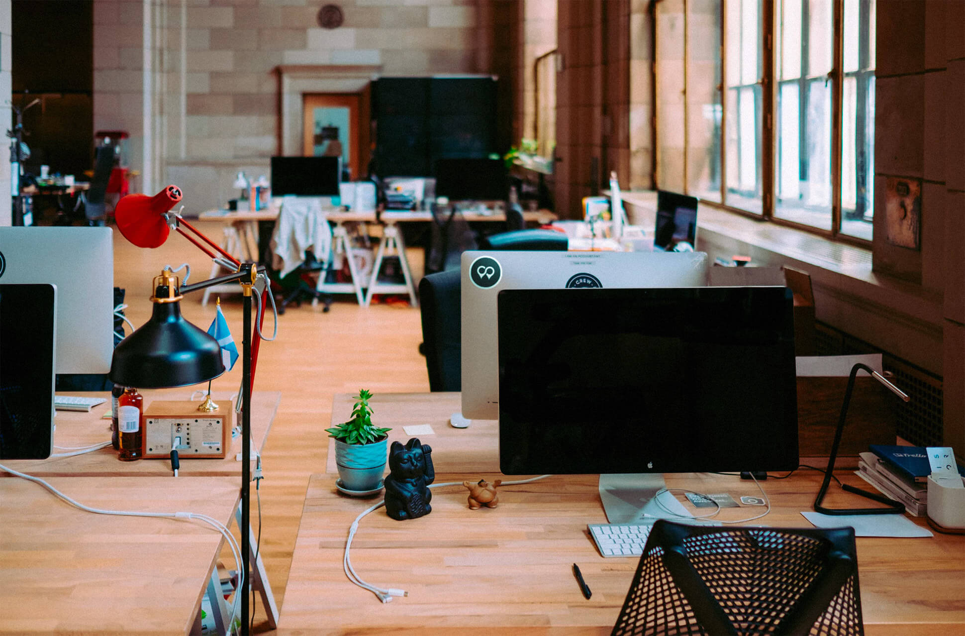
Coworking is an increasingly popular way of working that allows independent professionals, entrepreneurs and SMEs from different sectors to share the same workspace, both physical and virtual, to develop their professional projects independently and at the same time promote collaborative initiatives. Coworking Spain is an online platform that allows you to quickly find, compare and contact coworking locations in Spain.
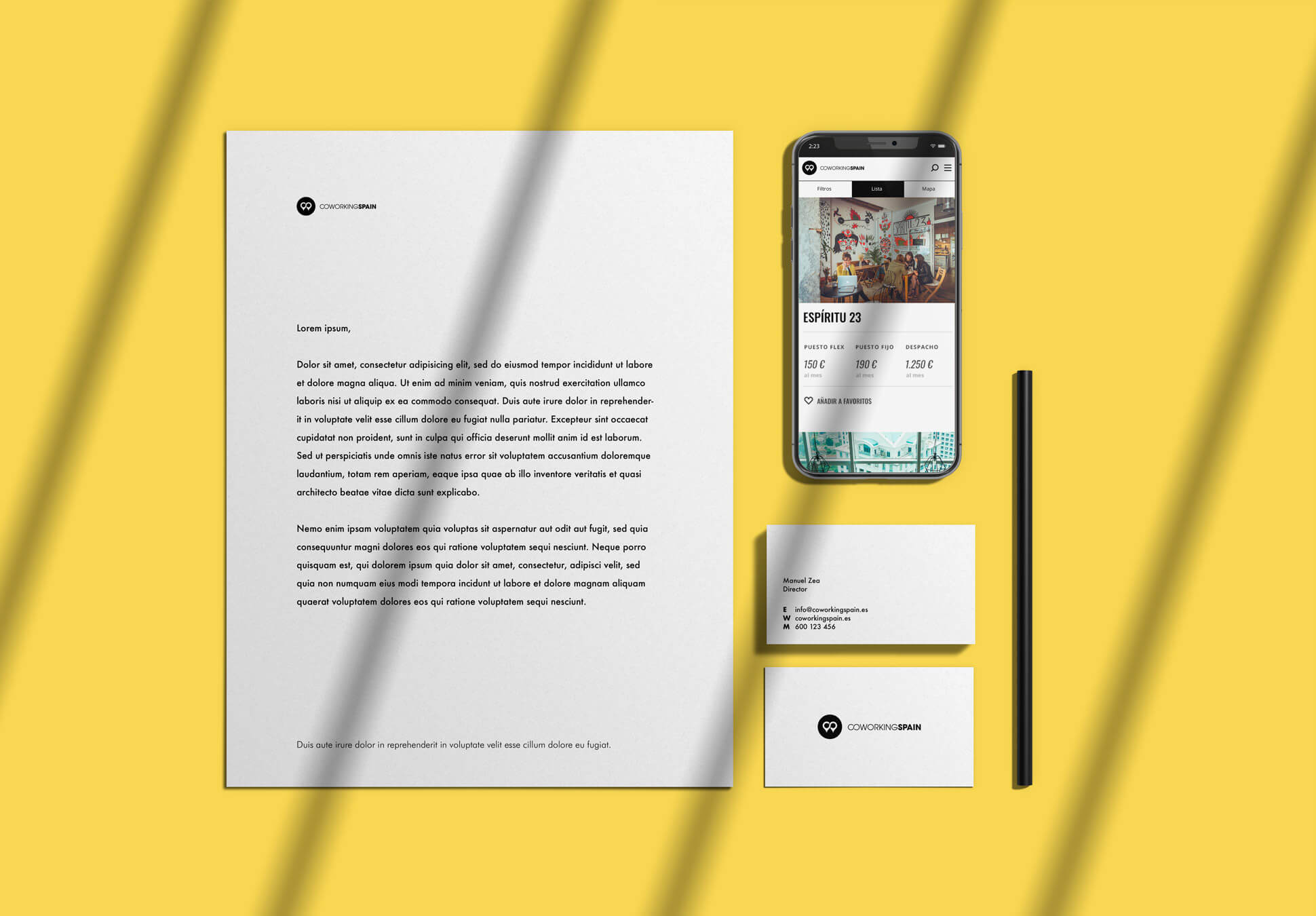
In order to promote the idea of coworking in Spain and facilitate the process of finding an ideal space, we redesigned the Corporate Identity of the brand, developed the website and created online marketing campaigns.
The brand
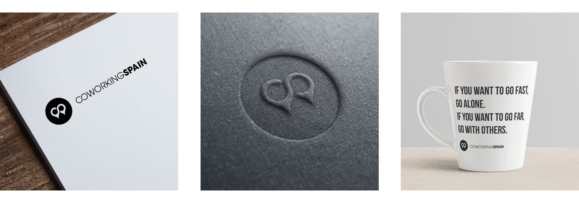
The brand we created is formed by an anagram of two location points connected on the map. With that we represent the main characteristic of the business: to be a meeting point for all coworkings in Spain. The union and the connection are also represented in the link between the letters C and O.
The main colours to be used in all the visual communication of the brand are black and white. On the website the use of yellow will be enhanced in order to preserve a more formal language and generate confidence in users but also providing a touch of innovation, creativity and modernity.
If content is fire, social networks are gasoline
Aiming to promote the culture of coworking and this new style of work we were managing the social media of Coworking Spain, where we focused on promoting venues, events and inspirational workshops.
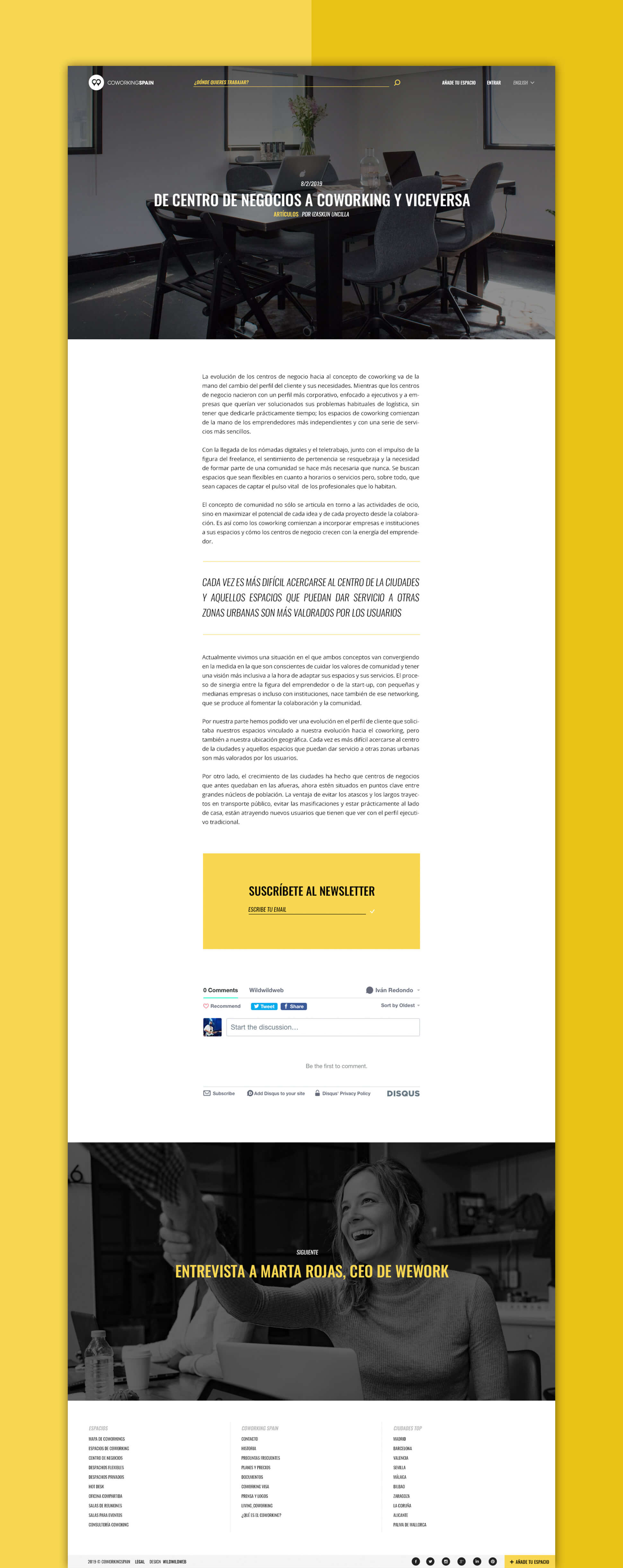
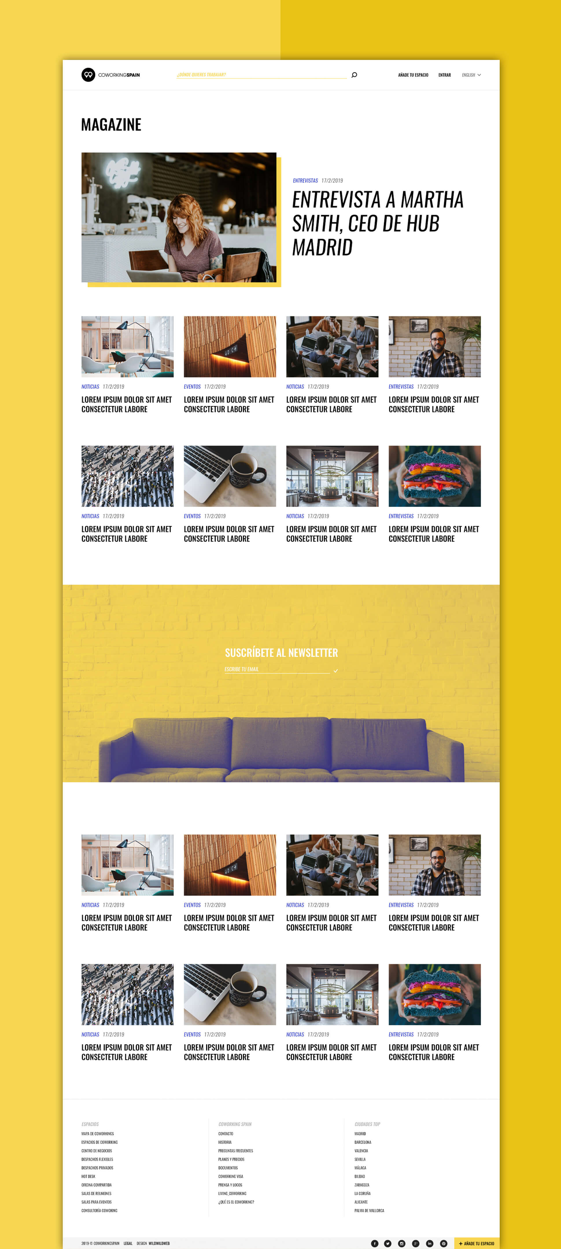
We created and developed an online magazine with articles on topics related to coworking, from industry news and events to interviews and lifestyle blogs.
In order to promote the website and advertise coworking spaces, events and the created content we also run email marketing campaigns.
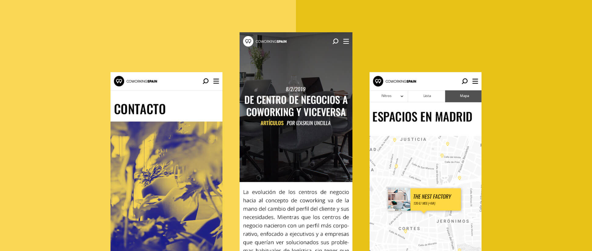
The website
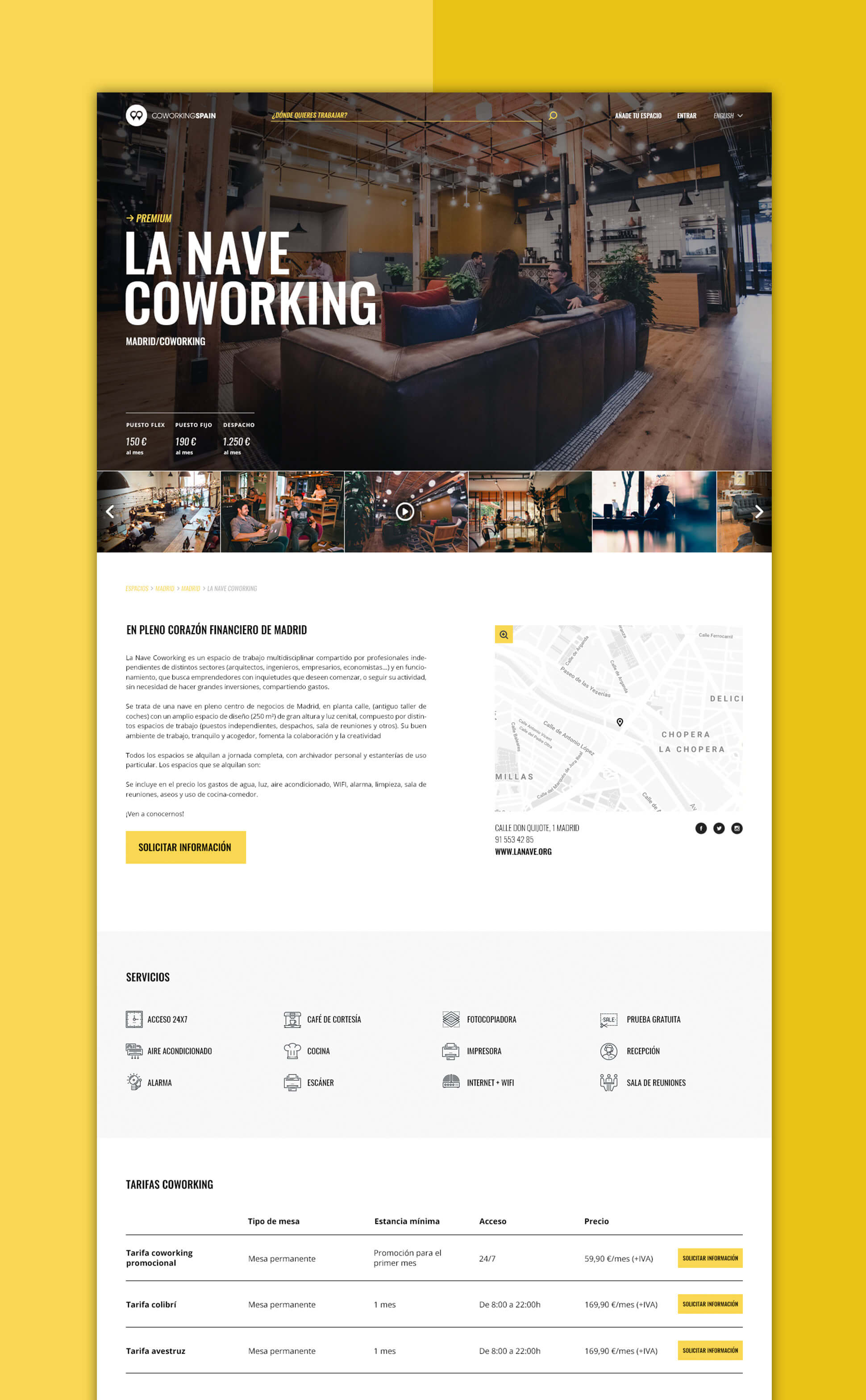
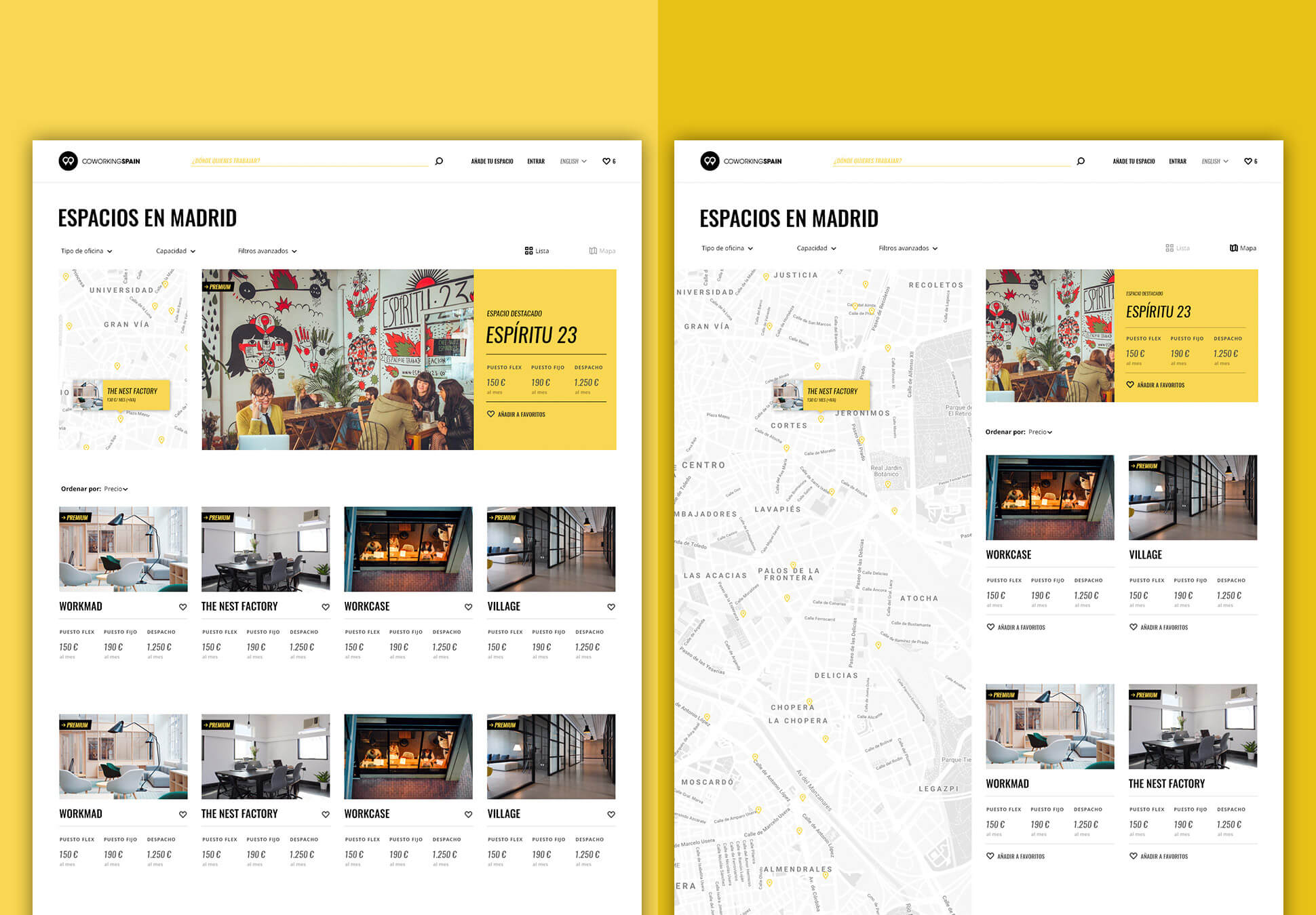
The objective of the redesign was to improve the findability and renew the image of the web, which was somewhat outdated after 5 years since the last restyling.
After carrying out the usual process of user experience design, the main pain points were identified and the solutions for each of the problems were proposed.
The result was a new interface with a minimalist and slightly hipster design in which photographs of spaces and typography are the leading themes. The yellow color and a careful selection of icons help to guide the user through the interface and various calls to action.
The new header keeps the most relevant actions always visible and the new search and space filtering system makes finding workspaces and meeting rooms much easier and more intuitive.