Necsa is a company dedicated to the management of non-hazardous waste with a strong environmental and technological component that it wants to transmit through their image.
With these guidelines we developed the corporate identity. The use of color in the logo, with a range that goes from red to green passing many tones, represents the process of waste since its collection to its recycling. We avoid the use of green as a primary color because, after studying the competition, we noted that in 70% of cases that was the color used by other companies in the sector. In this way we differentiated ourselves from other competitors while pitching a design based in a very wide range of colors.
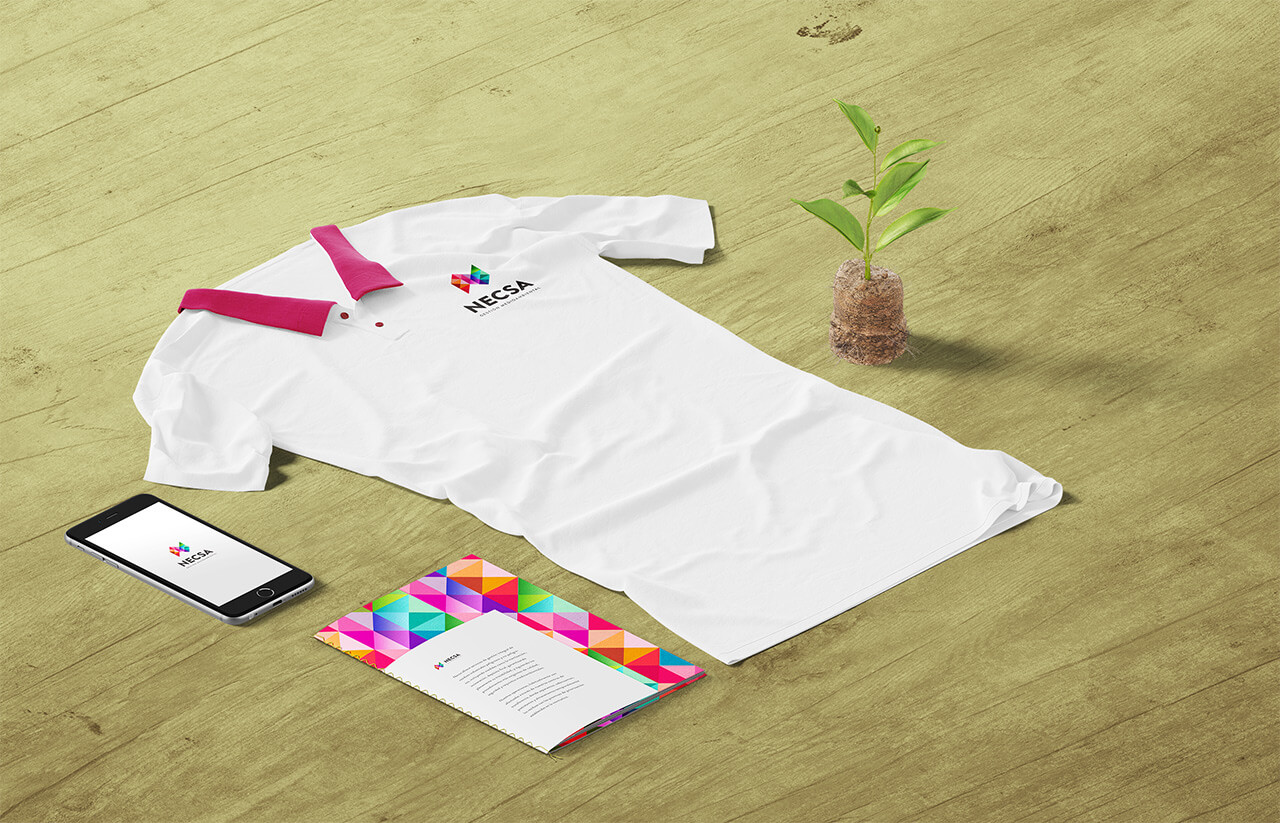
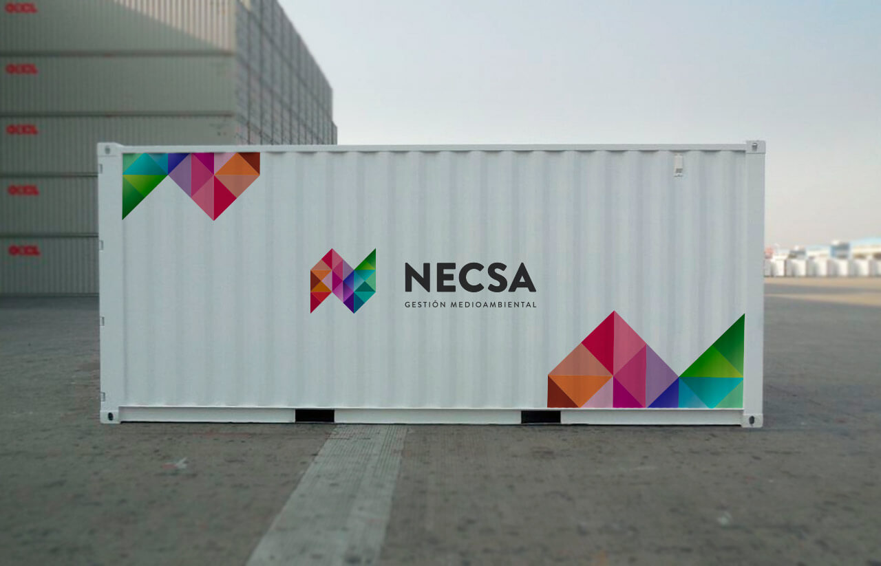
Once we chose the logo we went onto creating the different applications it would have in stationery, uniforms, vehicles and containers. Trough these media we played with the color patterns that the logo has to offer so all elements that will be at street level (especially trucks and containers) are easily recognizable.


