How can we help?Get in touch
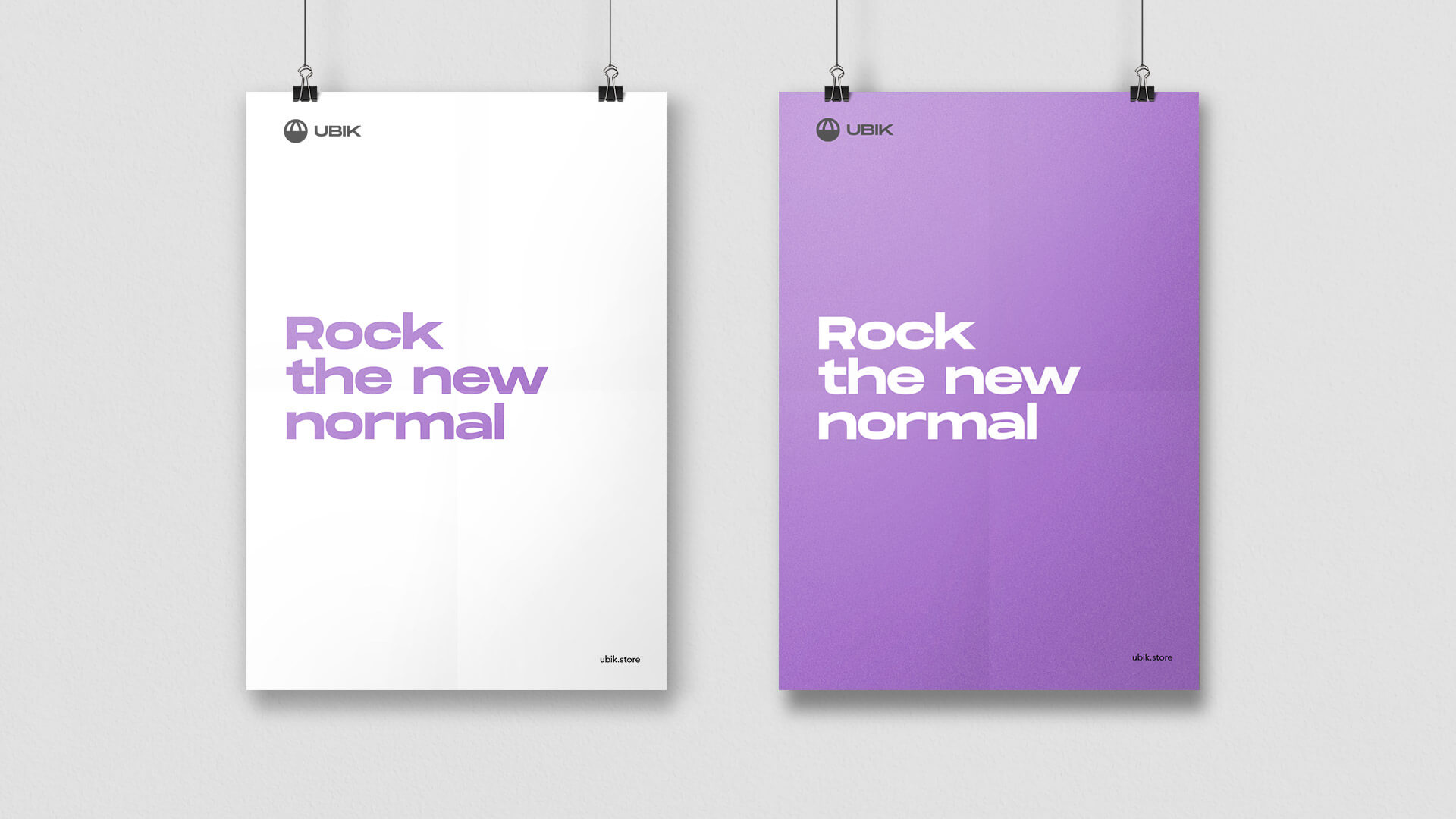
Ubik is the new brand for designer face masks. It makes us feel unique and look more stylish.
After the outbreak of Covid-19, the world's demand for face masks became more prevalent. We embarked on an adventure creating a brand, product line and marketing in the space of four weeks.
After a few days of market research and some validation tests in a lean startup approach, we went straight into the brand’s creation.
Naming
We began to model the brand around concepts that we knew should be part of the DNA from the beginning: it should be a responsible, optimistic, eco-friendly and socially aware company.
The brand had to be a breath of fresh air in the sector.
After extensive (and urgent) work of study, compilation and validation, we got a winner: a short, sonorous, memorable, apparent and easy to remember name: UBIK.
Ubik. of the Latin ubique, the root of ubiquity (omnipresence)
· in botany or zoology, a ubiquitous organism is one that occupies all the geographical areas of the globe.
· in technology, it is used when we can be connected to a network at all times, no matter where.
· in theology, a deity that is present at the very same time everywhere.
We found the concept super powerful as it encapsulates the idea that globality and joint action contribute to making the world a safer place for all humanity.
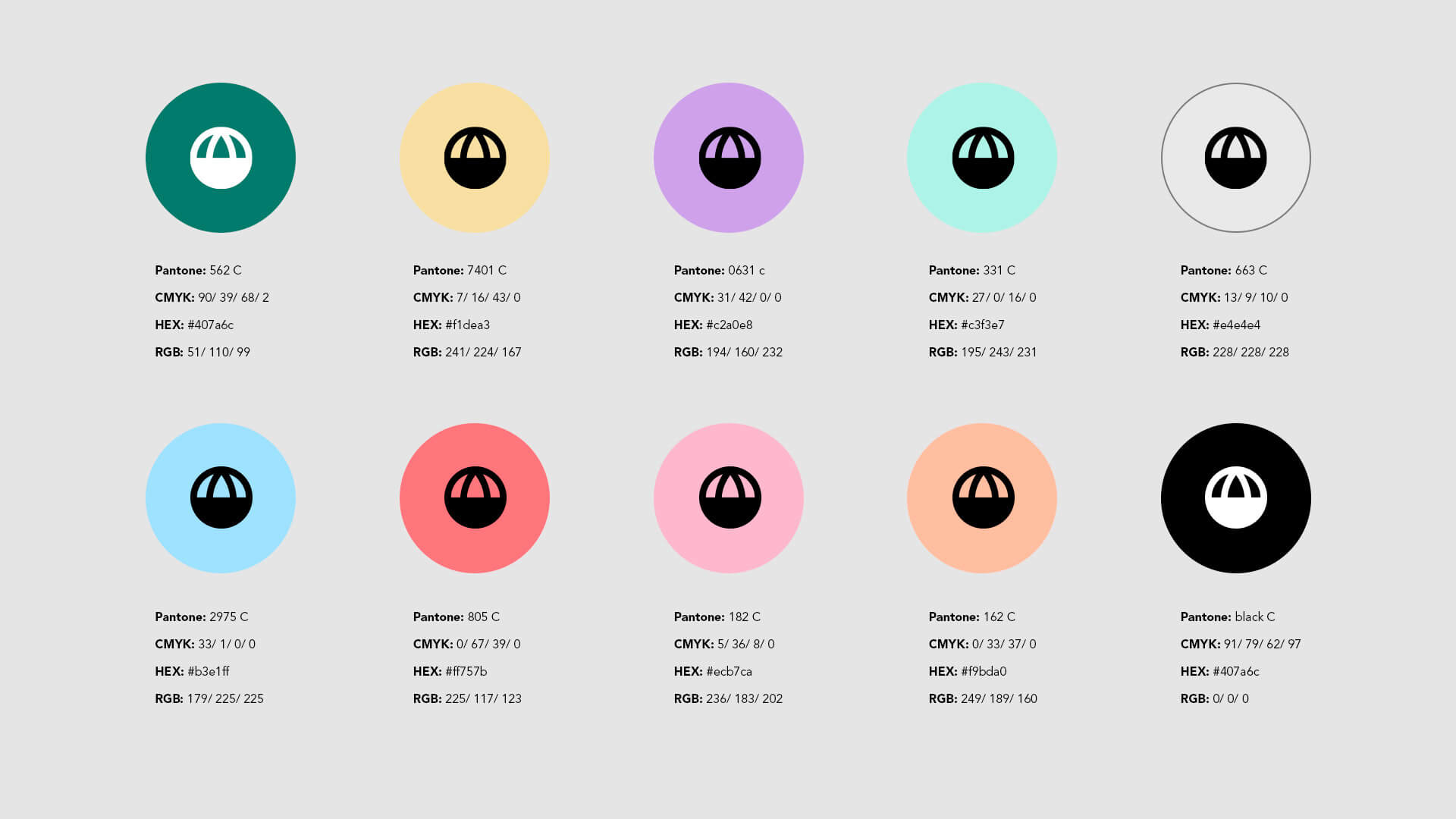
Visual Identity
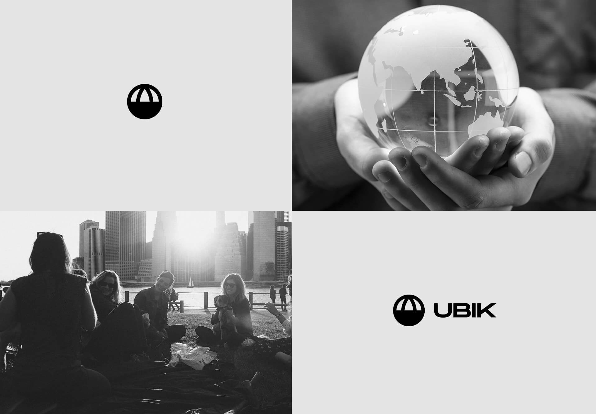
The symbol of Ubik is the conceptual representation of the earth, a reference to the concept on which the name itself is based (everywhere, around the world), whose lower half is covered or protected.
In addition, in a more abstract way, he wants to represent a face wearing a mask, alluding to the dual meaning of the protection of the earth and our own.
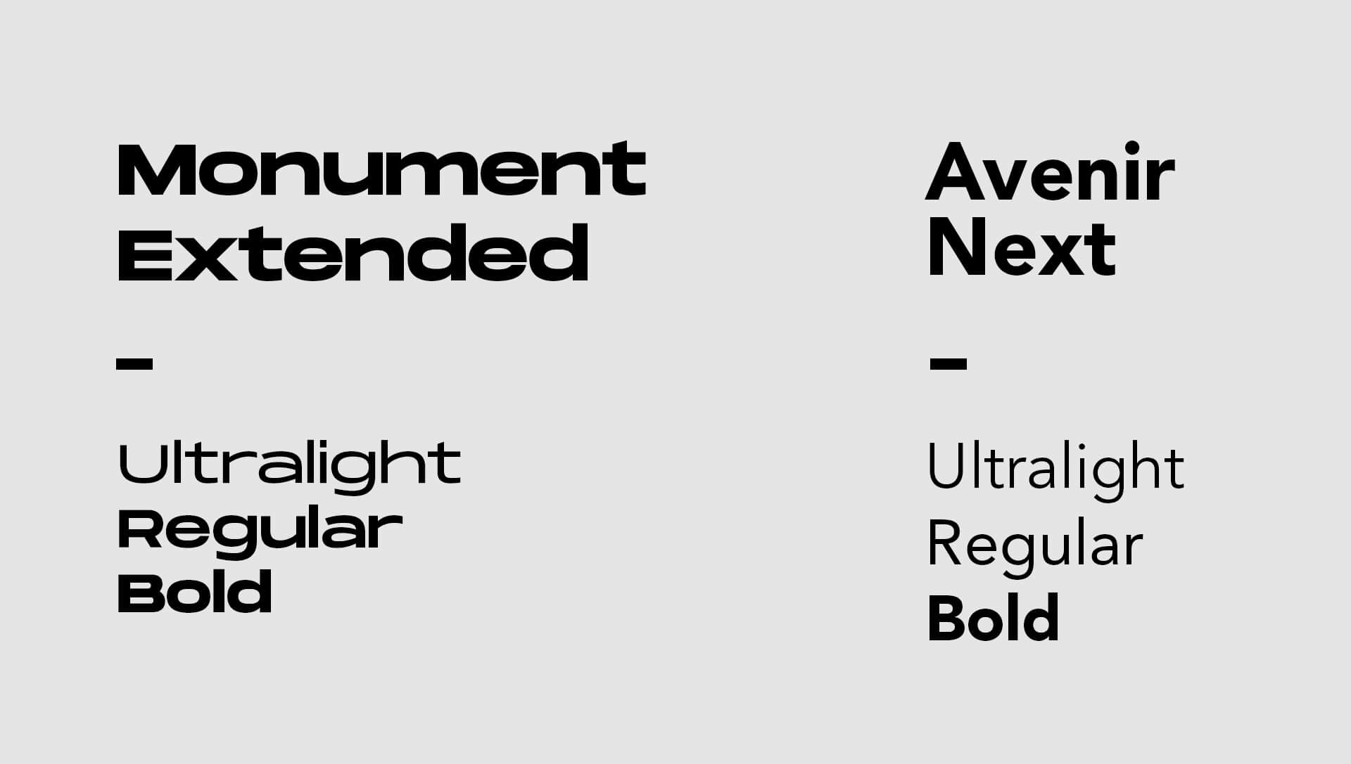
The main font is Monument extended, an sans serif font from the Pangram Pangram foundry. It is a very versatile typography that shows avant-garde, unique and powerful aspect that we wanted to convey.
As a complementary font we chose the Avenir Next, a reference typography in the world of design that allowed us to generate contrast and provide readability.
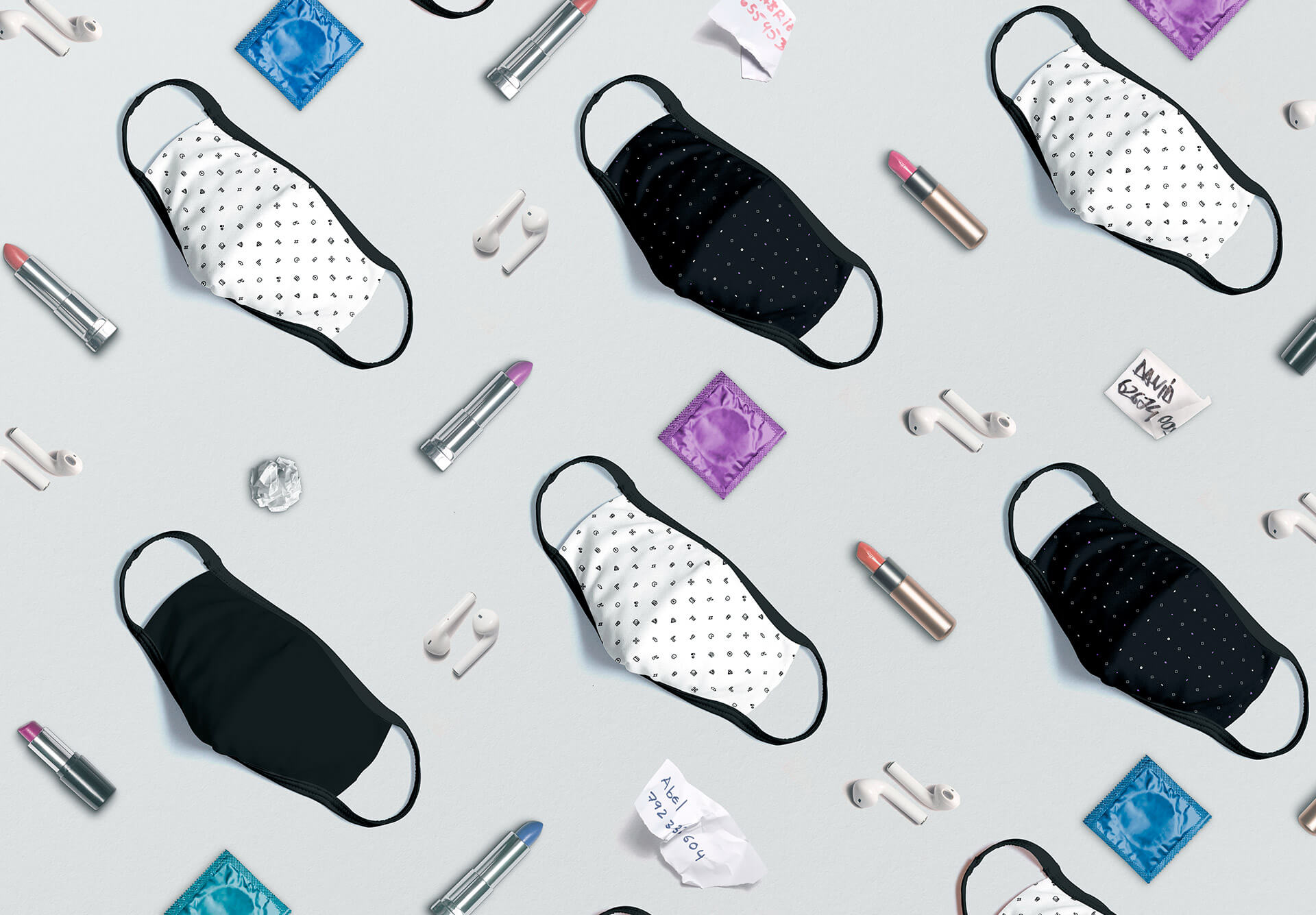
Product design
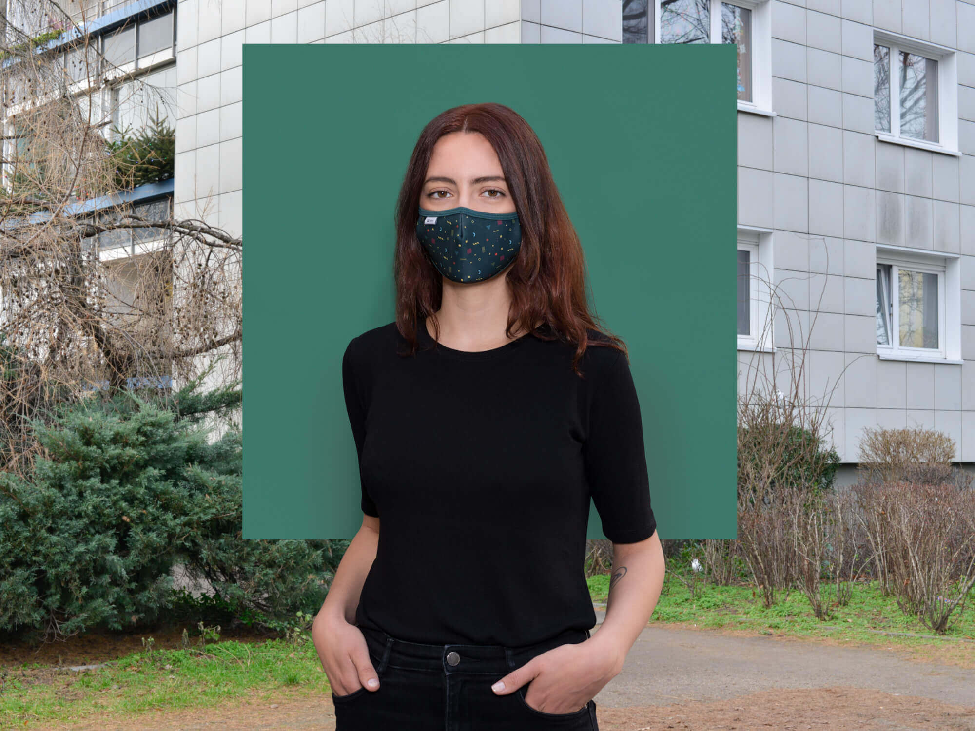
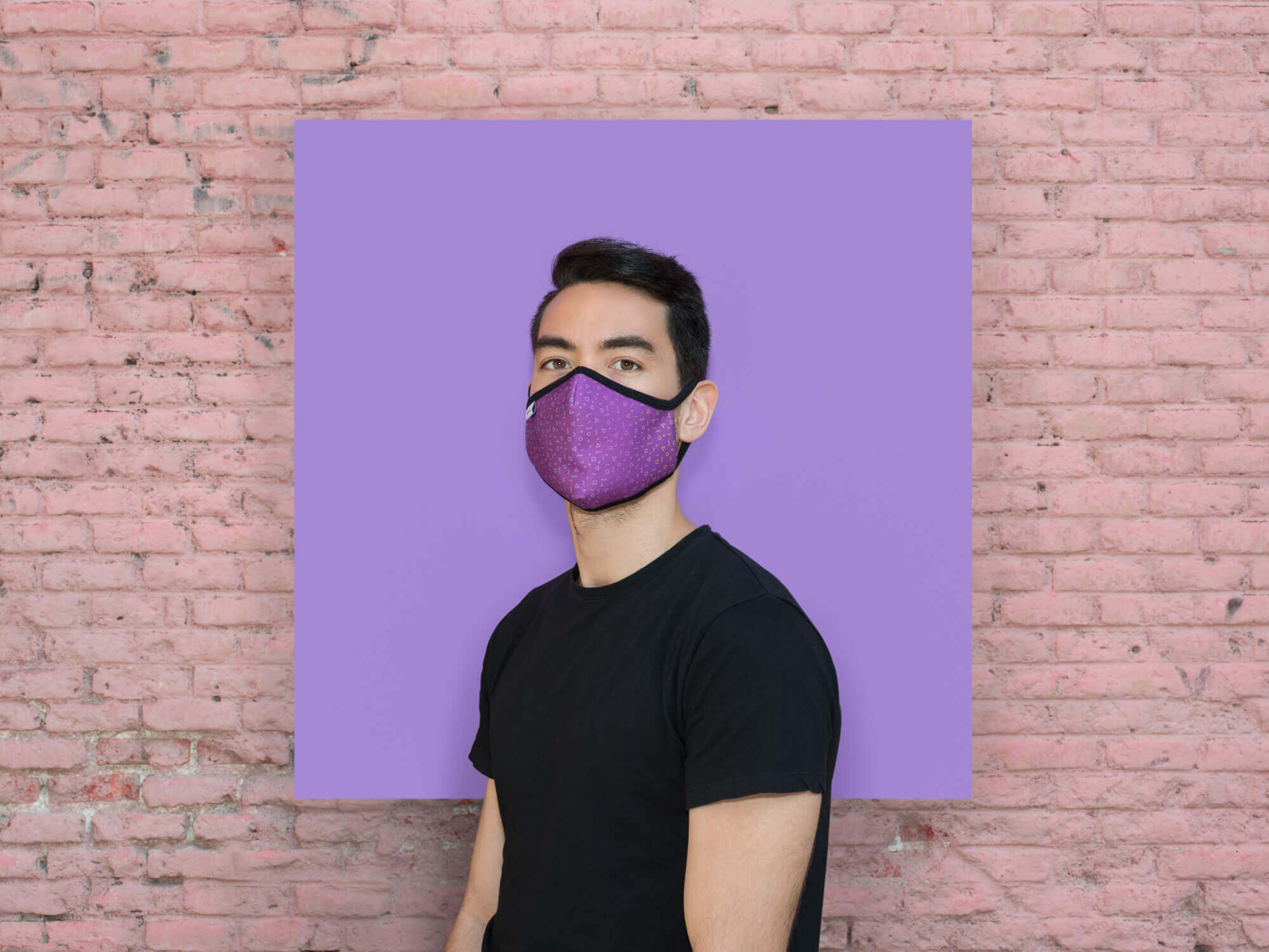
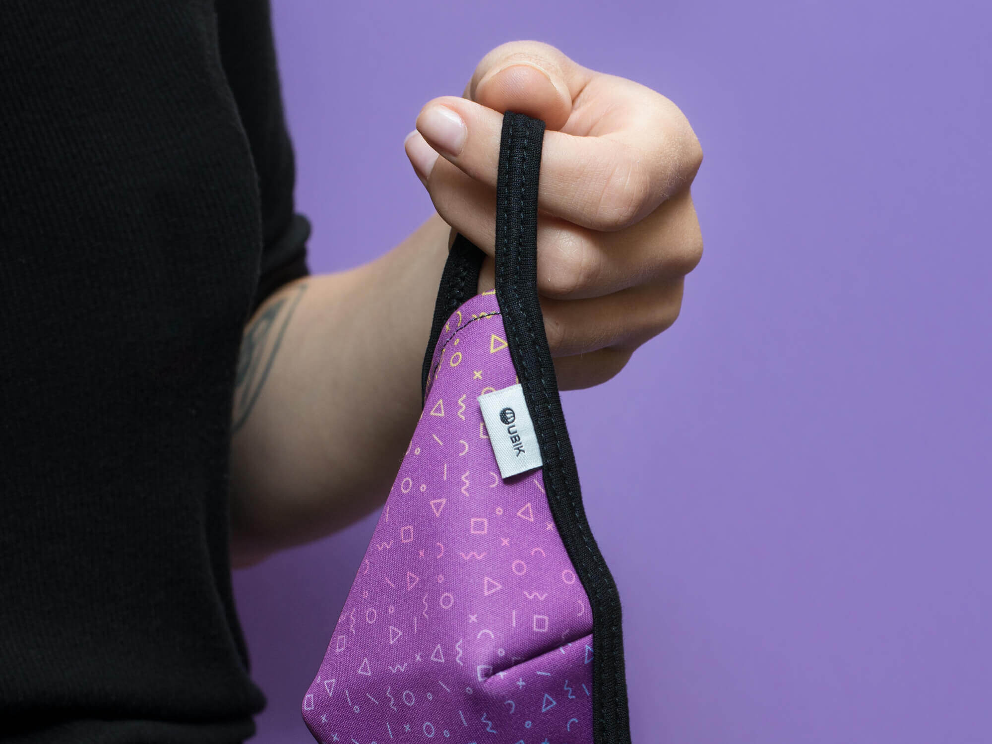
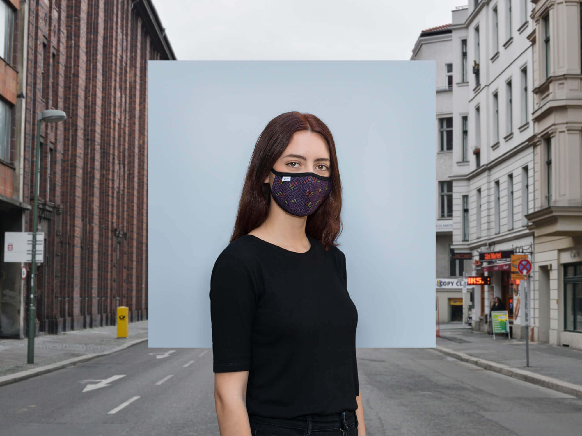
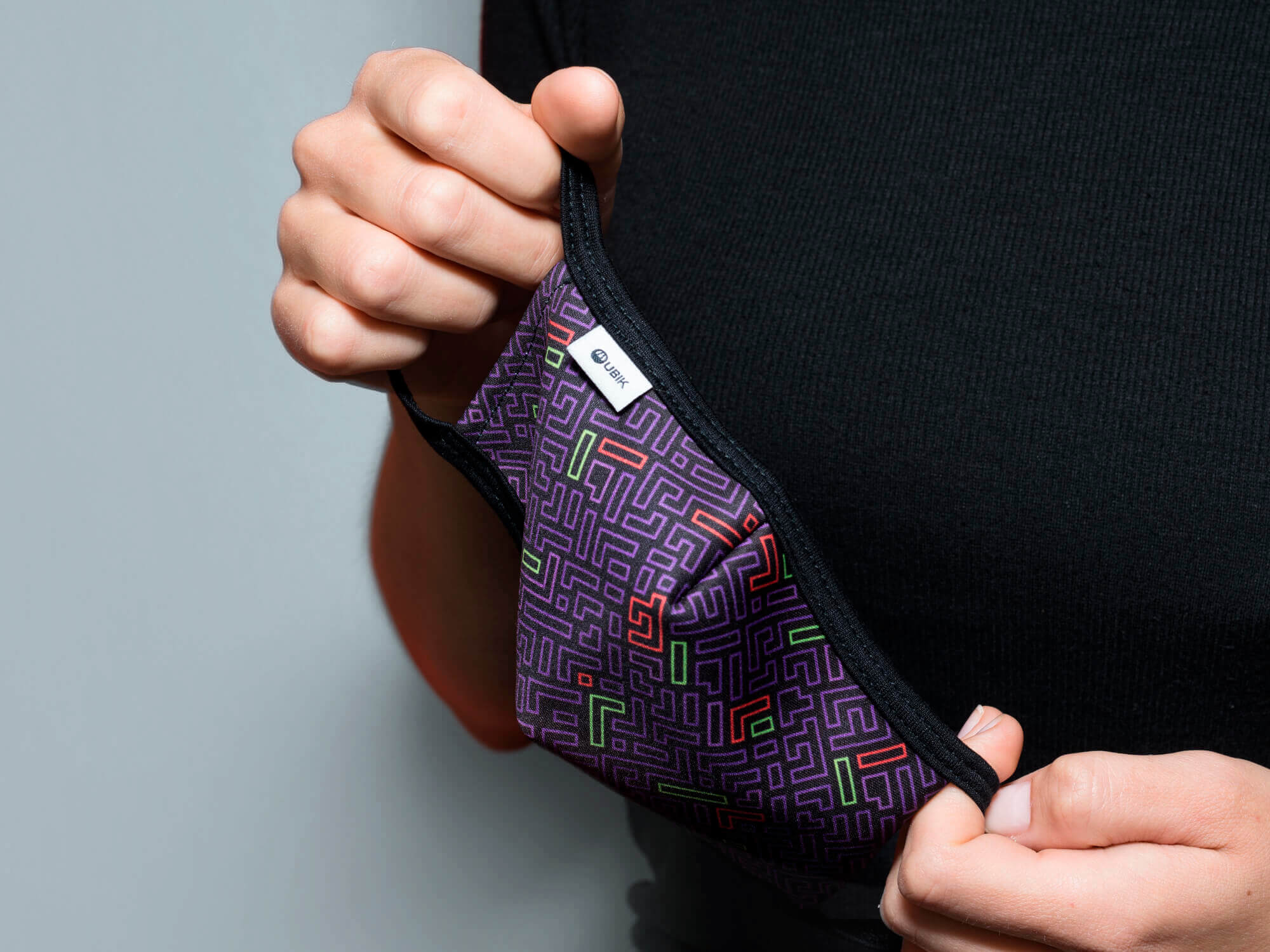
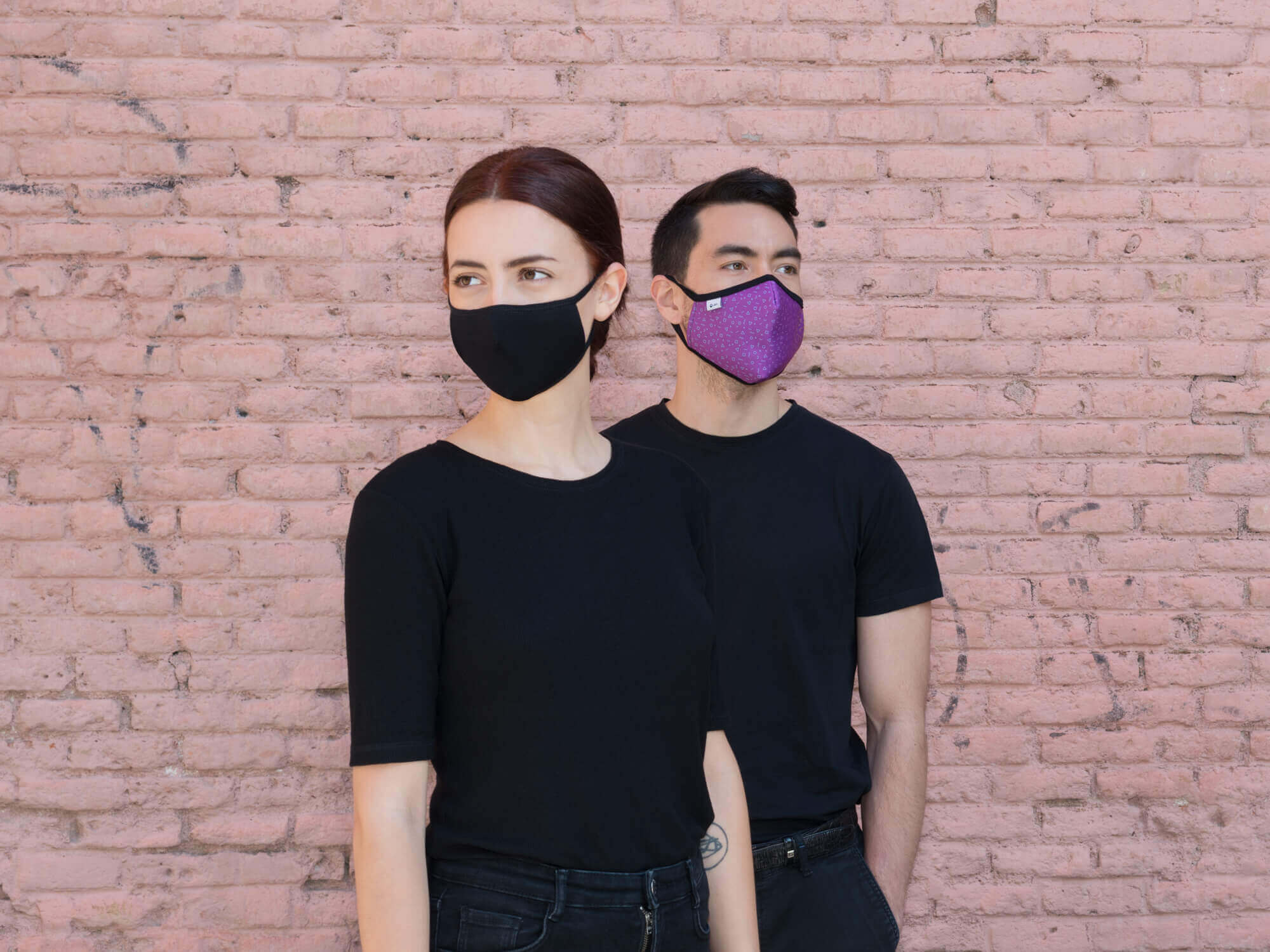
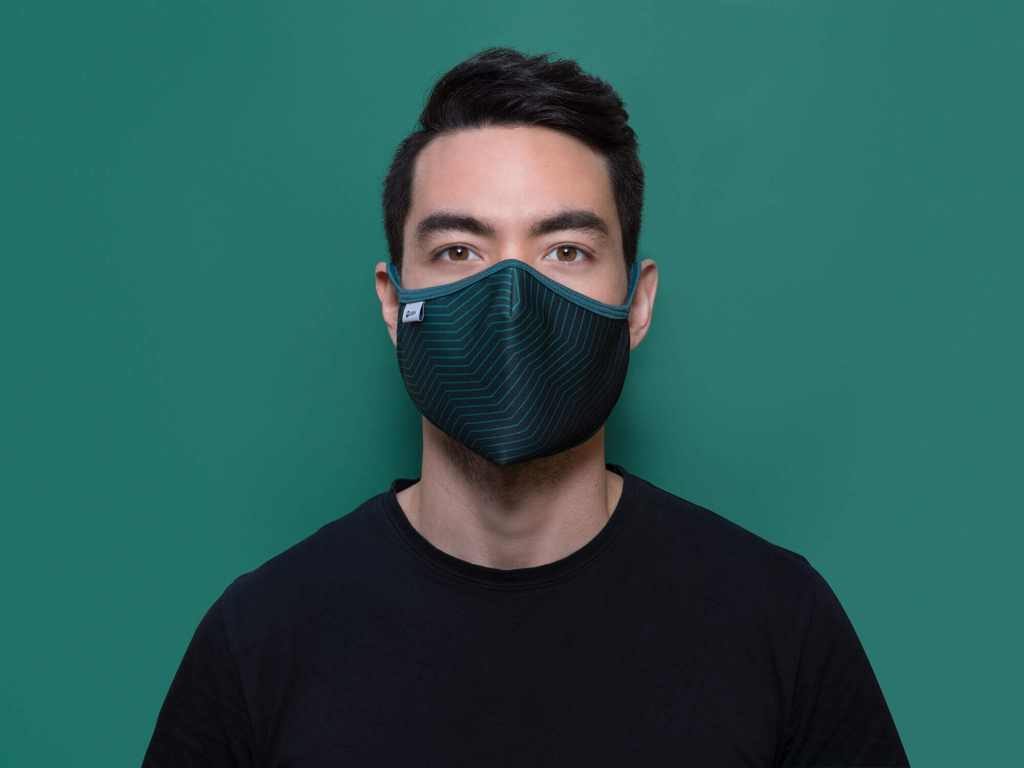
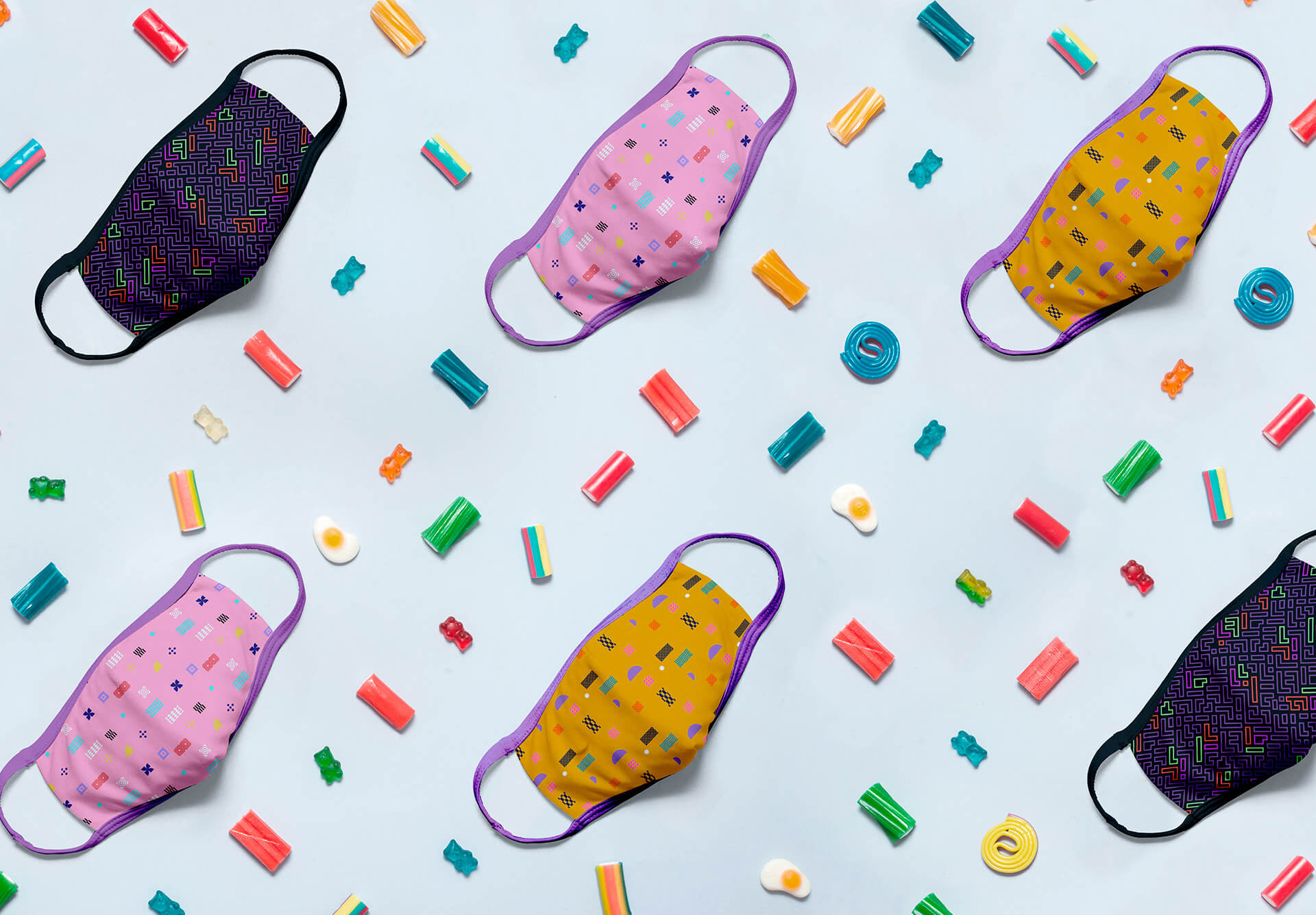
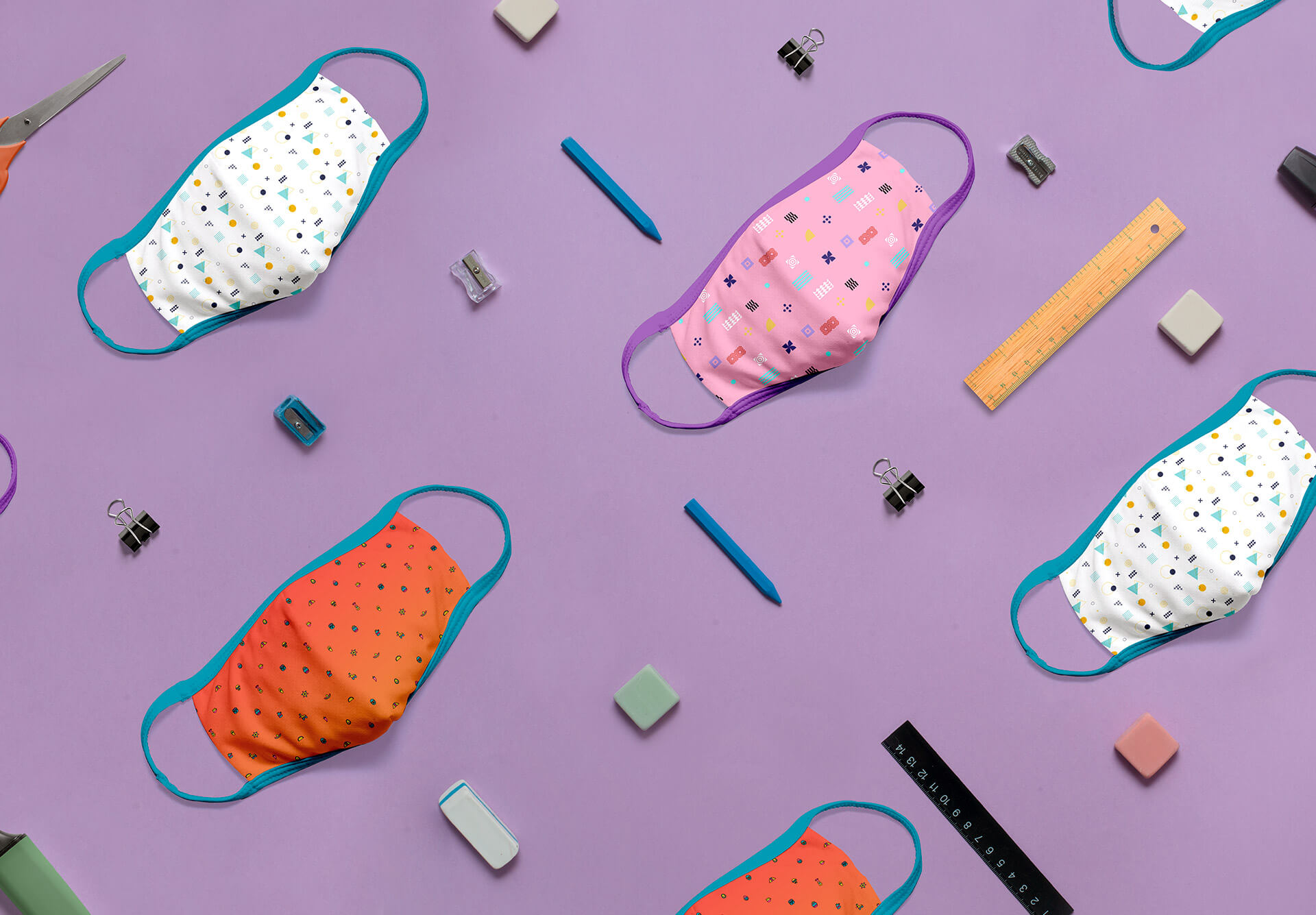
For product design we collaborated with different professionals from the Spanish textile industry who helped us shape the mask concept we had in mind.
We chose designs based on geometric patterns and icons with a wide range of colors, while at the same time being comfortable, washable and with above-average filtration characteristics.
To reinforce the concept of ubiquity and globality we decided to name each mask model with the name of an emblematic or charming place.
Chiang Mai, Aguas Calientes, Lanzarote, Rishikesh, Tulum, Canggu, Zanzibar, Essaouira or Leipzig are some examples of these unique places that fit perfectly with the spirit of the brand.