


How can we help?Get in touch
School of writing and translation
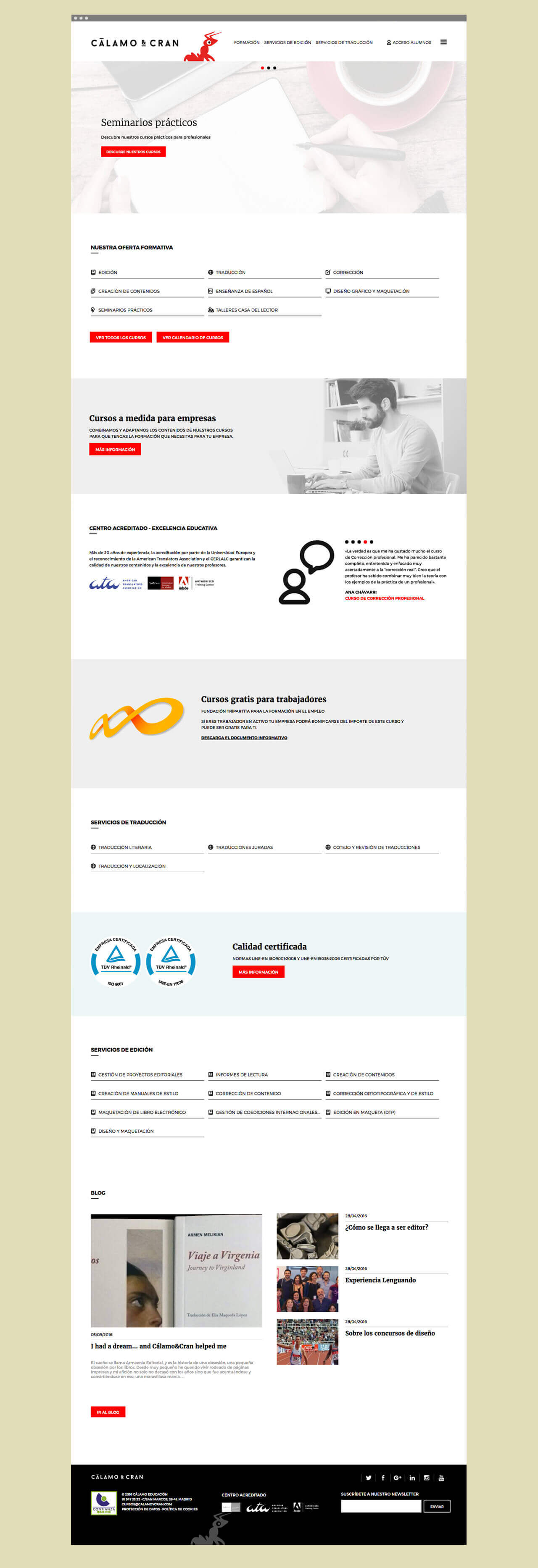
CÁLAMO & CRAN was founded in 1997 as an editorial services company, a pioneer in proofreading services. But thanks to the expansion of its services and training courses it has established itself as a leader in training and translation nationwide. We handle the redesign and development of its new website, as well as the logo restyling.
Restructuring Content
One of the most complex challenges in redesigning the website was restructuring the content of the old site and adapting it to the new one. For that purpose constant collaboration with the customer was fundamental, they let themselves be counseled and adapted to our creative process. Moreover, being a responsive web the challenge of restructuring it was twofold.
Powered by Drupal
We propose for the new web site architecture based on Drupal 7. Despite being a standard web structure, some sections had a drastic need to be adapted to the customer’s needs. SEO positioning and remarketing are crucial for this business, so we had the Webform modules adapted to our data needs. Finally, we have taken into account during the development of the site any future improvements that may happen to the website, so that the registration and reservation system can be transformed into an online store when the customer needs it.
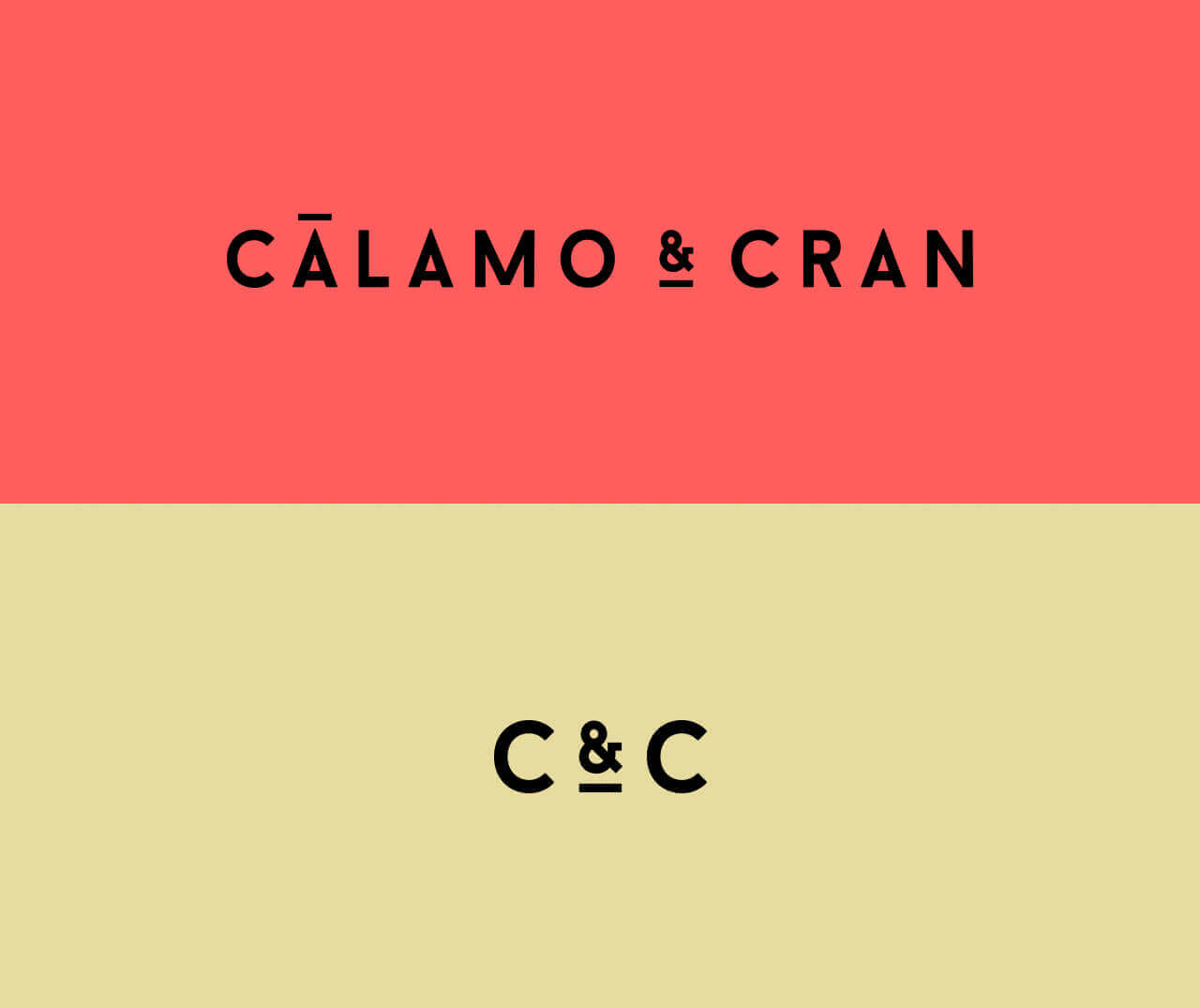
Restyling of the logo
Following the line marked by the redesign of the web, we made a restyling of the logo to fit the new global image. It ended up looking fully integrated to the new image of a more coherent and modern way.
Aiming for the responsive
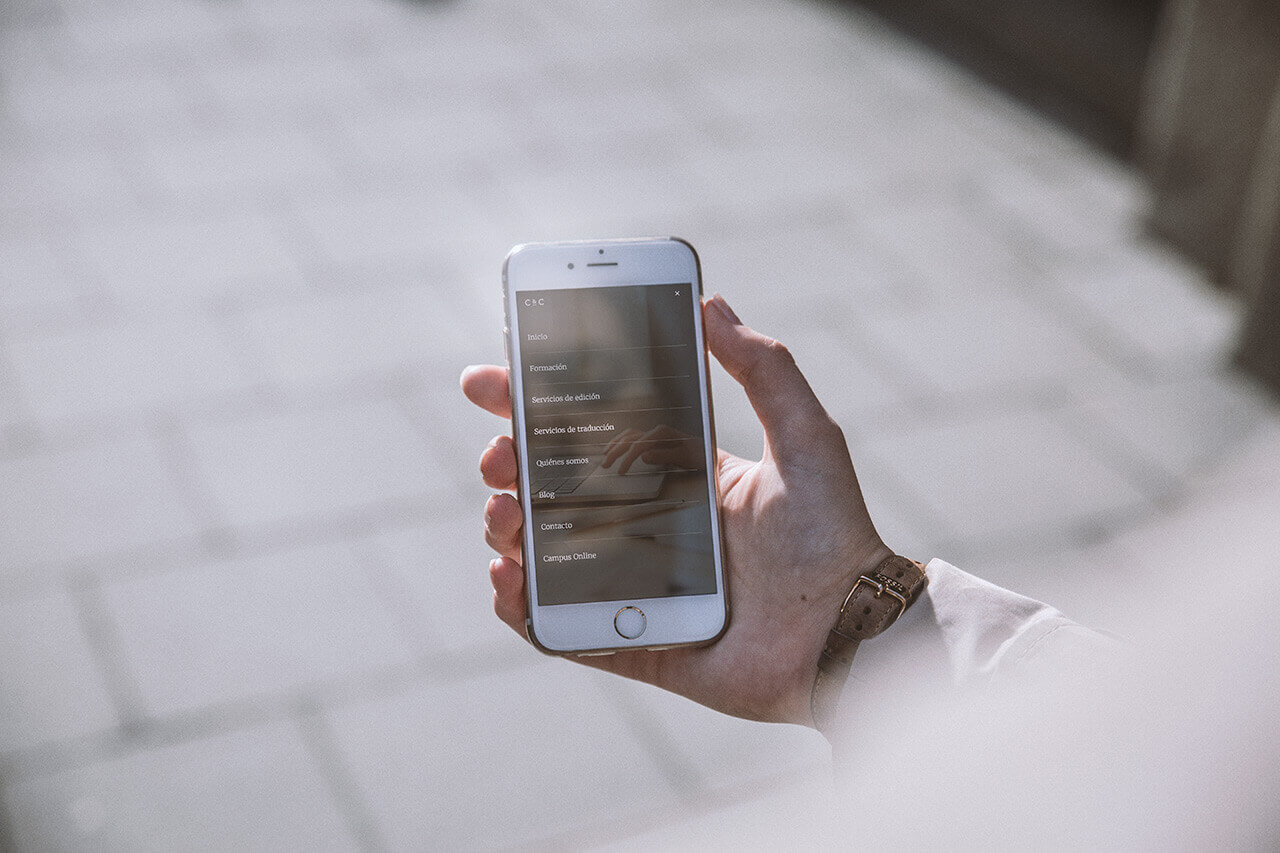
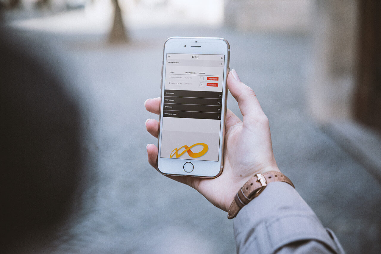
To carry the redesign to fruition, the Mobile First and responsive paradigm were considered at all times, taking us to perform very complex solutions but at the same time very powerful for the user experience. The adaptation of all content to different screen sizes and screen orientations has needed five types of media queries to fulfill the first rule of responsive design: Do not hide or remove to adapt.
One of these solutions was the combination of an "offcanvas" responsive menu with a small conventional menu to adjust to the customer need to show all their service offerings in a manner accessible to the user. This menu is suitable for both tablets and mobile in a fluid way. The user never loses sight.
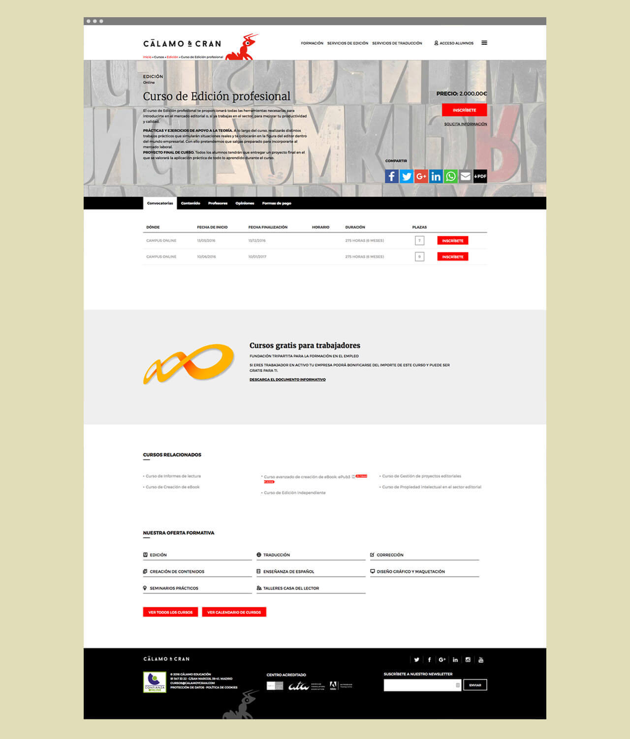
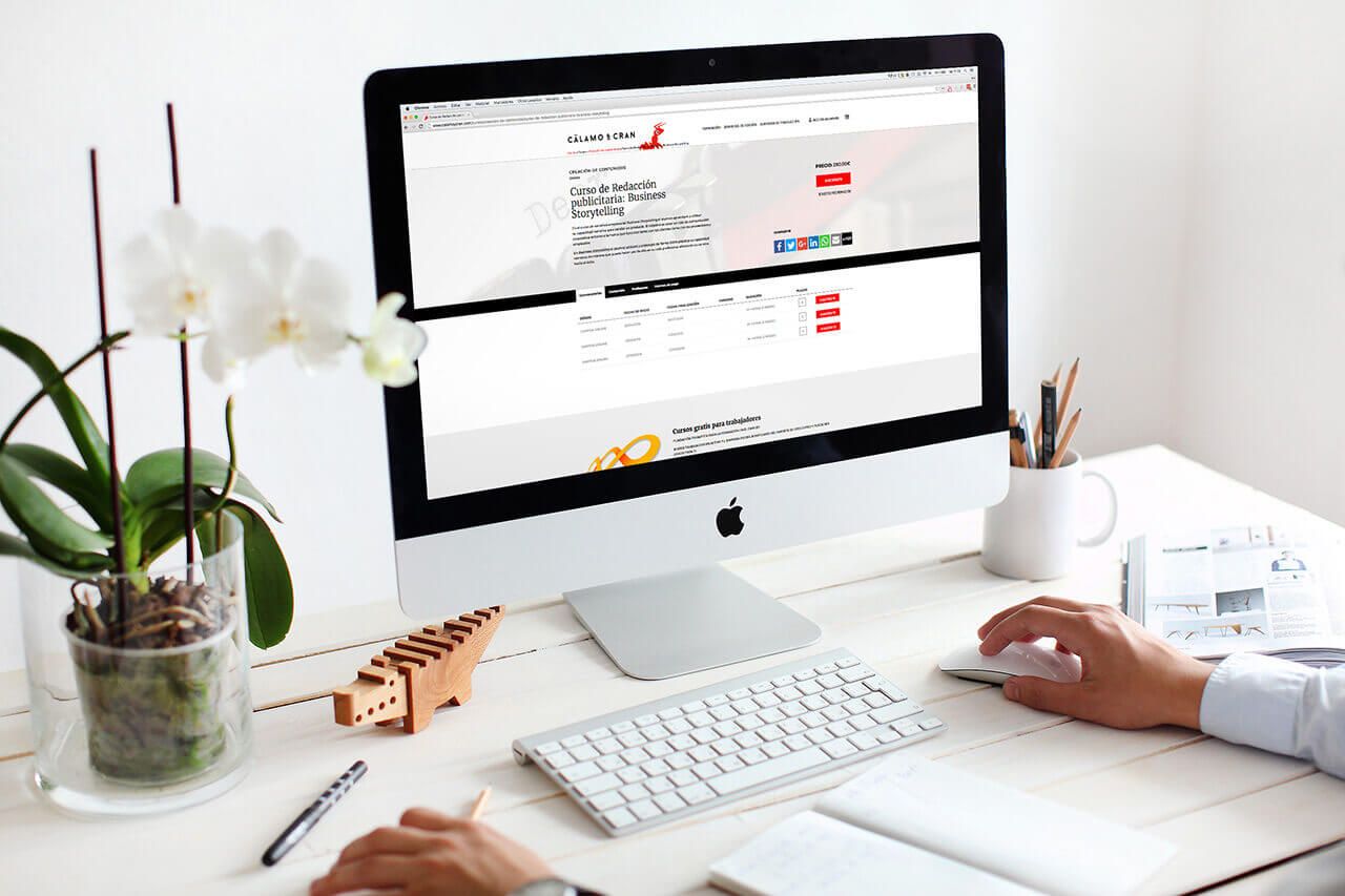
Another one of the toughest challenges was adapting all the information in "tables" in an intuitive way for the user, so we use a customized version of FooTables Drupal module. This solution allowed us to transform automatically the format "table" from the section "Calls" to an "acorddion" or dropdown format on tablets and mobiles without sacrificing some of the information and returning to fulfill the first rule of responsive.
It was also a challenge to structure the "Payment" section within the courses. The client needed a fully open configuration that allows creating different fields depending on the course and this is not easy to show in a fluid way. We use a field nesting system combining Field Groups and Field Collections. This allowed us to group a number of fields so that the customer has complete freedom of content creation, adding few needs, and we complete freedom to fit multiple screen formats in the final design.
Do it yourself
Despite the complexity of the design, its adaptation to responsive and web architecture, once the project was completed it was also achieved the total autonomy and non-dependant on us to edit 99% of the information displayed on its website.
So we've developed a custom Dashboard from the client to access the creation and editing of any type of web content (courses, teachers, services, blog, etc ...). The fields that make these types of content are freely configurable by the customer and easily viewed thanks to modules like Choosen or Field Collections.
The SEO part and web Metatags are also fully editable by the customer accessing from the Dashboard or from the content tabs. This allows the customer to have control at all times of any improvement over positioning or remarketing without depending on us.
The client has a powerful, independent web development took and fully self-manageable. Something that is not always possible depending on the CMS used for development. In this case Drupal allows not only all this freedom but can be scaled as the web grows.
