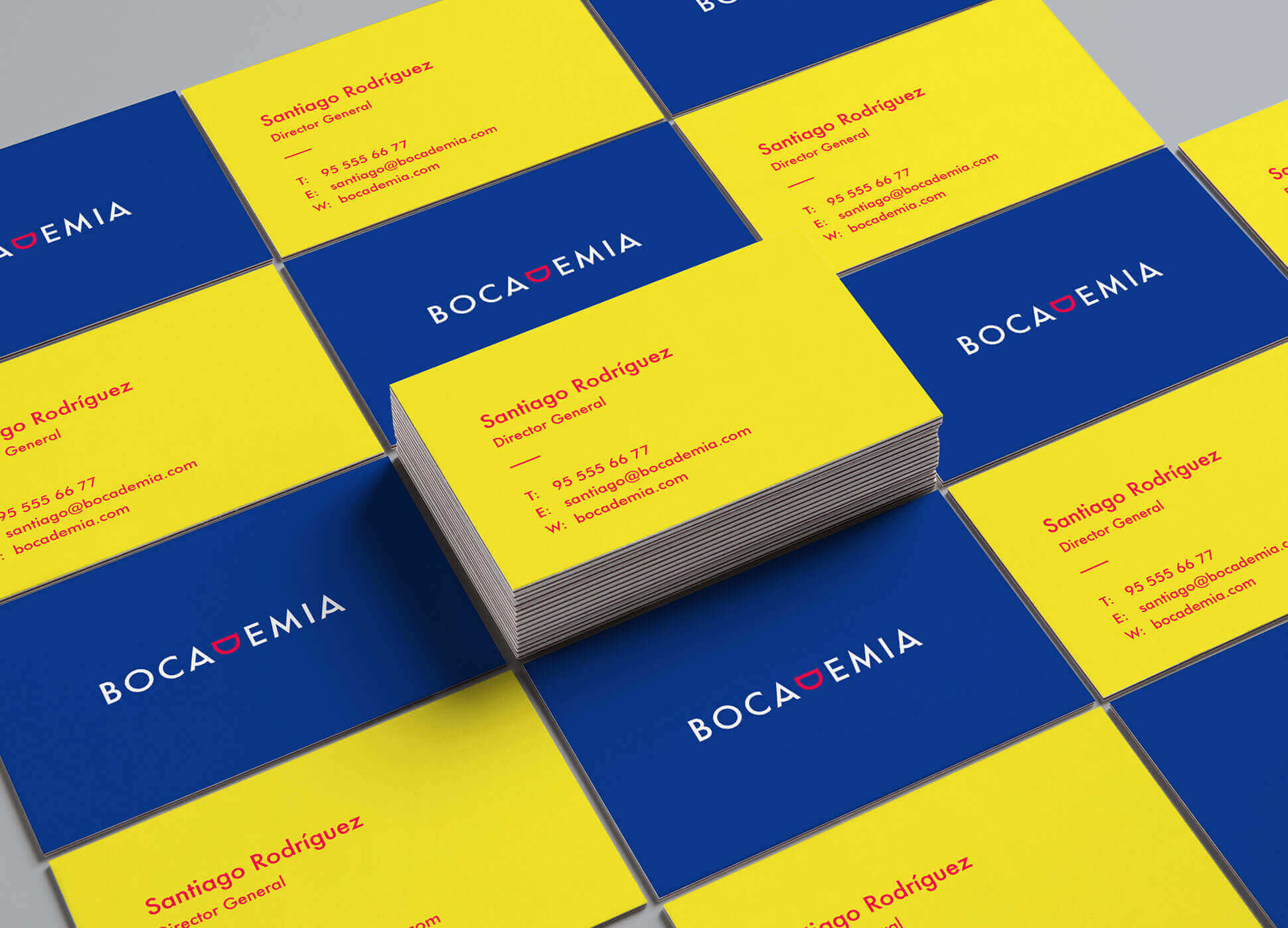
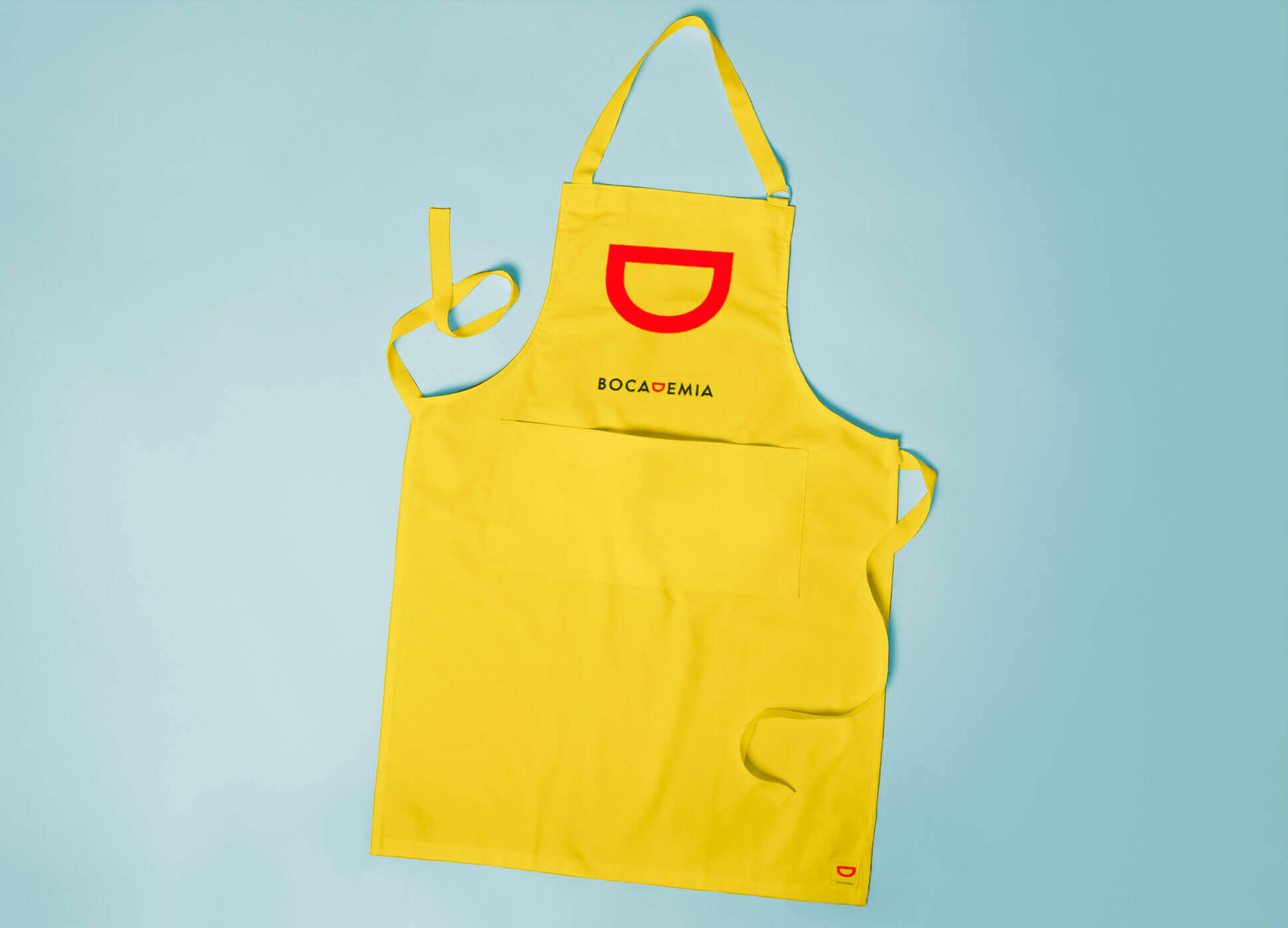
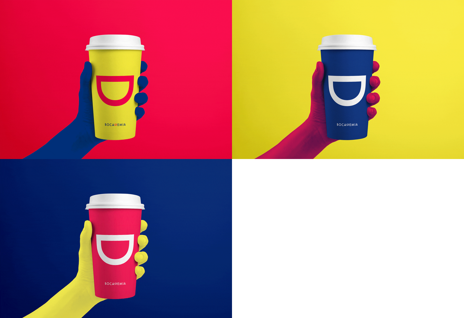
Bocademia was an idea dreamt up by two businessmen who sought out to create a new fast food business chain, based on the typical cuisine from Malaga.
A franchise model that offers the famous Andalusian breakfasts and lunches all over the world: molletes antequeranos, pitufos, serranitos, tapas and of course a range of coffees from the region.

Through a consulting process, we carried out a strategic analysis and diagnosis of the situation to be able later to define the new brand's identity and experience.
A fresh concept was proposed, based on a healthy, ecological and natural alternatives. We escaped the coldness of traditional fast food to continue being as welcoming and friendly as a typical bar in Malaga.
If a brand could be defined as a repository of meanings that build value and preference among our audiences, the name is what represents us.
During the process we always kept in mind that we had to express our uniqueness in respect to other similar chains, through impeccable branding that would transmit the "Mediterranean warmth" with great service.
The name had to be fun, easy to remember, efficient, familiar and ambitious. Bocademia was chosen because it transmits everything we wanted from the start.

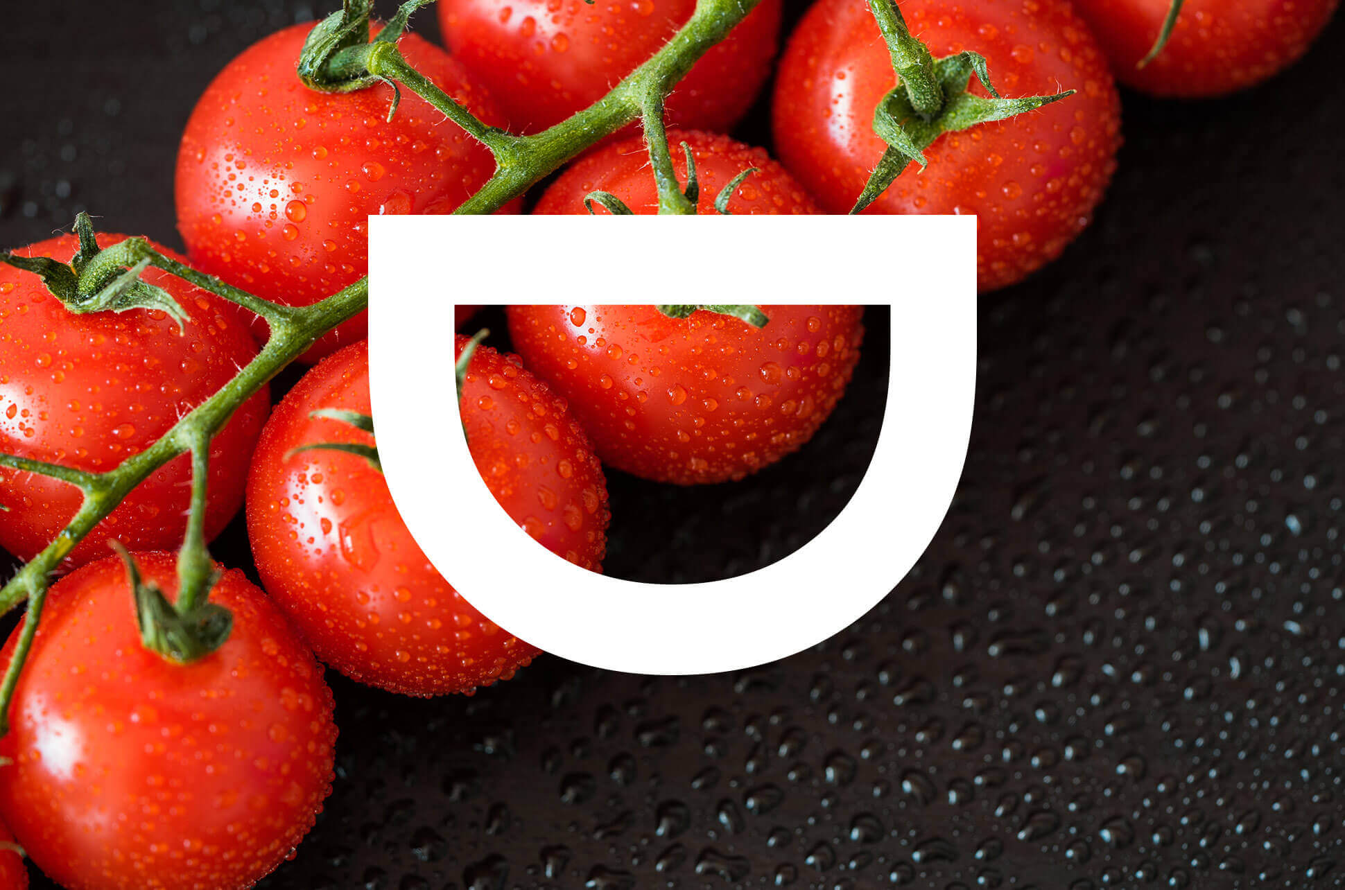
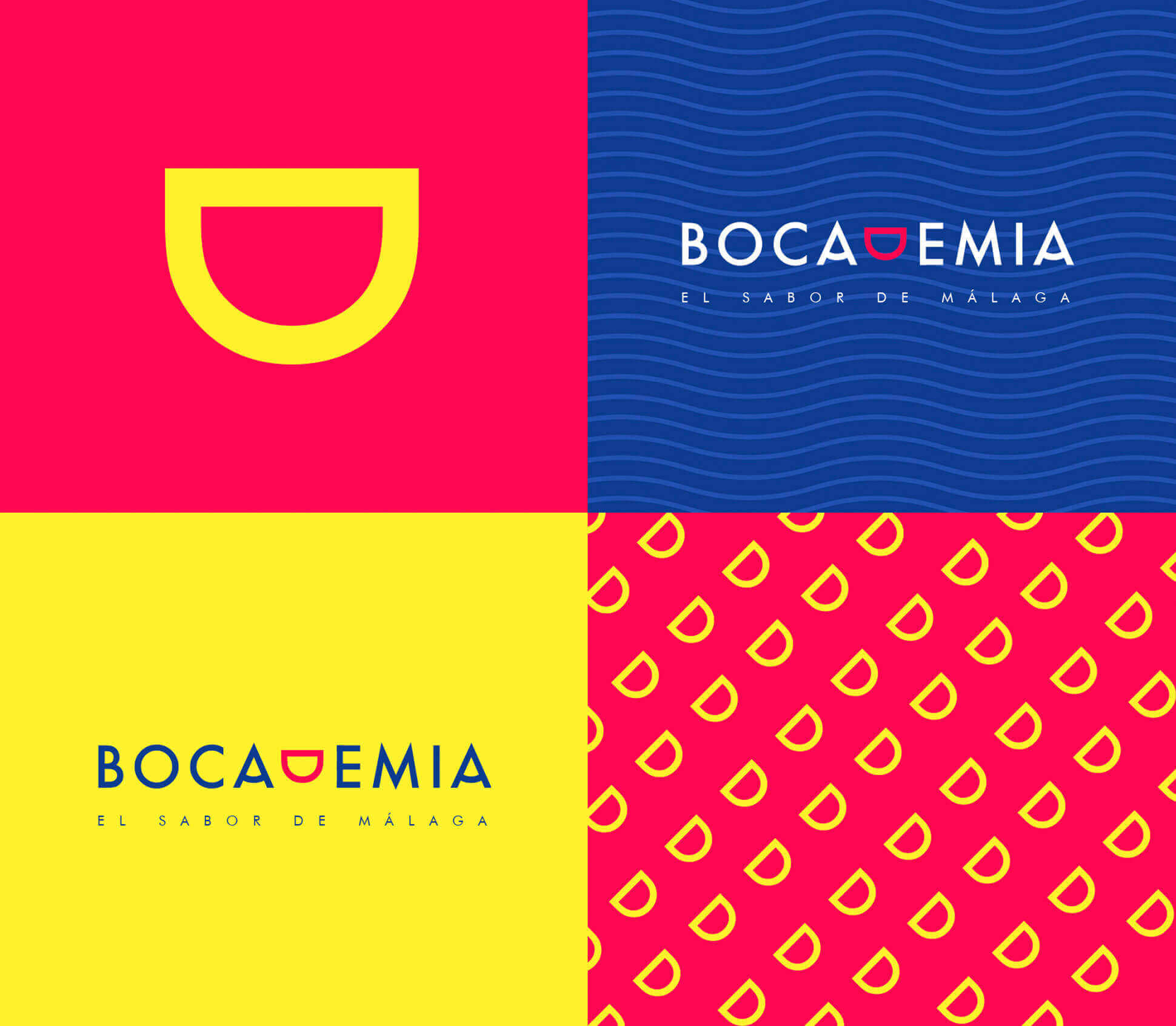
The symbol or icon of Bocademia is the graphic representation of a smile. It conveys one of the most important values of the brand, which is joy. In addition, thanks to a play on words in Spanish, the rebus used (the mouth shape as a D) is the simplification of the brand name: Bocademia.
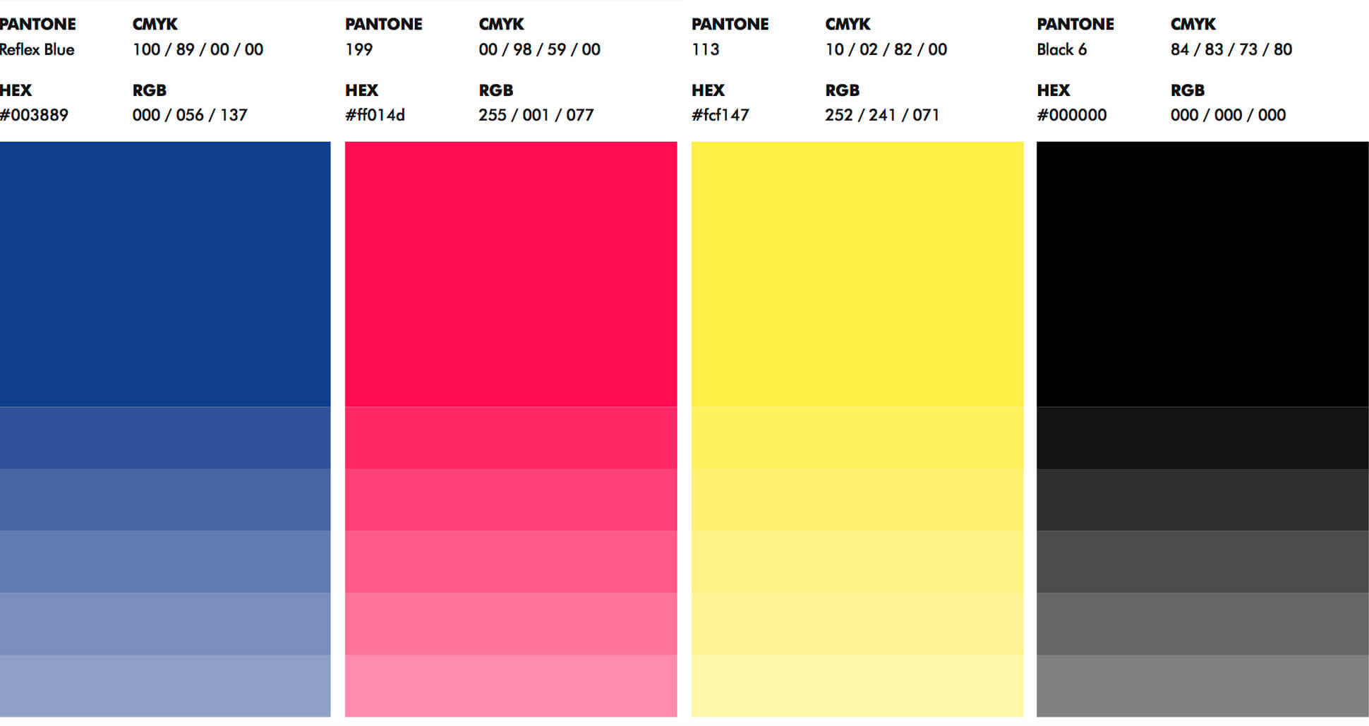
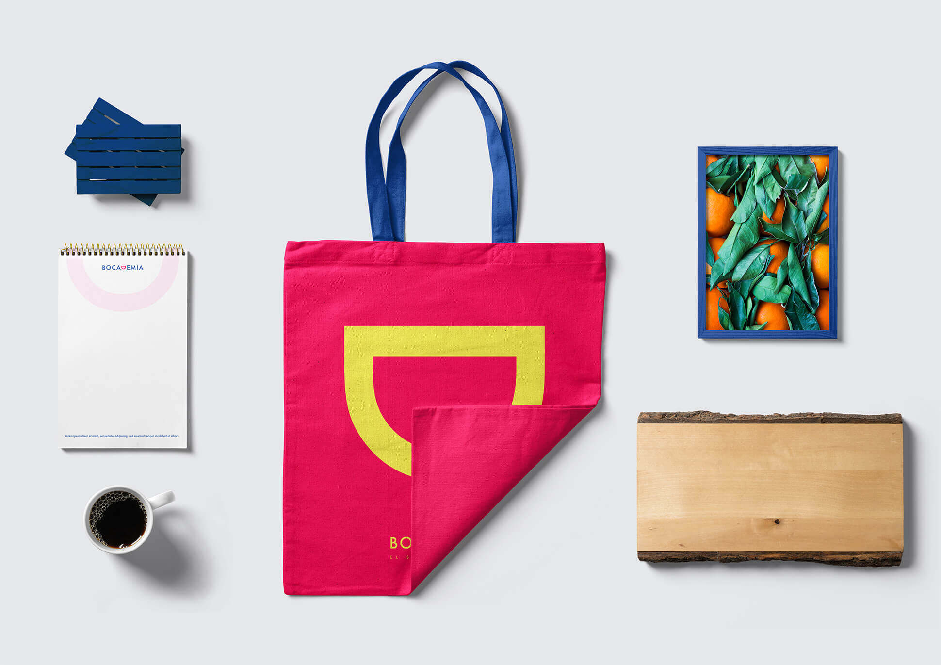
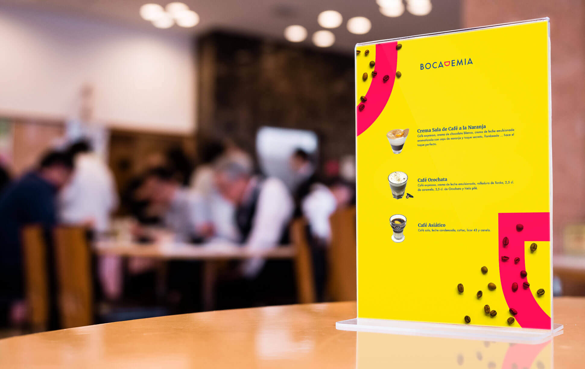
The 3 corporate colors of the brand that we used are: Sea Blue, Passion Red and Sun Yellow. With them, we created an imagery of ornamental elements, illustrations and patterns that can accompany the brand in its various applications.
