Microinteractions are small pieces of functionality that allow the user to carry out a concrete action.
Today we are surrounded by them because they are found in all digital products.
Good microinteraction design improves the user experience and can be responsible for users falling in love with our product.
The history of microinteractions goes back to the earliest electronic devices and many of the GUI standards we use today were once primitive microinteractions.
A microinteraction can be part of a product or it can be the complete product.
For example, a weighing scale only serves for one thing: to calculate the weight. It has only one case of use: the user climbs on top and the scale shows the weight by means of the display.
Well-designed interactions solve a specific problem with efficiency, humour and style; making the difference between a product we love and one we simply accept.
For example Google offers suggestions on what you are looking instantly generating a unique and magical feeling in the user.
.jpg)
Whatsapp displays small icons in each message to report the status of conversations.
A clock indicates that the message has not arrived, a tick indicates that the message has arrived at the Whatsapp server, a double tick indicates that the message has arrived at the recipient's device, and a double tick changes to blue when the recipient has read the message.

On the contrary, an ill-conceived microinteraction can cause great confusion and frustration in a user.
For example, the small wheel to regulate the temperature of some refrigerators has always seemed super confusing.
It has numbers from 1 to 9, but it is not entirely clear whether a higher number is colder or more temperature.

The design is greatly improved by simply adding the word Colder.

But it gets much better if we add some thermometer icons at each end of the scale so that anyone can understand the microinteraction regardless of the language they speak.

I personally would have opted for snowflake icons that are more illustrative. One snowflake on one side of the wheel and three snowflakes on the opposite side. It could even be improved by adding a color gradient from warm to cold tones.

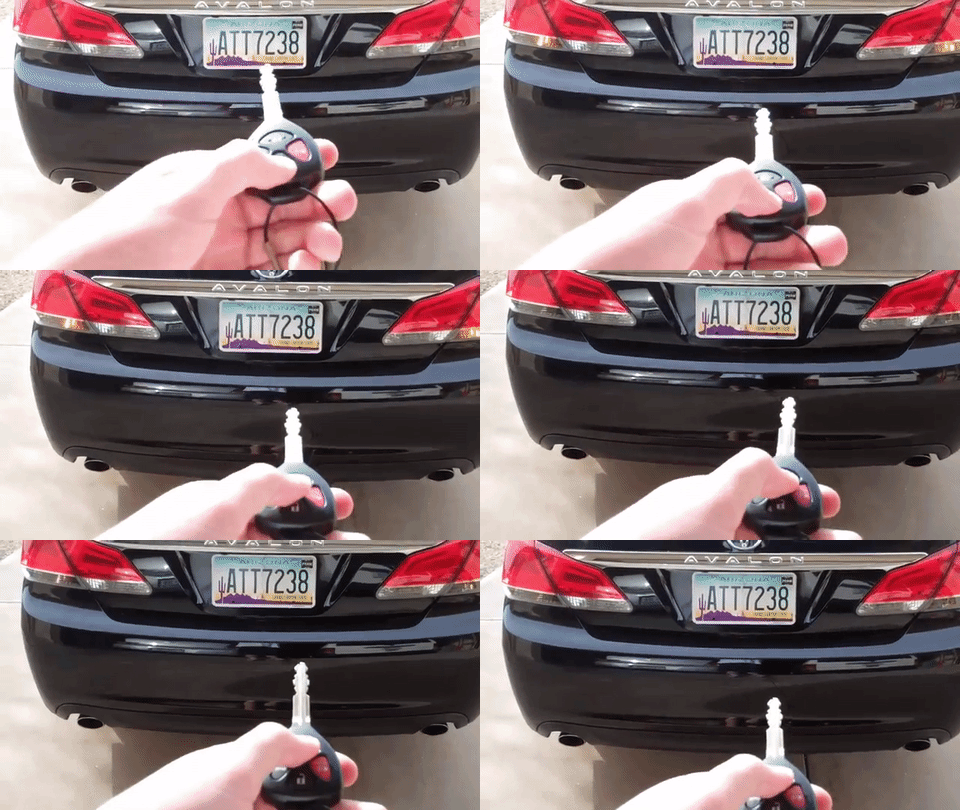
Another mythical example of poorly designed microinteraction is the locking of a car with the remote control. Just after pressing the button on the remote control the lights of the car blink and a beep sounds, all fantastic if it were not because when you open the car occurs virtually the same.
For this reason most people press the button several times and even more than one returns to the street to check if the car is closed.
A microinteraction consists of 4 parts: The triggers that initiate it, the rules that determine its operation, the feedback generated by the rules that give status information and finally the loops and modes that determine the duration of a microinteraction, define whether it repeats or changes over time and allow us to change the operation of the same in particularly cumbersome scenarios.
We are going to desgranar each one of these parts:
1.- Triggers that initiate it
A trigger is what initiates the microinteraction. It is important that the user easily identifies the trigger, that there are no visual discrepancies, for example if the trigger looks like a switch it must act as such.
The more common and used the microinteraction is more visible and easy to recognize the trigger should be.
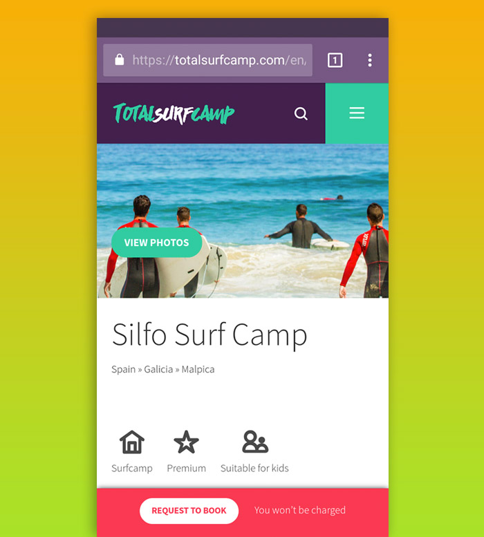
Ex: During the design of the website for Drupalcamp Spain 2017 we decided to place the call to action to buy tickets as a floating button that is always visible, at all times and throughout the site.
.jpg)
There are two types of triggers:
Manuals:
It is the user who determines when the microinteraction starts. These triggers arise from the user's desire to do something: I want to turn off the alarm, I want to know how to go to Lisbon, I want to start a chat with my ex-girlfriend, and so on.
The most obvious and common example of this type of triggers is the button.
System:
They are activated automatically and without human intervention if a certain condition is met. Most of the time the user can configure and limit these triggers.
Typical examples of conditions are:
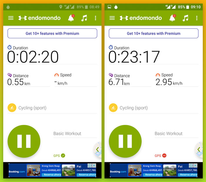
Errors: When an error occurs in an app, the system communicates it through a microinteraction.
E.g.: Endomondo generates a voice alert and displays a red icon when the GPS signal is lost.
Location Changes:When we enter or leave a particular location.
E.g.: Tripadvisor shows suggestions about restaurants in the cities you have just reached by means of push notifications to the mobile phones of those users who have previously authorized it.
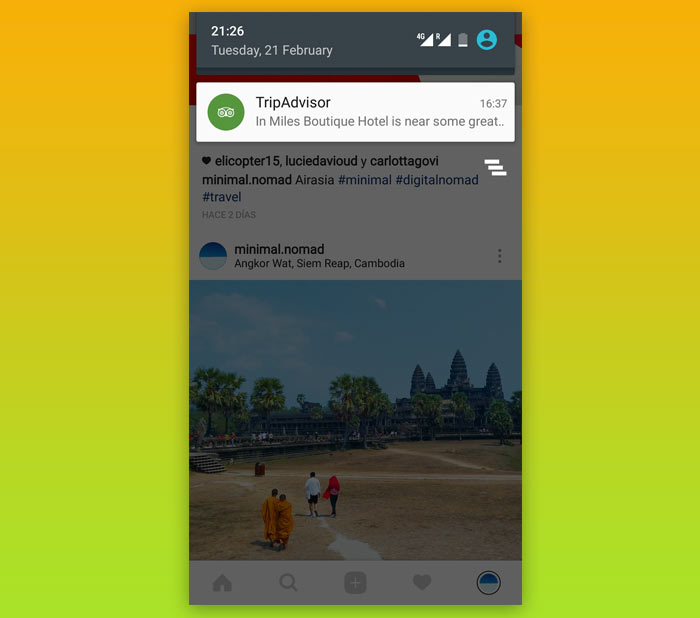
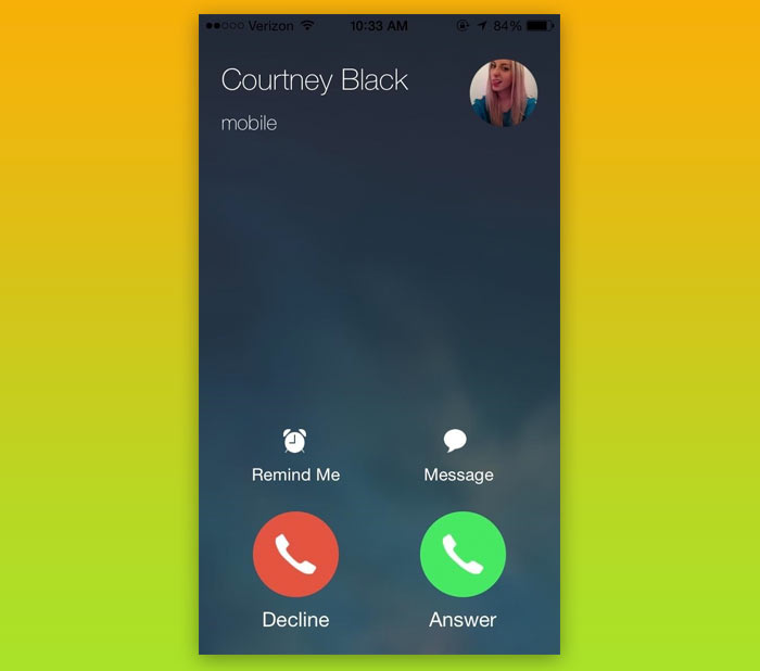
Incoming data: A new email, an available update, the time, a call, a message, etc.
E.g.: Any smartphone receiving a call shows several options automatically such as picking up the call, hanging up or answering with a sms.
Other microinteractions:in many cases one microinteraction precedes another and is part of a feature or macrointeraction. For example, in the registration of a user after entering email and password can be sent an email to confirm the account through a link.
2.- Rules that determine how it works
The rules serve to create a model of microinteraction and should reflect both context constraints and business constraints.
The key to defining the rules is to reduce complexity. Limit options to a minimum and set default values. The more options, the more rules.
All the information we know a priori should be used to make the rules. Data of the user that we have saved, data of the platform, or of the environment.
E.g.: Instagram uses data that it has from the people we follow and it follows us to generate the rules of the microinteraction that suggests us to follow new users.
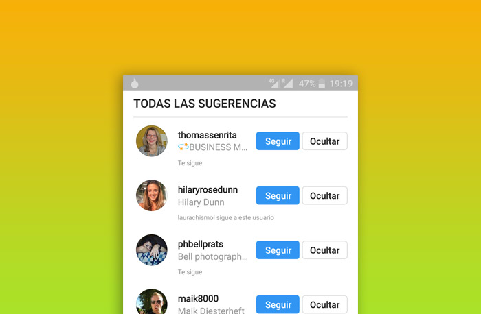
You have to define states for each element and see how it changes with time or user interaction.
The rules also serve to prevent errors. Prevent the user from making a mistake.
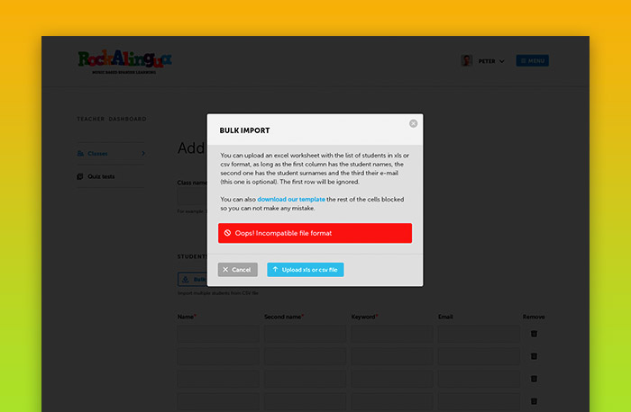
3.- Feedback that informs the user of what is happening
Feedback is possibly the most important part of a microinteraction because it provides the user with information that allows them to understand how the action takes place.
It is important to define what information the user needs to know and when they need to know it. There are the following types of feedback:
Visual feedback: Animations and messages. The most common of all types of feedback.
Ex: Asana shows a floating confirmation message when the user marks a task as completed.
.jpg)
Feedback in audio form: Earcorns and voice (speech). Earcorn are distinctive sounds used to announce certain events: system startup, new message, etc. Perhaps the most famous earcorn in history is the mythical Windows XP boot sound, or the error sound!
The audio feedback can also be simply by voice, the synthesized voices are already very realistic and it is increasingly common for an app to inform us of anything in this way.
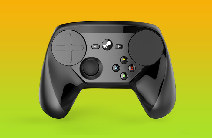
Vibrotactile feedback: The device in question vibrates to send the user some kind of information.
A lot has happened since 1976 when the Moto Cross arcade video game "Fonz" added the first vibrotactile feedback in history so that players could feel the vibration when crashing into other bikes in the game.
Today this type of feedback is very common on consoles, gaming machines, smartphones and tablets.
Ex: The Steam controller implements this type of feedback.
Feedback allows us to give personality to our microinteraction and therefore to our application.
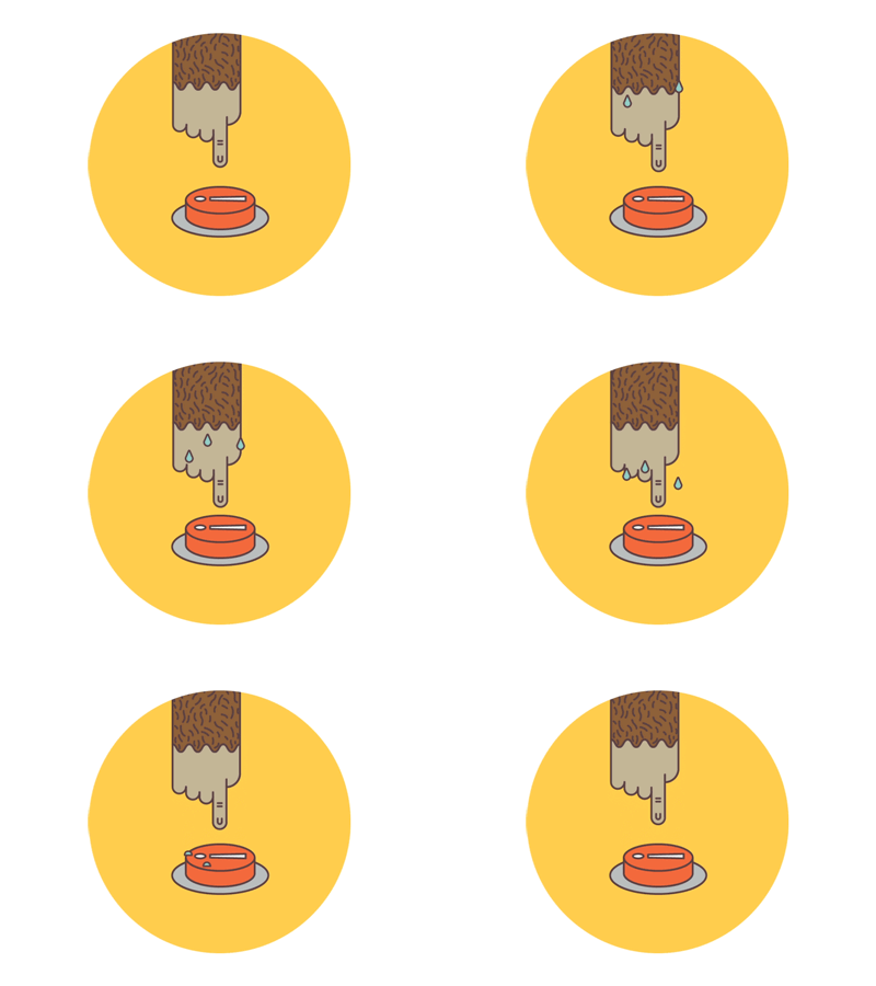
Ex: Mailchimp gives a cool touch of humor to the critical moment of sending an email.
Whenever possible, feedback should be given to the user to avoid moments of uncertainty. Good feedback gives us that fantastic sensation of having control of the app.
4.- Loops and modes
When there are infrequent actions that can cloud the microinteraction we use what is known as "mode".
A mode is a specific space in which the functioning of the microinteraction changes.
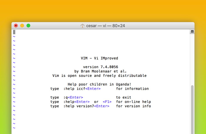
Already in the early days of modern computing, the mythical text editor for UNIX Vi systems based its handling on the change of mode: The command mode allowed you to move within a file and perform editing operations such as searching, deleting text, modifying text, etc. while the insert mode allowed you to write new text to the file. To change the mode you had to press the ESC key. (Although I spoke about it in the past, hundreds of thousands of programmers and system administrators still use Vi every day).
Ex: Capture of the vi Editor for Mac OS.
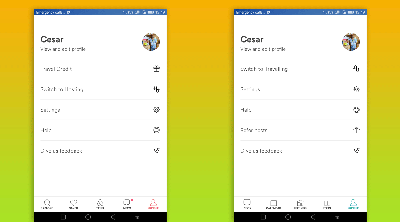
Whenever possible a mode should have its own screen to avoid confusion.
Ex: Airbnb allows users who have their house for rent on the platform to switch between travel mode and host mode.
Finally, loops determine the duration of a microiteraction and define whether it repeats itself or changes over time.
Loop parameters must be carefully chosen to ensure the best user experience.
Long-term loops are used to provide the microinteraction with memory and to simplify it over time.
As designers, it is important to use microinteractions correctly as they allow us to improve the user experience and provide our products with that little magic touch that engages users.


