ux

Dark Patterns UX
Dark patterns are design patterns that are used intentionally to trick the user into taking actions against their will. Deception and lies are deeply rooted in our beloved capitalist system. The design of the user experience can not be left aside and has assimilated some existing deceptive practices and has invented new ones. The neologism "dark pattern" was invented by the designer Harry Brignull a few years ago when he registered the domain darkpatterns.org to define and catalog these design patterns. The most common Dark Patters are: Confirmshaming  When you have to activate some option or sign up for a service or otherwise they make you feel guilty, embarrassed, imbecile or bad person. Tumblr wants us to feel bad people if we don`t deactivate our Ad blocker. Disguised Ads  Ads appear "disguised" as normal content, video players or navigation elements to confuse you and to click on them without knowing it. Plusdede shows a supposed video player and when you click on the play an advertising window opens instead of starting the movie playback​. Forced Continuity  When they offer you a free trial or trial service and when it is finish they start charging you without any notification. This practice is well known in Spain, since it is one of the favorite of mobile operators, they call you, they offer you a new free service and later you realize that they are charging you. Subscriptions that are renewed automatically without warning are also included in this typology. Audible invites you to try a month for free but at the end of the trial period does not ask if you want to continue. Friend Spam  They ask us permission to access our email contacts, some social network or our phone for a specific action, for example find friends and then do what they want with those permissions, such as sending spam to all your friends. The most famous episode related to this dark pattern was when they fined Linkedin with 13 million dollars for carrying out this practice a few years ago. Misdirection  As its name suggests, it is when the user is distracted from what really matters so that he does not see something and goes through some process.  Price comparison prevention  The website makes it very difficult for you to compare one item with another, so you can not make a studied decision.
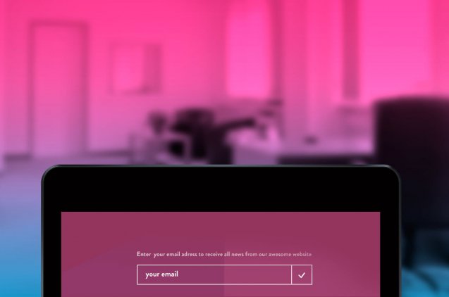
 Privacy Zuckering  When you are tricked into sharing more private information than you really want. The name is in honor of Mark Zuckerberg, Facebook CEO. This occurs because very often, when you use an online service, the fine print hidden in the terms and conditions grants permission to the website to sell your personal information to other companies. Roach motel After this ridiculous name hides a very common practice that is to facilitate the entry or subscribe to a service and tremendously difficult to unsubscribe from it. It sounds to you right? effectively! is what all mobile operators do. You can register on their website in 5 minutes but to unsubscribe you have to request it by fax. Canon do not underline the link to cancel the subscription to his newsletter so we do not see it. Bait and switch  Those cases in which the user wants to perform an action and carry out another totally different, which is what interests the "deceptive" web. Sneak into basket  It is a practice of online sales systems where an extra item is included in the shopping basket with the intention that you buy it without realizing it. The extra element is usually added through a checkbox or radio button that is activated and is not visible in any previous step to the basket. It was a common practice on the websites of low cost airlines, although fortunately it is becoming less and less normal. Godaddy try`s to strain a Privacy service when you buy a domain Hidden Costs  This is almost the same as the previous one, it is usually applied when you are in the last step of the purchase process and suddenly there are extra expenses that you did not know, such as delivery costs or taxes. The difference with Sneak into Basket is that they do not appear until the last step of the purchase process.   The use of dark patterns can be lucrative and beneficial in the short term but in the long run almost always affects negatively the branding of any organization. The alternative to these dark patterns would be to make good persuasive designs that convince the user in a positive way to carry out the desired actions.   Main photo: Rendiansyah Nugroho
La revolución de los asistentes de voz
Making a reservation or asking an appointment for the doctor is something of the past, now thanks to the technology developed by Google, a personal voice assistant will do it for you. Welcome to the present of artificial intelligence! Last tuesday, May 8, the technology giant brought together developers from around the world for the annual conference Google IO 2018, focused on exploring the future of technology. This year the focus has been placed on the development of artificial intelligences. Among the most important releases of AI that have been presented, one of the most prominent has been Google Duplex, an artificial intelligence that has the ability to engage in real conversations with users. How does it work and how could it revolutionize the industry? From the Shoreline amphitheater in Mountain View (California), the general director Sundar Pichai was clear before his bet for the AI ​​and the investigation, presenting in scoop "Google Duplex". This new technology will strengthen the functions of Google's assistant until now and will bring naturalness to the way of speaking thanks to the implementation of six new voices including that of John Legend. Isn`t it great? A personal secretary in the palm of your hand Among the possibilities offered by this AI, it is important to ask the voice assistant to book in a restaurant or take an appointment for the hairdresser. Google is clearly taking the lead in voice and artificial intelligence services industry. This new technology is expected to be tested this summer on the smart speakers of its own brand. How could it improve our quality of life? The idea behind Google's Duplex is to make a realistic AI that speaks like us, reacts as we do and even makes us feel like we are talking to a real person. In the video of the conference, the AI ​​does not sound like a robot or a voice like the one we are used to hearing from Siri, Alexa or Cortana. It seems that the future of voice aids has arrived! According to Nick Fox (VP of design for Google Assistant): "We don`t want to force others to implement these changes, but that is how an assistant should sound". How are we going to differentiate the ai of a human in a conversation if they are the same? This question may have come to your mind, raising some ethical questions. The developers and designers who build the AI ​​"have an obligation to reveal to anyone who interacts with them that they are talking to a machine," said Paul Saffo (of Stanford University). Through social networks, many users have expressed concern about the use of these robots: "These machines could be used for political purposes and to give voting instructions," says Kay Firth-Butterfield on Twitter). During the Google IO there was a demo of a conversation between the AI ​​and a hairdressing employee. The Google assistant sounded amazingly realistic and even muttered "hemm ..." while the other interlocutor was checking hes schedule. The voice was so natural that the employee did not even realize she was talking to a machine. According to Google, this system can be very useful for customers and you will ask yourself why? Undoubtedly one of the main advantages is the saving of time that it supposes for the users, as well as for the small companies that do not have online reservation system. The goal is to help you manage and perform tasks. What does duplex technology save inside? At the heart of Google Duplex, we find an artificial neural network that has been trained to exchange big data over the phone. Calls are divided into multiple tasks: manage pauses, interruptions, give detailed information or synchronize with the speaker. The AI ​​also adapts to the answers depending on the perceived importance. The result? Awesome. Despite the complexity of understanding human language and drawing conclusions, Google Duplex is a system that is able to understand the nuances of conversation. Gather the understanding of natural language, deep learning and textual speech: The Natural Language Understanding (NLU) is also used by IBM to process advanced text analysis. It extracts a lot of content data (keywords, concepts, relationships, etc.) and understands the feeling and emotion. It is possible to find out if the feeling of an article is positive or negative and obtain information about the emotion with which the author is writing. In addition, it can determine in which part of the article the writer is expressing anger, sadness, fear or joy. In-depth learning is part of machine learning methods based on data representations. Nowadays, the power of AI helps computers develop superhuman abilities and the recognition of images. Thus, this type of learning allows scientists to use their resources effectively, analyzing in a month what used to take 10 years. The devices we use every day translate even the most complex languages ​​from voice to text and from images to words. In 2015, Google's DeepMind created the AlphaGo program that uses self-learning to beat the real players of the Go board game. Text-to-Speech (TTS) technology is a voice engine used to broadcast words from any device. For example, if you travel somewhere using Google Maps, TTS talks to you to tell you where to go. It works with all types of digital devices (computers, tablets, smartphones). The voice is generated by computer and not only reads texts but also images through the process of scanning and optical character recognition (OCR) in real time. This technology is used to help children in the development of their reading skills. It seems that the future is here!
Micromomentos
Are we already entering that future that we saw in the series and films of science fiction? At the moment the cars do not fly, but by pressing an electronic button from home they send you a product at the moment. In an era where immediacy is the order of the day, it is logical that consumers are increasingly impatient. But why? Especially because of the enormous development that technology has experienced in the last decade. We want everything here and now. Recently it was said that we had a world of possibilities at a single click, now this world is even more accelerated and closer. We can have everything in the palm of our hand. Thanks to the evolution of web commerce (Amazon has done a lot of good or very bad, depending on how you look at it) and especially to mobile devices, specifically smartphones, in the future we could end up becoming something similar to the human characters of the Wall-E movie. Jokes aside, since we get up in the morning until we go to bed, we look at the screens of our mobile phones on average 150 times a day and approximately 130 minutes. It is here that what is known as micromomento arises, that in which a person accesses a digital medium to satisfy a need to learn, do, discover or buy something. It is curious that the term has been coined by Google, the king of Big Data, which we unconsciously go as if it were an oracle, and from which we expect an immediate and accurate answer: "how to do this, I want to see that, I need to see the other, etc. " We respond to a stimulus immediately, waiting for the best response, with which we will make a mostly improvised decision. To get an idea, after the consumer has been impacted by X television ads, a flash may appear, a need to search for information in a short space of time. This is what we know as "window of opportunity". Preventing the moment and the message as well as facilitating digital infrastructure, will allow brands to box in the ring of micro-moments. It is necessary to distinguish the micromomentos "O.G", those that we consider business opportunity, from those that are not, the "fake" that do not interest us. For it according to the great oracle Google, we can establish that a micromomento consists of four parts: 1.- The person: the target customer. Who he is and what we know about him. 2.- The intention: information, purchase, etc ... 3.- The context: not all micro-moments are the same. 4.- Immediacy: need to satisfy immediately. In an ultra-competitive era, in which we live a gigantic advertising saturation, where the consumer as a rule does not consider a predetermined brand in its search, but goes investigating like Sherlock; micromomentos are very important, since the consumer is really looking to satisfy YOUR need. The companies that elaborate a strategy understanding and satisfying these micro-moments and needs, will be the winners of the battle. But of course, it is not all gold that shines, nor can we know all the micro-moments, nor all the micro-moments are equal. In general, we want our personal moments to be respected. If we publish our breakfast on Instagram, and suddenly we see two elements like Mario Vaquerizo and Rebeca selling tires at a good price, we will consider it strange, intrusive and even annoying. Another totally different case is that we have to pass the review of our car but we do not have too much cash. We may take our cell phone out of our pocket and look for "tires at a good price". This is where the micro-moments race begins. The micromomentos happen through the way of the consumer So, all this will impact on the so-called "consumer path", the pilgrimage and phases in which this can establish a contact with the brands is in continuous change, and therefore can suppose different business opportunities for companies. First, in a certain micromanage, a brand can impact and say: Hey, I'm here! Second, in a micromomento in which the consumer needs information, initiating a process that may end up in purchase, a brand must be able to enter into the consideration of it, that is, that it be taken into account at the time of Make the decision: You know I'm here, and I offer you this! Third, in the purchase phase it is essential not to fail, immediacy and ease are the keys to success: Pim, pam, pum, tuna sandwich !. And finally, loyalty and loyalty are essential to achieve a possible repurchase: Go home, come back for Christmas. How can we benefit from micro-moments   We must carefully select what micro-moments we really want to win. The contents we offer are of great importance, as is the treatment of statistical or qualitative data that allows us to better segmentation. So to succeed you must: Analyze micro-moments: what is sought and in what places. It is essential to know the consumers and our target audience. Analyze the context and moments of contact: adapt and offer solutions as quickly and efficiently as possible. Adapt the UX: allow mobility between the contents and the purchase process. Usability and accessibility. In short, optimization, optimization and optimization. Position correctly. Carry out measurements on the different micro-moments and the impact of our responses.. After all this, I hope it has become clear that, through micromomentos, the preferences of the users are defined. Also, not all of these little moments are equal in importance, and in fact you have to avoid being intrusive. For this reason we can not abandon the drift as the Dutch wanderer to our target, we must be present offering the fastest, simplest and most effective solutions through the different phases of the sales process: presale, sale and after sale. There are many websites where you can learn more about how companies currently use micro-moments, and they contain a lot of interesting and useful information.
Roof of Skywrapper from above in cloudy day
Chatbots are the biggest technological disruptor in the customer service scene. They are the talking point of every call center, every support team and every digital business worldwide. But what are chatbots really? Simple, it is a service, driven by rules and sometimes artificial intelligence, with which you interact through a chat. The service can take various forms, from functional to fun, and you can find it on sites like Facebook Messenger, Slack, Telegram, text messages, blogs etc. and help in certain tasks that can be solved only with questions and answers. The goal is that users who come into contact with chatbots can take advantage of this technology to receive information immediately, speeding up the response time between brand and customer/consumer. Keep in mind that these "bugs" work 24/7 and can respond simultaneously to a large number of messages. Due to the use of wide-ranging chatbots, there are several different potential services that can use the technology. Currently, the most popular uses are in applications and messaging services, allowing customers to talk directly to a company, or vice versa. Popularized by Facebook Messenger, companies also use chatbots to reach users through instant messaging services. This can be in the form of customer service or to send automatic notifications, promotions, etc.. Succeeding online is not easy and offering an effective and quality service is increasingly necessary to avoid succumbing to competition.   Chatbots can also be found on many of today's leading mobile devices in the form of personal assistant services. The well-known Siri (Apple iOS), Cortana (Microsoft Windows) and Google Assistant (Android) can be classified as chatbots, as they can use artificial intelligence and automatic learning to answer questions, albeit at a higher level than "traditional" shanties. Some services can even be linked to external applications and services to provide more enriching experiences, such as weather updates, travel times, or even restaurant reservations. The Dutch airline KLM, for example, has set up a chat to better serve its passengers. They can now receive confirmation of their reservations, obtain their boarding pass or be informed of the status of their flight at any time. Another example is Moovit, a bot integrated into Facebook Messenger capable of answering users' questions about travel planning, suggesting journeys using the public transport network. With 900 million users worldwide, it has information on public transport in 800 cities. The million question: How Can Chatbots Help Me? You're probably wondering what's all the fuss about chatbots? Great question and a very simple answer. It's because, for the first time, people use messaging applications more than they use social networks. Today, one of the biggest problems for companies is still the lack of effective and fluid communication with their customers. The delayed and often ineffective relationship is the target of criticism. Chatbot can help provide faster and more assertive customer service. According to a survey conducted by Lithium Technologies, 53% of consumers who come into contact with brands via Twitter expect a response within an hour. And this number grows to 72% when it comes to complaints. The result revealed that only 11.2% of brands respond at that time and that the majority of them (65%) respond within 24 hours. This is quite alarming for companies considering what this delay can cause, such as customer loss and negative branding on social networks. This is where you have to make the most of them. Chatbots can improve the user experience, including customer service, as well as help with specific marketing campaigns. Keep in mind that if a customer has a problem with a product, they can connect with the chatbot to explain the situation and the chatbot can process that information to provide a recommendation on how to fix the product. Generating trust is fundamental for a business to be afloat and one of the main pillars if you want to sell on the Internet or have a presence worthy of your brand. Create and configure a chatbot First of all and for your better understanding: There are two types of chatbots, one based on a set of rules, and another more advanced version that uses automatic learning. Chatbots based on rules: These bots are very limited. They can only respond to very specific commands. If you say something wrong, they won't know what you mean.   Chatbots based on automatic learning: These have an "artificial brain". You don't have to be ridiculously specific when you talk to him. They understand the language, not just the commands. These bots become increasingly intelligent as they learn from the conversations they have with people. Now, if you're thinking about setting up a chatbot, forget it. It's a process that requires a very high level of computer skills. Nowadays there are tools that facilitate the life of those who do not master the subject and whose "hard" work is nothing more than the creation of a conversation between the audience and oneself. There are different alternatives. You can opt for an official framework, such as those provided for free by messaging applications such as Facebook Messenger, Slack or Telegram, for example, or you can opt for unofficial frameworks such as Botkit, ChatScript, Meya, Gupshup or Pandorabots. In addition, there are several commercial platforms with really interesting prices that let you create a chatbot from scratch. The best known are: Botsify, Flow XO, Rebotify, Morph.ai, Motion AI and Smooch. Assigning the possible interactions with your audience, understanding the tone of the speech you want to give to your chatbot and making its messages attractive are fundamental requirements for your strategy to be able to give the expected results. Chatbots are easy to use and many customers prefer them to calling a representative on the phone because it is usually faster and less invasive. They can also help companies save money and are easy to set up. Because most chatbots use messaging applications that are already on billions of phones worldwide, it is likely that your customers are already ready for your bot. Chatbots rise as the future of the customer experience and have the power to replace search windows and many applications in the not-too-distant future. And now, do you feel like launching your chatbot?   Main photo: Denys Nevozhai
Anatomía de una microinteracción
Microinteractions are small pieces of functionality that allow the user to carry out a concrete action. Today we are surrounded by them because they are found in all digital products. Good microinteraction design improves the user experience and can be responsible for users falling in love with our product. The history of microinteractions goes back to the earliest electronic devices and many of the GUI standards we use today were once primitive microinteractions. A microinteraction can be part of a product or it can be the complete product. For example, a weighing scale only serves for one thing: to calculate the weight. It has only one case of use: the user climbs on top and the scale shows the weight by means of the display. Well-designed interactions solve a specific problem with efficiency, humour and style; making the difference between a product we love and one we simply accept. For example Google offers suggestions on what you are looking instantly generating a unique and magical feeling in the user. Whatsapp displays small icons in each message to report the status of conversations. A clock indicates that the message has not arrived, a tick indicates that the message has arrived at the Whatsapp server, a double tick indicates that the message has arrived at the recipient's device, and a double tick changes to blue when the recipient has read the message. On the contrary, an ill-conceived microinteraction can cause great confusion and frustration in a user. For example, the small wheel to regulate the temperature of some refrigerators has always seemed super confusing. It has numbers from 1 to 9, but it is not entirely clear whether a higher number is colder or more temperature. The design is greatly improved by simply adding the word Colder. But it gets much better if we add some thermometer icons at each end of the scale so that anyone can understand the microinteraction regardless of the language they speak. I personally would have opted for snowflake icons that are more illustrative. One snowflake on one side of the wheel and three snowflakes on the opposite side. It could even be improved by adding a color gradient from warm to cold tones. Another mythical example of poorly designed microinteraction is the locking of a car with the remote control. Just after pressing the button on the remote control the lights of the car blink and a beep sounds, all fantastic if it were not because when you open the car occurs virtually the same. For this reason most people press the button several times and even more than one returns to the street to check if the car is closed. A microinteraction consists of 4 parts: The triggers that initiate it, the rules that determine its operation, the feedback generated by the rules that give status information and finally the loops and modes that determine the duration of a microinteraction, define whether it repeats or changes over time and allow us to change the operation of the same in particularly cumbersome scenarios. We are going to desgranar each one of these parts: 1.- Triggers that initiate it A trigger is what initiates the microinteraction. It is important that the user easily identifies the trigger, that there are no visual discrepancies, for example if the trigger looks like a switch it must act as such. The more common and used the microinteraction is more visible and easy to recognize the trigger should be. Ex: During the design of the website for Drupalcamp Spain 2017 we decided to place the call to action to buy tickets as a floating button that is always visible, at all times and throughout the site. There are two types of triggers: Manuals: It is the user who determines when the microinteraction starts. These triggers arise from the user's desire to do something: I want to turn off the alarm, I want to know how to go to Lisbon, I want to start a chat with my ex-girlfriend, and so on. The most obvious and common example of this type of triggers is the button. System: They are activated automatically and without human intervention if a certain condition is met. Most of the time the user can configure and limit these triggers. Typical examples of conditions are: Errors: When an error occurs in an app, the system communicates it through a microinteraction. E.g.: Endomondo generates a voice alert and displays a red icon when the GPS signal is lost. Location Changes:When we enter or leave a particular location. E.g.: Tripadvisor shows suggestions about restaurants in the cities you have just reached by means of push notifications to the mobile phones of those users who have previously authorized it. Incoming data: A new email, an available update, the time, a call, a message, etc. E.g.: Any smartphone receiving a call shows several options automatically such as picking up the call, hanging up or answering with a sms. Other microinteractions:in many cases one microinteraction precedes another and is part of a feature or macrointeraction. For example, in the registration of a user after entering email and password can be sent an email to confirm the account through a link. 2.- Rules that determine how it works The rules serve to create a model of microinteraction and should reflect both context constraints and business constraints. The key to defining the rules is to reduce complexity. Limit options to a minimum and set default values. The more options, the more rules. All the information we know a priori should be used to make the rules. Data of the user that we have saved, data of the platform, or of the environment. E.g.: Instagram uses data that it has from the people we follow and it follows us to generate the rules of the microinteraction that suggests us to follow new users. You have to define states for each element and see how it changes with time or user interaction. The rules also serve to prevent errors. Prevent the user from making a mistake. 3.- Feedback that informs the user of what is happening Feedback is possibly the most important part of a microinteraction because it provides the user with information that allows them to understand how the action takes place. It is important to define what information the user needs to know and when they need to know it. There are the following types of feedback: Visual feedback: Animations and messages. The most common of all types of feedback. Ex: Asana shows a floating confirmation message when the user marks a task as completed. Feedback in audio form: Earcorns and voice (speech). Earcorn are distinctive sounds used to announce certain events: system startup, new message, etc. Perhaps the most famous earcorn in history is the mythical Windows XP boot sound, or the error sound! The audio feedback can also be simply by voice, the synthesized voices are already very realistic and it is increasingly common for an app to inform us of anything in this way. Vibrotactile feedback: The device in question vibrates to send the user some kind of information. A lot has happened since 1976 when the Moto Cross arcade video game "Fonz" added the first vibrotactile feedback in history so that players could feel the vibration when crashing into other bikes in the game. Today this type of feedback is very common on consoles, gaming machines, smartphones and tablets. Ex: The Steam controller implements this type of feedback. Feedback allows us to give personality to our microinteraction and therefore to our application. Ex: Mailchimp gives a cool touch of humor to the critical moment of sending an email. Whenever possible, feedback should be given to the user to avoid moments of uncertainty. Good feedback gives us that fantastic sensation of having control of the app. 4.- Loops and modes When there are infrequent actions that can cloud the microinteraction we use what is known as "mode".   A mode is a specific space in which the functioning of the microinteraction changes. Already in the early days of modern computing, the mythical text editor for UNIX Vi systems based its handling on the change of mode: The command mode allowed you to move within a file and perform editing operations such as searching, deleting text, modifying text, etc. while the insert mode allowed you to write new text to the file. To change the mode you had to press the ESC key. (Although I spoke about it in the past, hundreds of thousands of programmers and system administrators still use Vi every day). Ex: Capture of the vi Editor for Mac OS. Whenever possible a mode should have its own screen to avoid confusion. Ex: Airbnb allows users who have their house for rent on the platform to switch between travel mode and host mode. Finally, loops determine the duration of a microiteraction and define whether it repeats itself or changes over time. Loop parameters must be carefully chosen to ensure the best user experience. Long-term loops are used to provide the microinteraction with memory and to simplify it over time.   As designers, it is important to use microinteractions correctly as they allow us to improve the user experience and provide our products with that little magic touch that engages users.
Cool Building
Nowadays it's more common to find fully customized form elements that enhance the user experience. In this article we will see how to turn a typical checkbox into a switch that is much more modern and visually appealing.   Let's see an example of how this switch would be used in the typical options in a user area: span.question { display: inline-block; vertical-align: middle; margin-right: 10px; font-weight: bold; } .switch { position: relative; display: inline-block; width: 60px; height: 34px; vertical-align: middle; } .switch input { display:none; } .slider { position: absolute; cursor: pointer; top: 0; left: 0; right: 0; bottom: 0; background-color: #ccc; -webkit-transition: .4s; transition: .4s; } .slider:before { position: absolute; content: ""; height: 26px; width: 26px; left: 4px; bottom: 4px; background-color: white; -webkit-transition: .4s; transition: .4s; } input:checked + .slider { background-color: #E27AD8; } input:checked + .slider:before { -webkit-transform: translateX(26px); -ms-transform: translateX(26px); transform: translateX(26px); } .slider.round { border-radius: 34px; } .slider.round:before { border-radius: 50%; }       Publish my email address       Receive newsletter       Receive email notifications   First we need to define the html. We are going to use the labels and input tags of a typical checkbox and an extra div that will serve to do the trick with css. HTML <label class="switch">   <input type="checkbox">   <div class="slider round"></div> </label>   Now let's go with the css: CSS /* Format the label that will serve as container */ .switch { position: relative; display: inline-block; width: 60px; height: 34px; } /* Hide the html checkbox */ .switch input { display:none; } /* Format the switch box on which the control knob or slider will slide */ .slider { position: absolute; cursor: pointer; top: 0; left: 0; right: 0; bottom: 0; background-color: #ccc; -webkit-transition: .4s; transition: .4s; } /* Depict the control knob or slider using the pseudo-selector before */ .slider:before { position: absolute; content: ""; height: 26px; width: 26px; left: 4px; bottom: 4px; background-color: white; -webkit-transition: .4s; transition: .4s; } /* We change the background color when the checkbox is activated */ input:checked + .slider { background-color: #E27AD8; } /* We slide the slider to the right when the checkbox is activated */ input:checked + .slider:before { -webkit-transform: translateX(26px); -ms-transform: translateX(26px); transform: translateX(26px); } /* We apply a rounded edge effect to the slider and to the bottom of the slide */ .slider.round { border-radius: 34px; } .slider.round:before { border-radius: 50%; } That's all folks! Now we know how to create a toggle switch or switch with css. Easy, fast and for the whole family! Main photo: Pierre Chatel
Métodos de validación y user research
“User research ” is a set of observation techniques and the obtaining of feedback and the analysis of results that allow us to understand the behaviors, needs and motivations of the users of any product or service. There are dozens of methods and variants within the field of user research.  In this article, we will describe the 6 most used in the web industry.     Card Sorting This consists of asking a group of users to group content and functionality in open or closed categories. The result of the exercise are patterns of how users expect to find the content, as well as navigation tips, menus and categories. This method doesn't provide a final structure, but helps answer many questions we ask ourselves in the design phase. More info: http://www.usability.gov/how-to-and-tools/methods/card-sorting.html http://boxesandarrows.com/card-sorting-a-definitive-guide/ http://www.measuringu.com/blog/card-sorting.php     Eye Tracking This technique uses technology to analyze eye movements on the user interface. The result is a heat map of points of focus that offer clear information about which parts of the site capture more attention and which is the visual flow of the user through the site. More info: http://www.webdesignerdepot.com/2013/11/4-essential-ux-rules-taught-by-eye-tracking-research/ https://uxmag.com/articles/leveraging-eye-tracking-to-create-an-engaging-user-experience/ http://www.uxbooth.com/articles/a-brief-history-of-eye-tracking/     A/B Test This consists of providing different versions of a page for different users and comparing the results to determine what works best. It is a great way to optimize funnels and landing pages. More info: http://www.wired.com/2012/04/ff_abtesting/ https://www.smashingmagazine.com/2010/06/the-ultimate-guide-to-a-b-testing/ http://www.uxbooth.com/articles/how-to-increase-site-performance-through-ab-split-testing/     Focus Group This brings together users to discuss certain topics or issues related to the content or the website. The result yields useful information on the views and feelings of users in relation to the subject matter, providing insight into the audience and refining the target. More info: http://www.webcredible.com/blog/focus-groups-how-run-them/ http://www.slideshare.net/Centralis/adapting-focus-groups-for-user-experience-ux-research/ https://blog.mozilla.org/ux/2012/08/when-to-use-a-focus-group-and-when-not-to/     Usability testing This is an individual test where a page or site with representative users from the target market are evaluated. Direct user feedback is collected using the tool or the prototype which serves to implement improvements based on the results. More info: http://www.usability.gov/how-to-and-tools/methods/usability-testing.html http://www.uxbooth.com/articles/the-art-of-guerrilla-usability-testing/ http://uxmyths.com/post/831431504/myth-22-usability-testing-is-expensive     Quantitative Surveys Surveys of users are conducted for information about their satisfaction with the product, the usefulness of a particular page, their opinion on a particular topic, etc.  The benefits of this method are many because it allows better understanding of end users and the design of better products, thus reducing the risk of making mistakes or offering mediocre solutions. More info: http://uxmastery.com/better-user-research-through-surveys/ http://www.uxmatters.com/mt/archives/2012/09/strengths-and-weaknesses-of-quantitative-and-qualitative-research.php http://www.marketingdonut.co.uk/marketing/market-research/what-is-quantitative-research-   Main photo: Hal Gatewood
Breve historia del UX
UX, User eXperience Design, or Spanish user experience design is a relatively new discipline that has fairly complex and interesting roots. What follows is a brief and fleeting overview of its history. It is commonly accepted that the UX started around 1900, in the middle of the Second Industrial Revolution. During this period, more and more machines and tools were incorporated for industrial production tasks and the greater the use of these machines, the faster work was, and production increased. For this reason, it was important to optimize the usability and efficiency of the machines to improve the production of goods and services. Thus a part of the current UX was just born. A few years later we saw the UX applied to improve the ease of use of the first telecommunication devices, like the telegraph and telegram. Young lady operating a telegraph. Later, the UX was implemented in the field of ergonomics, the discipline responsible for the design of workplaces, tools and tasks, corresponding with the physiological, anatomical and physiological characteristics of the worker. In ergonomics we can see the UX application in areas such as the manufacture of any tool or piece of furniture to make it more pleasant to use and better suited to the human body. For example in creating a more comfortable chair for working in an office. The next milestone in the UX was the opening of Disneyland in 1955, a user-centric experience like no other to date. Its creator, visionary Walt Disney, was a pioneer in creating a service experience. Walt Disney with the Disneyland project. And finally we come to the genesis of interactive design and interfaces as we know them today, with the appearance of Xerox PARC in 1970, where the graphical user interface (GUI), windows, checkboxes , radio buttons, menus, mouse and many other things related to modern computing and object-oriented programming, laser printing and Ethernet standards were developed. Many of these innovations were due to the fact that Xerox was determined to implement something called user-centered design, which marked the beginning of the current UX. Workers at Xerox PARC in the 70s. Years later, in 1995, Donald Norman coined the term User Experience Design and called himself an "User Experience Architect" while working at Apple Computer. Donald described his position as the one who helped to harmonize the user interface and industrial design process. Donald Norman. Since 1990, the UX has grown exponentially and we started hearing concepts like usability, interactive design and information architecture. It was at this time when several well-knownAlan Cooper characters emerged in the current web industry, such as Jakob Nielsen, Alan Cooper y Steve Krug. All this brings us to today, where the user experience is a key feature for achieving a successful product or service, since it depends largely on the positive or negative perception of the company.   Main photo: David Clarke
Placeholder text form
With the advent of HTML5 few years ago, the possibility to add placeholder has appeared The placeholder text is displayed in a text field on a form before the user complete, it’s very useful since it clarify what information must be entered in this field. For example, the HTML code: <form> <label for="search">Subscribe to the newsletter</label> <input id="news" type="text" placeholder="Enter your email" name="seach"> <button id="subscribebutton" type="submit">Send</button> </form> It show something like this Adding placeholders to the forms is a good practice that improves usability and of course the user experience. The W3C recommends using the placeholder always with the Label that, since they are supposedly complementary, but in Wild Wild Web, we often use only one of the two, since using both will be redundant. Support for placeholder will only be visible in most modern web browsers but usually a jquery fallback is implemented for the same functionality in older browsers. There are several ways to add a placeholder to a field on a form in Drupal 7. Below we highlight 4 which we consider the most useful. Form module Placeholder https://www.drupal.org/project/form_placeholder This module allows us to add placeholders to any form of the site from the Drupal administration. Hints Webform module https://www.drupal.org/project/webform_hints This module allows automatic placeholders to incorporate any textfield, testarea, select list and email field forms created with the webform module (https://www.drupal.org/project/webform) This module also comes with support for older browsers that do not support the placeholder attribute will and implement the fallback using jQuery. Field placeholder module https://www.drupal.org/project/field_placeholder It allows you to add the placeholder attribute to any field of a drupal entity, as fields of a content type, terms of taxonomy, user, etc. When activated, it displays a new option to enter the placeholder when you edit or create a field. Function in the template.php Finally the more advanced technical approach that involves all code but it’s the most powerful of all. It is about adding the following function to template.php file from our theme. function YOURTHEMENAME_form_alter( &$form, &$form_state, $form_id ) { if (in_array( $form_id, array( 'user_login', 'user_login_block'))) { $form['name']['#attributes']['placeholder'] = t( 'Username' ); $form['pass']['#attributes']['placeholder'] = t( 'Password' ); } } This case introduces a placeholder for the login form. Remember to change the name of the function YOURTHEMENAME by the name of your theme, and change the id of the form and name of the field you want to make the change. Learn how to get the id of a form.
Mandrill para Drupal
Email is one of the most powerful tool for a website for enhancing customer service and increasing brand loyalty in all regards. If they’re used in the right way, transactional emails can improve the user’s experience, immediately arriving with the website’s and brand’s design style. What are transactional emails? Well, they aren’t newsletters or any other type of email. They’re sent on an individual basis because of a user’s action (or inaction) and act like notifications. Examples of transactional emails include the typical user registration email, password reminders from Badoo, order confirmation of a plane ticket to Marrakesh, wall posts from Francis on Facebook, profile visits from Lucy on LinkedIn, notifications you have joined an S&M group in your neighborhood, etc… If at some point you’ve had problems sending these types of emails from your site and your users can’t get them, or they go directly to the Spam folder, it’s probably because your server has been blacklisted as spam. Most of the time it’s because the server has been hacked and has become part of a zombie network that’s used for spamming. When this happens, antispam systems add the server’s IP address to a blacklist, and all the connected websites are affected too. To fix this problem, you have to use an external SMTP service to send transactional emails. These services guarantee your emails’ quick delivery. Users demand immediacy, and email delays will noticeably hurt the user’s experience. In Drupal, we can configure an SMTP server to send emails using the smtp module. But we can also use an external platform that specializes in this. Some of the most popular are Mailjet, Amazon SES, and Mandrill, but there are many more. Socialcompare has made a comparative list of transactional email services. Here at Wild Wild Web, we recommend you use Mandrill, the transactional email sending service from Mailchimp which can send up to 12,000 email per month for free and has fantastic integration with Drupal. If your website requires a larger volume of emails, there are also paid options. About Mandrill SPF and DKIM support that guarantees the emails aren’t marked as Spam Globally distributed infrastructure with servers in 5 continents which reduces latency Extensive email delivery statistics: openings, custom tagging, etc… Template system for personalizing emails Android and iOS apps Much more… Installing Mandrill into Drupal In order to install and configure Mandrill into Drupal, follow the following steps: 1. Download and install the modules: Mailsystem Mandrill 2. Download the Mandrill PHP API library installer and upload it to the folder /sites/all/libraries/mandrill   3. Activate the Mandrill, Mandrill Reports, and Mandrill Template modules 4. Create an account at mandrillapp.com 5. Get an API Key for your account 6. Put the API Key into the Drupal configuration screen and save it   7. Do some final adjustments to the module’s configuration Check the preferences for tracking or Google Analytics integration to track emails this way. Once this configuration is done, send a test email using (surprise) Send Test Email in order to see if it all works right. Now Drupal sends emails through Mandrill, but the results are only plain text… We’re back in the 90’s!   8. Make a template in Mandrill In order for emails to be branded with the logo and colors of your brand, we need to make a custom template. In your mandrillapp account, go to Outbound – Templates and hit Create a Template. While editing a new template, you just have to paste the HTML that you want to use for your email and use the Email Template Language from Mailchimp in order to tell Mandrill which part of the email is dynamic. It should be something like this: <body bgcolor="#202020" style="margin: 0;padding: 0;"> <table bgcolor="#202020" width="100%"> <tr>  <td>        <center> … HTML for customized email …   <div mc:edit="main" style="color:#000000;"></div> … HTML for customized email … </center>   </td> </tr> </table> </body> The key is the tag <div mc:edit="main" style="color:#000000;"></div> which separates the body of the email from the rest. 9. Create a mapping template in Drupal In order for Drupal to understand the new Mandrill template, you have to create a new Mandrill Template Map from admin/config/services/mandrill/templates, creating a name, selecting the template name and the region. Also, you have to select the Email Key that you want, which will usually be Site-wide Default.   Conclusions Transactional emails are very important in improving user experience so you need to guarantee that their delivery will be rapid by using third-party tools. Mandrill is a fantastic application for sending transactional emails from Drupal because it offers 12,000 free emails, is a well-developed application, and has great integration with our favorite CMS (Content Management System).
Chica con iPad
The Stanford Persuasive Technology Lab has compiled 10 rules to create a credible website. They are based on 3 years of research involving more than 4,500 people. ​ Show that you are real Demonstrate that you are a real business. Put your physical address in your website, a map, photos of your offices or building. If your business is affiliated with organizations like the chamber of commerce or other institutions, show this.   Make fact-checking easy Try to make it easy for people to verify that what you’re saying is true. Use citations and links to your sources… Though people may not click them, the links will increase the strength of your content.   Highlight your experience Emphasize what’s best: if you have experienced people in your business, let visitors know. If you have worked with important clients, tell your visitors. It all helps to build your credibility.   Show real people Let users know that there are real people behind your website and your business by using pictures and text. This is especially recommended if you work with customer service.   Provide your contact info Easy access to contact info means more contact from clients. Users have more confidence in websites that do this. Putting a visible telephone number on each and every page is a very good practice.   Professional Design Like Don Norman said, “attractive things work better.” The vast majority of people instantly evaluate your page based on its design. The website must be designed for the target audience, as well as the purpose of the company. Responsive design (adapted to all devices and frameworks) betters the usability and therefore the credibility of your business.   Update content often Websites that update frequently are seen as more credible. If a visitor is browsing your page and notices that your blog hasn’t been updated in a year, they will probably think the site has been abandoned. Updating the portfolio, blog, pictures and headlines makes your page a more credible place.   Avoid or minimize ads If it’s possible, try to avoid ads, or at least indicate clearly when content is sponsored. Each time you pester a visitor with ads in pop-ups or within your content, you’re losing credibility.   Avoid errors Language errors or dead links significantly damage your page’s credibility. Revise content periodically and be sure to pay attention to the little things.   Obviously these rules also rely on refined and professional offline behavior. Meetings with clients, response times and incident resolution are essential in order to avoid undermining the online work.
Las 10 Directrices de usabilidad más importantes
Many years ago, the king of usability Jakob Nielson said that “if people can’t use a website because it isn’t intuitive, they’ll go somewhere else.” He was right. Unfortunately today, a large percentage of websites still have serious problems with usability. The majority of web developers don’t analyse usability because they have little to no idea about the content or the design, only thinking about the aesthetics and not the usability.(?) So because of this, we have a list of important rules for usable websites.   The quality of a website’s design is an indicator of its credibility Multiple studies have shown that people don’t use any particular criteria when judging a website. Instead overall design is the first test of credibility, above even the reliability and quality of information.   Scrolling With the appearance of smartphones, there is no choice but to use scrolling on almost every site since users have become used to it. However, things like logos, navigation menus and headings should still be placed visibly at the top.   Blue is still the best color for links Ever since Sir Tim Berners-Lee created the first hypertext pages and picked the links to be blue (an apparently random choice), the color has remained the same. Blue is one of the least problematic colors for people with vision problems, meaning almost everyone can see blue or distinguish blue from other colors.   White space improves comprehension This unseen (but not unnoticed) element has a strong impact on the UX. If you want something to stand out, add white space around it.   Users don’t see advertising “Banner blindness” says that most of us consciously or subconsciously ignore information shown in banners. Because of this, we should avoid doing anything that makes a block seem like a banner ad.   The Pareto rule applies to the internet too 20% of users generate 80% of profit, is what this says… buying, submitting forms, commenting...   3 clicks is the max Users should be able to find what they are looking for without clicking more than 3 times on a site. This is especially important for online stores.   Humans can only remember 5 to 9 things at a time in their short term memory The classic rule of 7 give or take 2 has been applied since the 90’s, limiting the number of navigation menu items to 7. But this rule can also apply to other website elements like blocks of information and categories.   Load time is inversely proportional to user satisfaction Another classic principle, the two second rule says that users should not wait more than two seconds to get results from an action like loading a page or something similar.   Off screen navigation menus aren’t only for smartphones Since Facebook created the first off screen navigation menu, users have become accustomed to them, and today that new standard applies to every screen resolution.   Main photo: Age Barros
How can we help?Get in touch