Have you redesigned your website and still don't see a significant increase in conversions? Do not know how to engage in conversation with users? Maybe it's time for you to start paying attention to the little details.
It is no longer enough with a good content accompanied by a nice design, now it is necessary to go further and improve copy-writing, in particular in this article we are going to talk about microcopies.
What is a microcopy?
According to Christopher Murphy and Nicklas Persson in their book The Office of Words, a microcopy is: "It is the office of words at a micro level, considering the way words can satisfy a functional requirement by helping and improving design interactions, improving interfaces for both function and delight, and helping a user along the way.
In other words, these are small text elements that guide the user's experience through the web. Necessarily these pieces must be short and include accurate and useful information.
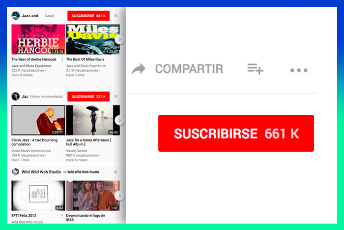
An example: The "Subscribe" button on Youtube. With just the use of a word accompanied by a good design we can guide the user to the action we want to develop. This is the simplest function of microcopies, but there are others that have emerged after seeing the great potential they have.
What are the objectives of microcopies?
As we have already mentioned, the main objective is to make it easier for users to navigate, but we can achieve many more if we put our imagination to work.
Increase conversion
Conversion is the main purpose of a website, getting a user to perform a certain action, such as subscribing to a newsletter, buying a product or becoming a follower of a social network.
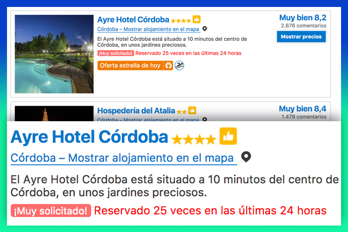
Booking, one of the world's busiest travel websites, has increased its conversion with the use of microcopies during the different stages of your booking. How? It was as easy as adding, "Very requested! There are only 6 left on our website!" on the initial screen of the search process, getting users to sign up for fear of becoming unavailable. It is a simple phrase that arouses the consumer's interest in this offer and ends up achieving its goal: to sell.
Improve newsletter opening and click rates
One of the ways to increase the conversion of a website is through the use of good microcopies in the newsletters, an essential element for the promotion and the creation of a link with the client. The newsletter is a way to introduce us to the lives of users, and get their attention to attract it to our content.
For the CoworkingSpain account, we work meticulously the microcopies of their newsletter, being aware of the great benefits they bring to this website, both in terms of increased visits and conversion.
First of all, the most important thing is to increase the opening rate, because if the user does not read the content no matter the design or how well written it is. Thus, we try to use phrases that connect with the user that intrigue him to know what else is inside that newsletter. How? Through phrases that either show you the solution to an existing need, that arouses your curiosity or even a statement on a subject that interests you and you know and which you want to know more about. But first of all, always from you to you, as if a person arrived, introduced himself and you want to continue to know him.
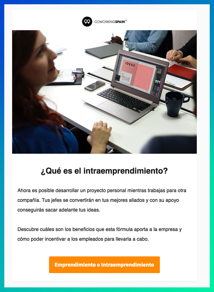
In this example of CoworkingSpain, the subject used is "What is intra-entrepreneurship", if you don't know about the subject you probably want to open the newsletter and continue reading. On the contrary, if I put "Intra entrepreneurship, a new concept", it might sound too impersonal and not arouse your curiosity.
And what about the CTA? Using ingenuity to add that touch of humor and make the user click, "Entrepreneurship or Intraentrepreneurship" is the issue addressed in this article.
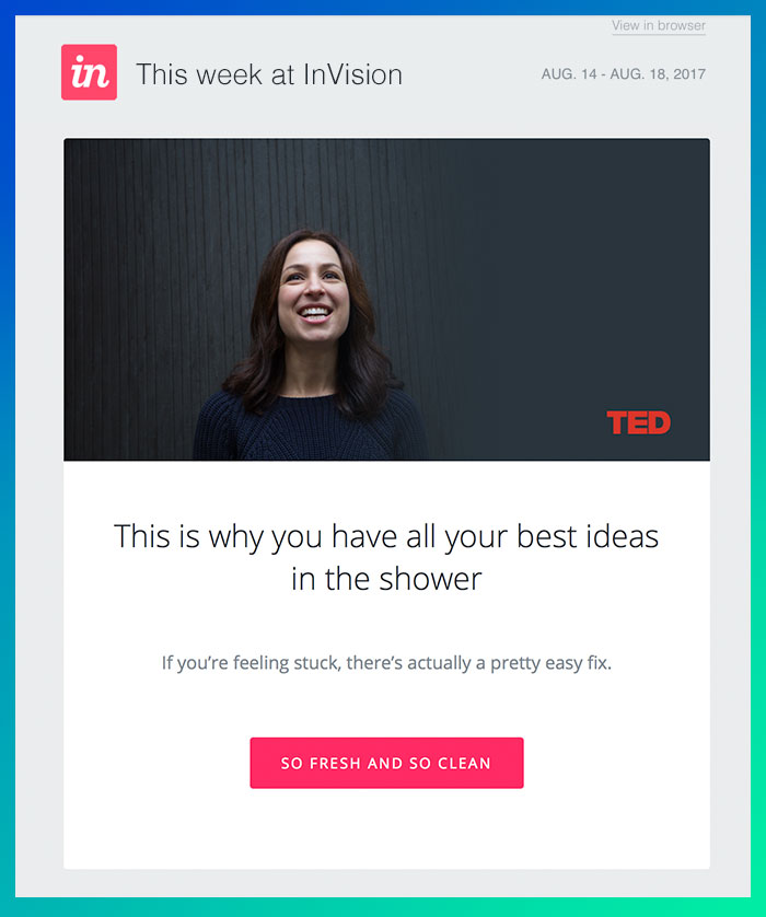
Another company that does really well is InVision, especially in the choice of their CTAs, in all their newsletters sharpen the ingenuity to increase the click rate.
In this example, they first used a title for your eye-catching article "This is why all your best ideas come up in the shower", getting your attention. Then they expose you to a problem for which they give you a solution "If you feel stagnant, there is actually a very easy way to solve it", with this they have almost beaten you, creating the need to know what the answer is.
They always manage to put the icing on the cake with the use of a perfect CTA, in this case "Fresh and Clean", a play on words that uses these terms in its two senses, a fresh and clean idea, that is, novel and polished and on the other hand, the feeling of freshness and cleanliness after the shower.
As you can see a copy is much more than a combination of words, is a small work that must contain the essence of the brand and in turn capture the consumer and convey some kind of feeling, according to the ultimate goal that is sought.
Increase confidence
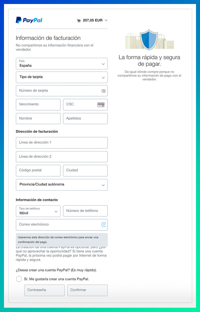
This is a handicap for many websites, according to data obtained from a survey conducted by PayPal we see that around 46% of the American population is still afraid to provide bank details during the time of online payment, just as we also observe that over 94% of respondents leave a website if they do not trust it. The microcopies play a very important role in getting the user to trust what they are seeing, through clarifications, for example, those that appear on the Paypal website.
Here we can see several types of copies, on the one hand those that give you an extra confidence like "The fast and secure way to pay" or "We do not share your financial information with the seller", on the other hand, an explanation of why the email is requested through a copy that says "We will use this email address to send payment information", ensuring that we will not receive advertising. All of them provide security to the customer when entering their bank details.
Respond to concerns
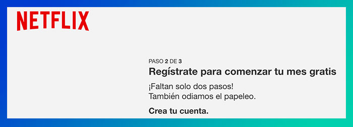
Surely many of you at the time of carrying out certain online actions have had doubts about whether or not to carry them out for lack of information. For example, when we are about to register on a website and we do not have much time if you have a complicated registration system on the second screen probably abandon the idea. The solution to this problem is as easy as adding an explanatory microcopy like the one you can see in Netflix. It informs us of the remaining steps with the phrase "Just two steps away!" also adds a humorous note with the "We also hate paperwork" and always makes it clear that the first month is free.
All these aspects together make the user carry out the registration and feel a sympathy for this brand.
Clarify possible doubts
Another of the main objectives of microcopies is to solve the doubts that users may have before they arise, that is, think as if you were a consumer and anticípate.
In order to choose the right text, the best thing to do is to carry out a prior test to find out what their interests and concerns are and thus adapt your copies to them.
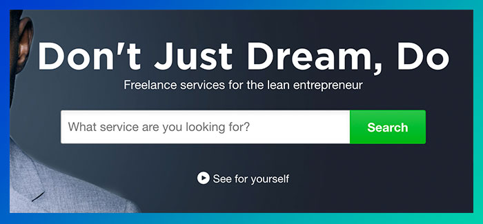
Here you can see a clear example, instead of this placeholder (the microcopy that appears inside the text box) we could have used a label such as "Write what you are looking for". However, by putting a question we are somehow persuading and encouraging the user to type. In this Fiverr example, if you came in and saw a box with a formal phrase that only told you what to do, you might leave the page without interacting with it, but if you add "What service are you looking for?" you feel the need to respond, as if it were another human being.
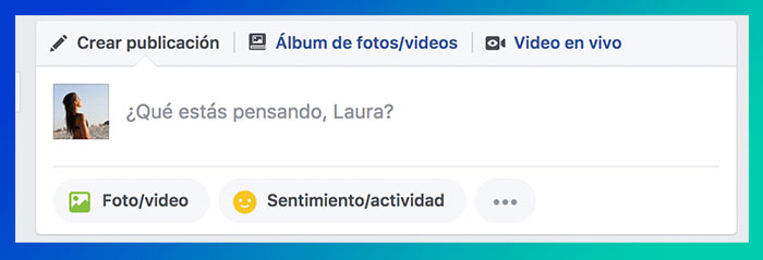
We can see other examples on pages like Facebook or Twitter, which add placeholders, some of them personalized as "What are you thinking, Laura? in order to get you to interact and create content on the social network.
Explain the errors
Although one of our missions, when we are in front of a website, is to minimize errors, it is inevitable that sometimes arise and when this happens we must be prepared so that the user does not leave the site without understanding why.
Surely you have seen many errors pages 404, but here comes into play the creativity of the designer to keep the client on the web, either by adding a button that redirects you to the Home Page or with a good microcopy that makes you continue browsing the web in any other way.
In Tripadvisor's website you can find a clear example of a good copy for 404 error pages. They take their main resource, be a travel page, and use it to their advantage to give it a comic point and hook users: "This page is on vacation... and you should be too". In turn, it redirects you to other sections of its website by adding a search box accompanied by the phrase "We checked more than 200 sites to find you the hotel at the best price". Isn't that perfect?
.jpg)
Microcopy as web design
"Details are not details. They make the design," by Charles Eames. In the case of microcopies, we see this quote from the American architect clearly reflected.
In the list of tasks of a web designer, these small pieces of text are relegated to the last positions and yet can be a great impetus for increased conversions, provided they are used in a proper way.
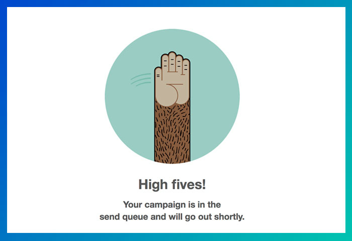
A clear example of a good use of microcopies is Mailchimp, has made this element one of its strengths, which accompanied by good images get the ultimate goal, which is to keep the user informed, in addition to differentiate itself from the competition by adding a fun and own tone.
Microcopy, a fundamental part of the UX
The microcopies will condition the user's experience and feeling towards the brand, so we must pay special attention. Each word must be clear, simple and above all seek the user's persuasion. At the end of the art of the microcopy is to enrich the customer experience through the small details, to motivate them to perform certain actions and to create a bond of friendship between the brand and the end consumer. How to do it? This is where the humour and ingenuity of copy-writers come into play.
Clifford Nass, professor of communication at Stanford University, discovered through one of his many researches that humour makes people feel better, comforts them with themselves and makes them appreciate interactions to a greater extent, increasing their cooperation and the acceptance of recommendations. What does this mean? That when we engage in a conversation with users via the web and use a humorous and friendly tone with them, they will appreciate everything we tell them and they will surely take it into account, and we even get them to convert and consume our product.
Nass also said that if you manage to excite or provoke some kind of positive feeling in the users, the conversion is just around the corner, you already have more than halfway done.
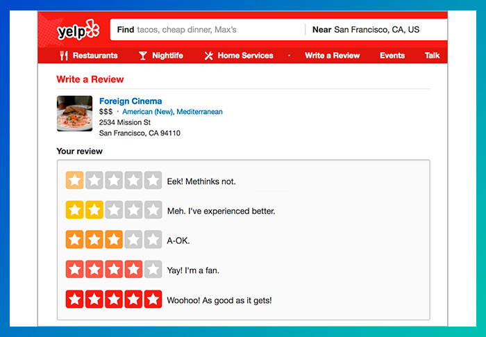
In this example of Yelp, we can see a clear example of the use of humor during one of the steps that forms the user's journey on their website. In particular, the moment of the reviews that the great majority passes without finalizing the process. Yelp adds some fun microcopies next to each of the scores to motivate the user to value their experience.
Surely thanks to phrases like "Yay! I'm a fan" have gotten a lot of people to give it a good rating. It's brilliant! I'm a big fan of these microcopies.
But the use of microcopies is not limited to persuading through humor, it must also be useful and bring value to the user. For example, if when you enter an app like BlaBlaCar all the buttons indicate "click here" you would probably leave immediately not understanding what to do, however if you see "I do not agree" "continue" or "confirm", these small pieces guide you in the steps you must take and facilitate the experience, while enriching it.
.jpg)
Now it's up to you to put into practice all the information learned in this article and start reaping the fruits of a good use of microcopies. Remember, provide the user with a personalized experience, surprise them, get them hooked and loyal through the art of copy-writing.


