
How can we help?Get in touch
Sometimes I wake up at night drenched in sweat remembering the time you could only use “secure fonts” or “system fonts” when designing a website: Arial, Verdana, Trebuchet, Georgia or my favorite, Comic Sans.
Fortunately those times have gone and now typographic variety is huge. So great we sometimes can take longer to select the fonts and the tool than picking a movie in Netflix (normally it takes me three and a half days to do the latter).
Because of that, let’s take a look at the most popular Web Font Services and select my favorite fonts from each one.
Google Fonts
is the most used web tool when talking Web Font services, and the one with the most fonts. It’s a free service and that makes the typographic selection a bit of a mixed bag.
From all of those I’ll pick three:
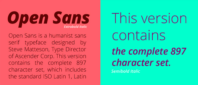
Open Sans
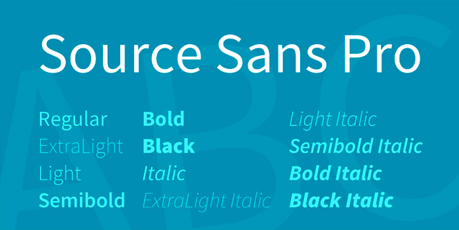
Source Sans Pro
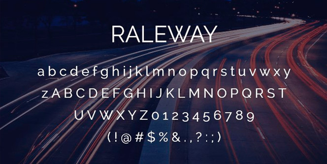
Raleway
Typekit
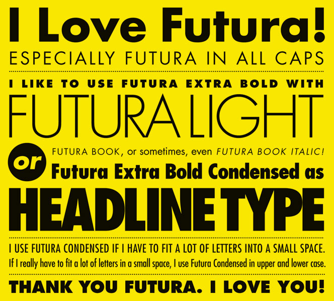
Typekit is the other giant along with Google Fonts; between the two they take the bigger piece of the cake. It belongs to Adobe and in this case it is a paid tool, so the quality of the fonts is a little bit better because we can find many licensed fonts like Futura.
Futura
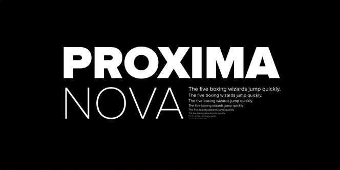
Proxima Nova
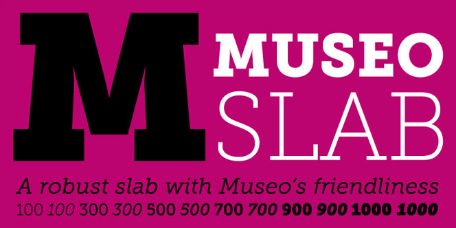
Museo Slab
Typoteque
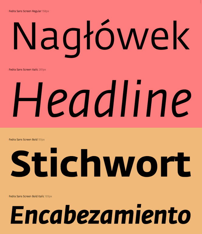
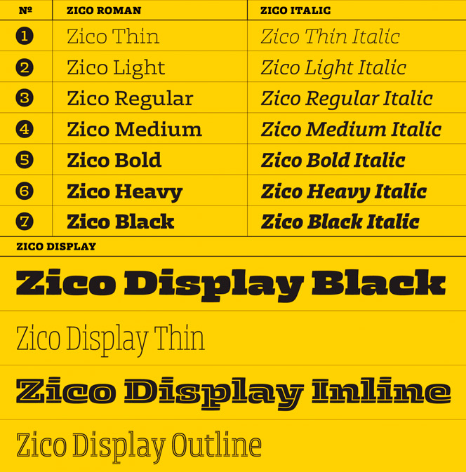
Typoteque offers a wide range of families through a payment service, á la Typekit, but the fonts we find aren’t the same quality (it’s hard to compete with Adobe), there are some interesting ones, though. The selection of typography books in their store is certainly worth a look.
Freda Sans Screen
Zico
Webtype
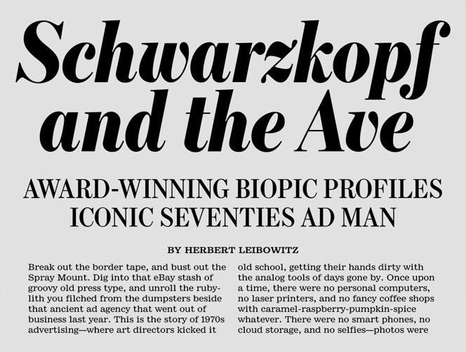
A Webtype, also paid service, sadly I predict its future will be the same as Fontdeck’s, another web font service that ended up closing, partly because running against Adobe and Google is like playing the Champions with a team made up of friends. However amongst the vast majority of dispensable fonts one stood out: a super elegant serif typography.
Escrow
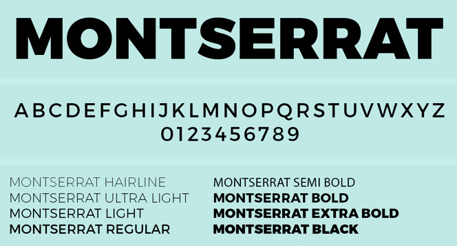
Brick
In Brick they’ve honored the famous quote by Mies Van der Rohe that said “less is more”, it meaning, few fonts but most of them being quality fonts. Amongst others you can find Monserrat, the best alternative to Gotham, but in this case— contrary to Google Fonts where they offer only one weight— they have all its weights.
Montserrat
Bodoni
Bitter
After this overview I can only invite you to visit these tools somewhat frequently because their catalog is constantly growing. May the force be with you.
Author
Related articles
No hay entradas
Related works
Fun musical spanish

A revolution of the surfing experience