Renewing the image of a unique historical place.

Palacio de Esquileo is a charming hotel that specializes in wedding receptions and business meetings. 

After a change of management, from parents to children, we were in charge of the rebranding of Palacio de Esquileo. 

With a future ahead of them, the hotel needed a new image that would transmit both modernity and history and would enhance its development and differentiate it from its competitors.

Entrada del Palacio de Esquileo
A hotel with history

The hotel is close to medieval towns of Segovia such as Riaza, Sepúlveda, Pedraza, Ayllón or Maderuelo. 

Esquileo comes from shearing, "esquilar" in Spanish, which means cutting wool to cattle gives the name to the brand. This is what was done in these centres, 37 of which were documented in 1700 on the northern slope of the Central System, the economic base of the Crown of Castile and which for centuries was its most important industry. Once sheared, the sheep were branded with the irons of each house.

The challenge of the project was to represent the concepts that accompany the story of the brand, cattle and shearing, in a modern and elegant way. Our goal was to convey the exclusivity of the place and generate a strong link with its target audience.

Fotografías de oveja, lana y hierro de marcado del ganado
El exterior del Palacio de Esquileo
El interior del Palacio de Esquileo
Fuente en el Palacio de Esquileo
Solution

For typography we used Futura, an elegant sans serif font which is very different from the majority tendency in the sector in which we see how Script or serif are the ones that are the most commonly used. This way we distinguish ourselves from the competition and we manage to transmit the concept of modernity that was intended. We also introduced the link between the letters D and E as a nod to this medieval history of the place


Logotipo de Palacio de Esquileo
Detalles del logotipo de Palacio de Esquileo
Applications

The previous identity did not adapt well to all types of media and sizes, so one of our challenges was to make it work perfectly in all contact points and all its applications. To do this, we created a symbol inspired by the cattle branding irons that referred to the concepts of wool and sheep, along with the initials of the name of the farm.

For the colours we chose two complementary shades, gold and dark blue, which give the sensation of exclusivity and elegance that the brand intends to transmit within the sector.

Papelería corporativa del Palacio de Esquileo
Detalles del bordado del Palacio de Esquileo
Tríptico del Palacio de Esquileo
Sello de lacre del Palacio de Esquileo
Patrón de fondo del logo del Palacio de Esquileo
Share: 

CWSC

Array
Unique sinks

Miapetra is a Spanish company dedicated to manufacturing exclusive sinks and shower trays made of a single stone with a unique design.

We handled the global branding of the brand working by the following steps:


Study of the Competition

Analysis of the main competing companies, examining their strengths and weaknesses with special carefulness.


Humanization of the brand

At this stage we assign featured and values to the brand normally ​​associated with personality traits allowing us to treat it as if it were a person. This is very useful not only when creating the graphical representation of the brand, but also to understand how it has to communicate with its audience and choose a coherent, consistent tone.


Design values ​​of the brand

Selection of the main graphic options, such as colors, shapes and fonts based on the values ​​that they represent.


Logo design

Creation of several proposals for the brand and their application in various media.


Foto de lavabo hecho de piedra de Miapetra
Naming y logo

Para la construcción del logo hemos querido transformar la E de la palabra en un isotipo, es decir la representación gráfica icónica de una marca. Los picos y los ángulos nos recuerdan al material de la piedra. Este detalle será utilizado como elemento decorativo en algunas de las aplicaciones.


Anagrama Miapetra
Bocetos de logotipo en cuaderno
Logotipo de Miapetra en Illustrator
Logotipo de Miapetra sobre fondo oscuro
Foto de un lavabo de Miapetra
Tipografía y gama cromática

Quisimos una gama de colores limitada pero que le diese a la marca una característica elegante, lujosa y atemporal. Utilizamos el gris azulado que contrasta con los tonos terrosos y blancos de los diferentes materiales utilizados por Miapetra.

Colores corporativos de Miapetra
Tipografía corporativa de Miapetra
Aplicaciones

Diseñamos varios elememtos para imprenta dentro del proyecto de papelería corporativa, lo que nos permitió desarrollar más en profundidad la esencia del branding: minimalismo y elegancia.

Branding de Miapetra
Foto de un lavabo negro de Miapetra
Tarjetas de visita de Miapetra
Foto de lavabo de Miapetra
Share: 
A revolution of the surfing experience

Totalsurfcamp is a global online platform that allows you to quickly and easily search, compare and book surf experiences.

We were in charge of branding, website development and management of all online marketing processes since the conception of Totalsurfcamp.


Tabla de surf apoyada en una palmera en la playa
A brand that's a bit of a rascal

As it is an international project, the brand name had to work well in different languages and be very descriptive of the business, so that there was no doubt about the role of the business.

For the logo we chose a customization of a script typography that reflects the natural, alternative and somewhat rascal style associated with the surfing community.

In addition to white and black, we chose two colors for the corporate identity: turquoise green and purple. These colors generate a pleasant contrast between each other, and are a creative and innovative choice. Turquoise green reminds us of the crystalline beaches of this shade that are so appreciated among surfers.


Logo Totalsurfcamp
Tarjetas de visita de totalsurfcamp
Camiseta de totalsurfcamp
Fotografía de surfista andando con una tabla en el brazo
Marketing for a 2 sides marketplace

We manage Totalsurfcamp's social networks, where we spread the atmosphere and energy of the surf camps and the exotic destinations where they are located. We focus on promoting the experiences offered by the surfcamps and the characteristics of different countries, so that every surf fan can find something to their liking. 


We created and developed a blog with articles on topics related to surfing, from tips and tricks for surfers at every level to news and curiosities of the world of this sport. 


In order to promote the web and the created contents we also manage the e-mail marketing campaigns


Mockups de la web de Totalsurfcamp.com
Mockup de sección de destinos de Totalsurfcamp.com
Responsive and user-friendly design in which photography is the main character

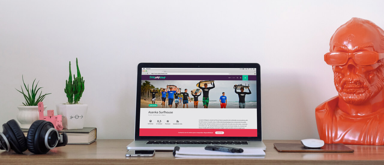
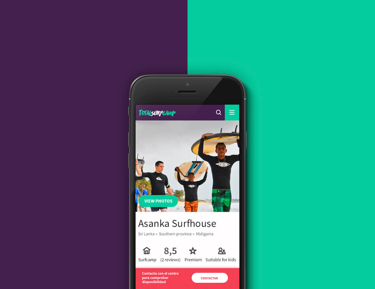
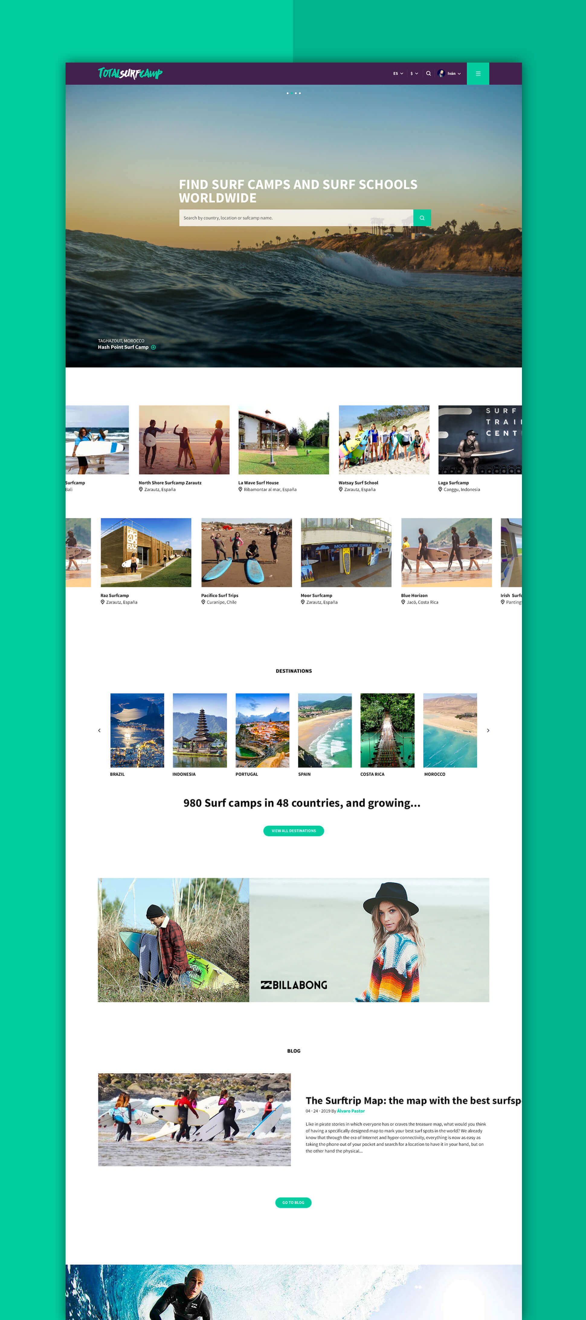
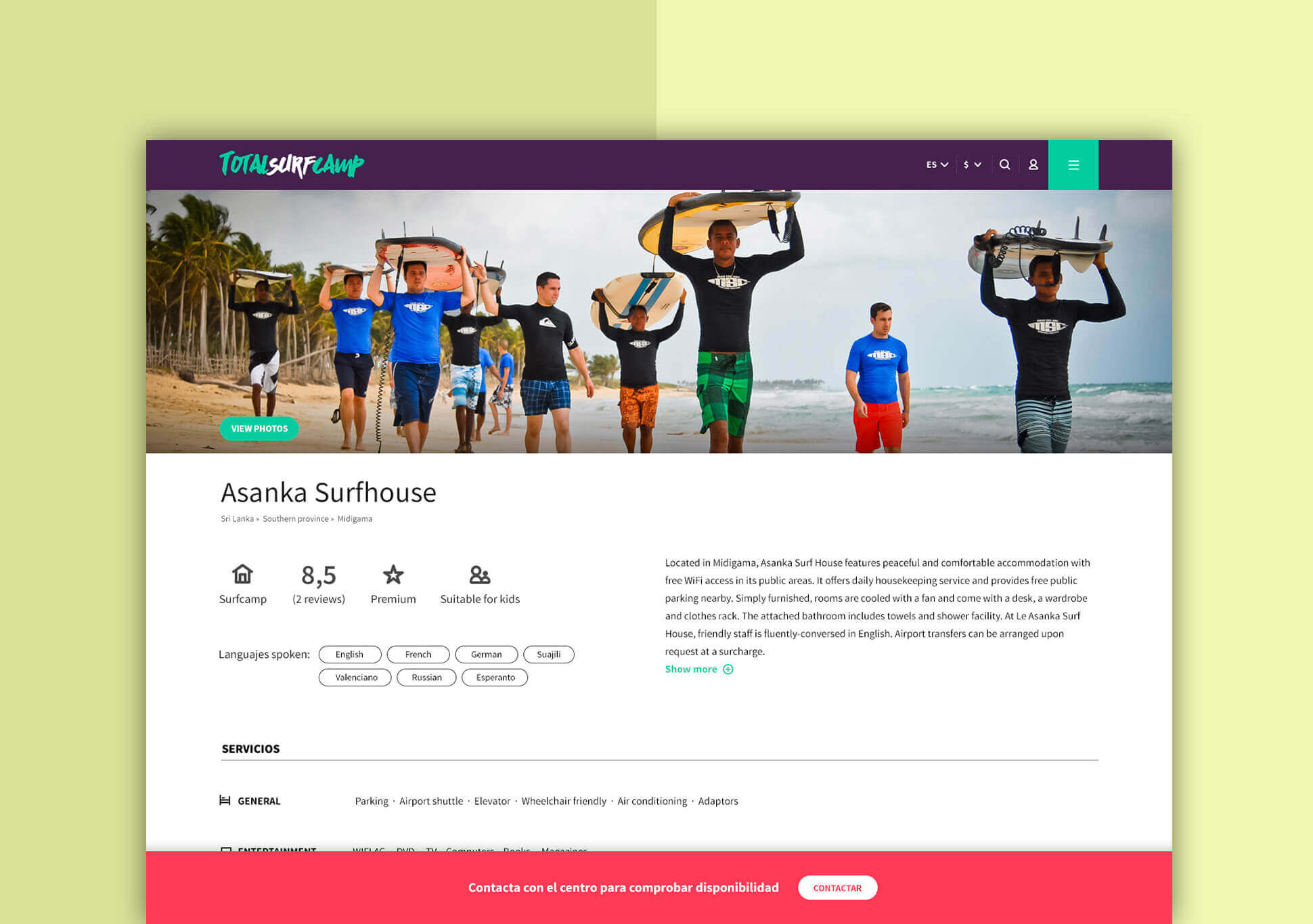
We developed the website in Drupal with adaptive responsive design based on a clean and "user friendly" graphic style in which the photography is the main character.

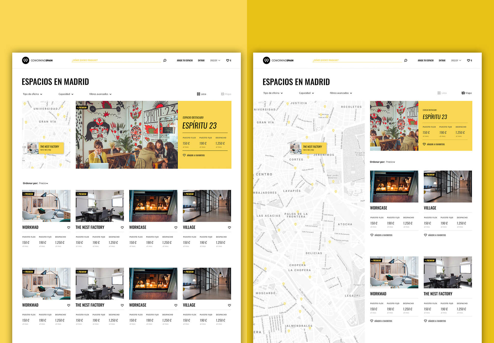
The primary goal of the site is the booking of online experiences for an international audience. The simplified User Journey that conditioned the entire process of interface design was: 

Search -> Listing with reviews -> Booking

We didn't invent anything new, we simply applied the already proven formula of other online tourism giants to this niche.

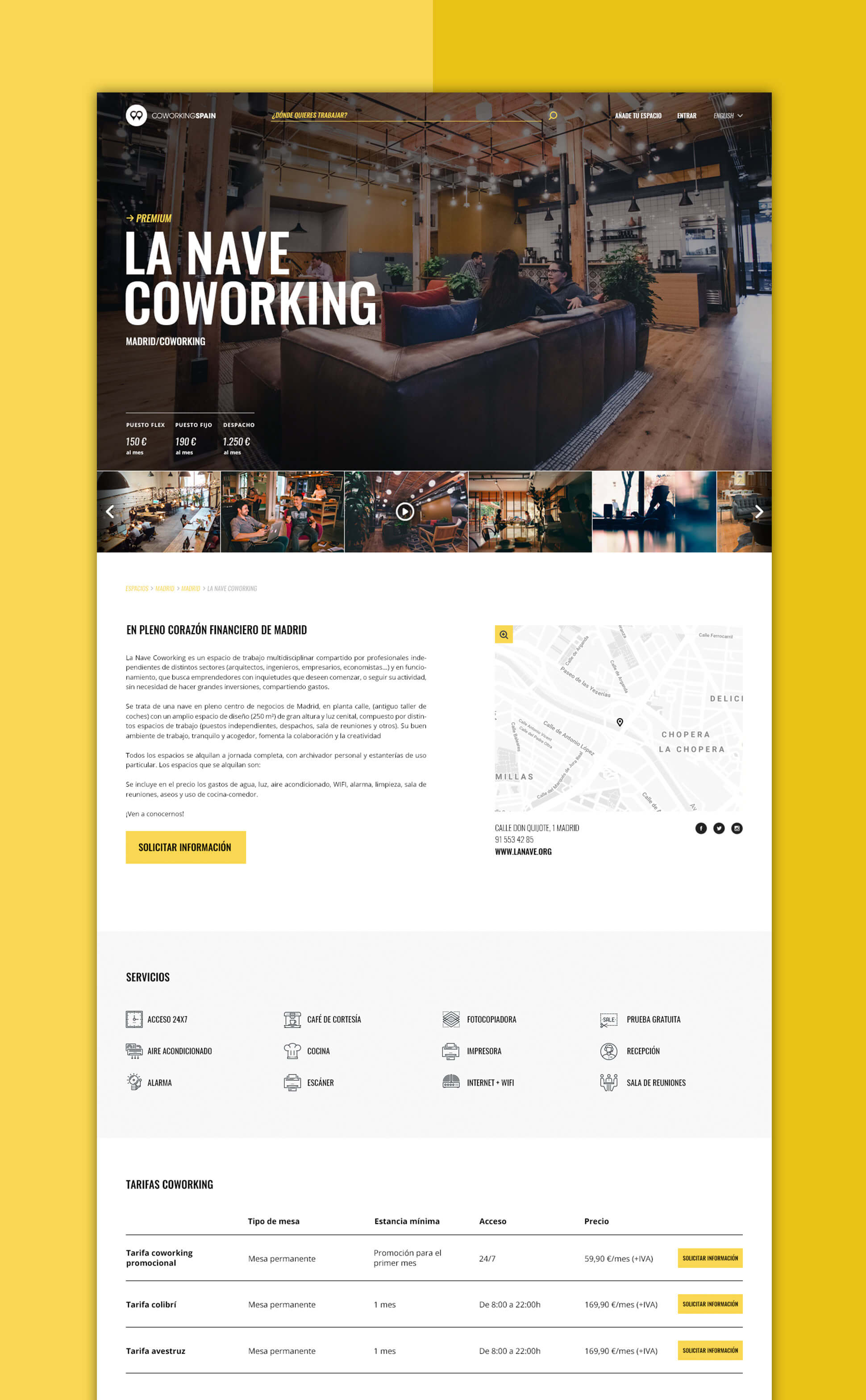
This is undoubtedly one of the most complex websites we have developed as it is a 2 side marketplace that has to work for users looking for a surf experience and for managers of surf centres who want to promote their experiences.

The main features of the platform developed in Drupal include the following: 

Content in 7 languages with automatic translation system against Google Translate API, dynamic content depending on the location of the user through smart ip, payment management system and credit card subscriptions based on Stripe, invoice generation system, messaging system between users and surf centres with email notifications, different roles and control panels for standard users, managers of surf centres or managers of several surf centres and freemium system to automatically highlight in the lists and covers those surf centres that contract a premium plan.

Mockups de la versión mobile web de Totalsurfcamp.com
Portada de la web de Totalsurfcamp.com
Funcionamiento de los perfiles de surfcamps en la web de Totalsurfcamp
Foto de tablas de surf apoyadas en una palmera en la playa
Share: 
Designing the image of one of the most important annual coworking meetings in the world.

The Coworking Spain Conference is an event for people interested in this new work philosophy that consists of sharing a workspace between professionals from different sectors, saving costs and, at the same time, generating synergies and support among the workers themselves.

Since its creation in 2012 we have been in charge of developing the corporate identity for all the editions of the conference.

Patrón geométrico de Coworking Spain Conference
Visual identity

We always try to maintain a coherence between all the editions, updating our previous work but respecting the particularity of each one of them. 

The language we use is based on the application of very saturated colours and simple, clear and concise geometric shapes. This combination represents a characteristic aspect of the different cities that host the conference.

On this occasion we wanted to convey the concept of diversity and collaboration through the use of geometric pieces that fit together. For the logo we used a very condensed sans serif typeface.

Póster Coworking Spain Conference 2017
Pases Coworking Spain Conference 2017
Póster Coworking Spain Conference 2017
Entradas Coworking Spain Conference 2017
Gif animado de cuenta atrás para el final de las entradas con descuento de la Coworking Spain Conference 2017
Programa Coworking Spain Conference 2017
Póster Coworking Spain Conference 2017
Mockup del perfil de Instagram de coworkingspain
Web design

The CWSC website is based on Drupal and was originally created in 2012. Since then every year the core and Drupal modules are updated with new versions available to keep the code safe and up to date.

In order to adapt the design to the new branding, each year only the theme layer is modified, reusing most of the blocks and components of the template. 

This way of working implies an important cost saving for our client. 

Mockup del sitio web de coworkingspainconference.es
Share: 
Designing the brand and the digital ecosystem of the leading website for coworking spaces in Spain.

Coworking is an increasingly popular way of working that allows independent professionals, entrepreneurs and SMEs from different sectors to share the same workspace, both physical and virtual, to develop their professional projects independently and at the same time promote collaborative initiatives. Coworking Spain is an online platform that allows you to quickly find, compare and contact coworking locations in Spain.

In order to promote the idea of coworking in Spain and facilitate the process of finding an ideal space, we redesigned the Corporate Identity of the brand, developed the website and created online marketing campaigns.


Espacio coworking
The brand

The brand we created is formed by an anagram of two location points connected on the map. With that we represent the main characteristic of the business: to be a meeting point for all coworkings in Spain. The union and the connection are also represented in the link between the letters C and O.

The main colours to be used in all the visual communication of the brand are black and white. On the website the use of yellow will be enhanced in order to preserve a more formal language and generate confidence in users but also providing a touch of innovation, creativity and modernity.

Logotipo de Coworking Spain sobre fondo negro
Papelería corporativa de Coworking Spain
Anagrama de Coworking Spain
Aplicaciones de la marca de Coworking Spain en papelería y tazas
If content is fire, social networks are gasoline

Aiming to promote the culture of coworking and this new style of work we were managing the social media of Coworking Spain, where we focused on promoting venues, events and inspirational workshops.

We created and developed an online magazine with articles on topics related to coworking, from industry news and events to interviews and lifestyle blogs. 

In order to promote the website and advertise coworking spaces, events and the created content we also run email marketing campaigns.

Mock-up de contenido de las redes sociales de Coworking Spain
The website

The objective of the redesign was to improve the findability and renew the image of the web, which was somewhat outdated after 5 years since the last restyling.

After carrying out the usual process of user experience design, the main pain points were identified and the solutions for each of the problems were proposed.

The result was a new interface with a minimalist and slightly hipster design in which photographs of spaces and typography are the leading themes. The yellow color and a careful selection of icons help to guide the user through the interface and various calls to action. 

The new header keeps the most relevant actions always visible and the new search and space filtering system makes finding workspaces and meeting rooms much easier and more intuitive.

Mockup de sección de detalles de sitios de coworkingspain.es
Mockup de sección de mapa de coworkingspain.es
Mockup de sección de artículos de coworkingspain.es
Mockup de sección de listado de magazine de coworkingspain.es
Mockups de la versión mobile de coworkingspain.es
Share: 

Pages

How can we help?Get in touch