There comes a time when brands are faced with the need to renew their corporate image to try to adapt to new times or by a natural evolution of the company. This may be one of the most difficult decisions a company must make. A rebranding involves many risks that must be willing to assume, especially when the brand is recognized especially for its logo or colors and we want to make a change in these aspects.
Here you have the top 10 of the best rebranding of this year:
Movistar
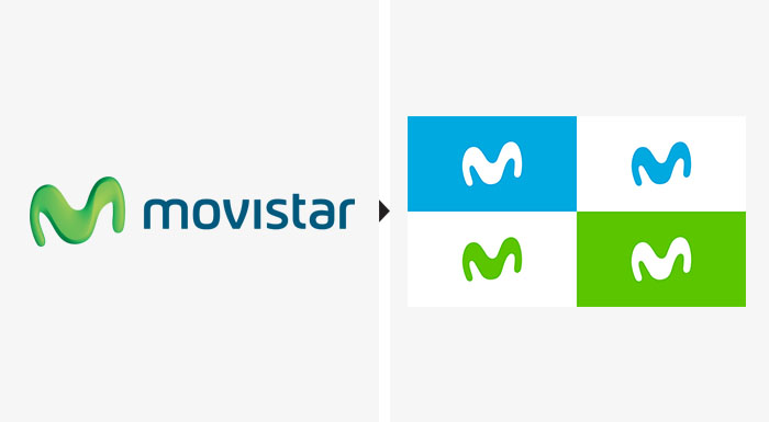
The most important Spanish telecommunications multinational was born in 1995 under the name of Telefónica de España SA. In 2010 it started to use the name Movistar for its advertising image, trying to reach a younger audience. A very necessary facelift for the oldest telephone company in our country. Throughout this time Movistar has carried out 6 rebrandings of its logo, tending towards simplicity, until the last one was carried out in 2017.
This rebranding has been carried out by the company Lambie-Nairn. What was their objective? To show a brand closer to new technologies, giving it an expression of modernity and symbolising the company's new business challenges.
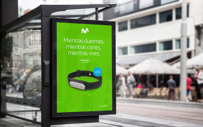
For Movistar's new design, it has been decided to eliminate the glosses and reliefs (goodbye M in 3D), as well as the blue background in gradient. Now the M is flat, simpler and sometimes detached from the green to appear in some cases also in blue and white. This flatter form is also designed to be used in social networks and to be able to create from its curves a more simplified language, easily applicable.
Converse
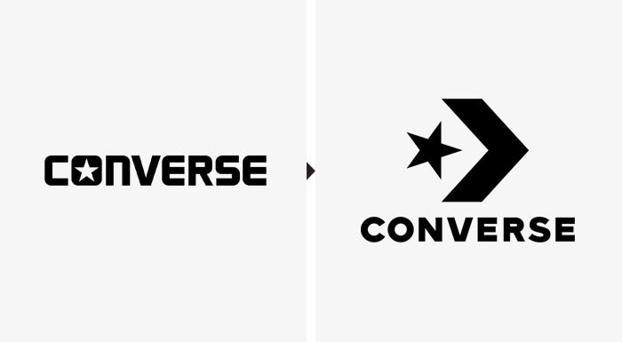
The famous brand of canvas slippers was created in Massachusetts in 1908. It has made several rebrandings throughout its more than 100 years of history, but maintaining since the 70s the star and arrow.
The British studio Sawdust was in charge of the rebranding. From the beginning they have been clear that they would maintain the essence of Converse. As Adam Cohn, director of global design, said in an interview for the Cool Hunting website: "the star and arrow symbol has been in use since the 1970s and we wanted it to be an important part of our identity; that part of the research was clear: let's take advantage of an icon that is part of our legacy and that also represents progress. The challenge was to put our name on the composition, so we had to develop a new typographic arrangement.
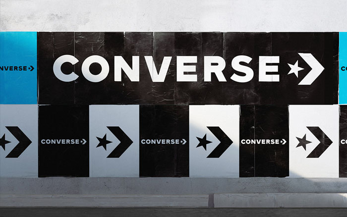
In this design the word "Converse" is now in the background, making it smaller than the image of the arrow along with the star. The typography has been changed, going on to use, according to the agency, "a mixture of 4 or 5 versions that were used in the past for the logo of the brand".
Cirque du Soleil
In 1984, one of the world's largest circus companies was created in Baie-Saint-Paul. Currently, taking into account only the shows that take place in the city of Las Vegas receive more than 9 million spectators a year. Since its inception have made 5 rebrandings, most have always kept the traditional lines except the latter has definitely broken with them.
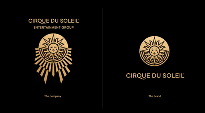
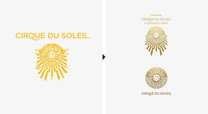
The Brand Union Consultant in collaboration with Commissaire Officiel Studio, has been in charge of this change. The aim of the company is to become a multi-brand company, creating a parallel brand away from the show, hence the design shows a completely different image to what we are used to. The design has the same medallion but much more simplified, allowing it to be used in smaller formats. It can also be used more comfortably on social networks.
The logo has gone from incorporating many details to simple and clear lines, as has the typography that has been refined for better legibility in social networks. The intense yellow color they used, is now a more dull and sophisticated yellow. The colors used for the background are blue, white and black.
Formula 1
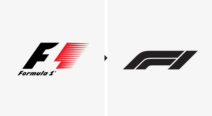
It has been 67 years since the first Formula 1 race was held in 1950 in England, plus the previous branding was for 23 years.
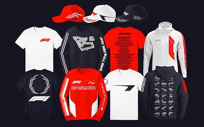
The design has been made by the London agency Wieden + Kennedy. The change of ownership to Liberty Media has been one of the triggers of this change of image. In addition, the need to adapt to new times and its use in social networks.
The logo now consists of two straight figures with a curve simulating an F and a vertical line simulating a 1. Representing two cars that run a circuit, wanting to reach the finish line. The new branding shows a much simpler image and with fewer details, thus achieving lines more in line with current events, more modern.
Ebay
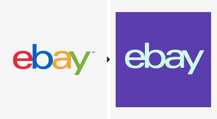
The pioneer of online product auctions was founded in 1995 in California. Throughout its history its logo has undergone only two modifications. In the beginning, the logo included multicolored letters superimposed on top of each other, giving a childish image. In the first rebranding they kept the multicolored letters but separated them to get a better legibility.
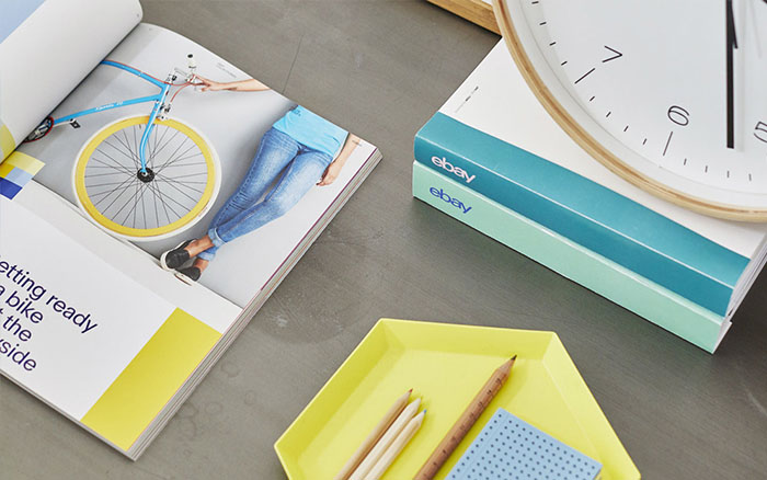
The second and last rebranding carried out for the brand by Form& together with the ebay team, the brand has decided to get rid of the multicoloured letters. The colors are still kept in the background, betting on a more elegant design and not so childish but without losing its essence.
The typography used is Market Sans, created by Swiss Typefaces especially for this project.
Schweppes
This company was born in 1783 in the city of Geneva, but did not reach Spain until the 1950s. The brand is owned by different companies in each of the countries, so it is not difficult to see that both branding and packaging are in turn different. For example, in the United Kingdom it is owned by Coca Cola, while in Spain it is owned by Orangina-Schweppes.
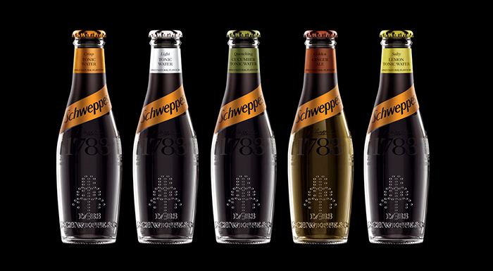
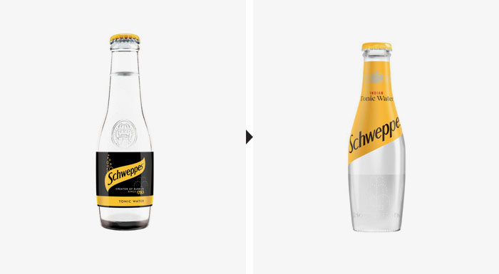
The new UK branding has been designed between Coca-Cola and Kenyon Weston. The new shape of the bottle is inspired by Jacob Schweppe's original model from 1783. The pity is that this redesign will not reach countries like Spain since Schweppes is not part of the Coca-Cola group.
On this occasion they have opted for a change in typography, now it is dry stick eliminating the serifs for better use and printing on the new bottles.
Häagen Dazs
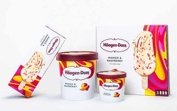
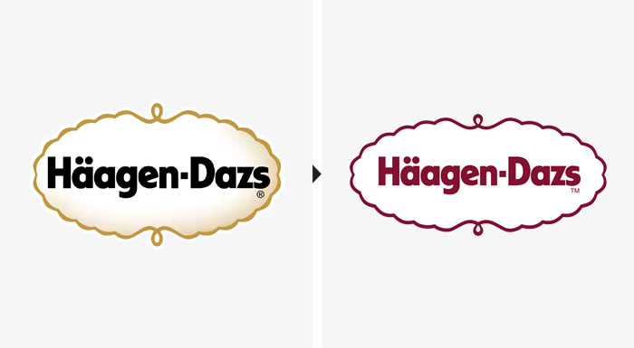
Since the unpronounceable New York ice cream company was born in 1961, there had been no corporate image redesign until today.
The Manchester LOVE agency has been in charge of washing the face of the brand. The aim of Häagen Dazs with this change is to renew and modernize itself to adapt to the new times and technological advances.
The black and gold colours that gave an old-fashioned image have been eliminated. Burgundy was the only one that remained intact, the brand's flagship colour. They have also redesigned their packaging, making it more visual. The ice cream brand has more than 50 patterns to decorate all the packs. Artists, designers and art directors from all over the world have lent themselves to carry out this rebranding.
YouTube
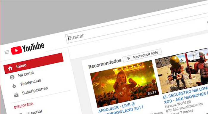
The world's most visited video platform, with more than 1.5 billion users, was born in California in 2005. The number of members is only surpassed by Facebook, which has more than 2,000 million users. It should be noted that this year YouTube counted 1,000 million hours in views a day, doubling what was achieved in 2015 when 500 million hours were counted.
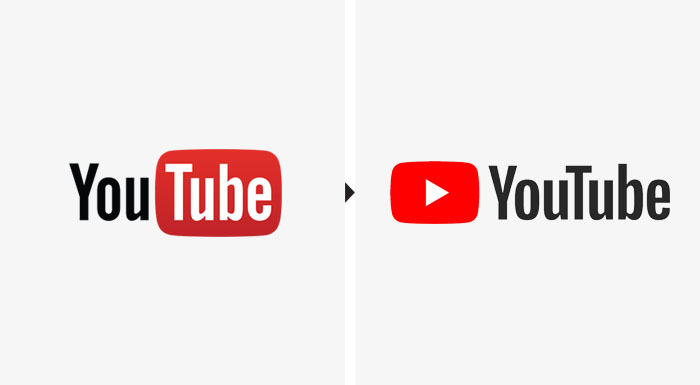
The rebranding has been done by the company itself, with Christopher Bettig in the art part and Robert Thompson in navigation and video viewing. In addition, they have had the collaboration of Saffron for the creation of the design. This has been their first rebranding since it was created, with the aim of making existing elements work better.
Youtube Sans, a more rounded and less condensed typeface, has been specially created for the occasion, in order to improve its legibility without losing its essence. The word "Tube" has been taken out of the red box, joining it to "You". In addition, they have placed in front of "Youtube" the play icon of their videos, a new element added to the logo of the brand.
Calvin Klein
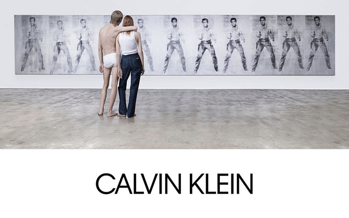
One of the most important fashion houses in the world, founded in 1968 in the United States, has made the second rebranding of its history in 2017. The brand operates in more than 110 countries, obtaining annual revenues of more than 8,000 million dollars.
On this occasion, the design was created by Raf Simons, under the direction of graphic designer Peter Saville. This change has been a tribute to the founder and the foundations of the house.
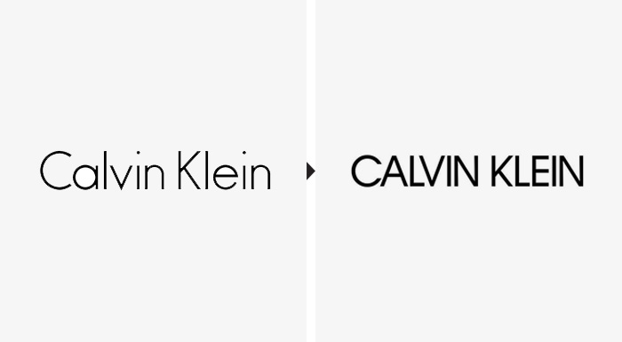
The most notable changes have been the change from lower case names to capital letters and the use of a new typeface, discarding the traditionally used Futura.
Audi
The German automobile company was founded in 1909 and became part of the Volkswagen Group in 1965. It now operates worldwide with annual revenues of 45,096 million euros. It is not the first time that the brand decides to redesign its logo, have a long history of changes always trying to adapt to new times.
The redesign has been carried out by Audi in collaboration with the German agencies Strichpunkt and KMS TEAM. The objective sought on this occasion was to adapt to new technologies and break with the current image giving free rein to creativity.
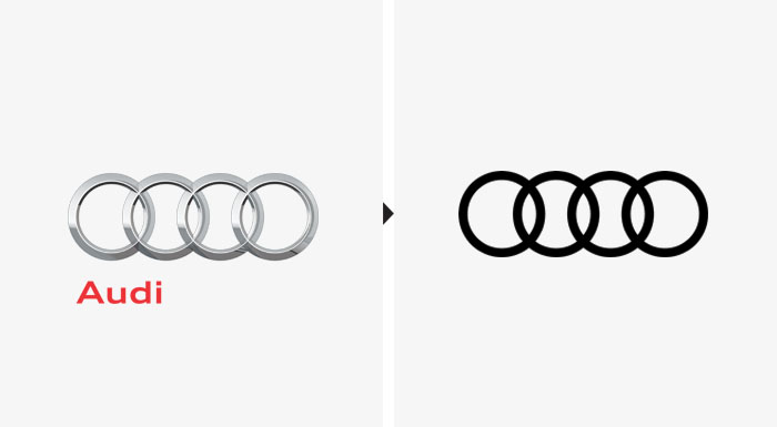
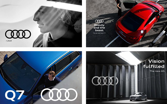
In the new branding we can see that the word Audi has been removed in its entirety and disposed of the reliefs and brightness of the rings (goodbye to the 3D design of these). The logo has become completely flat and with simple lines, allowing better use in social networks.
