How can we help?Get in touch
Upgrading the identity of the prestigious multinational company of the automotive industry.
Febest Autoparts is a multinational company present in more than 25 countries and dedicated to the distribution of high quality car parts.
We took care of the rebranding of the company, maintaining its essence without separating it visually from something that was already recognized and respected.

Visual identity redesign
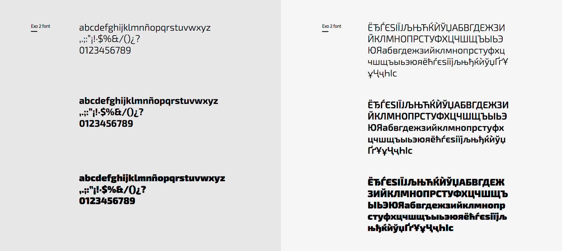
The first thing we did was to adjust all the strokes, spaces and curves present in your old logo. We enlarged the kerning and gave balance to each letter and its entirety. We gave a different typography and spacing to the phrase "Auto Parts" that completes the logo with a sans serif typography.
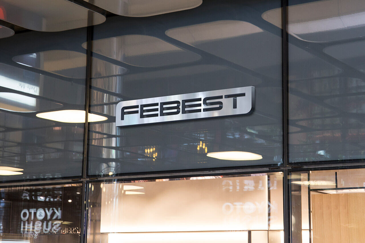
Later we proposed to change the frame for a text tablet preserving the original curvatures but adjusting to those of the typography it contains. Changing the line for the mass of colour gives the brand a greater solidity and reliability, values that the customer wants to emphasize in a remarkable way.
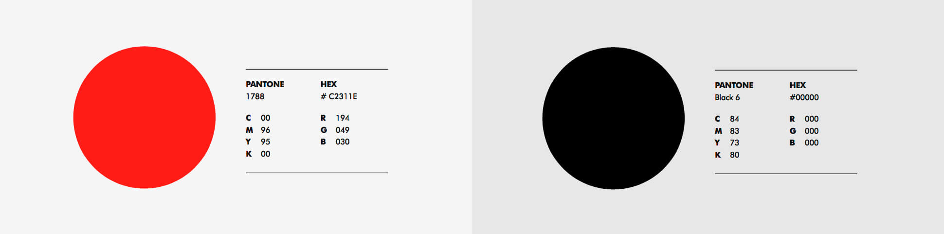
The last step was the color since originally the brand was black. We chose to use red, a tone that is also the most valued in the automotive sector.

Applications
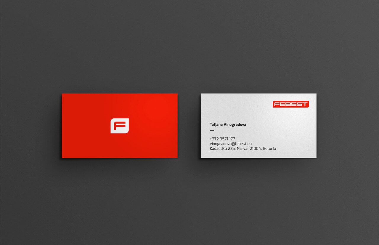
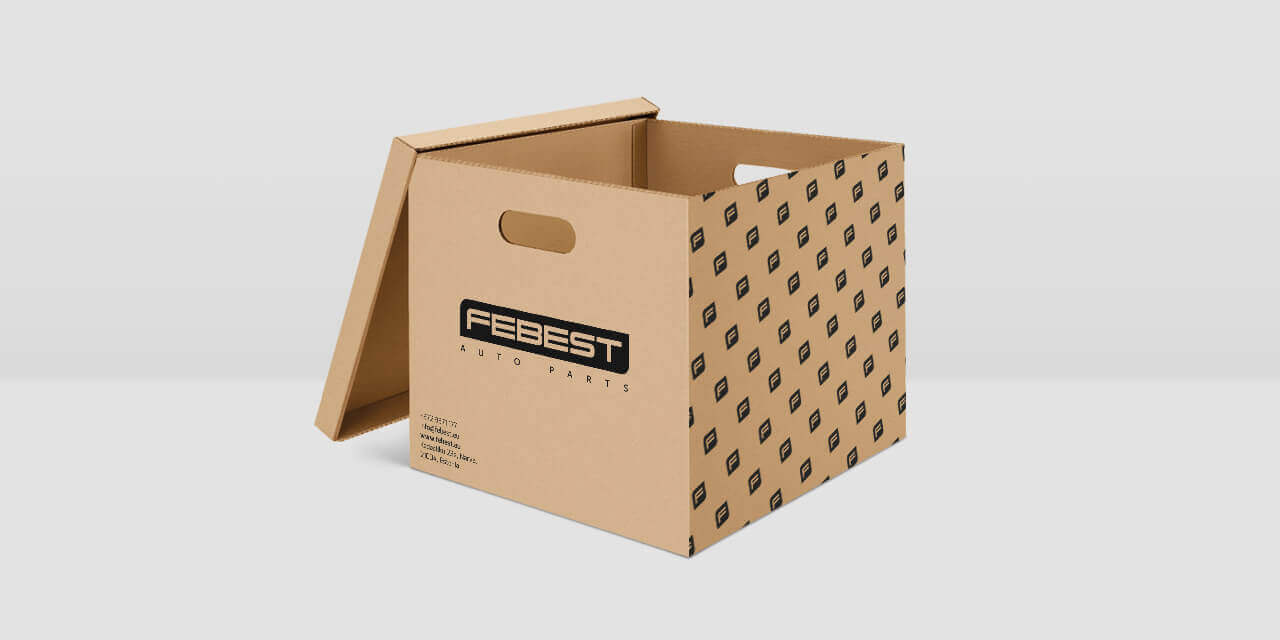
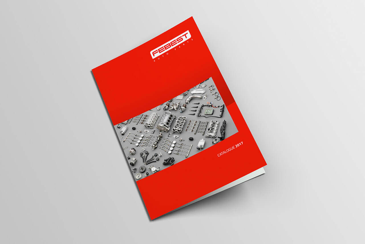
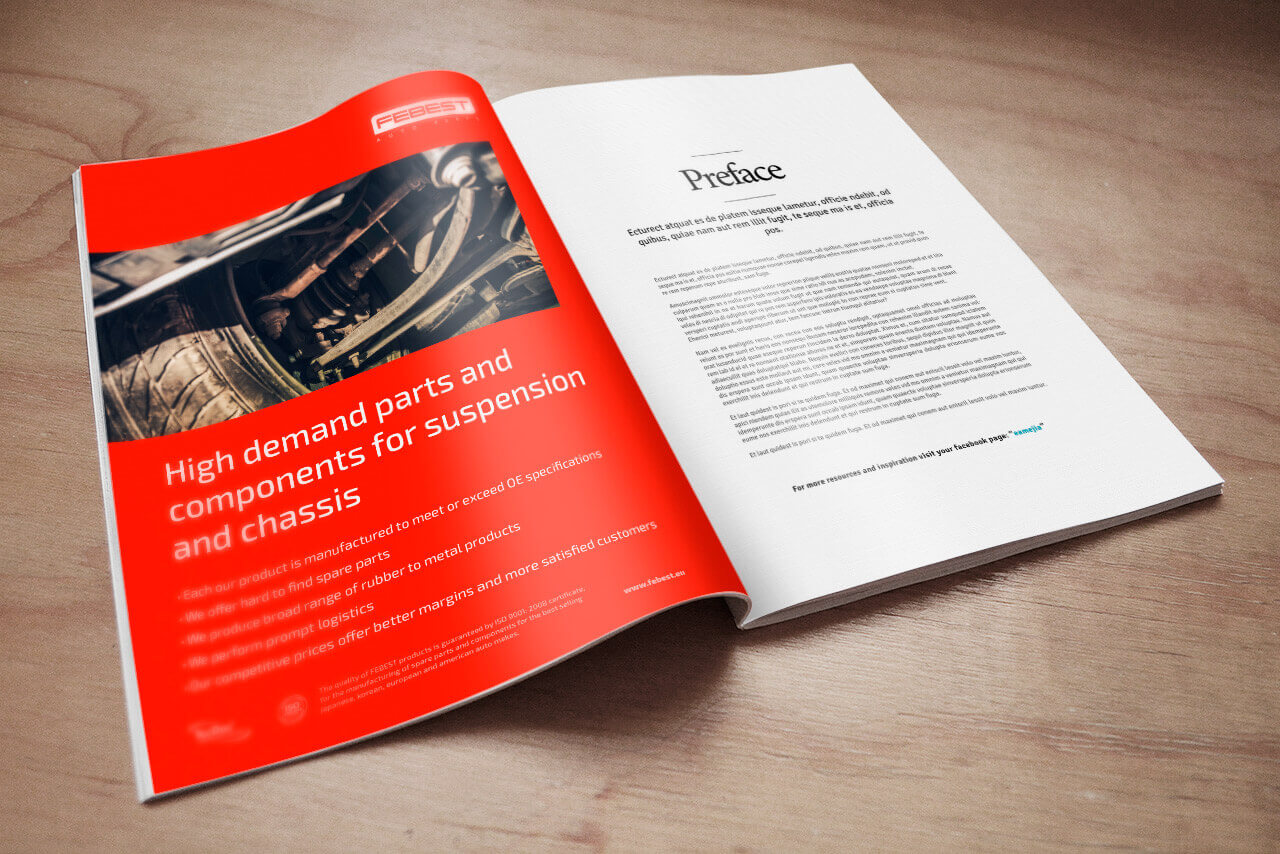
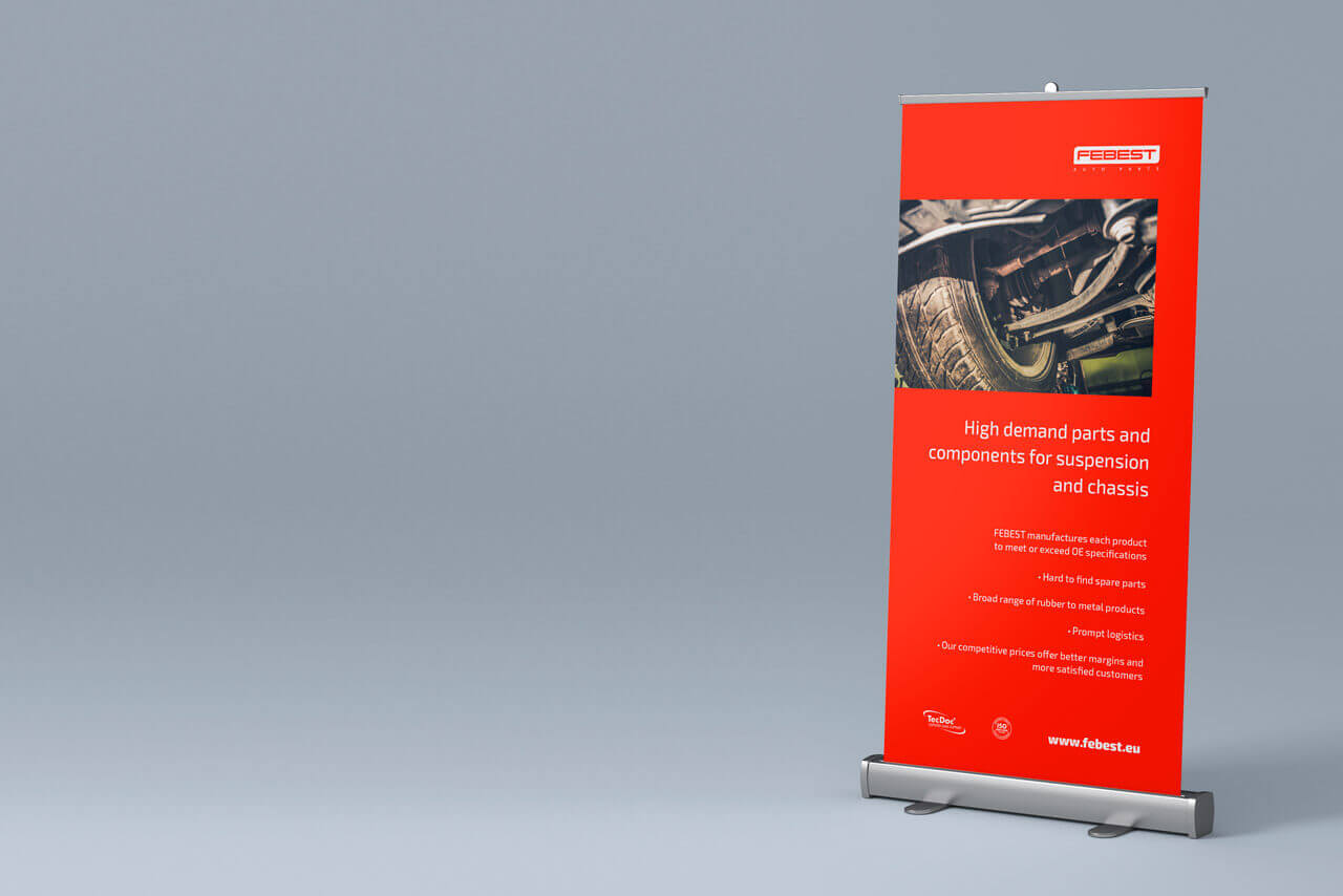
On the basis of the corporate identity manual, we created a series of stationery and packaging elements, as well as promotional pieces. In all the cases we repeat the indications of typography, color and marked layout.